Picker API
The Picker API lets merchants search for and select items from your app-specific data, such as product reviews, email templates, or subscription options. Use this API to build custom selection dialogs with your own data structure, badges, and thumbnails. The picker returns the IDs of selected items.
If you need to pick Shopify products, variants, or collections, use the Resource Picker API instead.
If you need to pick Shopify products, variants, or collections, use the Resource Picker API instead.
Anchor to Use casesUse cases
- Resource selection: Enable resource picker dialogs for selecting products, customers, or other resources.
- Multi-select: Build interfaces that enable selecting multiple resources at once.
- Filtered selection: Provide filtered resource selection with search and filtering capabilities.
- Workflow integration: Integrate resource pickers into configuration workflows.
Anchor to PropertiesProperties
The picker function opens a custom selection dialog with your app-specific data. It accepts configuration options to define the picker's heading, items, headers, and selection behavior. It returns a Promise that resolves to a Picker object with a selected property for accessing the merchant's selection.
- Anchor to headingheadingheadingstringstringrequiredrequired
The heading displayed at the top of the picker modal. Use a clear, descriptive title that tells merchants what they're selecting.
- Anchor to itemsitemsitemsItem[]Item[]requiredrequired
The list of items that merchants can select from. Each item appears as a row in the picker table.
- Anchor to headersheadersheadersHeader[]Header[]
The column headers for the picker table. Define headers to label and organize the data columns displayed for each item. The header order determines the column layout.
- Anchor to multiplemultiplemultipleboolean | numberboolean | number
The selection mode for the picker. Pass
trueto allow unlimited selections,falsefor single-item selection only, or a number to set a maximum selection limit (for example,3allows up to three items).
Header
The configuration for a table column header in the picker. Each header creates a labeled column that displays corresponding data from items.
- content
The label text displayed at the top of the table column. Use clear, concise labels that describe the data in that column (for example, "Price", "Status", "Last Updated").
string - type
The data type that controls column formatting and text alignment. Use `'number'` for currency, prices, or numeric values (displays right-aligned), or `'string'` for text content (displays left-aligned).
'string' | 'number'
Item
An individual item that merchants can select in the picker. Each item appears as a row in the picker table.
- badges
Status or context badges displayed next to the heading in the first column. Use badges to highlight item state, completion status, or other important attributes (for example, "Draft", "Published", "Incomplete").
PickerBadge[] - data
Additional data displayed in subsequent columns after the heading. Each value appears in its own column, and the order must match the `headers` array. For example, if headers are `["Price", "Status"]`, then data would be `[19.99, "Active"]`.
DataPoint[] - disabled
Whether the item can be selected. When `true`, the item is disabled and can't be selected. Disabled items appear grayed out and merchants can't choose them. Use this for items that are unavailable or don't meet selection criteria.
boolean - heading
The primary text displayed in the first column. This is typically the item's name or title and is the most prominent text in the row.
string - id
The unique identifier for this item. This ID is returned in the selection array when the merchant selects this item. Use an ID that helps you identify the item in your system (for example, template IDs, review IDs, or custom option keys).
string - selected
Whether the item is preselected when the picker opens. When `true`, the item appears selected by default. Merchants can still deselect preselected items. Use this to show current selections or suggest default choices.
boolean - thumbnail
A small preview image or icon displayed at the start of the row. Thumbnails help merchants visually identify items at a glance. Provide a URL to the image file.
{ url: string; }
PickerBadge
A badge displayed next to an item in the picker to show status or progress. Use badges to highlight important item attributes or states that affect selection decisions.
- content
The text content of the badge. Keep this short and descriptive (for example, "Draft", "Active", "Incomplete").
string - progress
The progress indicator for the badge. Use this to show completion status for items that have progress states.
Progress - tone
The visual tone indicating status or importance. Choose a tone that matches the badge's meaning.
Tone
Progress
The progress state for picker badges showing completion status. Use this to indicate how complete an item is: `'incomplete'` for not started, `'partiallyComplete'` for in progress, or `'complete'` for finished.
'incomplete' | 'partiallyComplete' | 'complete'Tone
The visual tone for picker badges indicating status or importance. Use different tones to communicate urgency or state: `'info'` for neutral information, `'success'` for positive states, `'warning'` for caution, or `'critical'` for urgent issues.
'info' | 'success' | 'warning' | 'critical'DataPoint
A single data point that can appear in a picker table cell. Can be text, a number, or undefined if the cell should be empty.
string | number | undefinedjsx
Preview
Examples
Select email templates
Description
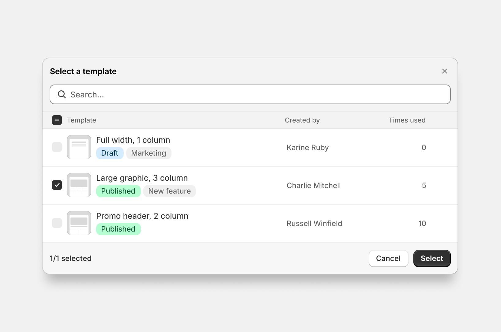
Build a custom picker for email templates with multiple columns and status badges. This example shows defining column headers, populating items with searchable data fields, adding visual status indicators, and handling the selection promise. Use this pattern for app-specific resources like templates, product reviews, or subscription options where you need custom data structures beyond standard Shopify resources.
jsx
import {render} from 'preact';
import {useState} from 'preact/hooks';

export default async () => {
  render(<Extension />, document.body);
};

function Extension() {
  const [selected, setSelected] = useState(null);

  const handlePickTemplate = async () => {
    const pickerInstance = await shopify.picker({
      heading: 'Select a template',
      multiple: false,
      headers: [
            {content: 'Templates'},
            {content: 'Created by'},
            {content: 'Times used', type: 'number'},
      ],
      items: [
        {
          id: '1',
          heading: 'Full width, 1 column',
          data: ['Karine Ruby', '0'],
          badges: [{content: 'Draft', tone: 'info'}, {content: 'Marketing'}],
        },
        {
          id: '2',
          heading: 'Large graphic, 3 column',
          data: ['Russell Winfield', '5'],
          badges: [
            {content: 'Published', tone: 'success'},
            {content: 'New feature'},
          ],
          selected: true,
        },
        {
          id: '3',
          heading: 'Promo header, 2 column',
          data: ['Russel Winfield', '10'],
          badges: [{content: 'Published', tone: 'success'}],
        },
      ],
    });

    const result = await pickerInstance.selected;
    setSelected(result);
  };

  return (
    <s-page heading="Template Selector">
      <s-button onClick={handlePickTemplate}>Choose Template</s-button>
      {selected && selected.length > 0 && (
        <s-text>Selected template: {selected[0]}</s-text>
      )}
    </s-page>
  );
}
Disable specific items
Description
Disable specific picker items to prevent selection while keeping them visible for context. This example shows setting `disabled: true` on individual items to mark them as non-selectable. This is useful for showing all available options while preventing selection of incompatible resources, templates currently being edited by others, or deprecated features that require upgrades.
jsx
import {render} from 'preact';

export default async () => {
  render(<Extension />, document.body);
};

function Extension() {
  const handlePick = async () => {
    await shopify.picker({
      heading: 'Select items',
      items: [
        {id: '1', heading: 'Available item'},
        {id: '2', heading: 'Disabled item', disabled: true},
      ],
    });
  };

  return (
    <s-page heading="Picker with Disabled Items">
      <s-button onClick={handlePick}>Open Picker</s-button>
    </s-page>
  );
}
Limit selection count
Description
Limit selection to a maximum number of items by setting `multiple: 2` in the picker options. This example shows restricting selection to exactly 2 items. Use this when your feature has hard constraints, such as A/B test variants needing exactly two options, comparison views with fixed slots, or integration mappings that support a specific connection count.
jsx
import {render} from 'preact';

export default async () => {
  render(<Extension />, document.body);
};

function Extension() {
  const handlePick = async () => {
    await shopify.picker({
      heading: 'Select items (up to 2)',
      multiple: 2,
      headers: [{content: 'Main heading'}],
      items: [
        {id: '1', heading: 'Item 1'},
        {id: '2', heading: 'Item 2'},
        {id: '3', heading: 'Item 3'},
      ],
    });
  };

  return (
    <s-page heading="Limited Selection Picker">
      <s-button onClick={handlePick}>Open Picker</s-button>
    </s-page>
  );
}
Preselect items
Description
Open the picker with items already selected by setting `selected: true` on individual items. This example shows pre-marking items as selected when the picker opens. Use this for edit workflows where you need to show what resources are already associated with a configuration, such as automation rule triggers or notification recipients. Merchants can modify the selection before confirming.
jsx
import {render} from 'preact';

export default async () => {
  render(<Extension />, document.body);
};

function Extension() {
  const handlePick = async () => {
    await shopify.picker({
      heading: 'Select items',
      items: [
        {id: '1', heading: 'Item 1', selected: true},
        {id: '2', heading: 'Item 2'},
      ],
    });
  };

  return (
    <s-page heading="Picker with Preselection">
      <s-button onClick={handlePick}>Open Picker</s-button>
    </s-page>
  );
}
Select unlimited items
Description
Allow unlimited selection by setting `multiple: true` without a numeric limit. This example shows enabling flexible multi-selection where merchants control how many items to choose. This is useful for bulk operations, mass notification sending, export tools, or tag management where selection quantity depends on merchant needs without artificial constraints.
jsx
import {render} from 'preact';

export default async () => {
  render(<Extension />, document.body);
};

function Extension() {
  const handlePick = async () => {
    await shopify.picker({
      heading: 'Select items',
      multiple: true,
      items: [
        {id: '1', heading: 'Item 1'},
        {id: '2', heading: 'Item 2'},
        {id: '3', heading: 'Item 3'},
      ],
    });
  };

  return (
    <s-page heading="Unlimited Selection Picker">
      <s-button onClick={handlePick}>Open Picker</s-button>
    </s-page>
  );
}
Use GraphQL data
Description
Populate the picker with data from the [GraphQL Admin API](/docs/api/admin-graphql). This example fetches order data when the button is clicked, maps results to picker items, and opens the picker with the returned data. Use this pattern for Shopify data that isn't available through the Resource Picker API, such as orders, draft orders, or fulfillments.
jsx
import {render} from 'preact';

export default async () => {
  render(<Extension />, document.body);
};

function Extension() {
  const handlePick = async () => {
    const r = await fetch('shopify:admin/api/graphql.json', {
      method: 'POST',
      body: JSON.stringify({
        query: `query GetOrders($first: Int!) {
          orders(first: $first) {
            edges {
              node {
                id
                name
              }
            }
          }
        }`,
        variables: {first: 10},
      }),
    });

    const {data} = await r.json();

    await shopify.picker({
      heading: 'Select orders',
      items: data.orders.edges.map((edge) => ({
        id: edge.node.id,
        heading: edge.node.name,
      })),
    });
  };

  return (
    <s-page heading="Picker with GraphQL Data">
      <s-button onClick={handlePick}>Open Order Picker</s-button>
    </s-page>
  );
}
Anchor to Best practicesBest practices
- Handle undefined return on cancellation: When merchants cancel or close the picker, it returns
undefinedrather than an empty array. Check forundefinedexplicitly to distinguish cancellation from empty selection. - Disable items to prevent modification: Use the
disabledproperty on items combined withinitialSelectionIdsto create preselected items that merchants can't deselect.
Anchor to LimitationsLimitations
- The Picker API supports only app-specific data. It can't display Shopify resources like products or variants. Use Resource Picker API for Shopify resources.
- Picker items don't support hierarchical or nested structures. All items appear in a flat list.
- The picker can't be customized with additional filters, search operators, or sorting beyond what merchants type in the search field.