Polaris web components
This is a release candidate of Polaris built with Web components. If you’re looking for a stable React implementation, see the Checkout React documentation.
Actions
Button
Triggers actions or events, such as submitting forms, opening dialogs, or navigating to other pages. Use Button to let users perform specific tasks or initiate interactions throughout the interface. Buttons can also function as links, guiding users to internal or external destinations.
Clickable
A generic interactive container component that provides a flexible alternative for custom interactive elements not achievable with existing components like Button or Link. Use it to apply specific styling such as backgrounds, padding, or borders.
Link
Makes text interactive, allowing users to navigate to other pages or perform specific actions. Supports standard URLs, custom protocols, and navigation within Shopify or app pages.
Press
Allows users to toggle between active/inactive states. Use to represent a persistent on/off or selected/unselected status.
Feedback
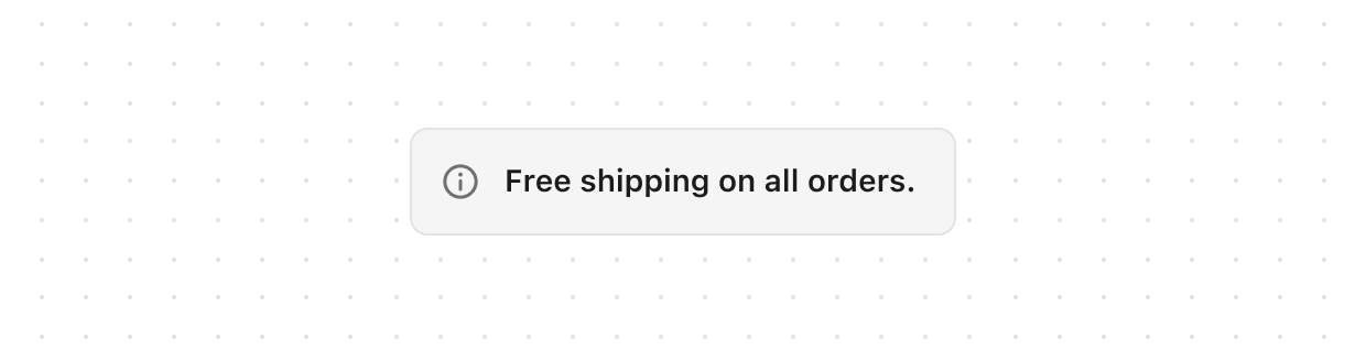
Banner
Highlights important information or required actions prominently within the interface. Use to communicate statuses, provide feedback, or draw attention to critical updates.
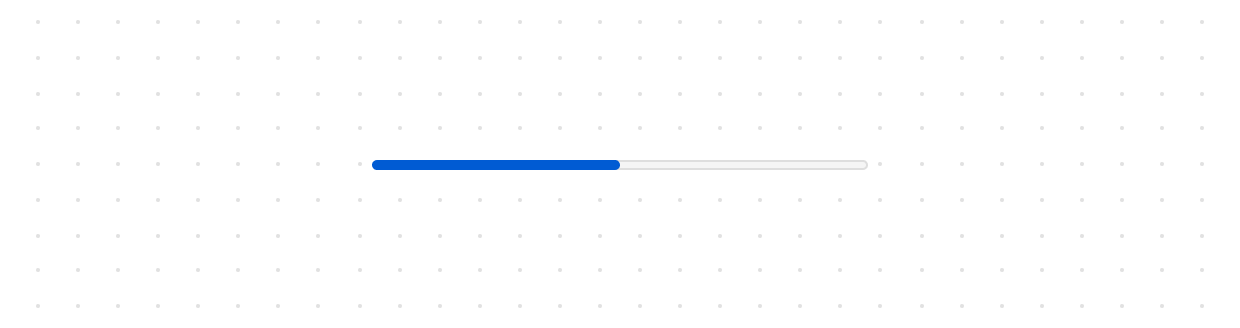
Progress
Displays an indicator showing the completion status of a task. Use to visually communicate progress in either determinate (known percentage) or indeterminate (unknown duration) states.
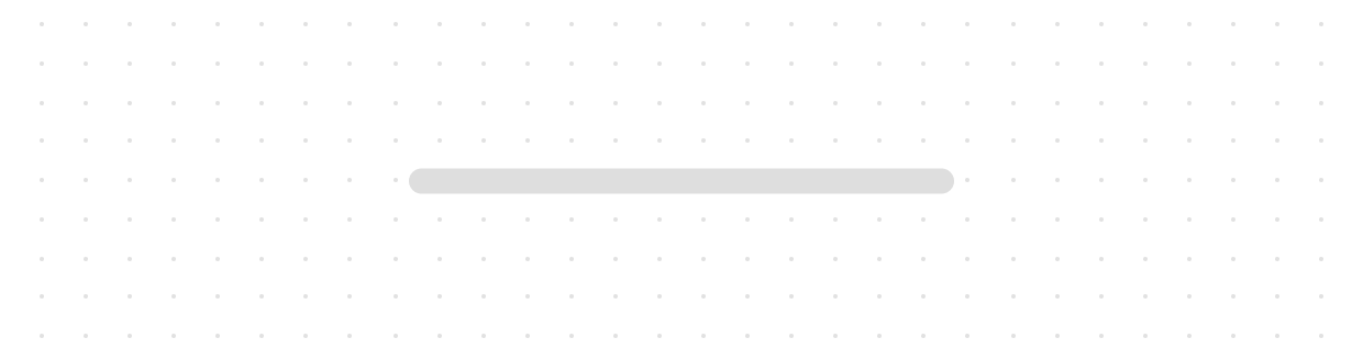
Skeleton
Displays a placeholder representation of text content while it loads. Use to improve perceived performance by showing users where text will appear.
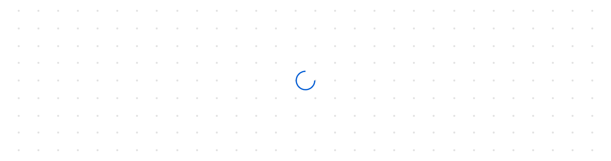
Spinner
Displays an animated indicator showing users that content or actions are loading. Use to communicate ongoing processes, such as fetching data from a server. For loading states on buttons, use the “loading” property on the Button component instead.
Forms
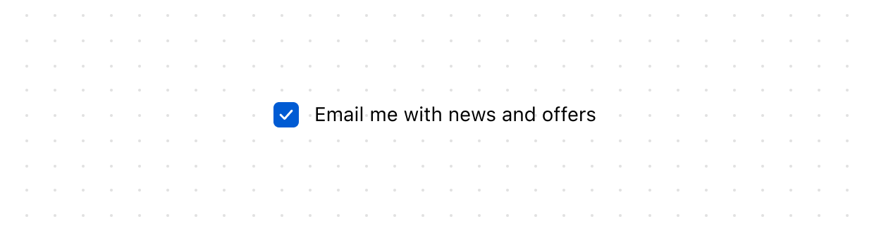
Checkbox
Give users a clear way to make selections, such as agreeing to terms or choosing multiple items from a list.
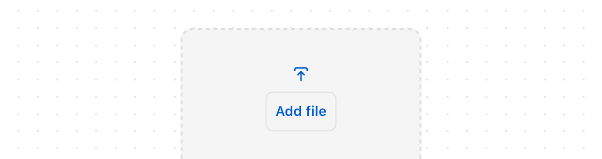
Drop
Lets users upload files through drag-and-drop functionality into a designated area on a page, or by activating a button.
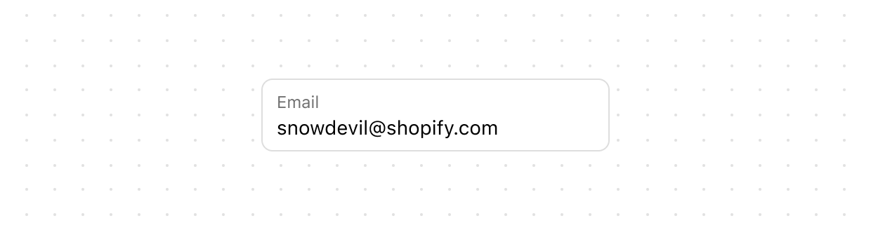
Email
Let users enter email addresses with optimized keyboard settings.
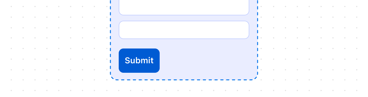
Form
Wraps one or more form controls and enables implicit submission, letting users submit the form from any input by pressing “Enter.” Unlike the HTML form element, this component doesn’t automatically submit data via HTTP. You must register a submit event to handle form submission in JavaScript.
Money
Collect monetary values from users with built-in currency formatting and validation.
Phone
Use PhoneField to allow users to enter phone numbers.
Switch
Give users a clear way to toggle options on or off.
Text
Collect longer text content from users with a multi-line input that expands automatically.
Text
Lets users enter or edit text within a single-line input. Use to collect short, free-form information from users.
Interactive
Details
Creates a collapsible content area that can be expanded or collapsed by users. Use with Summary to provide expandable sections for additional information or settings.
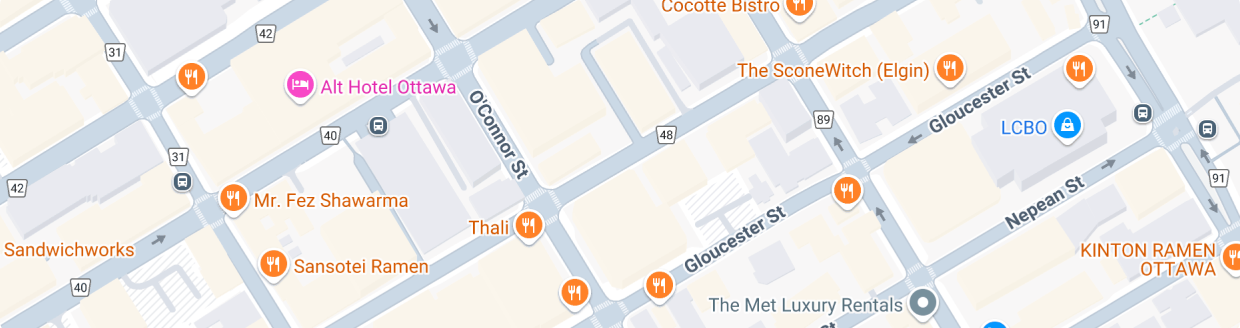
Map
Use Map to display a map on a page. This component is useful for displaying a map of a location, such as a store or a customer’s address.
Media
Icon
Renders a graphic symbol to visually communicate core parts of the product and available actions. Icons can act as wayfinding tools to help users quickly understand their location within the interface and common interaction patterns.
Image
Embeds an image within the interface and controls its presentation. Use to visually illustrate concepts, showcase products, or support user tasks and interactions.
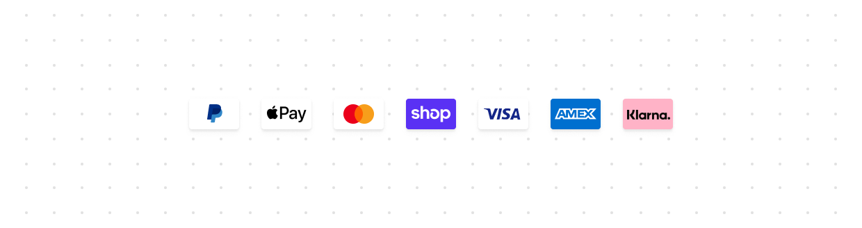
Payment
Displays icons representing payment methods. Use to visually communicate available or saved payment options clearly
Product
Use ProductThumbnail to display a product thumbnail
Overlays

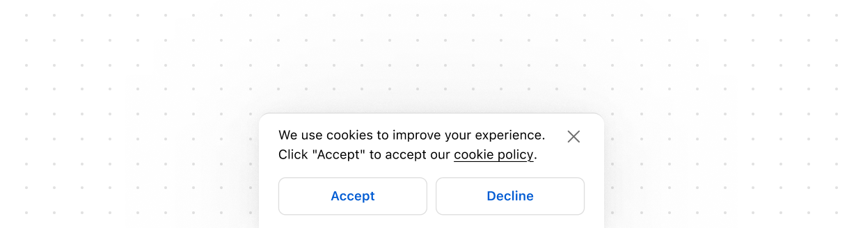
Modal
Displays content in an overlay. Use to create a distraction-free experience such as a confirmation dialog or a settings panel.
Popover
Popovers are used to display content in an overlay that can be triggered by a button.
Sheet
The Sheet component displays essential information for customers at the bottom of the screen, appearing above other elements. Use it sparingly to avoid distracting customers during checkout. This component requires access to Customer Privacy API to be rendered. The library automatically applies the WAI-ARIA Dialog pattern to both the activator and the sheet content.
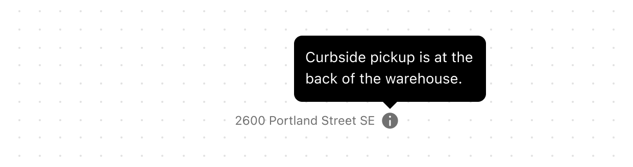
Tooltip
Displays helpful information in a small overlay when users hover or focus on an element. Use to provide additional context without cluttering the interface.
Structure
Box
A generic container that provides a flexible alternative for custom designs not achievable with existing components. Use it to apply styling such as backgrounds, padding, or borders, or to nest and group other components. The contents of Box always maintain their natural size, making it especially useful within layout components that would otherwise stretch their children.
Divider
Create clear visual separation between elements in your user interface.
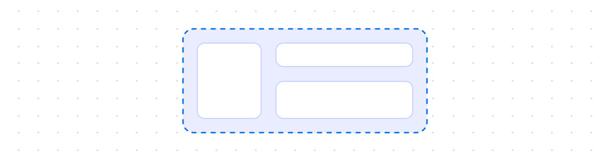
Grid
Use s-grid to organize your content in a matrix of rows and columns and make responsive layouts for pages. Grid follows the same pattern as the CSS grid layout.
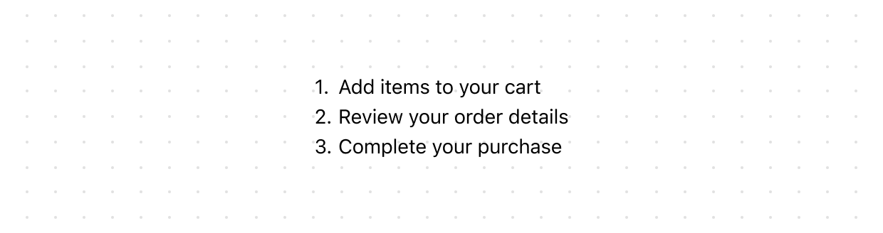
Ordered
Displays a numbered list of related items in a specific sequence. Use to present step-by-step instructions, ranked items, or procedures where order matters.
Section
Groups related content into clearly-defined thematic areas. Sections have contextual styling that automatically adapts based on nesting depth. They also adjust heading levels to maintain a meaningful and accessible page structure.
Stack
Organizes elements horizontally or vertically along the block or inline axis. Use to structure layouts, group related components, or control spacing between elements.
Unordered
Displays a bulleted list of related items. Use to present collections of items or options where the sequence isn’t critical.
Titles and text
Abbreviation
Displays abbreviated text or acronyms, revealing their full meaning or additional context through a tooltip on hover or focus. Use to clarify shortened terms, initialisms, or technical language without interrupting the reading flow.
Badge
Inform users about the status of an object or indicate that an action has been completed.
Heading
Renders hierarchical titles to communicate the structure and organization of page content. Heading levels adjust automatically based on nesting within parent Section components, ensuring a meaningful and accessible page outline.
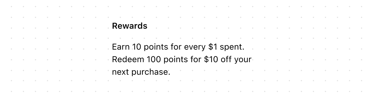
Paragraph
Displays a block of text and can contain inline elements such as buttons, links, or emphasized text. Use to present standalone blocks of content as opposed to inline text.
Text
Displays inline text with specific visual styles or tones. Use to emphasize or differentiate words or phrases within a Paragraph or other block-level components.
Time
Represents a specific point or duration in time. Use to display dates, times, or durations clearly and consistently. May include a machine-readable datetime attribute for improved accessibility and functionality.