Clickable chip
The clickable chip component displays interactive labels or categories that buyers can click or remove. Use clickable chip to show filter tags, selected options, or merchant-created labels that buyers need to interact with or dismiss.
Clickable chips support multiple visual variants, optional icons, and can function as both clickable buttons and removable tags for flexible interaction patterns. For non-interactive labels, use chip.
Supported targets
- purchase.
checkout. actions. render-before - purchase.
checkout. block. render - purchase.
checkout. cart-line-item. render-after - purchase.
checkout. cart-line-list. render-after - purchase.
checkout. contact. render-after - purchase.
checkout. delivery-address. render-after - purchase.
checkout. delivery-address. render-before - purchase.
checkout. footer. render-after - purchase.
checkout. header. render-after - purchase.
checkout. payment-method-list. render-after - purchase.
checkout. payment-method-list. render-before - purchase.
checkout. pickup-location-list. render-after - purchase.
checkout. pickup-location-list. render-before - purchase.
checkout. pickup-location-option-item. render-after - purchase.
checkout. pickup-point-list. render-after - purchase.
checkout. pickup-point-list. render-before - purchase.
checkout. reductions. render-after - purchase.
checkout. reductions. render-before - purchase.
checkout. shipping-option-item. details. render - purchase.
checkout. shipping-option-item. render-after - purchase.
checkout. shipping-option-list. render-after - purchase.
checkout. shipping-option-list. render-before - purchase.
thank-you. announcement. render - purchase.
thank-you. block. render - purchase.
thank-you. cart-line-item. render-after - purchase.
thank-you. cart-line-list. render-after - purchase.
thank-you. customer-information. render-after - purchase.
thank-you. footer. render-after - purchase.
thank-you. header. render-after
Supported targets
- purchase.
checkout. actions. render-before - purchase.
checkout. block. render - purchase.
checkout. cart-line-item. render-after - purchase.
checkout. cart-line-list. render-after - purchase.
checkout. contact. render-after - purchase.
checkout. delivery-address. render-after - purchase.
checkout. delivery-address. render-before - purchase.
checkout. footer. render-after - purchase.
checkout. header. render-after - purchase.
checkout. payment-method-list. render-after - purchase.
checkout. payment-method-list. render-before - purchase.
checkout. pickup-location-list. render-after - purchase.
checkout. pickup-location-list. render-before - purchase.
checkout. pickup-location-option-item. render-after - purchase.
checkout. pickup-point-list. render-after - purchase.
checkout. pickup-point-list. render-before - purchase.
checkout. reductions. render-after - purchase.
checkout. reductions. render-before - purchase.
checkout. shipping-option-item. details. render - purchase.
checkout. shipping-option-item. render-after - purchase.
checkout. shipping-option-list. render-after - purchase.
checkout. shipping-option-list. render-before - purchase.
thank-you. announcement. render - purchase.
thank-you. block. render - purchase.
thank-you. cart-line-item. render-after - purchase.
thank-you. cart-line-list. render-after - purchase.
thank-you. customer-information. render-after - purchase.
thank-you. footer. render-after - purchase.
thank-you. header. render-after
Anchor to Use casesUse cases
- Filter tags: Display active filters that buyers can click to view or remove applied criteria.
- Selected options: Show currently selected choices like shipping methods or add-ons that buyers can dismiss.
- Category labels: Present interactive labels that navigate to related collections or product groups.
- Removable selections: Allow buyers to remove items from a selection set with a single tap.
Anchor to PropertiesProperties
Configure the following properties on the clickable chip component.
- Anchor to accessibilityLabelaccessibility
Labelaccessibility Label stringstring A label that describes the purpose or content of the component for assistive technologies like screen readers. Use this to provide additional context when the visible content alone doesn't clearly convey the component's purpose.
- Anchor to disableddisableddisabledbooleanbooleanDefault: falseDefault: false
Disables the chip, preventing all user interaction including clicks and removal. Disabled chips are visually dimmed to indicate they are not interactive.
- booleanbooleanDefault: falseDefault: false
Determines whether the chip is hidden.
If this property is being set on each framework render (as in 'controlled' usage), and the chip is
removable, ensure you update app state for this property when theremoveevent fires.If the chip is not
removable, it can still be hidden by setting this property.When using the
removablevariant, keephiddensynced with your app state. Ifhiddenisn't updated after the chip is removed, the chip can become permanently hidden.- Anchor to hrefhrefhrefstringstring
The URL to link to. When set, the chip navigates to the specified location after the
clickevent fires.- Anchor to idididstringstring
A unique identifier for the element. Use this to reference the element in JavaScript, link labels to form controls, or target specific elements for styling or scripting.
- Anchor to removableremovableremovablebooleanbooleanDefault: falseDefault: false
Whether the chip displays a remove button, allowing users to dismiss it. When
true, clicking the remove button fires theremoveevent.
Anchor to EventsEvents
The clickable chip component provides event callbacks for handling user interactions. Learn more about handling events.
- Anchor to afterhideafterhideafterhideCallbackEventListener<typeof tagName>CallbackEventListener<typeof tagName>
A callback fired after the chip is hidden. The
hiddenproperty will betruewhen this event fires.- Anchor to clickclickclickCallbackEventListener<typeof tagName>CallbackEventListener<typeof tagName>
A callback fired when the chip is clicked.
Learn more about the click event.
- Anchor to removeremoveremoveCallbackEventListener<typeof tagName>CallbackEventListener<typeof tagName>
A callback fired when the chip is removed.
CallbackEventListener
A typed event listener for custom element events. The listener receives a `CallbackEvent` with the correct `currentTarget` type for the associated custom element tag.
(EventListener & {
    (event: CallbackEvent<TTagName, Event> & TData): void;
}) | null
CallbackEvent
An event type that narrows the `currentTarget` to the specific HTML element associated with the custom element tag. This provides type-safe event handling in callback listeners.
TEvent & {
    currentTarget: HTMLElementTagNameMap[TTagName];
}
Anchor to SlotsSlots
The clickable chip component supports slots for additional content placement within the component. Learn more about using slots.
- Anchor to graphicgraphicgraphicHTMLElementHTMLElement
An optional graphic displayed at the start of the chip, such as an icon to visually reinforce the chip's label. Only the
s-iconelement and itstypeattribute are supported.
Anchor to ExamplesExamples
Anchor to Dismiss a selected optionDismiss a selected option
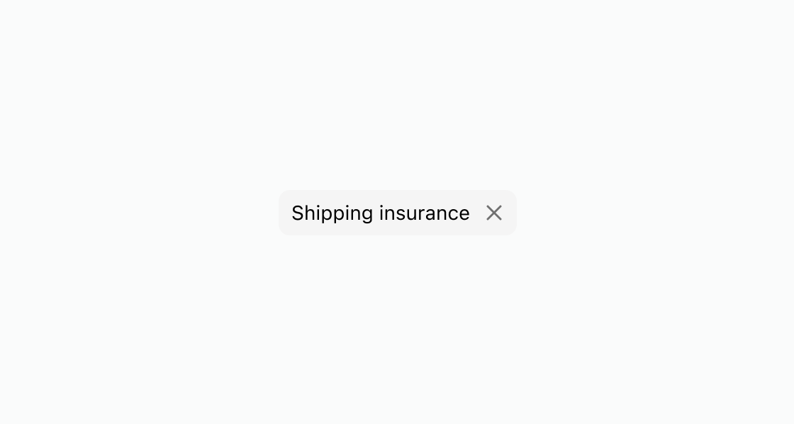
Show a removable chip that buyers can dismiss with a single tap. This example uses the removable attribute for a shipping insurance option.Dismiss a selected option
html
Anchor to Add an icon to a chipAdd an icon to a chip
Add an icon next to the chip label to reinforce its meaning. This example shows an s-clickable-chip with the graphic slot containing an s-icon, linked to a sale collection.html
Anchor to Disable a sold-out optionDisable a sold-out option
Show a chip in a non-interactive state to indicate an unavailable option. This example displays an s-clickable-chip with the disabled attribute for a sold-out selection.html
Anchor to Best practicesBest practices
- Keep labels concise: Use single words or short phrases that clearly identify the option or filter.
- Use
removablefor dismissible selections: Set theremovableattribute when buyers should be able to remove the chip from a selection set. - Add icons for clarity: Use the
graphicslot withs-iconto reinforce the chip's meaning, such as a discount icon for sale items. - Disable instead of hiding: When an option is temporarily unavailable, use the
disabledattribute rather than removing the chip from the interface.