Profile page (B2B)
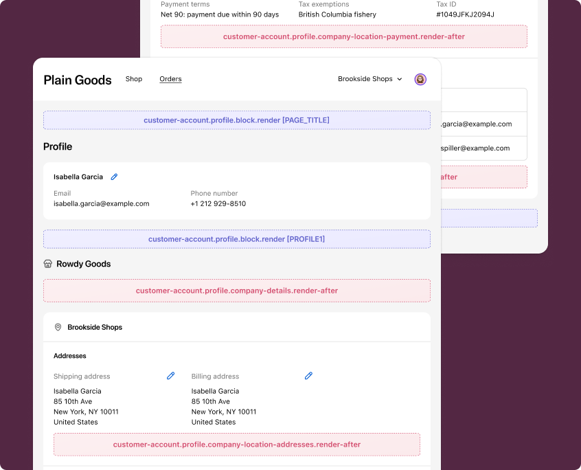
Profile page (B2B) extensions render on the Profile page for business-to-business (B2B) customers. These targets appear alongside Shopify's native company and location management UI so customers see your extension content in direct context with their company profile.
Anchor to Use casesUse cases
- Company details: Display supplementary company information, such as account manager contacts or company-specific policies.
- Location addresses: Show additional address context for a company location, such as delivery zone restrictions or warehouse details.
- Payment methods: Provide payment-related notices for a company location, such as credit terms or approved payment methods.
- Staff management: Display custom staff-related information for a company location, such as role descriptions or onboarding links.
- Custom profile content: Add app-specific content blocks to the Profile page that render for all customers, including B2B customers.
Anchor to Profile page (B2B) targetsProfile page (B2B) targets
Profile page (B2B) targets render on the Profile page for B2B customers. They're useful for adding contextual information about company details, location-specific settings, and custom content.
Anchor to Company details (render after) ,[object Object]Company details (render after) target
customer-account.profile.company-details.render-after
Renders after the company name and before the company location information on the Profile page.
Use this target to display supplementary company information such as account details, company-specific messaging, or links to external resources. This target gives you access to the Authenticated Account API, which provides company and location data through shopify.authenticatedAccount.purchasingCompany.
Supported components
- Abbreviation
- Announcement
- Avatar
- Badge
- Banner
- Box
- Button
- Button group
- Checkbox
- Chip
- Choice list
- Clickable
- Clickable chip
- Clipboard item
- Customer account action
- Date field
- Date picker
- Details
- Divider
- Drop zone
- Email field
- Form
- Grid
- Heading
- Icon
- Image
- Image group
- Link
- Map
- Menu
- Modal
- Money field
- Number field
- Ordered list
- Page
- Paragraph
- Password field
- Payment icon
- Phone field
- Popover
- Press button
- Product thumbnail
- Progress
- Qr code
- Query container
- Scroll box
- Section
- Select
- Sheet
- Skeleton paragraph
- Spinner
- Stack
- Switch
- Text
- Text area
- Text field
- Time
- Tooltip
- Unordered list
- Url field
Supported components
- Abbreviation
- Announcement
- Avatar
- Badge
- Banner
- Box
- Button
- Button group
- Checkbox
- Chip
- Choice list
- Clickable
- Clickable chip
- Clipboard item
- Customer account action
- Date field
- Date picker
- Details
- Divider
- Drop zone
- Email field
- Form
- Grid
- Heading
- Icon
- Image
- Image group
- Link
- Map
- Menu
- Modal
- Money field
- Number field
- Ordered list
- Page
- Paragraph
- Password field
- Payment icon
- Phone field
- Popover
- Press button
- Product thumbnail
- Progress
- Qr code
- Query container
- Scroll box
- Section
- Select
- Sheet
- Skeleton paragraph
- Spinner
- Stack
- Switch
- Text
- Text area
- Text field
- Time
- Tooltip
- Unordered list
- Url field
jsx
Examples
Display a company account notice
Description
Show a banner after the company name with account-specific information. This example reads the purchasing company from `shopify.authenticatedAccount` to confirm the B2B context before rendering.
jsx
import '@shopify/ui-extensions/preact';
import {render} from 'preact';

export default async () => {
  render(<Extension />, document.body);
};

function Extension() {
  const purchasingCompany =
    shopify.authenticatedAccount?.purchasingCompany?.value;

  if (!purchasingCompany) {
    return null;
  }

  return (
    <s-banner tone="info">
      Your company account is managed by your organization's admin. Contact
      your admin for changes to company details.
    </s-banner>
  );
}
Show a company resource link
Description
Display a link to an external company resource after the company details. This example uses `shopify.authenticatedAccount` to access the purchasing company context.
jsx
import '@shopify/ui-extensions/preact';
import {render} from 'preact';

export default async () => {
  render(<Extension />, document.body);
};

function Extension() {
  const purchasingCompany =
    shopify.authenticatedAccount?.purchasingCompany?.value;

  if (!purchasingCompany) {
    return null;
  }

  return (
    <s-stack direction="block" gap="base">
      <s-heading>Company resources</s-heading>
      <s-text>
        Access your company's purchasing guidelines and approved product
        catalog.
      </s-text>
      <s-link href="https://your-app.com/company-resources">
        View company resources
      </s-link>
    </s-stack>
  );
}
Anchor to Company location addresses (render after) ,[object Object]Company location addresses (render after) target
customer-account.profile.company-location-addresses.render-after
Renders after the addresses section for a company location on the Profile page. A separate instance of this extension is rendered for each company location.
Use this target to display additional address information for a specific company location, such as delivery restrictions or warehouse notes. This target provides shopify.locationId to identify the current company location, and also gives you access to the Authenticated Account API.
Supported components
- Abbreviation
- Announcement
- Avatar
- Badge
- Banner
- Box
- Button
- Button group
- Checkbox
- Chip
- Choice list
- Clickable
- Clickable chip
- Clipboard item
- Customer account action
- Date field
- Date picker
- Details
- Divider
- Drop zone
- Email field
- Form
- Grid
- Heading
- Icon
- Image
- Image group
- Link
- Map
- Menu
- Modal
- Money field
- Number field
- Ordered list
- Page
- Paragraph
- Password field
- Payment icon
- Phone field
- Popover
- Press button
- Product thumbnail
- Progress
- Qr code
- Query container
- Scroll box
- Section
- Select
- Sheet
- Skeleton paragraph
- Spinner
- Stack
- Switch
- Text
- Text area
- Text field
- Time
- Tooltip
- Unordered list
- Url field
Supported components
- Abbreviation
- Announcement
- Avatar
- Badge
- Banner
- Box
- Button
- Button group
- Checkbox
- Chip
- Choice list
- Clickable
- Clickable chip
- Clipboard item
- Customer account action
- Date field
- Date picker
- Details
- Divider
- Drop zone
- Email field
- Form
- Grid
- Heading
- Icon
- Image
- Image group
- Link
- Map
- Menu
- Modal
- Money field
- Number field
- Ordered list
- Page
- Paragraph
- Password field
- Payment icon
- Phone field
- Popover
- Press button
- Product thumbnail
- Progress
- Qr code
- Query container
- Scroll box
- Section
- Select
- Sheet
- Skeleton paragraph
- Spinner
- Stack
- Switch
- Text
- Text area
- Text field
- Time
- Tooltip
- Unordered list
- Url field
jsx
Examples
Display a delivery zone notice
Description
Show a banner after the company location addresses with delivery zone information. This example uses `shopify.locationId` to reference the current company location.
jsx
import '@shopify/ui-extensions/preact';
import {render} from 'preact';

export default async () => {
  render(<Extension />, document.body);
};

function Extension() {
  const locationId = shopify.locationId;

  return (
    <s-banner tone="info">
      Delivery to this location is available Monday through Friday.
      Contact support with location reference {locationId} for special
      delivery arrangements.
    </s-banner>
  );
}
Show address validation status
Description
Display address validation information for the company location. This example uses `shopify.locationId` to identify the location and renders a status message.
jsx
import '@shopify/ui-extensions/preact';
import {render} from 'preact';

export default async () => {
  render(<Extension />, document.body);
};

function Extension() {
  const locationId = shopify.locationId;

  return (
    <s-stack direction="block" gap="base">
      <s-heading>Address verification</s-heading>
      <s-text>
        The shipping address for this location has been verified and is
        eligible for expedited delivery.
      </s-text>
      <s-text color="subdued">
        Location: {locationId}
      </s-text>
    </s-stack>
  );
}
Anchor to Company location payment (render after) ,[object Object]Company location payment (render after) target
customer-account.profile.company-location-payment.render-after
Renders after the Payment methods section for a company location on the Profile page. A separate instance of this extension is rendered for each company location.
Use this target to display payment-related information for a specific company location, such as credit terms or approved payment methods. This target provides shopify.locationId to identify the current company location, and also gives you access to the Authenticated Account API.
Supported components
- Abbreviation
- Announcement
- Avatar
- Badge
- Banner
- Box
- Button
- Button group
- Checkbox
- Chip
- Choice list
- Clickable
- Clickable chip
- Clipboard item
- Customer account action
- Date field
- Date picker
- Details
- Divider
- Drop zone
- Email field
- Form
- Grid
- Heading
- Icon
- Image
- Image group
- Link
- Map
- Menu
- Modal
- Money field
- Number field
- Ordered list
- Page
- Paragraph
- Password field
- Payment icon
- Phone field
- Popover
- Press button
- Product thumbnail
- Progress
- Qr code
- Query container
- Scroll box
- Section
- Select
- Sheet
- Skeleton paragraph
- Spinner
- Stack
- Switch
- Text
- Text area
- Text field
- Time
- Tooltip
- Unordered list
- Url field
Supported components
- Abbreviation
- Announcement
- Avatar
- Badge
- Banner
- Box
- Button
- Button group
- Checkbox
- Chip
- Choice list
- Clickable
- Clickable chip
- Clipboard item
- Customer account action
- Date field
- Date picker
- Details
- Divider
- Drop zone
- Email field
- Form
- Grid
- Heading
- Icon
- Image
- Image group
- Link
- Map
- Menu
- Modal
- Money field
- Number field
- Ordered list
- Page
- Paragraph
- Password field
- Payment icon
- Phone field
- Popover
- Press button
- Product thumbnail
- Progress
- Qr code
- Query container
- Scroll box
- Section
- Select
- Sheet
- Skeleton paragraph
- Spinner
- Stack
- Switch
- Text
- Text area
- Text field
- Time
- Tooltip
- Unordered list
- Url field
jsx
Examples
Display payment terms
Description
Show a notice about payment terms for the company location. This example uses `shopify.locationId` to reference the current company location.
jsx
import '@shopify/ui-extensions/preact';
import {render} from 'preact';

export default async () => {
  render(<Extension />, document.body);
};

function Extension() {
  const locationId = shopify.locationId;

  return (
    <s-banner tone="info">
      This location has Net 30 payment terms. Invoices are sent on the 1st
      of each month. Contact your account manager for payment inquiries.
    </s-banner>
  );
}
Show credit limit information
Description
Display credit limit details for the company location. This example uses `shopify.locationId` to identify the location and shows credit-related information.
jsx
import '@shopify/ui-extensions/preact';
import {render} from 'preact';

export default async () => {
  render(<Extension />, document.body);
};

function Extension() {
  const locationId = shopify.locationId;

  return (
    <s-stack direction="block" gap="base">
      <s-heading>Credit information</s-heading>
      <s-text>
        Review your location's credit terms and available balance with your
        account manager.
      </s-text>
      <s-text color="subdued">
        Location: {locationId}
      </s-text>
    </s-stack>
  );
}
Anchor to Company location staff (render after) ,[object Object]Company location staff (render after) target
customer-account.profile.company-location-staff.render-after
Renders after the Staff and permissions section for a company location on the Profile page. A separate instance of this extension is rendered for each company location.
Use this target to display staff-related information for a specific company location, such as role descriptions or onboarding instructions. This target provides shopify.locationId to identify the current company location, and also gives you access to the Authenticated Account API.
Supported components
- Abbreviation
- Announcement
- Avatar
- Badge
- Banner
- Box
- Button
- Button group
- Checkbox
- Chip
- Choice list
- Clickable
- Clickable chip
- Clipboard item
- Customer account action
- Date field
- Date picker
- Details
- Divider
- Drop zone
- Email field
- Form
- Grid
- Heading
- Icon
- Image
- Image group
- Link
- Map
- Menu
- Modal
- Money field
- Number field
- Ordered list
- Page
- Paragraph
- Password field
- Payment icon
- Phone field
- Popover
- Press button
- Product thumbnail
- Progress
- Qr code
- Query container
- Scroll box
- Section
- Select
- Sheet
- Skeleton paragraph
- Spinner
- Stack
- Switch
- Text
- Text area
- Text field
- Time
- Tooltip
- Unordered list
- Url field
Supported components
- Abbreviation
- Announcement
- Avatar
- Badge
- Banner
- Box
- Button
- Button group
- Checkbox
- Chip
- Choice list
- Clickable
- Clickable chip
- Clipboard item
- Customer account action
- Date field
- Date picker
- Details
- Divider
- Drop zone
- Email field
- Form
- Grid
- Heading
- Icon
- Image
- Image group
- Link
- Map
- Menu
- Modal
- Money field
- Number field
- Ordered list
- Page
- Paragraph
- Password field
- Payment icon
- Phone field
- Popover
- Press button
- Product thumbnail
- Progress
- Qr code
- Query container
- Scroll box
- Section
- Select
- Sheet
- Skeleton paragraph
- Spinner
- Stack
- Switch
- Text
- Text area
- Text field
- Time
- Tooltip
- Unordered list
- Url field
jsx
Examples
Display a staff onboarding notice
Description
Show a banner after the staff section with onboarding information for the company location. This example uses `shopify.locationId` to reference the current company location.
jsx
import '@shopify/ui-extensions/preact';
import {render} from 'preact';

export default async () => {
  render(<Extension />, document.body);
};

function Extension() {
  const locationId = shopify.locationId;

  return (
    <s-banner tone="info">
      New staff members at this location will receive an onboarding email
      with purchasing guidelines and approval workflows.
    </s-banner>
  );
}
Show staff permissions summary
Description
Display a summary of staff permission levels for the company location. This example uses `shopify.locationId` to identify the location.
jsx
import '@shopify/ui-extensions/preact';
import {render} from 'preact';

export default async () => {
  render(<Extension />, document.body);
};

function Extension() {
  const locationId = shopify.locationId;

  return (
    <s-stack direction="block" gap="base">
      <s-heading>Permission levels</s-heading>
      <s-text>
        Staff permissions at this location are managed by your company
        admin. Contact your admin to request permission changes.
      </s-text>
      <s-text color="subdued">
        Location: {locationId}
      </s-text>
    </s-stack>
  );
}
Anchor to Profile block ,[object Object]Profile block target
customer-account.profile.block.render
Renders a block extension target on the Profile page. This target renders for all customers, including B2B customers.
Merchants can choose to place this extension in any of the supported locations.
Supported components
- Abbreviation
- Announcement
- Avatar
- Badge
- Banner
- Box
- Button
- Button group
- Checkbox
- Chip
- Choice list
- Clickable
- Clickable chip
- Clipboard item
- Customer account action
- Date field
- Date picker
- Details
- Divider
- Drop zone
- Email field
- Form
- Grid
- Heading
- Icon
- Image
- Image group
- Link
- Map
- Menu
- Modal
- Money field
- Number field
- Ordered list
- Page
- Paragraph
- Password field
- Payment icon
- Phone field
- Popover
- Press button
- Product thumbnail
- Progress
- Qr code
- Query container
- Scroll box
- Section
- Select
- Sheet
- Skeleton paragraph
- Spinner
- Stack
- Switch
- Text
- Text area
- Text field
- Time
- Tooltip
- Unordered list
- Url field
Supported components
- Abbreviation
- Announcement
- Avatar
- Badge
- Banner
- Box
- Button
- Button group
- Checkbox
- Chip
- Choice list
- Clickable
- Clickable chip
- Clipboard item
- Customer account action
- Date field
- Date picker
- Details
- Divider
- Drop zone
- Email field
- Form
- Grid
- Heading
- Icon
- Image
- Image group
- Link
- Map
- Menu
- Modal
- Money field
- Number field
- Ordered list
- Page
- Paragraph
- Password field
- Payment icon
- Phone field
- Popover
- Press button
- Product thumbnail
- Progress
- Qr code
- Query container
- Scroll box
- Section
- Select
- Sheet
- Skeleton paragraph
- Spinner
- Stack
- Switch
- Text
- Text area
- Text field
- Time
- Tooltip
- Unordered list
- Url field
jsx
Examples
Display a loyalty points summary
Description
Show a custom content block on the Profile page that displays loyalty points information. This example renders for all customers, including B2B customers.
jsx
import '@shopify/ui-extensions/preact';
import {render} from 'preact';

export default async () => {
  render(<Extension />, document.body);
};

function Extension() {
  return (
    <s-stack direction="block" gap="base">
      <s-heading>Loyalty program</s-heading>
      <s-text>
        You're a valued member of our loyalty program. Check your points
        balance and available rewards.
      </s-text>
      <s-link href="https://your-app.com/loyalty">
        View rewards
      </s-link>
    </s-stack>
  );
}
Show an app-specific profile section
Description
Add a custom section to the Profile page with app-specific content. This block extension renders for all customers and can be placed in any supported location by the merchant.
jsx
import '@shopify/ui-extensions/preact';
import {render} from 'preact';

export default async () => {
  render(<Extension />, document.body);
};

function Extension() {
  return (
    <s-stack direction="block" gap="base">
      <s-heading>Subscription preferences</s-heading>
      <s-text>
        Manage your email and notification preferences for order updates,
        promotions, and account activity.
      </s-text>
      <s-button onClick={() => shopify.toast.show('Preferences updated')}>
        Update preferences
      </s-button>
    </s-stack>
  );
}
Anchor to Best practicesBest practices
- Check for B2B context: For targets that rely on B2B data, always check that
shopify.authenticatedAccount?.purchasingCompany?.valueis defined before rendering company-specific content. Not all customers are B2B customers. - Keep content contextual: Profile page extensions render alongside company and location management UI, so content should be directly relevant to the section it appears in.
- Handle multiple instances: The company location targets (
company-location-addresses,company-location-payment,company-location-staff) render a separate instance for each company location. Useshopify.locationIdto differentiate between locations. - Avoid heavy rendering: These targets render inline within the Profile page. Avoid complex layouts or large data fetches that could cause layout shifts. Use banner or lightweight stack layouts for the best experience.