Number
Use a number field to conveniently and accurately capture numerical values.
Anchor to numberfieldNumberField
- Anchor to labellabelstringrequired
The content to use as the field label.
- Anchor to inputModeinputMode"decimal" | "numeric"
- number
- number
- Anchor to disableddisabledboolean
Whether the field can be modified.
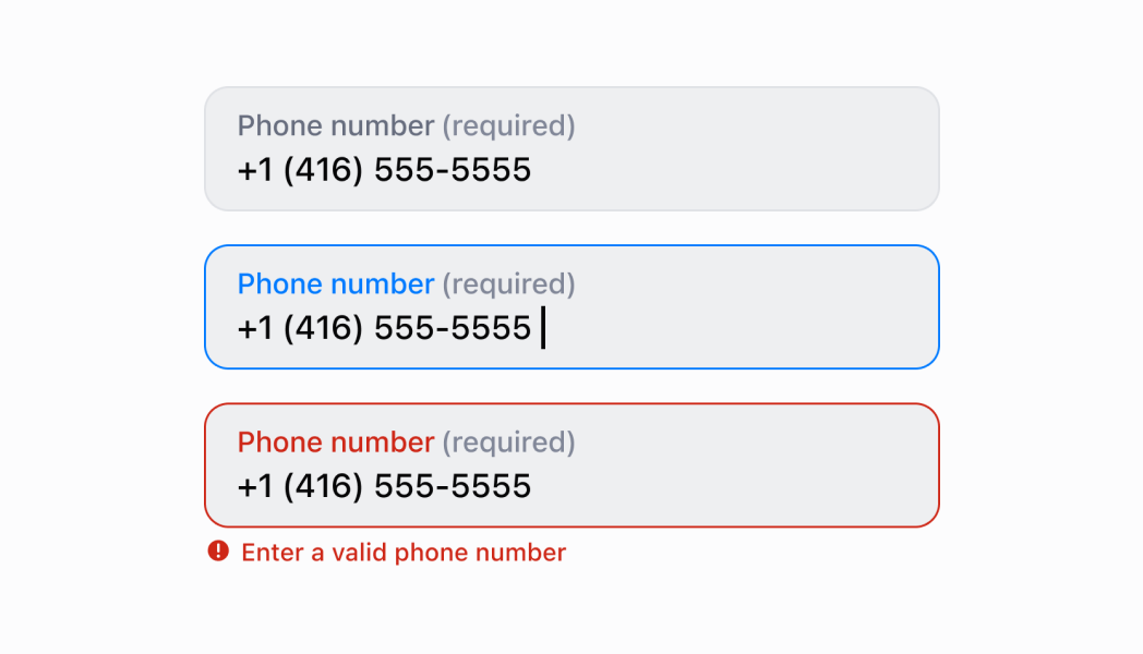
- Anchor to errorerrorstring
Indicates an error to the user. The field is given specific stylistic treatment to communicate problems that have to be resolved immediately.
- Anchor to onBluronBlur() => void
The callback when focus is removed.
- Anchor to onChangeonChange(value: string) => void
The callback when the user has finished editing a field.
- Anchor to onFocusonFocus() => void
The callback when input is focused.
- Anchor to onInputonInput(value: string) => void
Callback when the user makes any changes in the field. As noted in the documentation for
, you must not use this to updatevalue— use thecallback for that purpose. Use theprop when you need to do something as soon as the user makes a change, like clearing validation errors that apply to the field as soon as the user begins making the necessary adjustments.- Anchor to placeholderplaceholderstring
A short hint that describes the expected value of the field.
- Anchor to requiredrequiredboolean
Whether the field needs a value.
- Anchor to valuevaluestring
The current value for the field. Defaults to now. You should update this value in response to the
callback.- Anchor to helpTexthelpTextstring
The label under the text field which provides guidance or instructions that assist users.
- Anchor to actionactionInputAction
A button under the text field to provide extra functionality.
- Anchor to maxLengthmaxLengthnumber
The maximum number of characters allowed in the input field.
InputAction
- label
The text displayed in the button.
string - onPress
A callback to be performed.
() => void - disabled
Whether the button can be pressed.
boolean
export interface InputAction {
  /**
   * The text displayed in the button.
   */
  label: string;
  /**
   * A callback to be performed.
   */
  onPress: () => void;
  /**
   * Whether the button can be pressed.
   */
  disabled?: boolean;
}Number input
Examples
Number input
React
import React, {useState} from 'react';
import {
  NumberField,
  Screen,
  ScrollView,
  Navigator,
  Text,
  reactExtension,
} from '@shopify/ui-extensions-react/point-of-sale';

const SmartGridModal = () => {
  const [number, setNumber] = useState('');
  return (
    <Navigator>
      <Screen name="NumberField" title="NumberField Example">
        <ScrollView>
          <NumberField
            label="Number"
            placeholder="1234"
            helpText="Enter a numeric value."
            value={number}
            onChange={setNumber}
            required={true}
            action={{
              label: 'Clear',
              onPress: () => setNumber(''),
            }}
          />
          <Text>Entered Value: {number}</Text>
        </ScrollView>
      </Screen>
    </Navigator>
  );
};

export default reactExtension('pos.home.modal.render', () => (
  <SmartGridModal />
));
TS
import {
  Navigator,
  Screen,
  ScrollView,
  Text,
  NumberField,
  extension,
} from '@shopify/ui-extensions/point-of-sale';

export default extension('pos.home.modal.render', (root, api) => {
  const clearHandler = () => {
    numberField.updateProps({value: ''});
    textBox.replaceChildren('');
  };
  const numberField = root.createComponent(NumberField, {
    label: 'Number',
    placeholder: '1234',
    helpText: 'Enter a numeric value.',
    value: '',
    action: {label: 'Clear', onPress: clearHandler},
  });

  const textBox = root.createComponent(Text);

  const onChangeHandler = (newValue: string) => {
    numberField.updateProps({value: newValue});

    const textContent = `Selected Date: ${newValue}`;
    textBox.replaceChildren(textContent);
  };

  numberField.updateProps({onChange: onChangeHandler});

  const scrollView = root.createComponent(ScrollView);
  scrollView.append(numberField);
  scrollView.append(textBox);

  const screen = root.createComponent(Screen, {
    name: 'NumberField',
    title: 'Number Field Example',
  });
  screen.append(scrollView);

  const navigator = root.createComponent(Navigator);
  navigator.append(screen);

  root.append(navigator);
});
Preview