Version 2025-07 is the last API version to support React-based UI components. Later versions use web components, native UI elements with built-in accessibility, better performance, and consistent styling with Shopify's design system. Check out the upgrade guide to upgrade your extension.
Spacing
The Spacing component provides a set of spacing constants to be used in the POS UI extensions components library. Use these predefined values to maintain consistent spacing and layout patterns across POS interfaces.
The component provides access to design system spacing tokens through a set of predefined constants, ensuring consistent spacing throughout extensions. It eliminates the need for hardcoded pixel values by offering semantic spacing values that automatically adapt to design system changes, maintaining visual consistency across different screen sizes and orientations.
Spacing components provide semantic spacing names like 'tight', 'loose', and 'extraLoose' that map to specific design system values, making spacing choices more intuitive and maintainable.
Anchor to Use casesUse cases
- Element spacing: Apply consistent spacing between elements in Stack components.
- Vertical padding: Control vertical padding and margins with semantic spacing values.
- Horizontal spacing: Manage horizontal spacing using the comprehensive spacing scale.
- Visual hierarchy: Establish visual hierarchy through strategic use of spacing values.
Anchor to VerticalSpacingVertical
The spacing values for controlling vertical space between elements.
'HalfPoint' | 'ExtraSmall' | 'Small' | 'Medium' | 'Large' | 'ExtraLarge''HalfPoint' | 'ExtraSmall' | 'Small' | 'Medium' | 'Large' | 'ExtraLarge'Anchor to HorizontalSpacingHorizontal
The spacing values for controlling horizontal space between elements.
'HalfPoint' | 'ExtraSmall' | 'Small' | 'Medium' | 'Large' | 'ExtraLarge' | 'ExtraExtraLarge''HalfPoint' | 'ExtraSmall' | 'Small' | 'Medium' | 'Large' | 'ExtraLarge' | 'ExtraExtraLarge'Anchor to ExamplesExamples
Anchor to Use consistent spacing valuesUse consistent spacing values
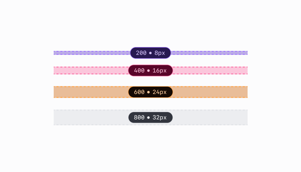
Apply consistent spacing patterns using design system tokens. This example demonstrates using predefined spacing constants instead of hardcoded pixel values, ensuring visual consistency that automatically adapts to design system changes across different screen sizes.Use consistent spacing values
Use consistent spacing values
React
VerticalSpacing.ExtraSmall;
HorizontalSpacing.ExtraSmall;
TS
VerticalSpacing.ExtraSmall;
HorizontalSpacing.ExtraSmall;
Anchor to Best practicesBest practices
- Apply numeric spacing for precise control: Use the numeric spacing values when you need precise control over spacing amounts, particularly in Stack components where exact spacing relationships are important for visual hierarchy.
- Maintain consistent spacing patterns: Establish consistent patterns for how you use spacing values across your extension. Similar types of content should use similar spacing values, helping users develop familiarity with your interface organization.
- Consider touch interface requirements: Ensure adequate spacing for touch-based interactions by using appropriate spacing values that provide comfortable touch targets. POS interfaces require generous spacing for reliable touch interaction.
- Balance spacing with content density: Choose spacing values that balance content density with readability. Use smaller spacing values for information-dense interfaces and larger values when content needs breathing room.
- Align spacing with visual hierarchy: Use larger spacing values to separate major content areas and smaller values for related elements. This creates clear visual hierarchy that helps users understand content relationships.
Anchor to LimitationsLimitations
- Spacing values are predefined constants—custom spacing values outside the provided scales aren't supported to maintain design system consistency.
- The Spacing component is primarily designed for layout components like Stack—not all components support all spacing types.
- Spacing behavior may vary between different POS device screen sizes and resolutions, though the relative relationships between spacing values remain consistent.