Search
The searchField component captures search terms for filtering and search functionality. Use it to enable inline search within specific sections or lists, like filtering products or searching customers.
Anchor to PropertiesProperties
Configure the following properties on the searchField component.
Configure the following properties on the search field component.
- Anchor to disableddisableddisabledbooleanbooleanDefault: falseDefault: false
Disables the field, disallowing any interaction.
- Anchor to idididstringstring
A unique identifier for the element.
- Anchor to placeholderplaceholderplaceholderstringstring
A short hint that describes the expected value of the field.
- Anchor to valuevaluevaluestringstring
The current value for the field. If omitted, the field will be empty.
Anchor to EventsEvents
The searchField component provides event callbacks for handling user interactions. Learn more about handling events.
The search field component provides event callbacks for handling user interactions. Learn more about handling events.
- Anchor to blurblurblur(event: CallbackEvent<"s-search-field">) => void(event: CallbackEvent<"s-search-field">) => void
Callback when the field loses focus.
- Anchor to changechangechange(event: CallbackEvent<"s-search-field">) => void(event: CallbackEvent<"s-search-field">) => void
Callback when the field loses focus after the user changes the value in the field.
- Anchor to focusfocusfocus(event: CallbackEvent<"s-search-field">) => void(event: CallbackEvent<"s-search-field">) => void
Callback when the field is focused.
- Anchor to inputinputinput(event: CallbackEvent<"s-search-field">) => void(event: CallbackEvent<"s-search-field">) => void
Callback when the user changes the value in the field.
CallbackEvent
- bubbles
boolean - cancelable
boolean - composed
boolean - currentTarget
HTMLElementTagNameMap[T] - detail
any - eventPhase
number - target
HTMLElementTagNameMap[T] | null
Anchor to ExamplesExamples
Enable search with a search field
Preview
Examples
Enable search with a search field
Description
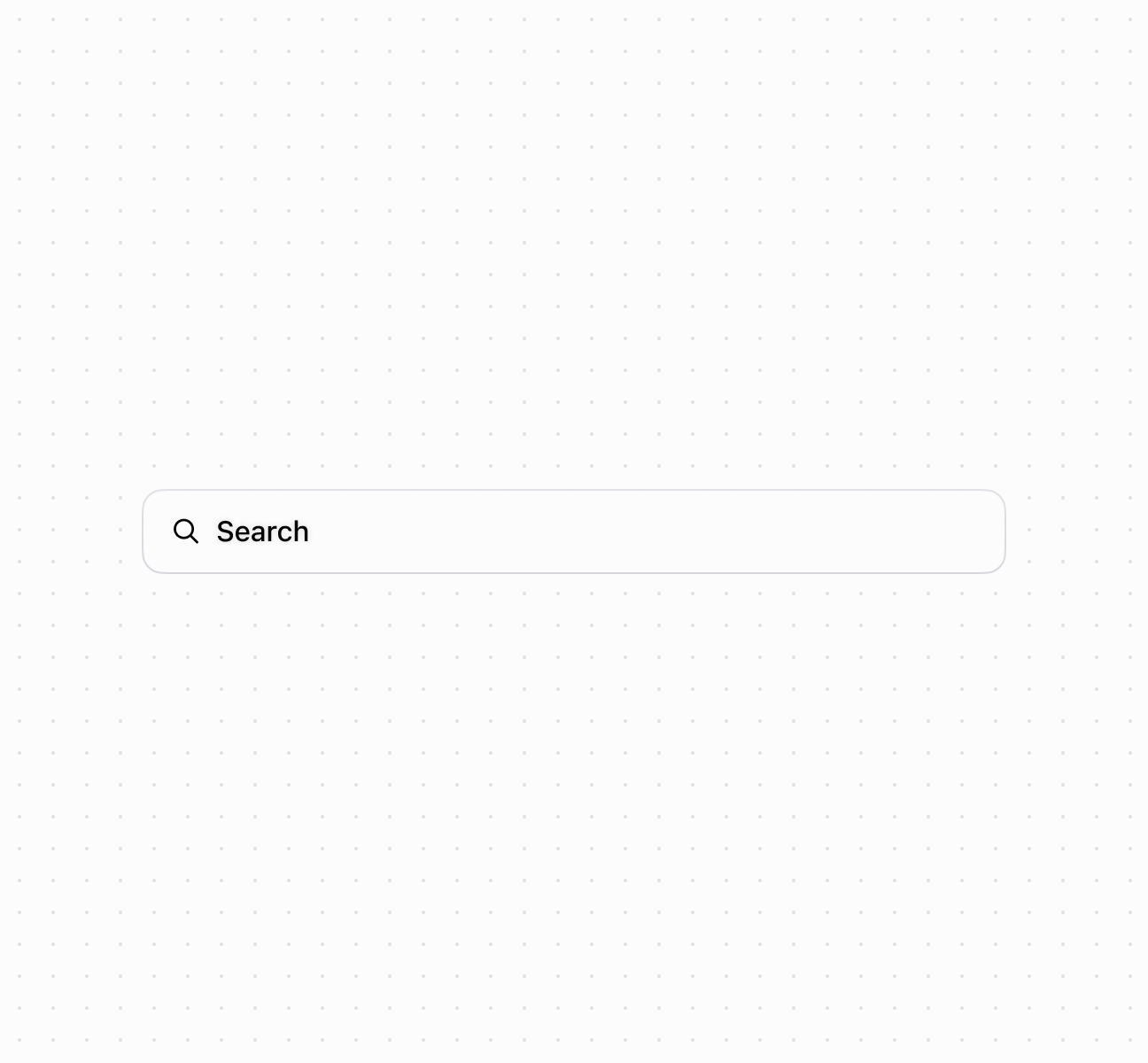
Enable search functionality using a searchField component. This example shows a basic search field with placeholder text.
Enable search with a search field
<s-search-field placeholder="Search" />Handle search input events
Description
Subscribe to search input events to respond when merchants enter search terms. This example demonstrates handling `onChange` and `onInput` events for real-time search functionality, debounced filtering, or triggering search API calls as merchants type their queries.
Handle search input events
<s-search-field
  placeholder="Search products..."
  value=""
  onInput={(event) => console.log('Input:', event.currentTarget.value)}
  onChange={(event) => console.log('Change:', event.currentTarget.value)}
  onFocus={(event) => console.log('Search focused')}
  onBlur={(event) => console.log('Search blurred')}
/>
Anchor to Best practicesBest practices
- Use for inline search and filtering: Choose searchField for filtering within specific sections or lists, not for global navigation or complex multi-step searches.
- Follow placeholder pattern: Use
"Search {items}"format like"Search products"or"Search customers"to clarify scope. - Choose the right event: Use
inputfor real-time filtering as users type. Usechangefor expensive operations that should wait until typing completes. - Handle empty values: When the field is cleared, reset filters or show all items appropriately.