Empty state
The empty state component displays a placeholder view when there is no content to show. Use it to guide users on what to do next, such as adding new items or performing actions to populate the view.
Support
Targets (8)
Anchor to Use casesUse cases
- No results: Display a helpful message when search queries or filters return no matching items.
- Empty lists: Guide users to add items when product lists, customer lists, or order histories are empty.
- First-time setup: Provide onboarding guidance when a feature is used for the first time.
- No data available: Indicate when data is unavailable and suggest actions to populate the view.
Anchor to PropertiesProperties
Configure the following properties on the empty state component.
- Anchor to headingheadingheadingstringstring
The heading of the empty state.
- Anchor to subheadingsubheadingsubheadingstringstring
The subheading of the empty state.
Anchor to SlotsSlots
The empty state component supports slots for adding graphics and actions. Learn more about using slots.
- Anchor to graphicgraphicgraphicHTMLElementHTMLElement
The graphic to display in the empty state. The only supported components is Icon, with a type of
alert-circle,search,info, orcircle-info.- Anchor to primary-actionprimary-actionprimary-actionHTMLElementHTMLElement
The primary action to perform, provided as a button or link type element.
- Anchor to secondary-actionssecondary-actionssecondary-actionsHTMLElementHTMLElement
The secondary actions to perform, provided as button or link type elements.
Anchor to ExamplesExamples
Anchor to Create a generic empty stateCreate a generic empty state
Create layouts using an empty state component. This example demonstrates a basic empty state container.Create a generic empty state
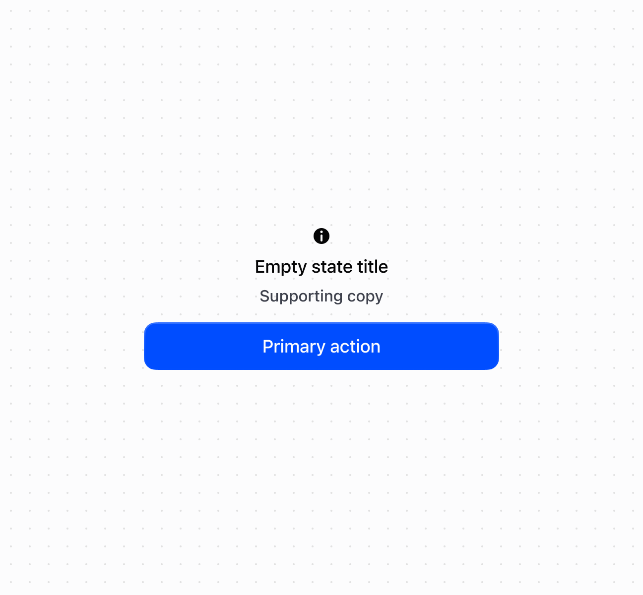
Create a generic empty state
<s-empty-state heading="Empty state title" subheading="Supporting copy">
<s-icon slot="graphic" type="info" />
<s-button slot="primary-action">Primary action</s-button>
</s-empty-state>
Was this page helpful?