Section
The section component groups related content into clearly-defined thematic areas. Use it to organize content and provide clear navigation landmarks.
The component manages heading levels automatically, ensuring nested sections maintain proper semantic structure. Only one secondary action button is supported for each section.
Support
Targets (14)
Supported targets
- pos.
cart. line-item-details. action. render - pos.
customer-details. action. render - pos.
customer-details. block. render - pos.
draft-order-details. action. render - pos.
draft-order-details. block. render - pos.
home. modal. render - pos.
order-details. action. render - pos.
order-details. block. render - pos.
product-details. action. render - pos.
product-details. block. render - pos.
purchase. post. action. render - pos.
purchase. post. block. render - pos.
register-details. action. render - pos.
register-details. block. render
Supported targets
- pos.
cart. line-item-details. action. render - pos.
customer-details. action. render - pos.
customer-details. block. render - pos.
draft-order-details. action. render - pos.
draft-order-details. block. render - pos.
home. modal. render - pos.
order-details. action. render - pos.
order-details. block. render - pos.
product-details. action. render - pos.
product-details. block. render - pos.
purchase. post. action. render - pos.
purchase. post. block. render - pos.
register-details. action. render - pos.
register-details. block. render
Anchor to Use casesUse cases
- Content grouping: Organize forms or interfaces into logical groups with clear headings.
- Navigation support: Group related settings or information into distinct scannable areas.
- Contextual actions: Provide actions through the secondary actions slot, like edit or configure buttons.
Anchor to PropertiesProperties
Groups related content into a titled section.
- Anchor to headingheadingheadingstringstring
A title that describes the content of the section.
If omitted, and no secondaryActions are provided, the section will be rendered without a header.
- Anchor to idididstringstring
A unique identifier for the element.
Anchor to SlotsSlots
The section component supports slots for additional content placement within the section. Learn more about using slots.
- Anchor to secondary-actionssecondary-actionssecondary-actionsHTMLElementHTMLElement
Button element to display in the section heading. A single button is supported.
Anchor to ExamplesExamples
Group related content using a section component. This example shows a basic section with a heading and content area.
Group related content into sections
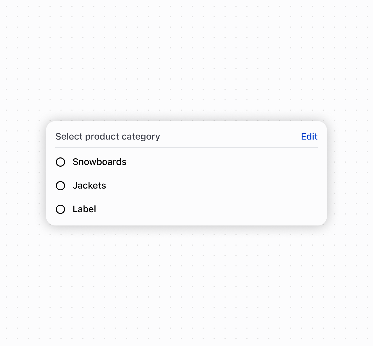
Group related content into sections
<s-section heading="Select product category">
<s-button slot="secondary-actions">Edit</s-button>
<s-choice-list>
<s-choice value="snowboards">Snowboards</s-choice>
<s-choice value="jackets">Jackets</s-choice>
<s-choice value="label">Label</s-choice>
</s-choice-list>
</s-section>
Anchor to Best practicesBest practices
- Write descriptive headings: Provide clear heading text that represents the section's content.
- Let heading levels adjust automatically: Nested sections automatically adjust heading levels for proper semantic structure.
- Place relevant secondary actions: Use the secondary-actions slot for actions that apply to the entire section, like "Edit Settings" or "Add Item."
Was this page helpful?