Metric card
The metric card (s-shopifyql-metric-card) renders the result of a single ShopifyQL query as a card. Provide a query, and the card fetches data, formats values, renders a chart or table, and handles loading states and errors.
Metric cards read data through window.shopify.shopifyQL. To arrange several cards together, use a metrics bar.
App Bridge loads the ShopifyQL data plugin at window.shopify.shopifyQL. This plugin resolves asynchronously, so it isn't always ready when your code runs. Wait for it before rendering a metric card, or the card will start in an error state.
App Bridge loads the ShopifyQL data plugin at window.shopify.shopifyQL. This plugin resolves asynchronously, so it isn't always ready when your code runs. Wait for it before rendering a metric card, or the card will start in an error state.
Anchor to Use casesUse cases
- Headline metric: Show a single KPI like total sales or sessions on an app home or dashboard page.
- Dimensional breakdown: Compare a metric across products, channels, or regions with a bar or donut chart.
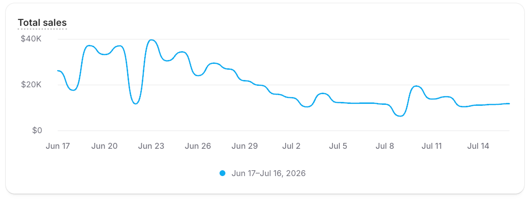
- Trend over time: Chart how a metric moves across a date range with a line chart.
- Drill-in summary: Surface a summary metric that links to its full report.
Anchor to PropertiesProperties
The query property is required. The rest are optional and control the card's headings, size, report link, and refresh behavior.
| Property | Type | Default | Description |
|---|---|---|---|
query | string | — | The ShopifyQL query whose result the card renders. The VISUALIZE clause sets the chart type. |
heading | string | — | Primary title at the top of the card. |
smallHeading | string | — | Secondary heading below the primary heading. |
description | string | — | Supporting text that describes the metric. |
size | 'small' | 'base' | 'base' | Controls the card's size. |
variant | 'auto' | 'secondary' | 'auto' | Visual variant of the card. |
summary | 'auto' | 'none' | 'auto' | Controls whether the card shows the summarized total value. |
primaryAction | 'auto' | 'none' | 'auto' | Controls whether the card shows its primary action. |
queryFormatting | 'auto' | 'none' | 'auto' | Controls whether the query string is auto-formatted before execution. Set to none to send the query without changes. |
pollingInterval | number | — | Interval, in milliseconds, at which the card refetches its query for live data. Set it only for data that must stay current. |
overrideCardQuery | string | — | Overrides the query used for the card's drill-in report link. |
reportLinkHandle | string | — | Handle or numeric report ID of the report to open from the card's footer report link. |
reportLinkDisabled | boolean | false | Turns off the card's report link. |
reportLinkTarget | 'auto' | '_blank' | '_self' | '_top' | 'auto' | Where the report link opens. |
Anchor to EventsEvents
The card exposes one event so you can handle its report link click yourself, like routing to a custom report page.
| Event | Description |
|---|---|
reportlinkclick | Fires when the card's report link is activated. In React, use onReportLinkClick. |
Anchor to ExamplesExamples
Each example pairs a query you can copy and adapt with the card it renders, ranging from a single value to a grouped breakdown or a multi-metric chart.
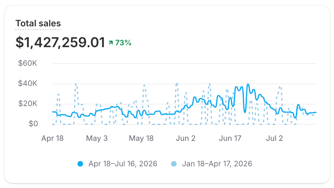
Show a single metric
Renders one query result as a card. Use it for a headline metric like sales or sessions, with an optional comparison to the previous period.
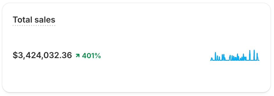
Show a compact KPI
Shrinks the card to a title, value, and percent-change indicator with size="small". Use it in dense layouts and metrics bars.
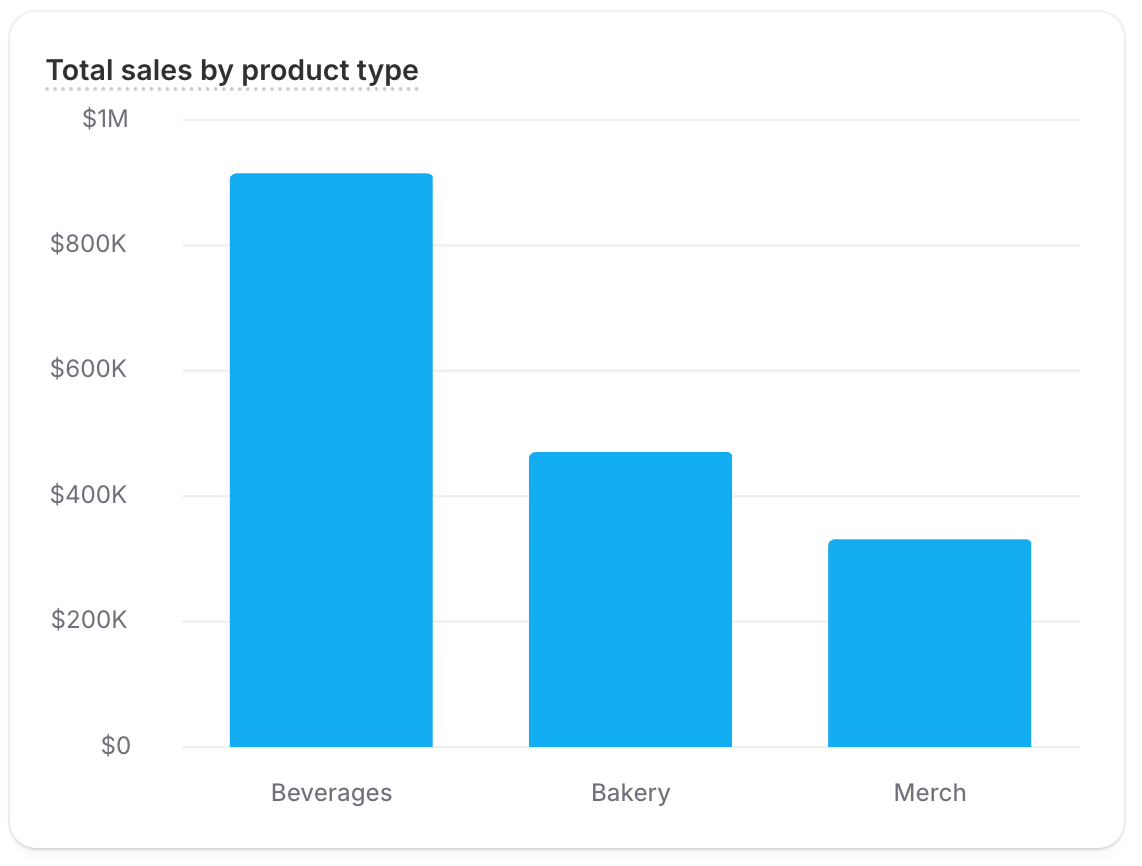
Break a metric down by dimension
Splits a metric across dimension values with GROUP BY and a bar chart. Use it to compare products, channels, or regions. GROUP BY TOP 3 returns the top three plus an Other row aggregating the rest; use GROUP BY ONLY TOP 3 to show just the top three.
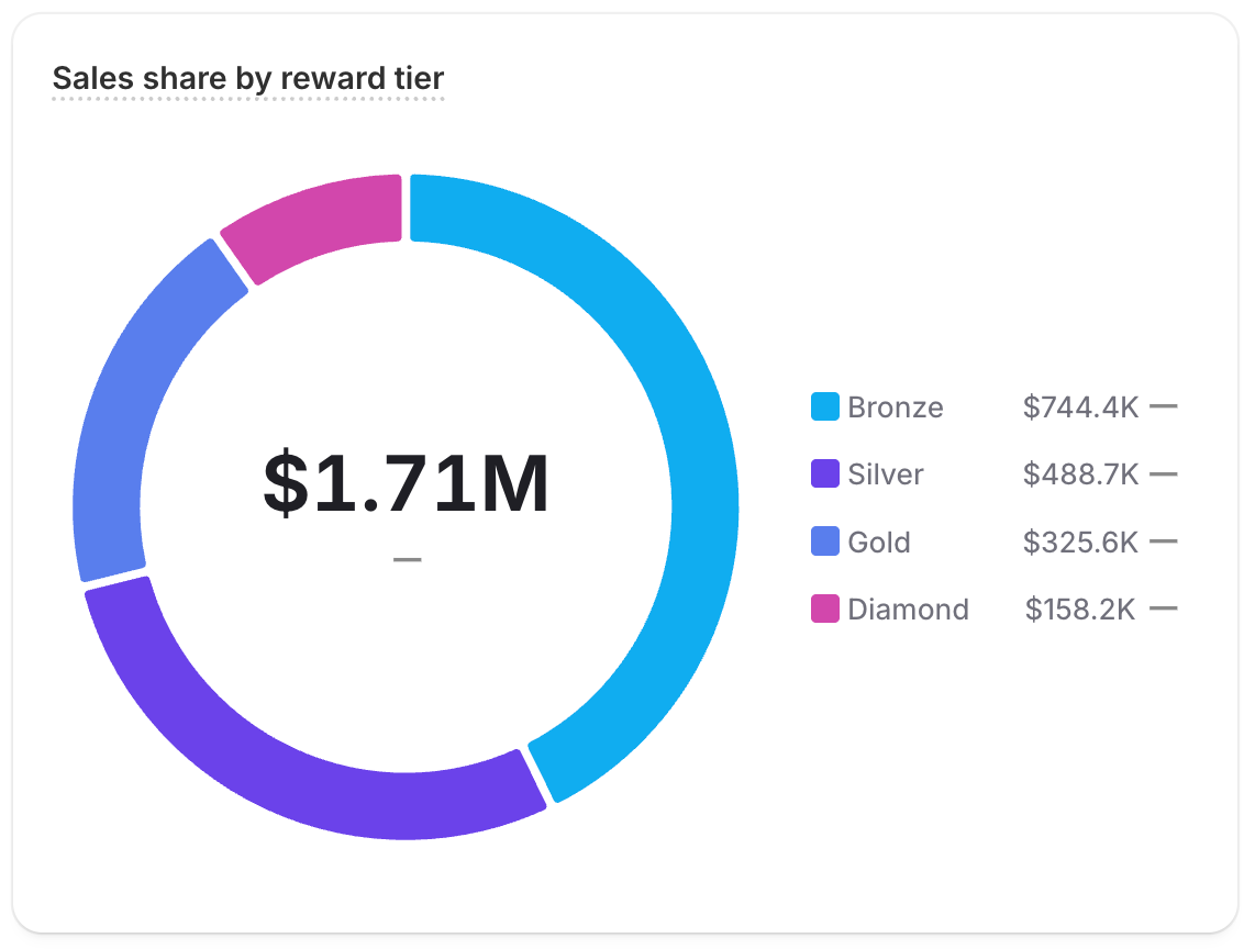
Show a percentage breakdown
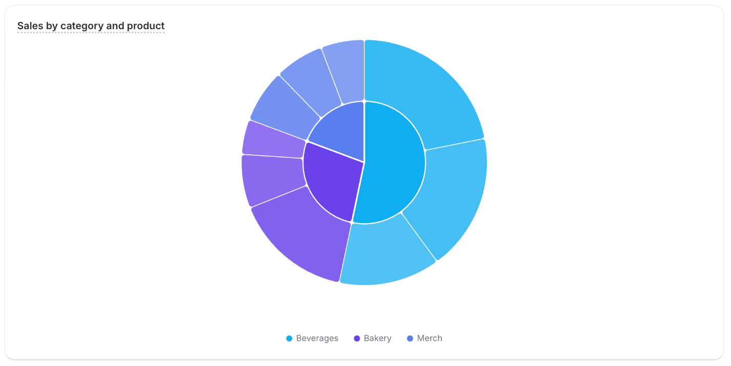
Splits a grouped total into slices with a donut chart. Use it to compare a few values as shares of the total. The grouped metafield's definition must have the analyticsQueryable capability enabled, or the card returns no data.
Rank dimension values in a list
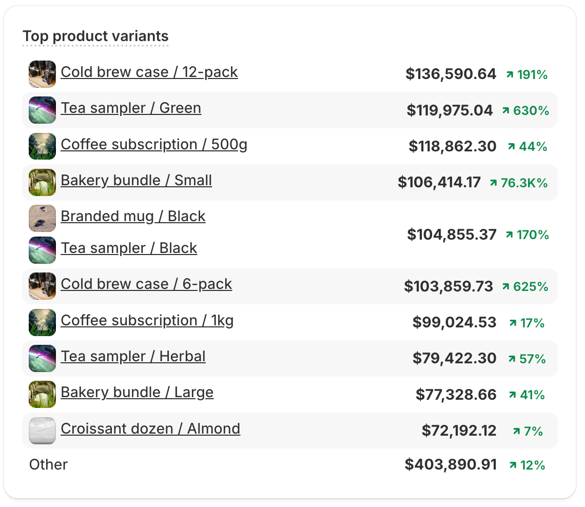
Ranks dimension values in an ordered list with list_with_dimension_values. Use it for top-N views like best-selling variants. GROUP BY TOP 10 returns the top ten plus an Other row aggregating the rest; use GROUP BY ONLY TOP 10 to show just the top ten.
Show a data table
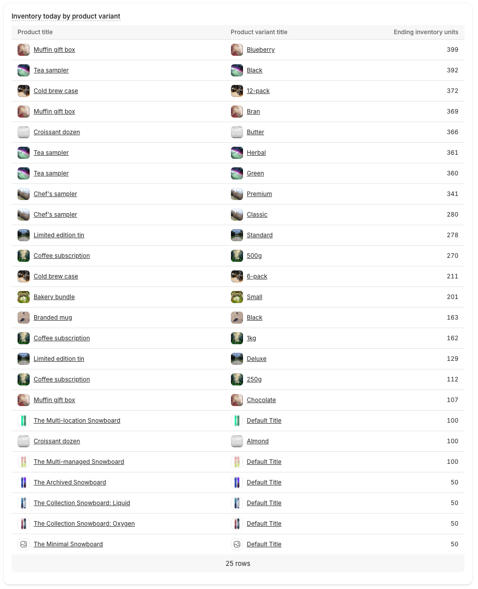
Renders the result as rows and columns with a table. Use it when exact numbers matter more than visual shape.
Combine chart types in one card
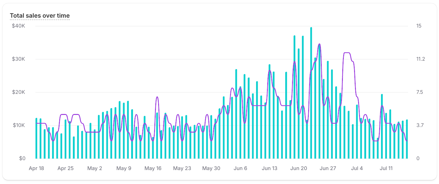
Plots several metrics together, each with its own chart type, in one VISUALIZE clause. Use it to relate metrics like sales and orders on one card.
Plot two metrics on a scatter chart
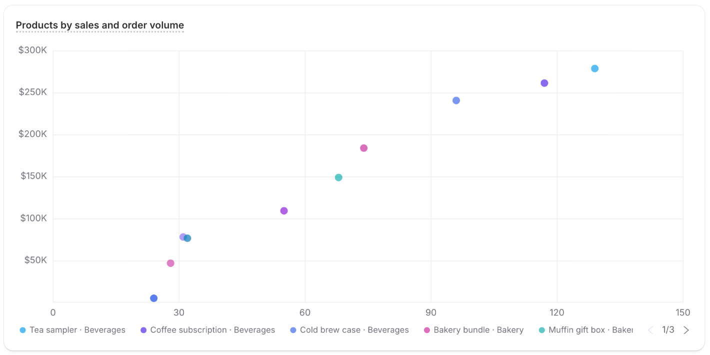
Plots one metric against another as points with a scatter_plot. Use it to spot correlation, clusters, and outliers between two measures.
Compare three metrics with a bubble chart
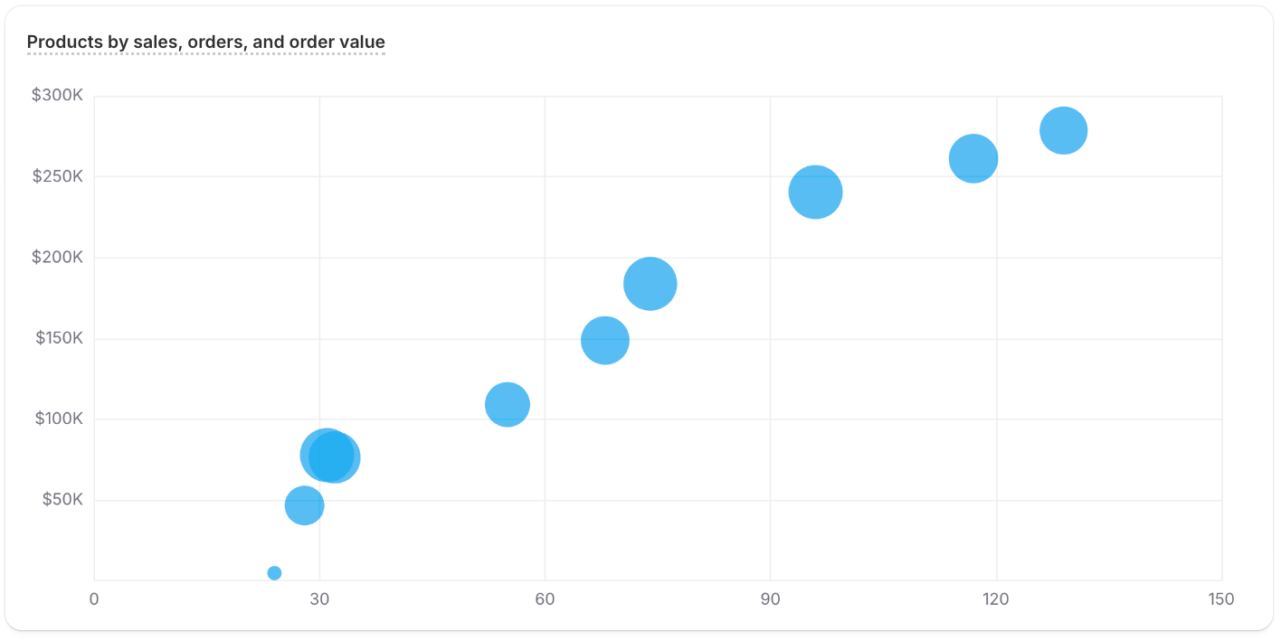
Positions points by two metrics and sizes each one by a third with a bubble_chart. Use it to compare entities across three measures at once.
Profile a dimension with a radar chart
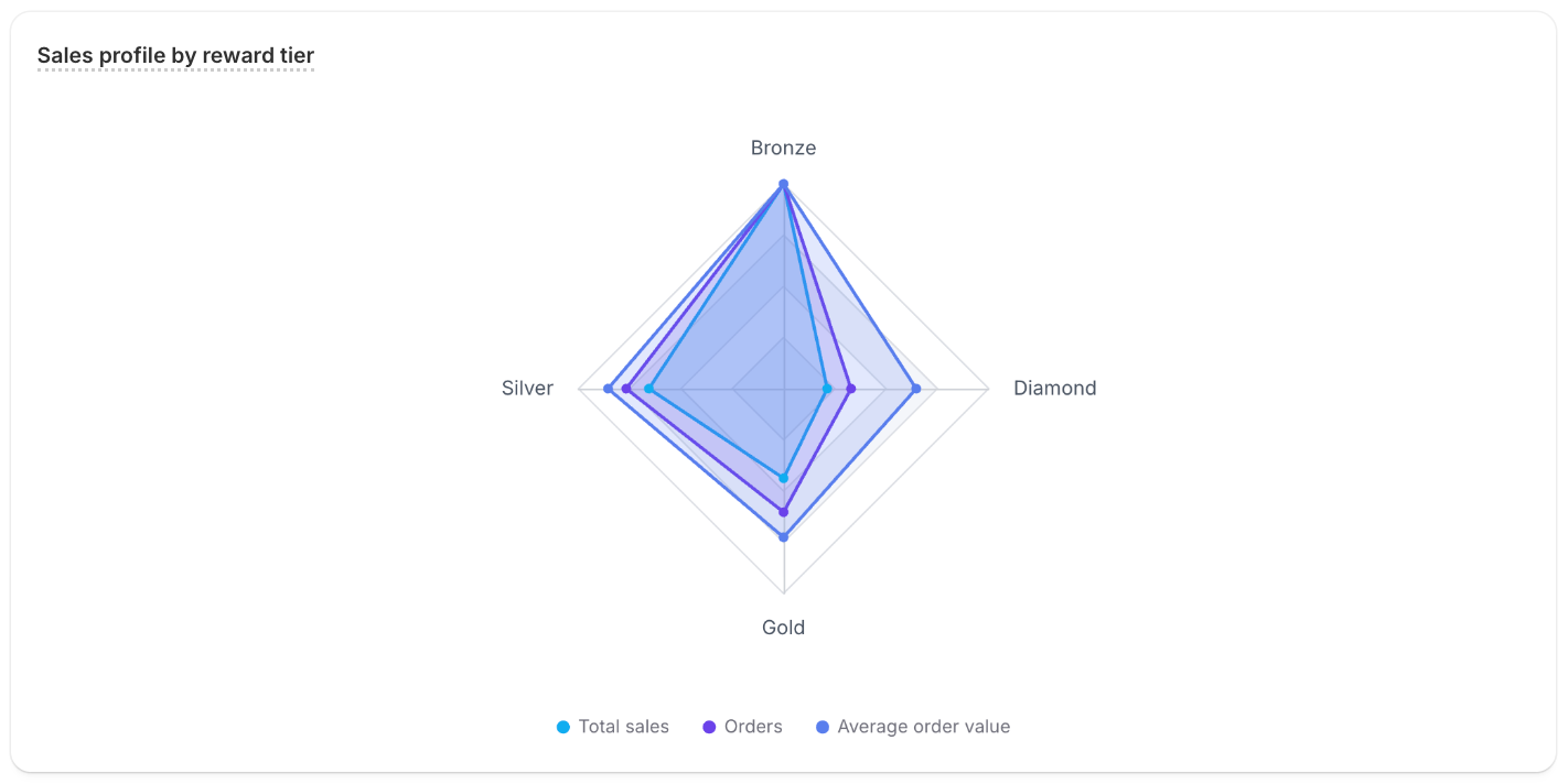
Plots several metrics on axes radiating from a center with a radar chart. Use it to contrast a dimension's values across multiple measures. The grouped metafield's definition must have the analyticsQueryable capability enabled, or the card returns no data.
Show a hierarchy with a treemap
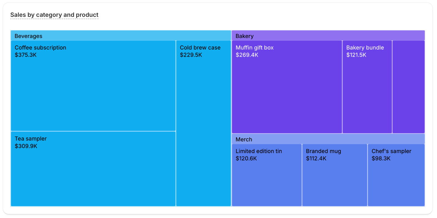
Tiles nested, area-sized boxes with a treemap. Use it to compare contribution across many items at once.
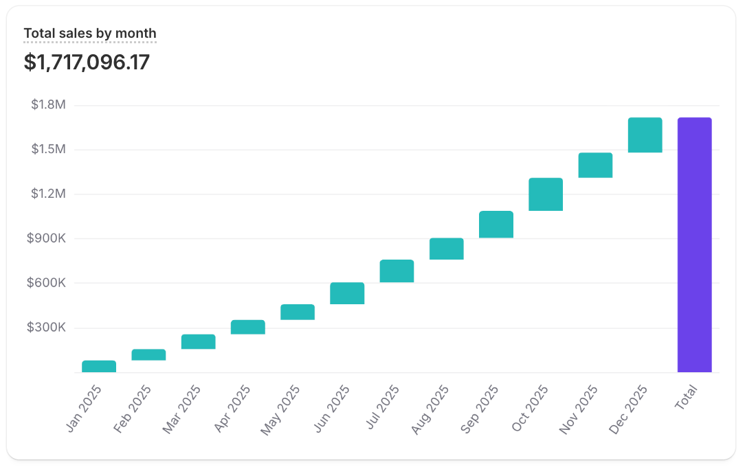
Show cumulative change with a waterfall
Breaks a total into sequential contributions with a waterfall chart. Use it to show how each period builds up to the running total.
Handle the report link in React
Handles the footer report link in your app with onReportLinkClick. Use it to route to a custom report page. Types come from the @shopify/analytics-ui-types package.
html
Anchor to Best practicesBest practices
These practices keep each card focused and its visualization suited to the data.
- Keep each card focused: Give every card one metric so users can read it at a glance. When you have several related metrics, lay them out in a metrics bar.
- Match the visualization to the data: Use
TYPE linefor trends over time,TYPE barorTYPE donutfor grouped dimensions, andTYPE list_with_dimension_valuesfor ranked lists. - Link to the underlying report: Set
reportLinkHandleso users can open the full report when a summary card raises a question.