VISUALIZE
VISUALIZE controls how a query's results are rendered as a chart or graph. It sets the visualization type, such as a line chart, bar chart, funnel, heatmap, or single number, and chooses which metric or metrics the ShopifyQL editor renders. When a query includes SHOW, VISUALIZE uses selected metrics, metric aliases, or generated metric columns. When a query omits SHOW, VISUALIZE is required and selects one or more metrics from the selected schema or schemas.
VISUALIZE only changes the chart shown in the ShopifyQL editor. When you run a query programmatically, you always get table data: the GraphQL Admin API returns the rows in its response, and the Python SDK and CLI return them as DataFrames, so your app renders the chart itself. The exception is the metric card web component, which takes the same query and renders the VISUALIZE chart for you. ShopifyQL still validates both clauses, so an invalid TYPE or ANNOTATE returns parseErrors instead of tableData.
Syntax
Anchor to VISUALIZEVISUALIZE
Use VISUALIZE with one or more selected metrics, metric aliases, or generated metric columns. When the query doesn't include SHOW, use VISUALIZE with one or more metrics from the selected schema or schemas. Reference any renamed metric by its AS alias. Add TYPE to set the chart type, or omit it to let ShopifyQL choose one.
With multiple metrics, a TYPE applies to the metric it follows and any earlier metrics without their own TYPE. Use MAX to cap the number of data points rendered, and ANNOTATE to overlay contextual events on supported charts.
ShopifyQL supports a range of TYPE values, grouped into categories by what each does best, such as comparing values, tracking change over time, or breaking down parts of a whole. The following sections describe each category and its types, along with the supported modifiers.
The chart type doesn't change the rows a query returns. The same VISUALIZE query renders a chart in the ShopifyQL editor, returns table data through the GraphQL Admin API and the Python SDK and CLI, and renders directly in the metric card web component.
ShopifyQL editor
ShopifyQL
GraphQL Admin API
Request
Response
Python
Request
Response
Web component
HTML
ShopifyQL
Anchor to Bar chartsBar charts
Use bar charts to compare values across categories. Choose horizontal variants for long labels, grouped variants for side-by-side comparisons, and stacked variants for parts of a total.
bar
Compares a single metric across categories or time buckets using vertical bars. This is the default choice for straightforward "how much per category" comparisons.
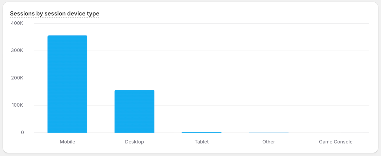
This example compares sessions across device types for the last year, ranked from most to fewest.
grouped_bar
Places two or more series side by side within each category. Use it when every category carries several values you want to compare directly.
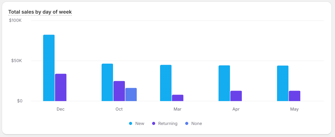
This example compares total_sales by day of week for the last year, with new and returning customers grouped side by side within each day.
horizontal_bar
Lays bars out horizontally, which keeps long category labels readable. Use it for rankings or for categories with descriptive names, such as product or city titles.
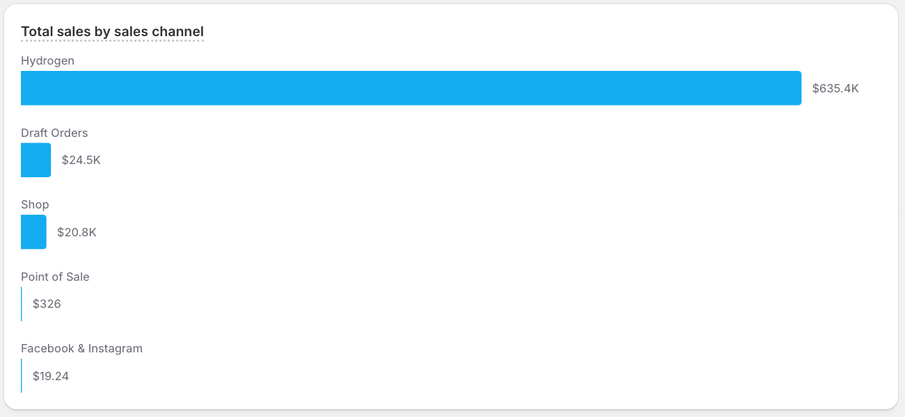
This example ranks total_sales by sales channel for the last year, with horizontal bars keeping the channel labels readable.
horizontal_grouped_bar
Combines a horizontal layout with grouped series, so several metrics share each row. Use it when categories have long labels and need a side-by-side comparison.
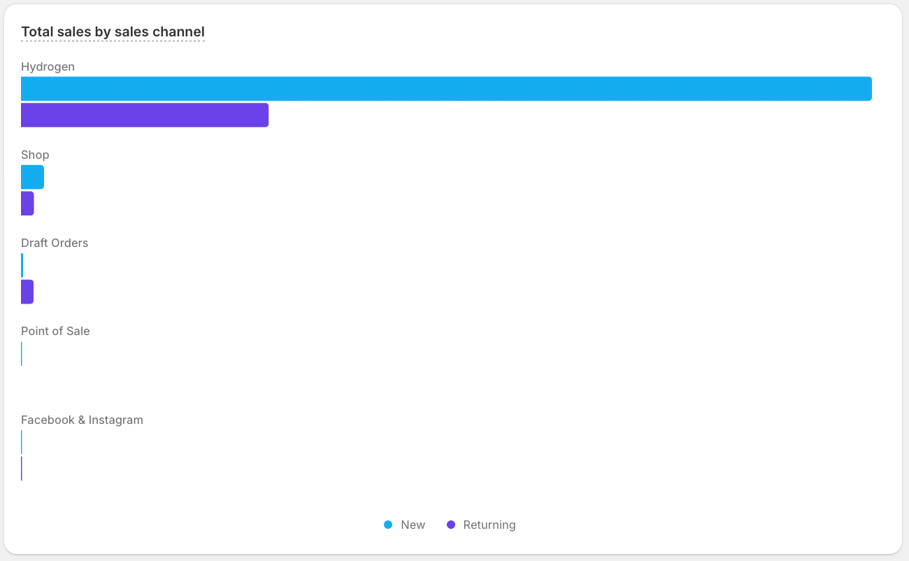
This example compares total_sales for new and returning customers within each sales channel for the last year, with horizontal bars keeping the channel labels readable.
single_stacked_bar
Shows one bar split into stacked segments, summarizing how a single total breaks down. Use it for a compact part-to-whole view, such as new and returning customers in a period.
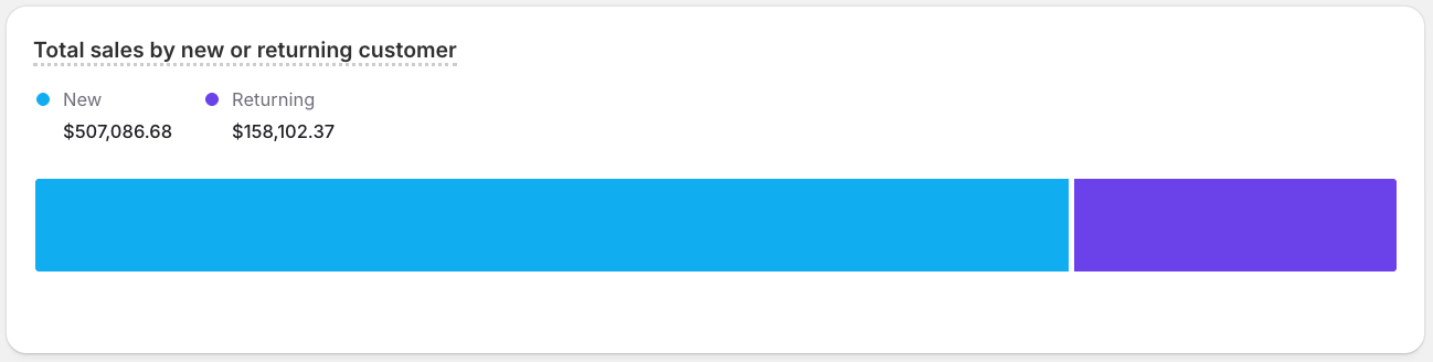
This example breaks last year's total_sales into new and returning customers.
stacked_bar
Stacks series on top of each other within each bar, showing both the category total and its composition. Use it to track how parts contribute to a whole across time or categories.
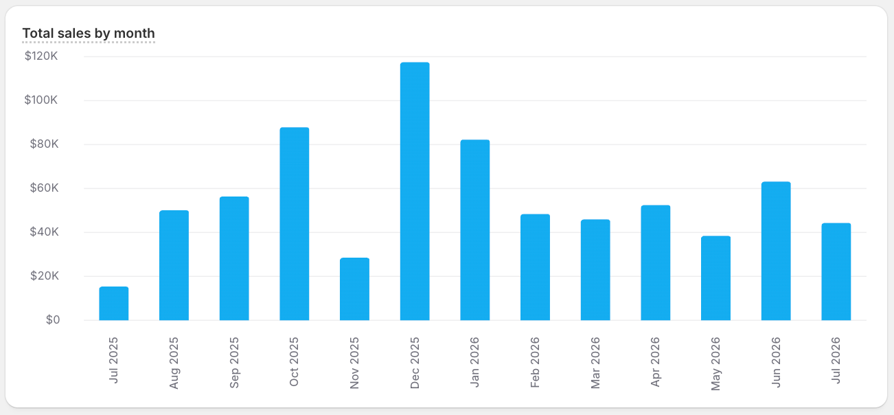
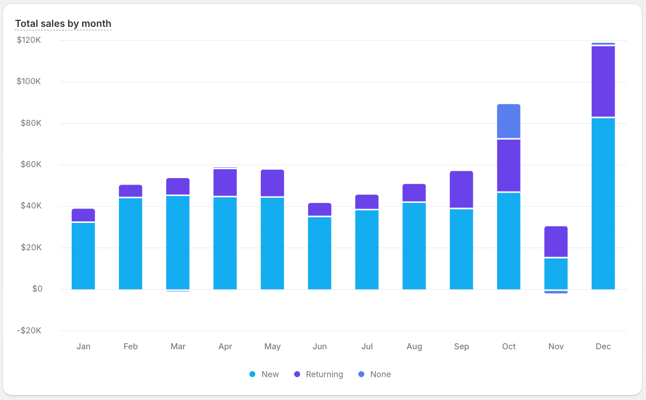
This example breaks down each month's total_sales by new and returning customers for the last year, so you can see both the monthly total and how each segment contributes to it.
stacked_horizontal_bar
Stacks segments along horizontal bars, pairing part-to-whole composition with readable long labels. Use it when stacked categories have descriptive names.
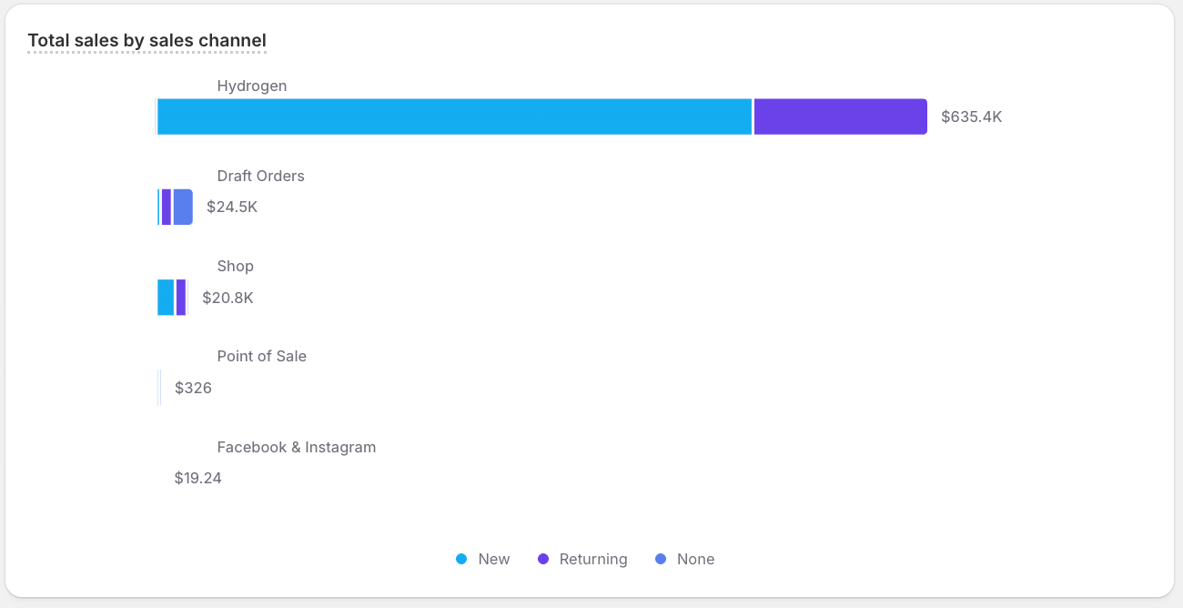
This example breaks down total_sales by new and returning customers within each sales channel over the past 90 days, pairing the part-to-whole split with readable channel labels.
Bar
Anchor to Customer analysis chartsCustomer analysis charts
Use customer analysis charts to track how groups of customers behave over their lifecycle, from first purchase through retention and churn. Reach for them when you want to compare segments over time rather than raw totals.
rfm_grid
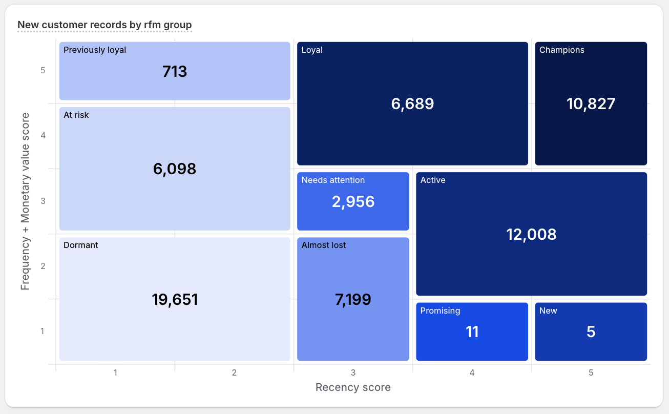
Arranges customer segments by recency, frequency, and monetary value. Use it to size and compare segments before targeting them.
This example sizes each RFM segment, like champions, at risk, and dormant, by how many customers fall into it.
RFM grid
Anchor to Distribution and relationship chartsDistribution and relationship charts
Use distribution and relationship charts to show how values spread out and how metrics relate to one another. Reach for them to spot clusters, outliers, correlations, and the overall shape of your data.
bubble_chart
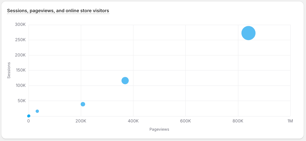
Positions points by two metrics and sizes each one by a third, packing three measures into a single view. Use it to compare entities across several dimensions at once.
This example plots each landing page type by its sessions and pageviews, with bubble size showing online_store_visitors.
histogram
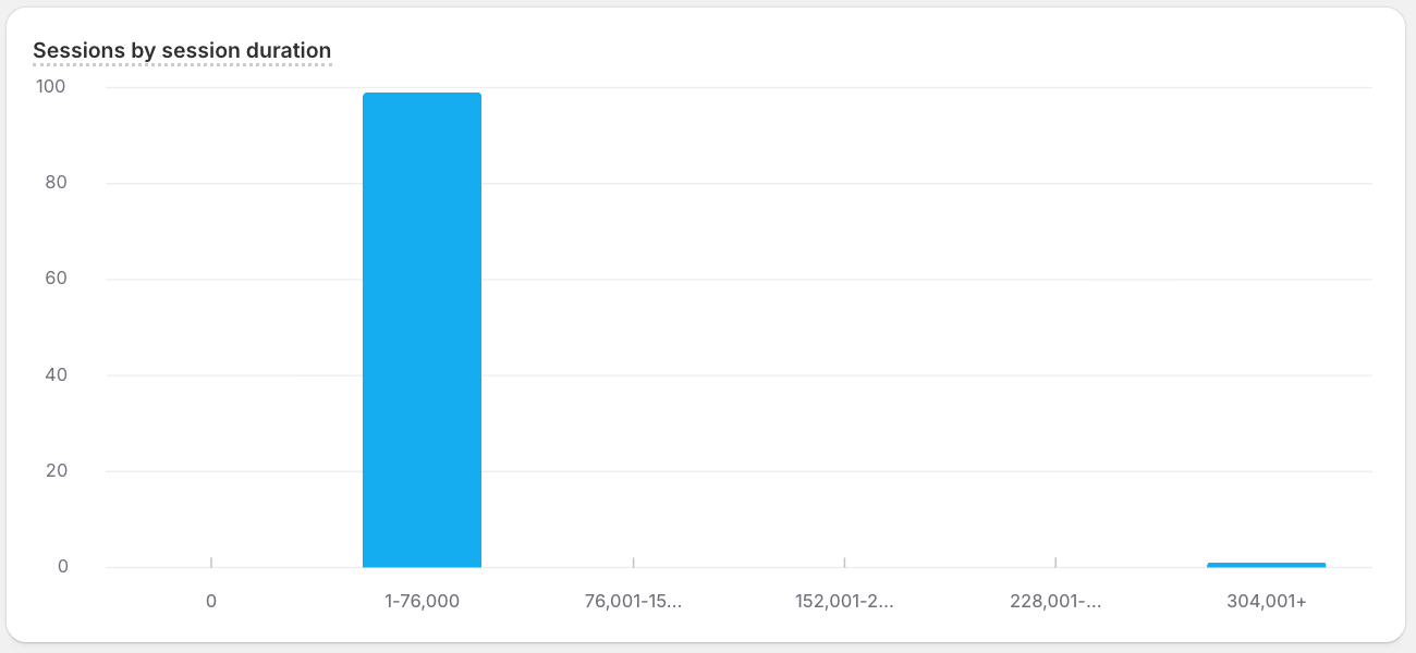
Buckets values into ranges and shows how many records fall in each, revealing the shape of a distribution. Use it to understand frequency and spread, such as delivery times.
This example shows how sessions are distributed across session durations, counting how many sessions fall into each duration bucket.
scatter_plot
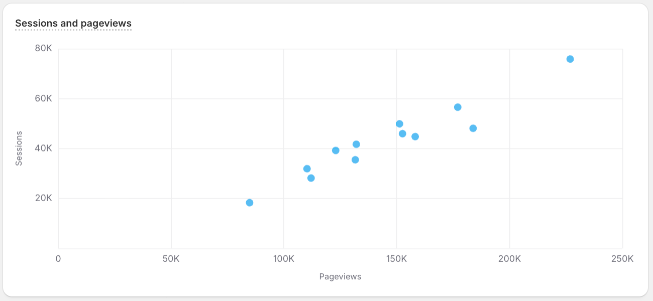
Plots one metric against another as points, exposing correlation, clusters, and outliers. Use it to explore the relationship between two measures.
This example plots each hour of the day by its sessions and pageviews for the last year.
Bubble chart
Anchor to Funnel, flow, and change chartsFunnel, flow, and change charts
Use funnel, flow, and change charts to follow how values move through stages or shift between periods. Reach for them to trace conversion drop-off, cumulative gains and losses, or how segments flow from one state to another.
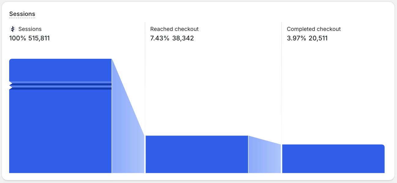
funnel
Shows how a count narrows across sequential stages, making the drop-off between steps obvious. Use it for conversion paths, such as sessions through to completed checkouts.
This example follows store sessions from adding to cart, to reaching checkout, to completing it.
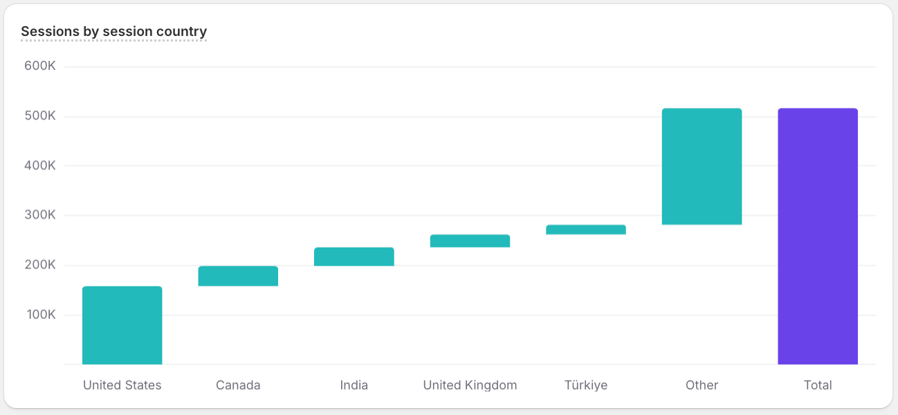
waterfall
Breaks a total into sequential positive and negative contributions, showing how you get from the starting value to the ending one. Use it to explain what drove a net change.
This example breaks sessions into contributions from the top five countries for the last year.
Funnel
Anchor to Heatmap and calendar chartsHeatmap and calendar charts
Use heatmap and calendar charts to show intensity across a grid of two dimensions, with color standing in for magnitude. Reach for them to surface hot spots and recurring patterns, such as the busiest days, hours, or calendar dates.
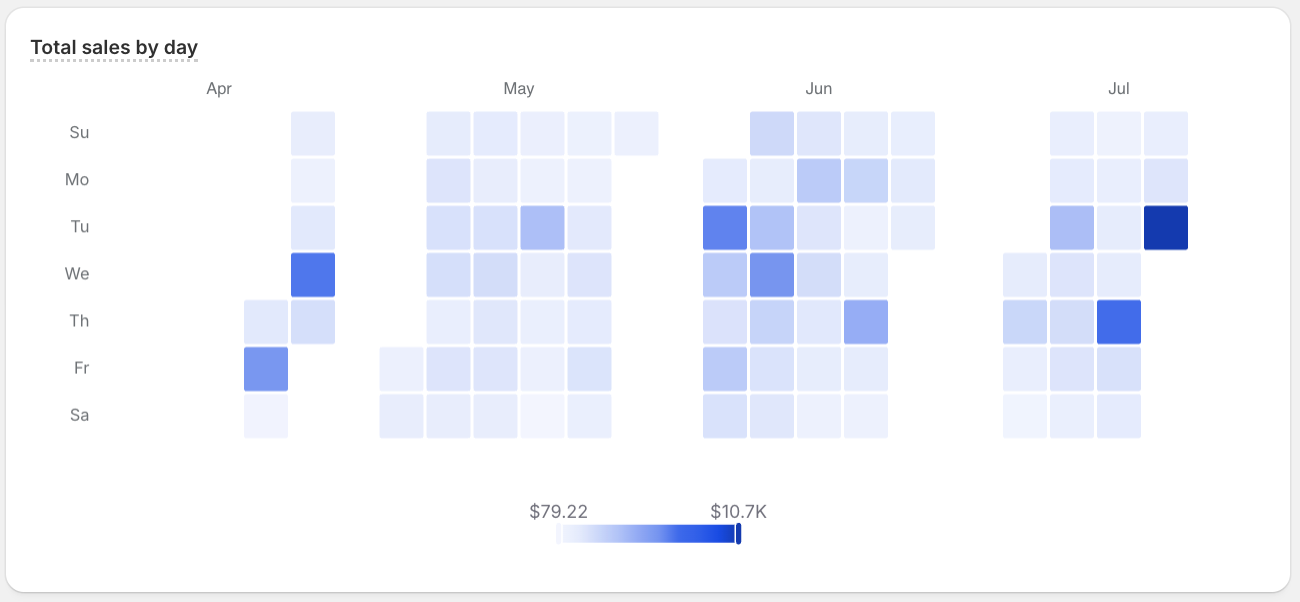
calendar_heatmap
Shades calendar days by intensity. Use it to find recurring weekly or seasonal hotspots.
This example shades each day in the last year by total_sales.
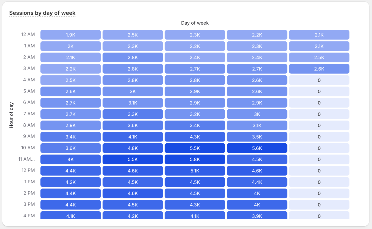
heatmap
Shades a grid of two dimensions by value. Use it for patterns such as day of week against hour of day.
This example plots sessions across day of week and hour of day for the last year, revealing when shoppers visit most.
Calendar heatmap
Anchor to Line and area chartsLine and area charts
Use line and area charts to show how metrics rise and fall over time. Reach for them to highlight trends, momentum, and cumulative growth across a continuous time axis.
line
Connects values over time, making trends, peaks, and dips easy to follow. This is the default choice for time-series metrics.
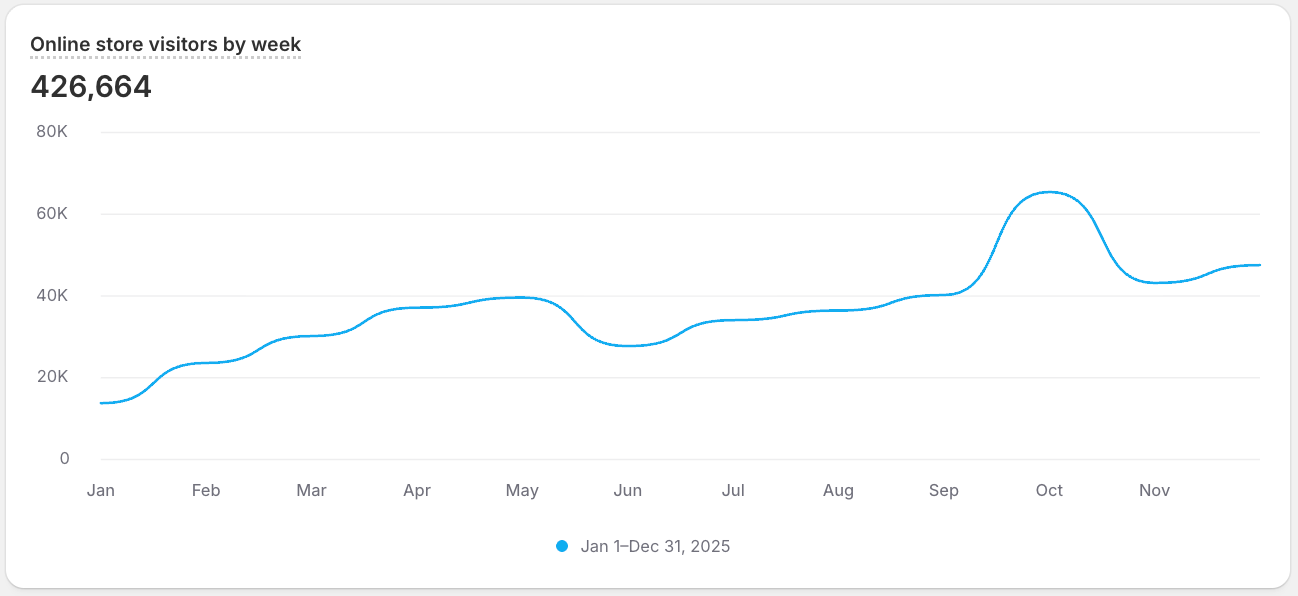
This example tracks weekly online_store_visitors over the last year, so you can follow the trend and spot peaks and dips at a glance.
stacked_area
Stacks filled series over time, showing both the running total and how each series contributes. Use it to track evolving composition across a period.
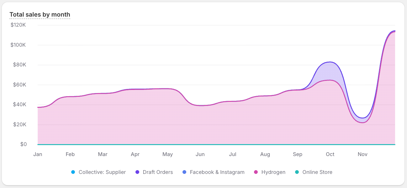
This example tracks monthly total_sales by sales channel over the last year, so you can see how each channel's contribution evolves over time.
Line
Anchor to Part-to-whole and hierarchy chartsPart-to-whole and hierarchy charts
Use part-to-whole and hierarchy charts to show how segments contribute to a total and how categories nest within one another. Reach for them to compare proportions or explore data that breaks down into levels.
donut
Splits a total into proportional arcs around a ring, leaving the center open for a label or total. Use it for a quick part-to-whole read across a few categories.
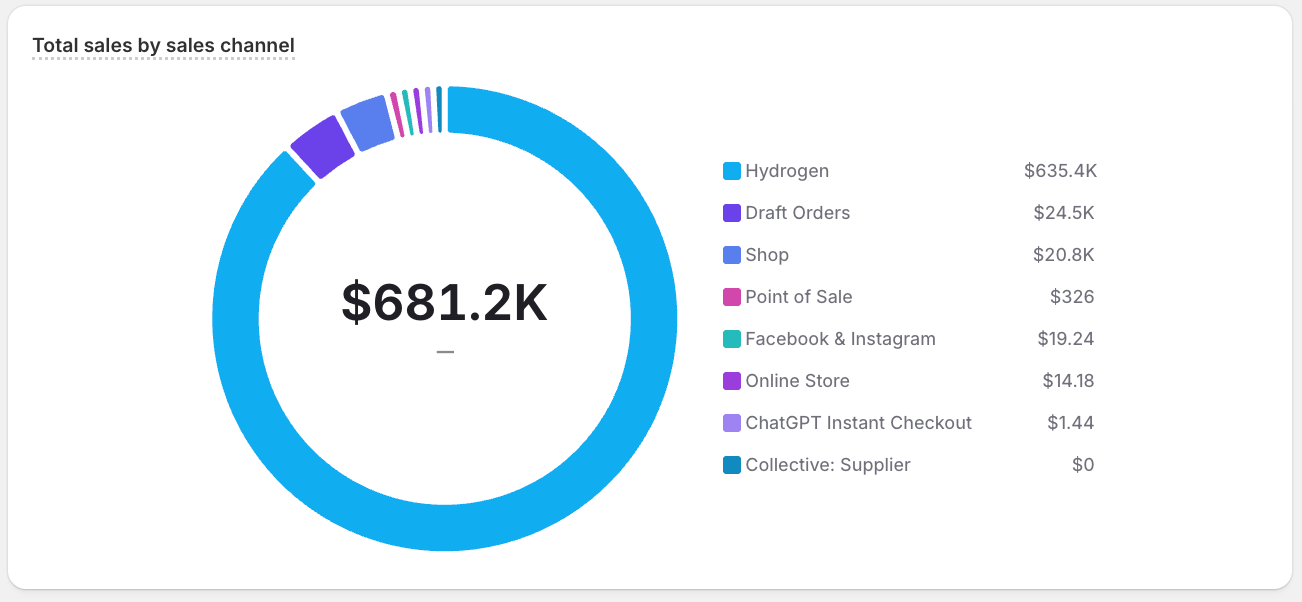
This example breaks down last year's total_sales by sales channel.
sunburst
Renders a hierarchy as concentric rings radiating from a center, where each ring is one level deeper. Use it to explore nested categories and their contribution to the whole.
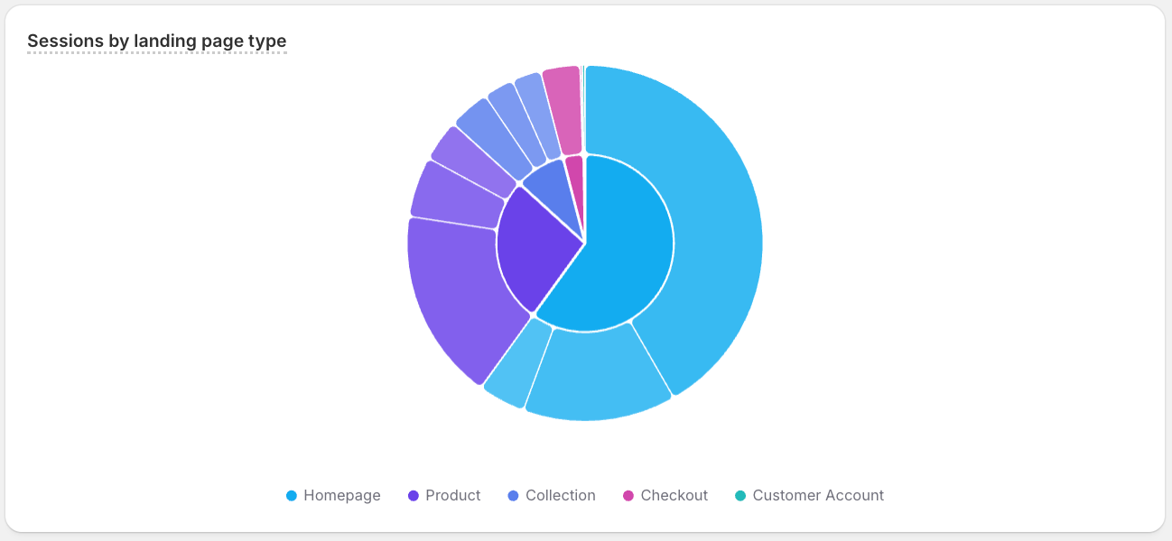
This example nests sessions by landing page type and then by referrer source for the last year, so you can explore where visitors come from within each entry point.
treemap
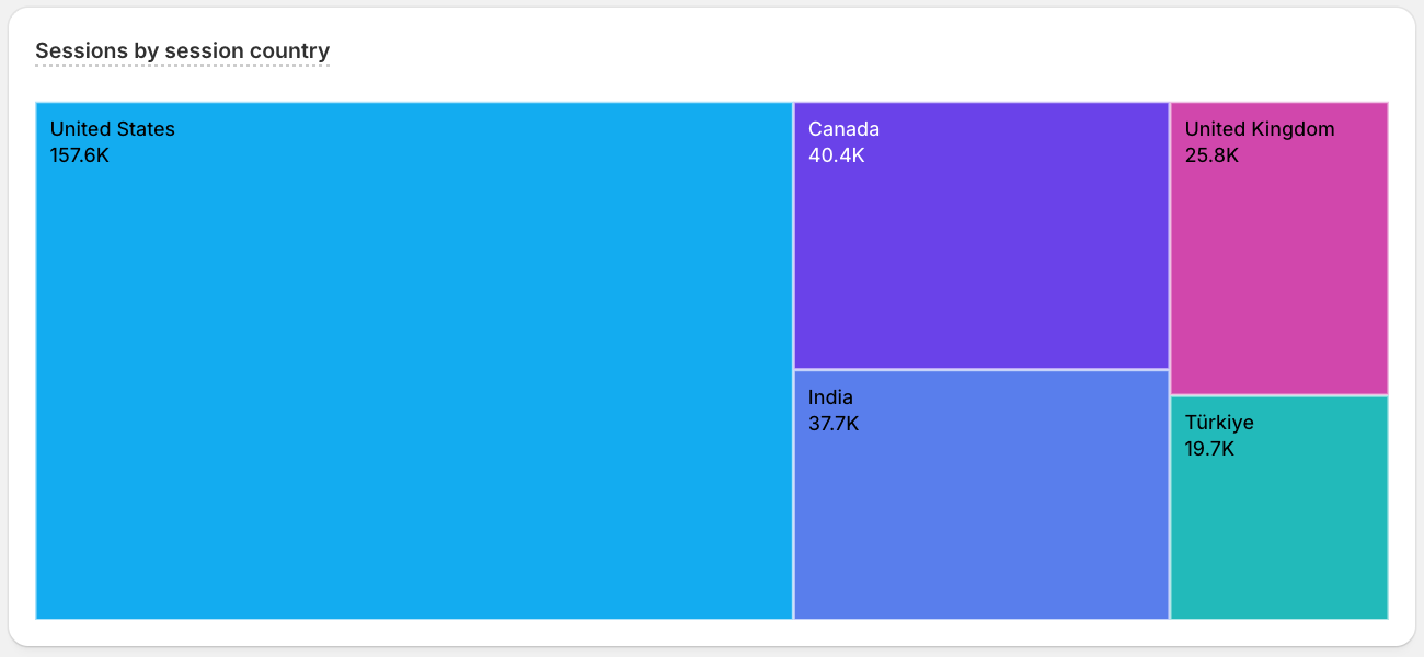
Tiles a rectangle into nested, area-sized boxes, packing many categories into a compact part-to-whole view. Use it to compare contribution across a large set of items.
This example sizes a tile for each country by its sessions for the last year, packing the top 20 into one part-to-whole view of where sessions come from.
Donut
Anchor to Radial chartsRadial charts
Use radial charts to arrange values around a central point, mapping magnitude to angle or distance from the center. Reach for them to compare many categories at once or to emphasize cyclical, dial-like data.
radar
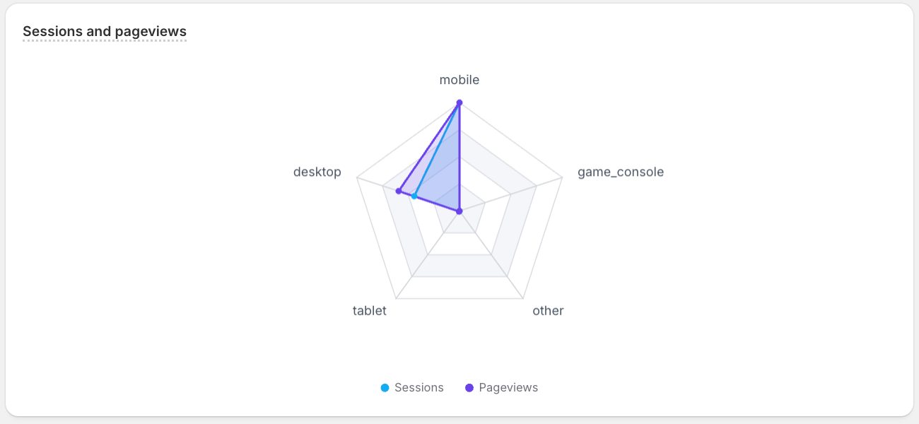
Plots several metrics on axes radiating from a center and connects them into a shape. Use it to contrast entities across multiple measures.
This example profiles each device type across sessions and pageviews for the last year, so you can compare their shapes at a glance.
Radar
Anchor to Single metricSingle metric
Use a single metric when the result should read as one headline number rather than a chart. Use it on dashboards and scorecards where a KPI, such as total sales or conversion rate, needs to stand on its own.
single_metric
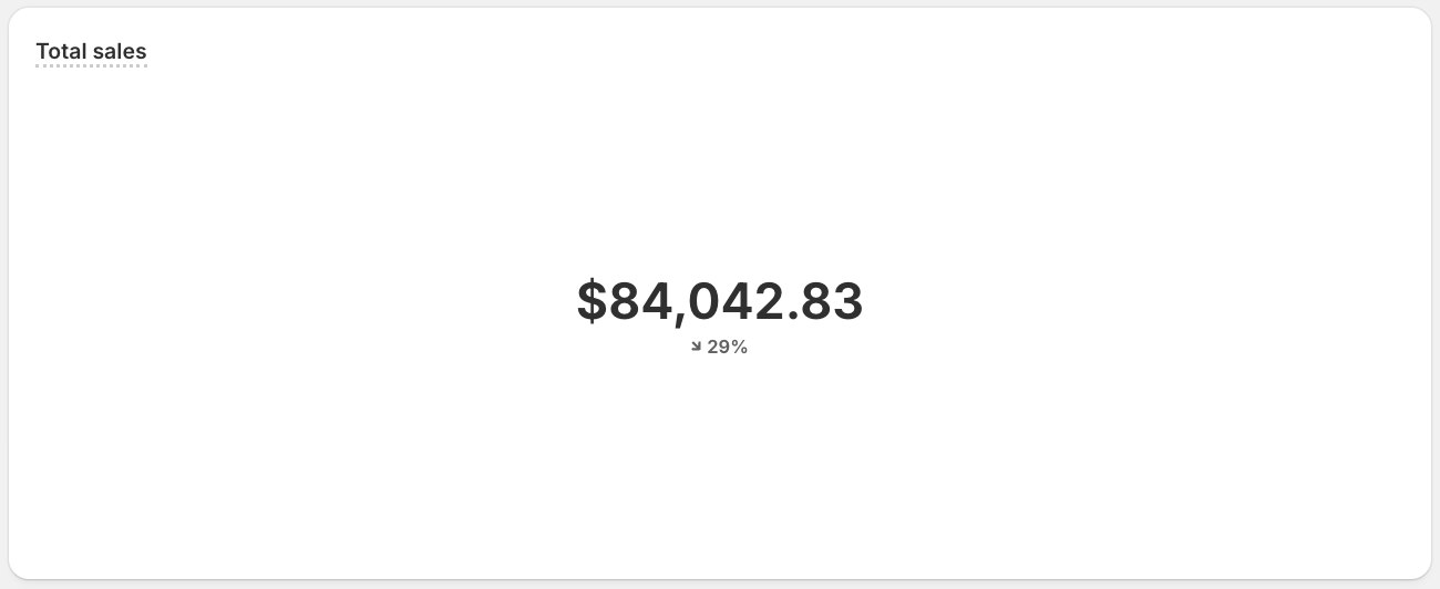
Displays one headline number, optionally with a comparison to a prior period, instead of a chart. Use it to spotlight a single KPI.
This example reports a single month's total_sales as one headline figure, with the change from the previous month.
Single metric
Anchor to Tables and listsTables and lists
Use tables and lists when exact values and rows matter more than visual shape. Reach for them to show precise figures, rank items, or enumerate the dimension values behind a query.
list
Presents results as a simple ranked list of values, focused on the metric rather than on chart shape. Use it for compact rankings or feeds.
This example ranks each month of this year by total_amount_spent, so you can read total customer spend as a compact ranked list.
list_with_dimension_values
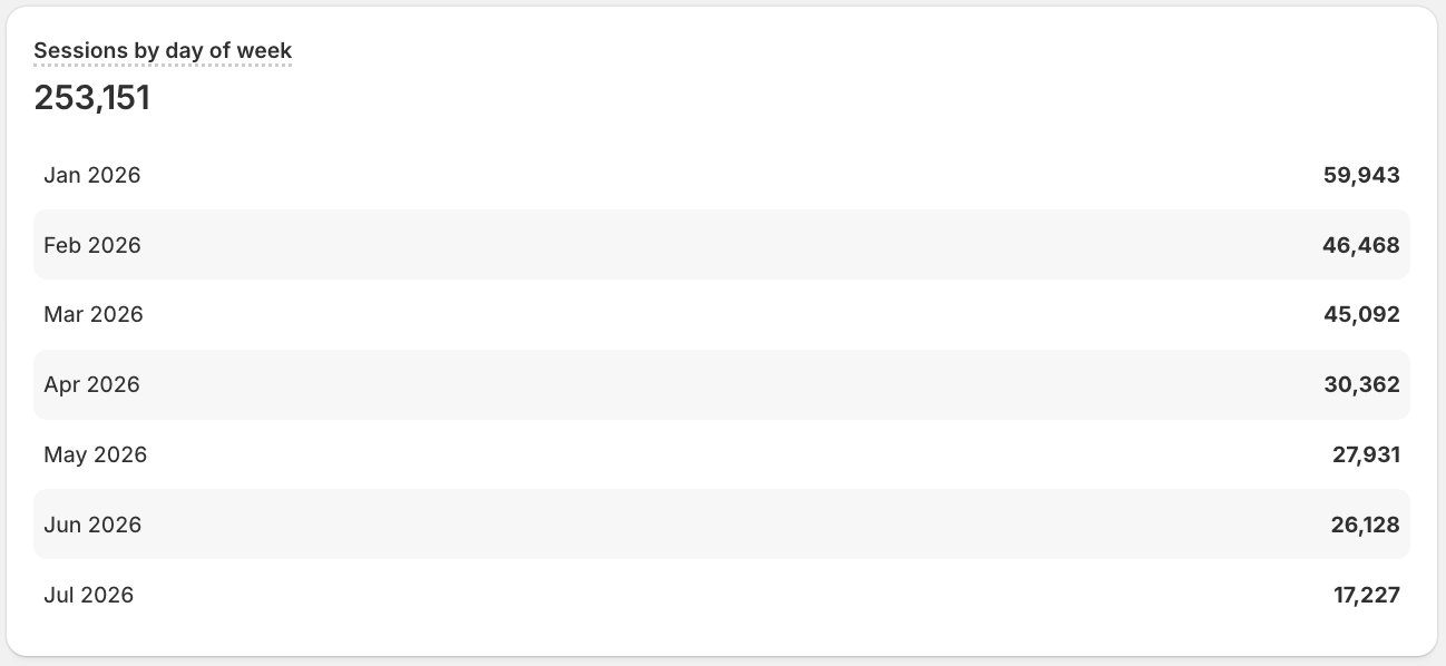
Lists results alongside their dimension values, keeping the breakdown labels next to each metric. Use it when those labels matter as much as the numbers.
This example lists sessions broken down by day of week for the last year, with each day's label beside its value.
table
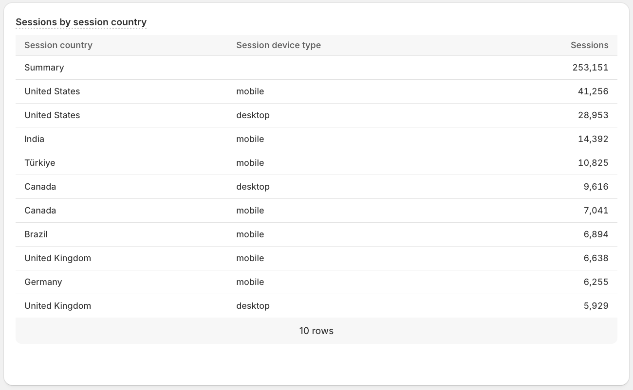
Lays results out as rows and columns of exact values, supporting multiple metrics and dimensions. Use it when precise numbers matter more than visual shape.
This example lays out sessions, pageviews, and online_store_visitors for each country and device type over the last year, so you can read the exact figures.
List

Anchor to Bar and line chartsBar and line charts
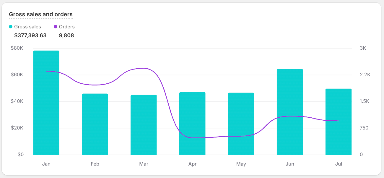
Use a bar and line chart to compare related metrics with different chart types in the same visualization. Set a TYPE on each metric to render the metrics with different chart types in one visualization.
This example plots monthly gross_sales as bars and orders as a line on the same time axis.
Bar and line chart
Anchor to ModifiersModifiers
Modifiers cap the number of data points rendered by VISUALIZE.
MAX <number>
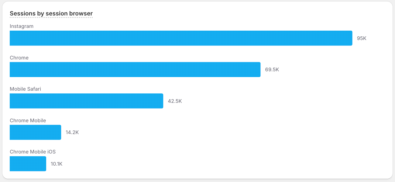
Caps how many data points the chart renders. Pair it with ORDER BY to show only the top results, or use it to keep a long time series readable. MAX is the preferred modifier in new queries.
This example shows your top five device browsers by sessions for the last year. After ORDER BY sessions DESC ranks them, MAX 5 keeps only the top five so the chart stays focused.
MAX example
Anchor to ANNOTATEANNOTATE
Use ANNOTATE to overlay contextual annotations on a time-based visualization.