Version 2025-07 is the last API version to support React-based UI components. Later versions use web components, native UI elements with built-in accessibility, better performance, and consistent styling with Shopify's design system. Check out the upgrade guide to upgrade your extension.
UI components
These components are built with remote-ui. For the equivalents used in newer API versions, see web components.
UI components are the building blocks that you use to display data and trigger API functions in admin UI extensions. These components follow Shopify's design system and render optimized interfaces for workflows in the Shopify admin.
Your target determines which components you can use because different locations in the Shopify admin have different interface requirements and constraints.
Anchor to ActionsActions
Actions enable users to perform tasks and navigate through the Shopify admin interface with interactive elements like buttons and links.
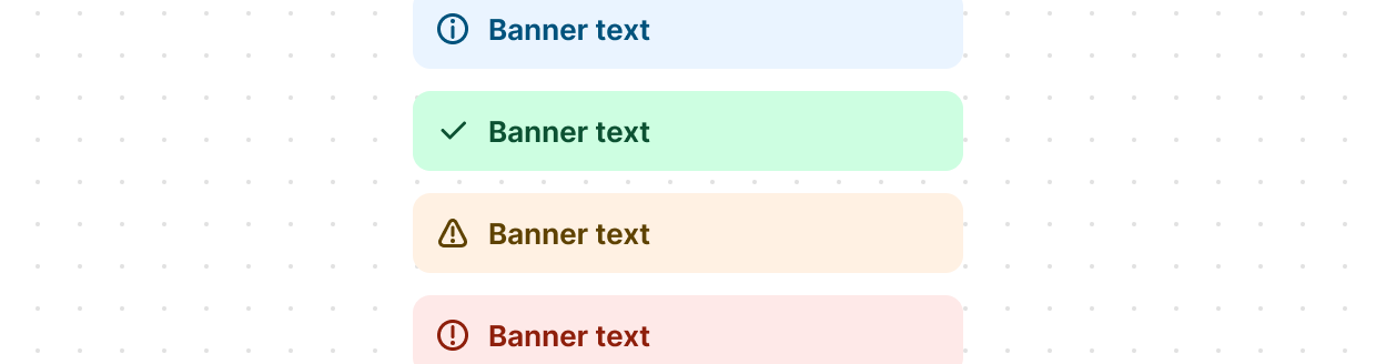
Anchor to Feedback and status indicatorsFeedback and status indicators
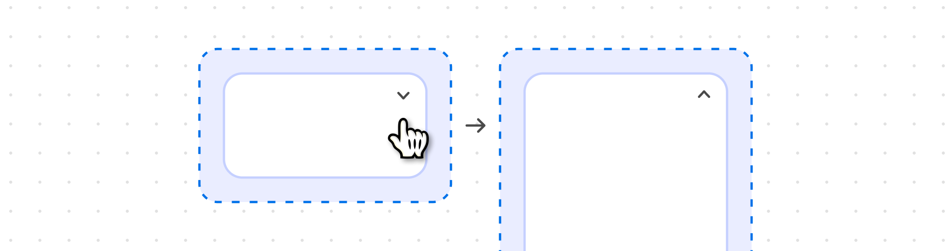
Feedback and status indicators communicate system states, progress, and important information to users.
Anchor to FormsForms
Forms capture and validate user input with specialized field types optimized for different data collection needs in the Shopify admin.
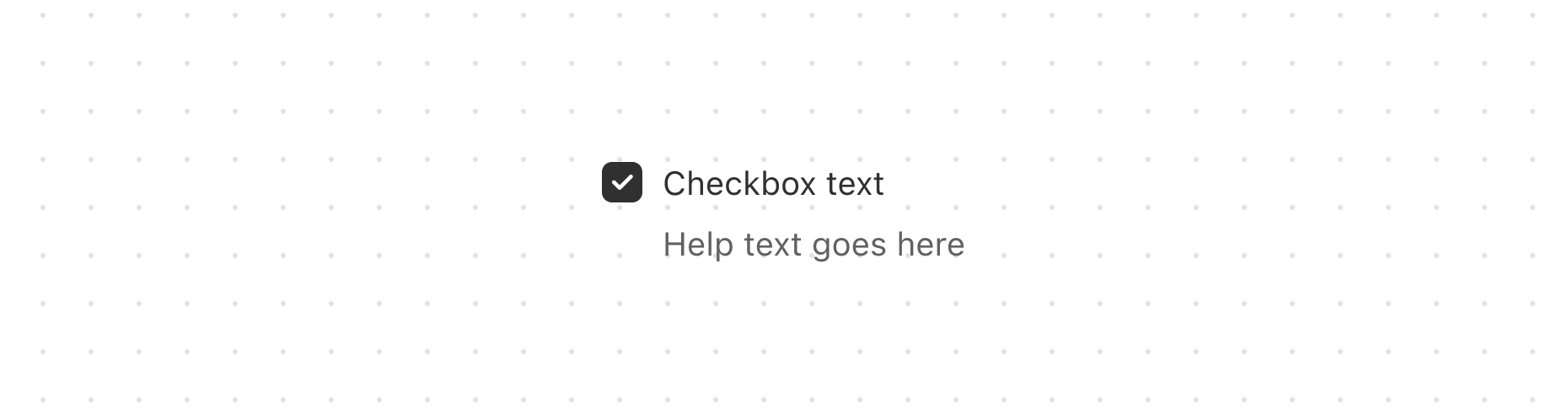
Checkbox
Capture user selections, such as agreeing to terms or choosing multiple items from a list.
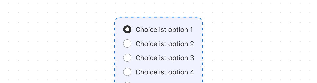
Choice
Present multiple options for single or multiple selections.
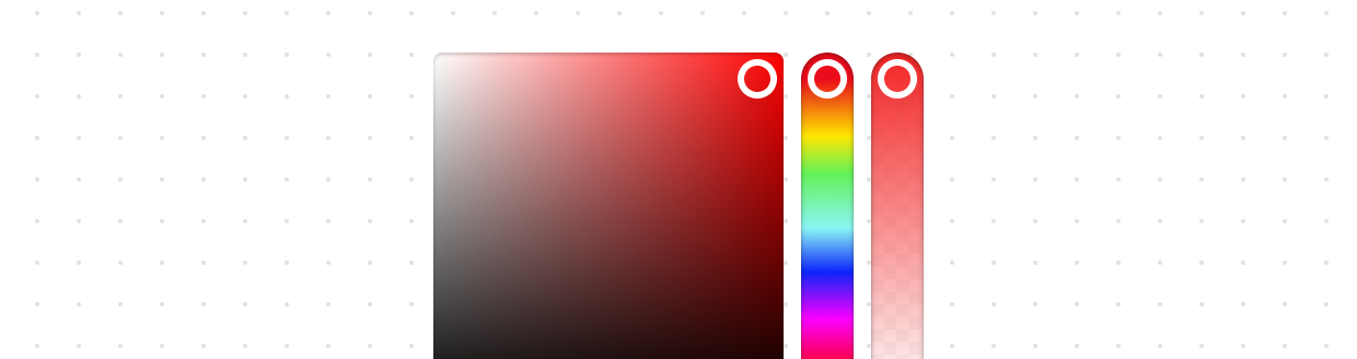
Color
Enable users to select colors from a color palette.
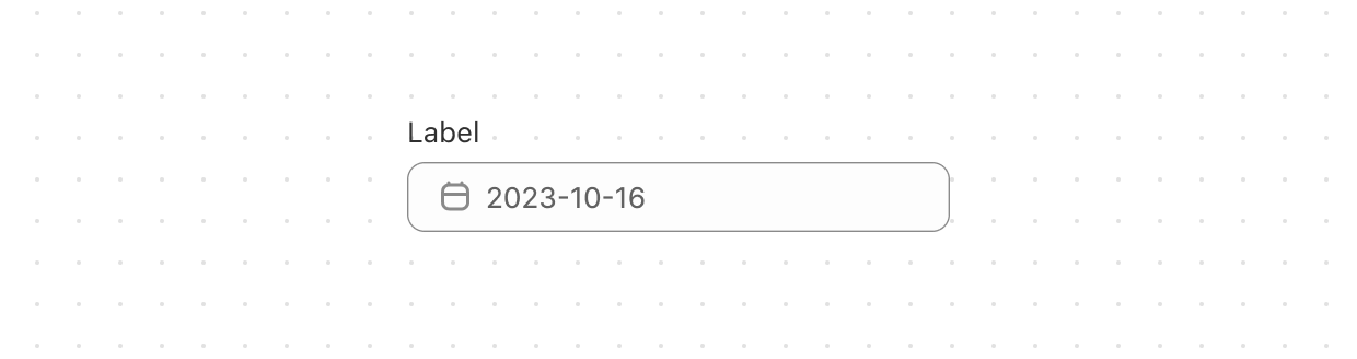
Date
Capture date input with a consistent interface for date selection and proper validation.
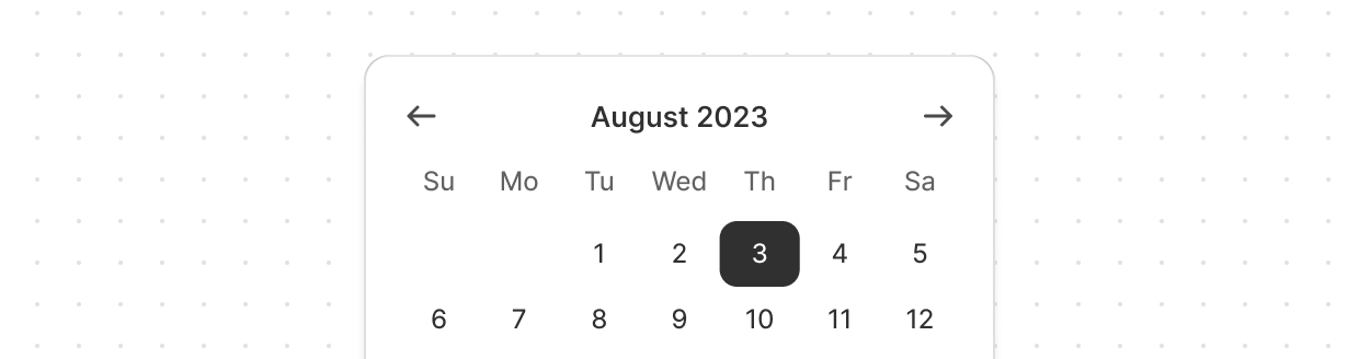
Date
Allow merchants to select a specific date using a calendar-like picker interface.
Email
Capture email address input from customers with built-in validation.
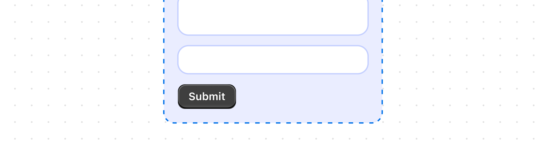
Form
Wrap form controls and enable implicit submission when users press Enter.
Function
Configure metafield settings for Shopify Functions with native save bar integration.
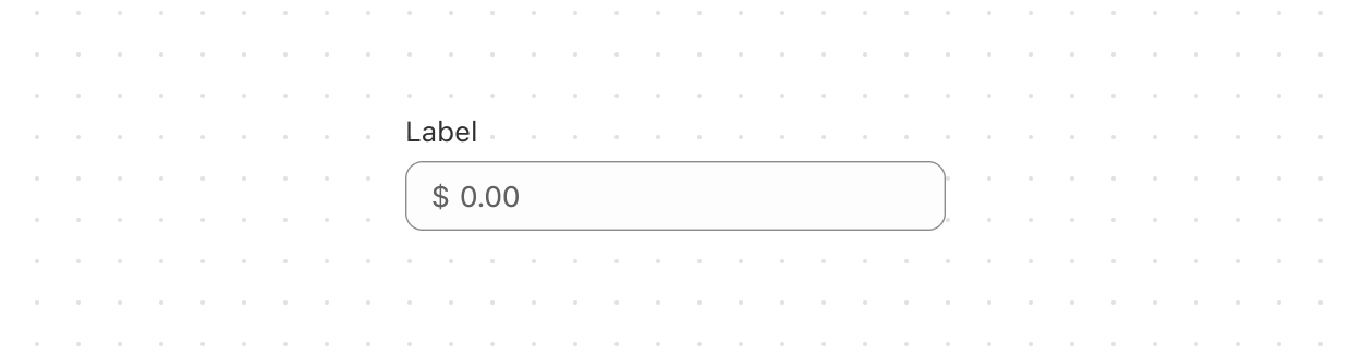
Money
Capture monetary values with built-in currency formatting and validation.
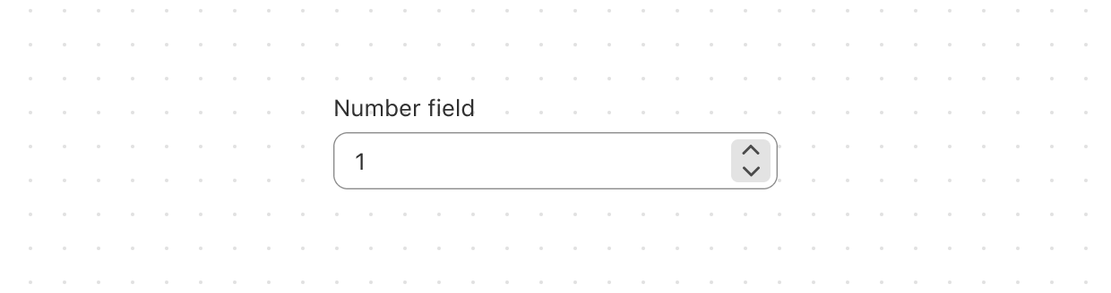
Number
Capture numeric input with built-in validation.
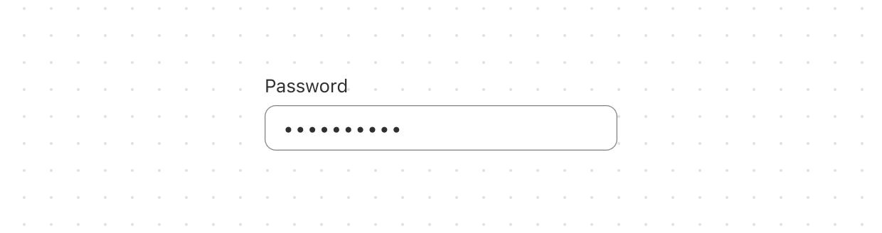
Password
Securely capture sensitive information.
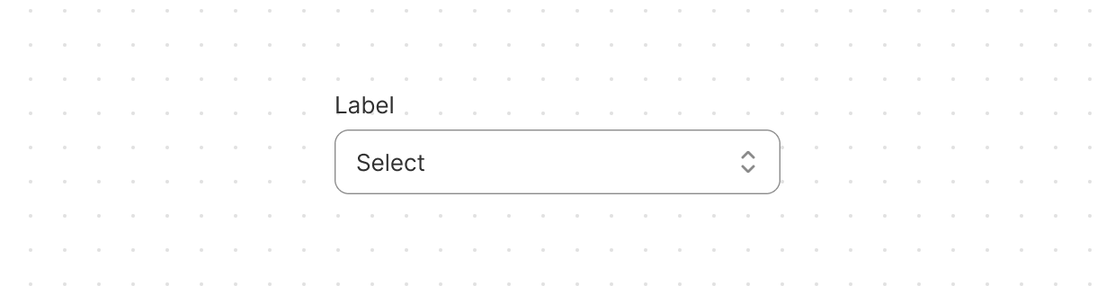
Select
Enable users to pick one option from a dropdown menu.
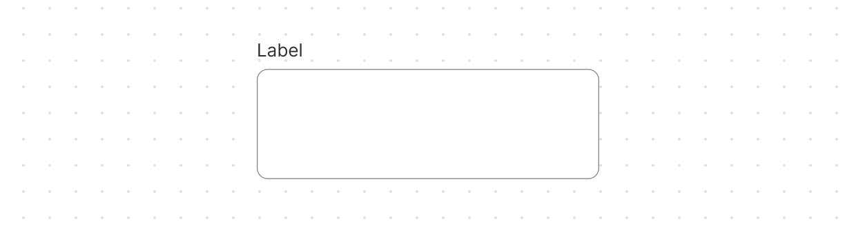
Text
Capture longer text content with a multi-line, resizable text input area.
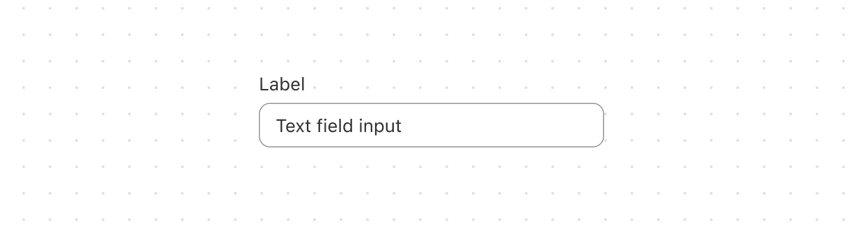
Text
Capture single-line text input.
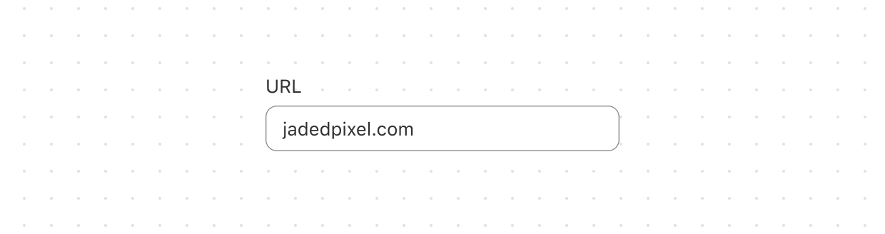
URL
Capture URLs with built-in formatting and validation.
Anchor to Layout and structureLayout and structure
Layout and structure components organize content hierarchically and spatially, creating clear visual relationships in Shopify admin interfaces.
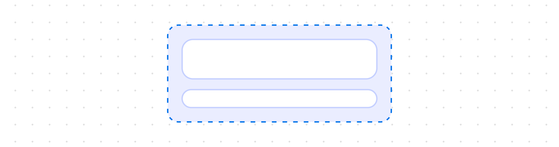
Block
Organize elements vertically with consistent spacing between items.
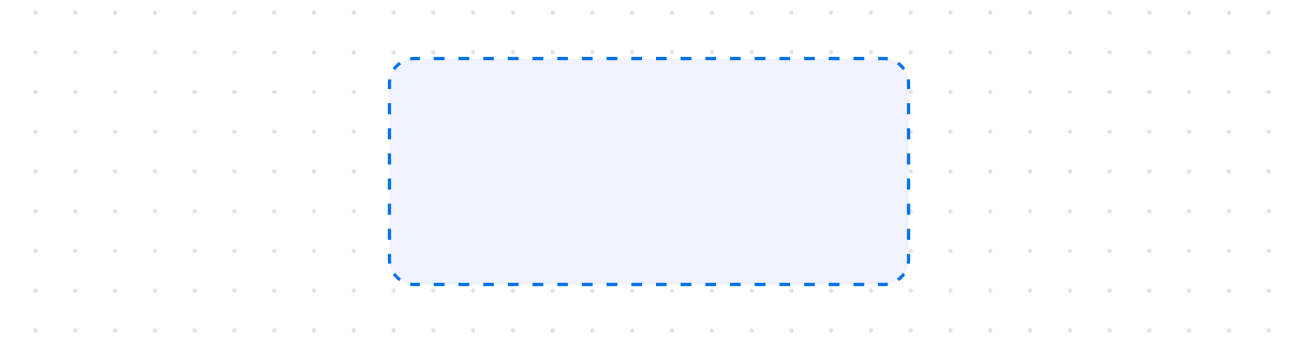
Box
Display a generic container with consistent spacing and styling.
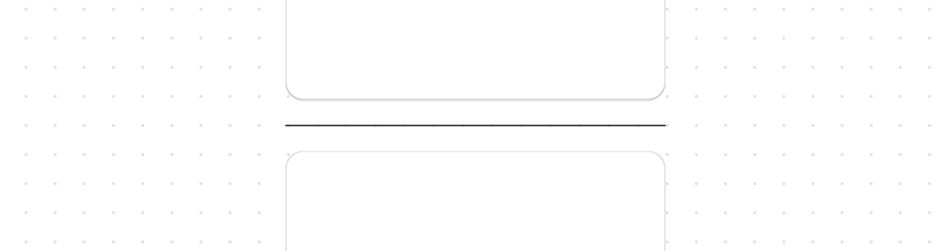
Divider
Create visual separation between content sections.
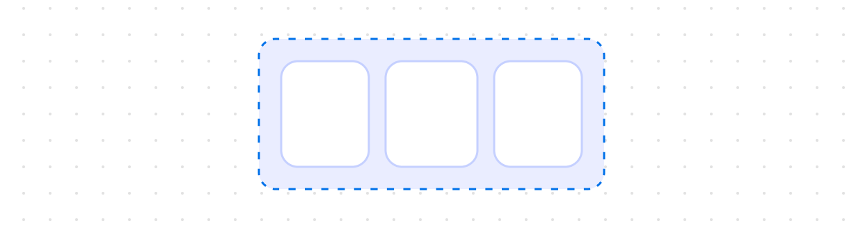
Inline
Organize elements horizontally with consistent spacing between items.
Section
Group related content into clearly-defined thematic areas.
Anchor to Media and visualsMedia and visuals
Media and visuals display images, icons, and graphical elements that enhance comprehension and visual communication in the Shopify admin.
Anchor to Settings and templatesSettings and templates
Settings and templates provide specialized components for configuring extension behavior and integration with Shopify admin contexts.

Admin
Define the title and action buttons that appear in action extension surfaces.
Admin
Configure block extension rendering on resource pages with height and overflow controls.

Admin
Specify the URL to use when merchants trigger a print action extension.
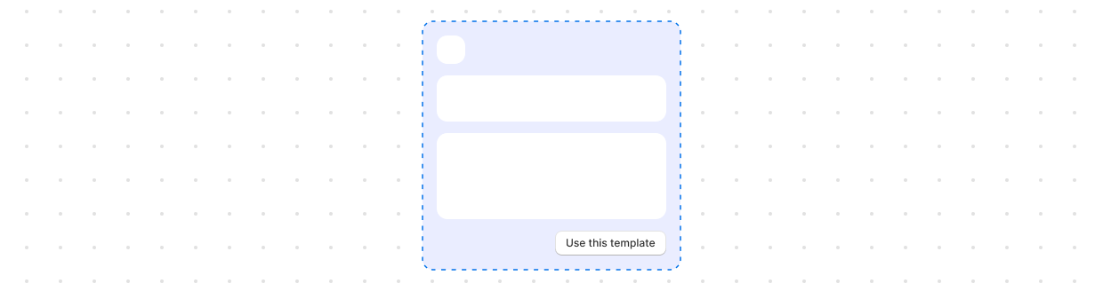
Customer
Configure customer segment templates with conditions and attributes.
Anchor to Typography and contentTypography and content
Typography and content components present textual information with appropriate hierarchy, emphasis, and styling for clear communication.
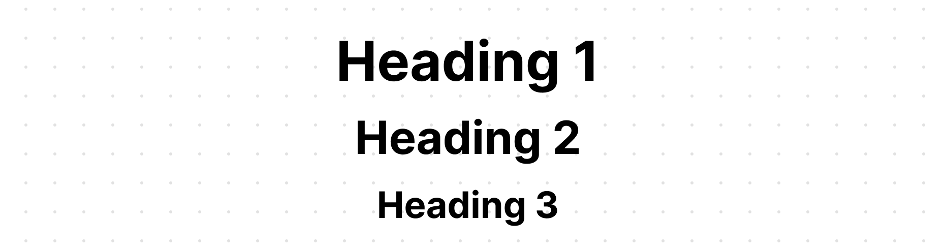
Heading
Render hierarchical titles to communicate the structure and organization of page content.
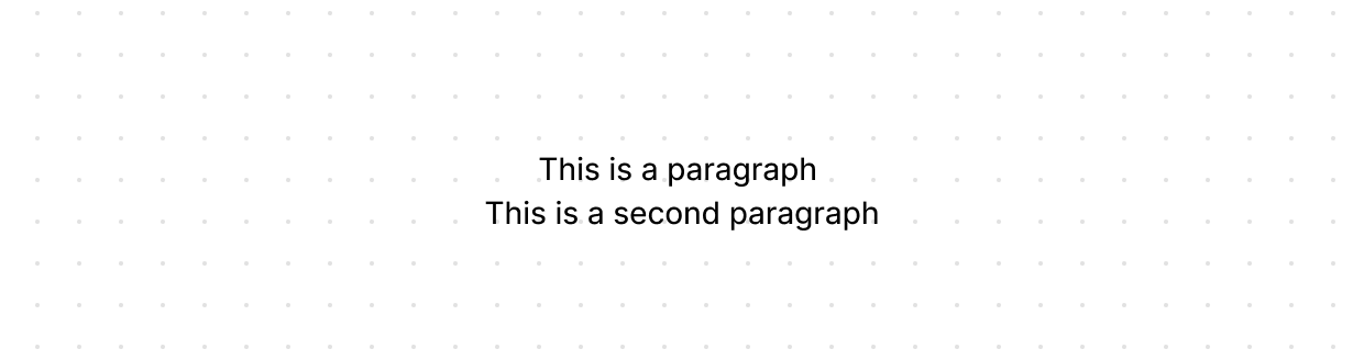
Paragraph
Display blocks of text that can contain inline elements such as buttons, links, or emphasized text.
Text
Display text with specific visual styles or tones.
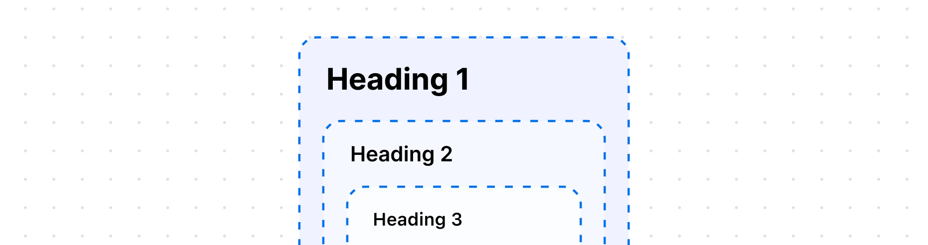
Heading
The HeadingGroup component controls the heading level hierarchy for any Heading components nested inside it.