Version 2025-07 is the last API version to support React-based UI components. Later versions use web components, native UI elements with built-in accessibility, better performance, and consistent styling with Shopify's design system. Check out the upgrade guide to upgrade your extension.
Text
The Text component renders inline text with support for font weight, style, variant, overflow behavior, and accessibility roles. Use it for non-heading, non-paragraph text that needs typographic control, such as labels, metadata, or emphasized words within a sentence.
For block-level text with spacing, use Paragraph. For titles and section headings, use Heading.
Supported targets
- admin.
abandoned-checkout-details. action. render - admin.
abandoned-checkout-details. block. render - admin.
catalog-details. action. render - admin.
catalog-details. block. render - admin.
collection-details. action. render - admin.
collection-details. block. render - admin.
collection-index. action. render - admin.
company-details. action. render - admin.
company-details. block. render - admin.
company-location-details. block. render - admin.
customer-details. action. render - admin.
customer-details. block. render - admin.
customer-index. action. render - admin.
customer-index. selection-action. render - admin.
customer-segment-details. action. render - admin.
discount-details. action. render - admin.
discount-details. function-settings. render - admin.
discount-index. action. render - admin.
draft-order-details. action. render - admin.
draft-order-details. block. render - admin.
draft-order-index. action. render - admin.
draft-order-index. selection-action. render - admin.
gift-card-details. action. render - admin.
gift-card-details. block. render - admin.
order-details. action. render - admin.
order-details. block. render - admin.
order-details. print-action. render - admin.
order-fulfilled-card. action. render - admin.
order-index. action. render - admin.
order-index. selection-action. render - admin.
order-index. selection-print-action. render - admin.
product-details. action. render - admin.
product-details. block. render - admin.
product-details. configuration. render - admin.
product-details. print-action. render - admin.
product-details. reorder. render - admin.
product-index. action. render - admin.
product-index. selection-action. render - admin.
product-index. selection-print-action. render - admin.
product-purchase-option. action. render - admin.
product-variant-details. action. render - admin.
product-variant-details. block. render - admin.
product-variant-details. configuration. render - admin.
product-variant-purchase-option. action. render - admin.
settings. order-routing-rule. render - admin.
settings. validation. render
Supported targets
- admin.
abandoned-checkout-details. action. render - admin.
abandoned-checkout-details. block. render - admin.
catalog-details. action. render - admin.
catalog-details. block. render - admin.
collection-details. action. render - admin.
collection-details. block. render - admin.
collection-index. action. render - admin.
company-details. action. render - admin.
company-details. block. render - admin.
company-location-details. block. render - admin.
customer-details. action. render - admin.
customer-details. block. render - admin.
customer-index. action. render - admin.
customer-index. selection-action. render - admin.
customer-segment-details. action. render - admin.
discount-details. action. render - admin.
discount-details. function-settings. render - admin.
discount-index. action. render - admin.
draft-order-details. action. render - admin.
draft-order-details. block. render - admin.
draft-order-index. action. render - admin.
draft-order-index. selection-action. render - admin.
gift-card-details. action. render - admin.
gift-card-details. block. render - admin.
order-details. action. render - admin.
order-details. block. render - admin.
order-details. print-action. render - admin.
order-fulfilled-card. action. render - admin.
order-index. action. render - admin.
order-index. selection-action. render - admin.
order-index. selection-print-action. render - admin.
product-details. action. render - admin.
product-details. block. render - admin.
product-details. configuration. render - admin.
product-details. print-action. render - admin.
product-details. reorder. render - admin.
product-index. action. render - admin.
product-index. selection-action. render - admin.
product-index. selection-print-action. render - admin.
product-purchase-option. action. render - admin.
product-variant-details. action. render - admin.
product-variant-details. block. render - admin.
product-variant-details. configuration. render - admin.
product-variant-purchase-option. action. render - admin.
settings. order-routing-rule. render - admin.
settings. validation. render
Anchor to Use casesUse cases
- Labels and descriptions: Display descriptive text for form fields or sections.
- Instructions: Provide usage instructions or help text for complex features.
- Status messages: Show status messages, confirmations, or informational text.
- Content display: Present product descriptions, order notes, or customer information.
Anchor to PropertiesProperties
Props for the Text component, an inline element for rendering and styling a run of text. Use Text to apply typographic treatments such as font weight, style, variant, and overflow behavior to a portion of content.
- Anchor to accessibilityRoleaccessibility
Roleaccessibility Role TextAccessibilityRoleTextAccessibilityRole The semantic meaning of the component’s content. When set, the role will be used by assistive technologies to help users navigate the page.
- Anchor to fontStylefont
Stylefont Style FontStyleFontStyle The styling of the font's letter forms.
- Anchor to fontVariantfont
Variantfont Variant FontVariantOptions | FontVariantOptions[]FontVariantOptions | FontVariantOptions[] The font variant options that control the usage of alternate glyphs. You can pass a single value or an array of values to combine multiple variants.
- Anchor to fontWeightfont
Weightfont Weight FontWeightFontWeight The weight (or boldness) of the font. Use heavier weights to create visual emphasis or establish hierarchy in your content.
- Anchor to idididstringstring
A unique identifier for the text element. When not set, a globally unique value is used instead.
- Anchor to textOverflowtext
Overflowtext Overflow TextOverflowTextOverflow The behavior for signaling hidden overflow content to users.
TextAccessibilityRole
Accessibility roles that can be applied to the Text component to convey additional semantic meaning to assistive technologies. Each role maps to a corresponding HTML element or ARIA role in web-based hosts. - `address`: The text is contact information. - `deletion`: The text has been deleted; typically used for discounted prices. - `mark`: The text is marked or highlighted and relevant to the current action. - `emphasis`: The text has emphatic stress compared to surrounding text. - `offset`: The text is offset from normal prose (such as a foreign word or definition). - `strong`: The text indicates strong importance, seriousness, or urgency.
'address' | 'deletion' | 'mark' | 'emphasis' | 'offset' | 'strong'FontStyle
Controls the styling of the font's letter forms. - `italic`: Renders text in an italic typeface, typically used for emphasis. - `normal`: Renders text in the upright, default typeface. Learn more about the [font-style](https://developer.mozilla.org/en-US/docs/Web/CSS/font-style) property.
'italic' | 'normal'FontVariantOptions
Font variant options that control the usage of alternate glyphs. - `numeric`: Enables alternate glyphs for numbers, fractions, and ordinal markers. - `all-small-caps`: Enables alternate glyphs for capital letters using small caps. - `none`: Disables all font-variant ligatures and resets other variants to their initial values. Learn more about the [font-variant](https://developer.mozilla.org/en-US/docs/Web/CSS/font-variant) property.
'numeric' | 'all-small-caps' | 'none'FontWeight
Controls the thickness (weight) of the font. Values range from lightest to heaviest. Some values are convenience aliases. - `light-300`: The lightest available weight. - `light-200`: Lighter than light-100. - `light-100`: Slightly below base weight. - `light`: An alias for `light-100`. - `base`: The default font weight. - `normal`: An alias for `base`. - `bold`: An alias for `bold-100`. - `bold-100`: Slightly above base weight; used for emphasis. - `bold-200`: Heavier than bold-100. - `bold-300`: The heaviest available weight. Learn more about the [font-weight](https://developer.mozilla.org/en-US/docs/Web/CSS/font-weight) property.
'light-300' | 'light-200' | 'light-100' | 'light' | 'base' | 'normal' | 'bold' | 'bold-100' | 'bold-200' | 'bold-300'TextOverflow
Controls how overflowing text content is signaled to the user when it doesn't fit within its container. - `ellipsis`: Truncates the text and displays an ellipsis (`…`) character at the point of truncation.
'ellipsis'Anchor to ExamplesExamples
Anchor to Highlight product pricingHighlight product pricing
Differentiate a current price from a compare-at price with bold and italic styling. This example uses Text with fontWeight for the current price and fontStyle for the compare-at value, showing how props change the visual weight of inline content.
Highlight product pricing
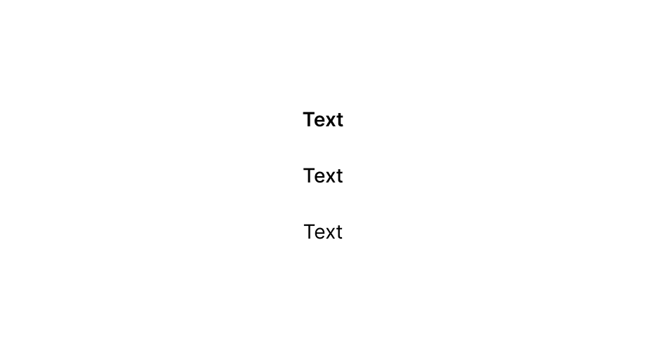
Highlight product pricing
React
import {reactExtension, Text, BlockStack} from '@shopify/ui-extensions-react/admin';

function App() {

  return (
    <BlockStack>
      <Text>Current price: </Text>
      <Text fontWeight="bold">$49.99</Text>
      <Text fontWeight="bold" fontStyle="italic">
        Compare at: $64.99
      </Text>
    </BlockStack>
  );
}

export default reactExtension(
  'admin.product-details.block.render',
  () => <App />,
);
TS
import {extension, Text, BlockStack} from '@shopify/ui-extensions/admin';

export default extension(
  'admin.product-details.block.render',
  (root) => {
    const stack = root.createComponent(BlockStack);

    const label = root.createComponent(
      Text,
      {},
      'Current price: ',
    );

    const price = root.createComponent(
      Text,
      {fontWeight: 'bold'},
      '$49.99',
    );

    const compare = root.createComponent(
      Text,
      {fontWeight: 'bold', fontStyle: 'italic'},
      'Compare at: $64.99',
    );

    stack.appendChild(label);
    stack.appendChild(price);
    stack.appendChild(compare);
    root.appendChild(stack);
  },
);
Anchor to Emphasize text for screen readersEmphasize text for screen readers
Communicate product status warnings with proper screen reader semantics using fontStyle and accessibilityRole. This example marks a draft status notice with emphasis and an action-required message with strong, so assistive technology conveys the visual urgency correctly.
Emphasize text for screen readers
React
import {reactExtension, Text, BlockStack} from '@shopify/ui-extensions-react/admin';

function App() {

  return (
    <BlockStack>
      <Text fontStyle="italic" accessibilityRole="emphasis">
        This product is currently in draft status and not visible to customers.
      </Text>
      <Text fontWeight="bold" accessibilityRole="strong">
        Action required: Complete all required fields before publishing.
      </Text>
    </BlockStack>
  );
}

export default reactExtension(
  'admin.product-details.block.render',
  () => <App />,
);
TS
import {extension, Text, BlockStack} from '@shopify/ui-extensions/admin';

export default extension(
  'admin.product-details.block.render',
  (root) => {

    const stack = root.createComponent(BlockStack);

    const status = root.createComponent(
      Text,
      {
        fontStyle: 'italic',
        accessibilityRole: 'emphasis',
      },
      'This product is currently in draft status and not visible to customers.',
    );

    const note = root.createComponent(
      Text,
      {
        fontWeight: 'bold',
        accessibilityRole: 'strong',
      },
      'Action required: Complete all required fields before publishing.',
    );

    stack.appendChild(status);
    stack.appendChild(note);
    root.appendChild(stack);
  },
);
Anchor to Truncate long descriptionsTruncate long descriptions
Prevent long product descriptions from breaking your layout using textOverflow="ellipsis". This example truncates content that exceeds its container width, keeping the block extension UI compact while still displaying the beginning of the text.
Truncate long descriptions
React
import {reactExtension, Text, BlockStack} from '@shopify/ui-extensions-react/admin';

function App() {

  return (
    <BlockStack>
      <Text fontWeight="bold">Product description</Text>
      <Text textOverflow="ellipsis">
        This premium organic cotton t-shirt features a relaxed fit with
        reinforced stitching, available in twelve colors with custom embroidery
        options for wholesale orders.
      </Text>
    </BlockStack>
  );
}

export default reactExtension(
  'admin.product-details.block.render',
  () => <App />,
);
TS
import {extension, Text, BlockStack} from '@shopify/ui-extensions/admin';

export default extension(
  'admin.product-details.block.render',
  (root) => {

    const stack = root.createComponent(BlockStack);

    const label = root.createComponent(
      Text,
      {fontWeight: 'bold'},
      'Product description',
    );

    const description = root.createComponent(
      Text,
      {textOverflow: 'ellipsis'},
      'This premium organic cotton t-shirt features a relaxed fit with reinforced stitching, available in twelve colors with custom embroidery options for wholesale orders.',
    );

    stack.appendChild(label);
    stack.appendChild(description);
    root.appendChild(stack);
  },
);
Anchor to Best practicesBest practices
- Use bold sparingly: Apply
fontWeightto emphasize key words or values within a sentence, not entire paragraphs. Overusing bold dilutes its impact and makes content harder to scan. - Use Paragraph for block-level text: Text renders inline by default. For block-level content with appropriate spacing between blocks, use the Paragraph component instead.
Anchor to LimitationsLimitations
- Text renders inline and flows with surrounding content. It doesn't add vertical spacing or block-level behavior. For block-level text with built-in spacing, use the Paragraph component.
- The
textOverflowprop only takes effect when the parent container constrains the available width. Without a width constraint, text will wrap rather than truncate. - Text doesn't support color or tone props. To communicate status through color, use the Badge component instead.