Press button
The press button component lets buyers toggle between active and inactive states. Use press button for persistent on/off or selected/unselected choices.
Press buttons provide visual feedback for pressed and unpressed states. For binary controls that take effect immediately without a save action, use switch instead.
Press button supports only a binary toggle state (pressed or unpressed). Multi-state or tri-state toggles aren't supported.
Supported targets
- purchase.
checkout. actions. render-before - purchase.
checkout. block. render - purchase.
checkout. cart-line-item. render-after - purchase.
checkout. cart-line-list. render-after - purchase.
checkout. contact. render-after - purchase.
checkout. delivery-address. render-after - purchase.
checkout. delivery-address. render-before - purchase.
checkout. footer. render-after - purchase.
checkout. header. render-after - purchase.
checkout. payment-method-list. render-after - purchase.
checkout. payment-method-list. render-before - purchase.
checkout. pickup-location-list. render-after - purchase.
checkout. pickup-location-list. render-before - purchase.
checkout. pickup-location-option-item. render-after - purchase.
checkout. pickup-point-list. render-after - purchase.
checkout. pickup-point-list. render-before - purchase.
checkout. reductions. render-after - purchase.
checkout. reductions. render-before - purchase.
checkout. shipping-option-item. details. render - purchase.
checkout. shipping-option-item. render-after - purchase.
checkout. shipping-option-list. render-after - purchase.
checkout. shipping-option-list. render-before - purchase.
thank-you. announcement. render - purchase.
thank-you. block. render - purchase.
thank-you. cart-line-item. render-after - purchase.
thank-you. cart-line-list. render-after - purchase.
thank-you. customer-information. render-after - purchase.
thank-you. footer. render-after - purchase.
thank-you. header. render-after
Supported targets
- purchase.
checkout. actions. render-before - purchase.
checkout. block. render - purchase.
checkout. cart-line-item. render-after - purchase.
checkout. cart-line-list. render-after - purchase.
checkout. contact. render-after - purchase.
checkout. delivery-address. render-after - purchase.
checkout. delivery-address. render-before - purchase.
checkout. footer. render-after - purchase.
checkout. header. render-after - purchase.
checkout. payment-method-list. render-after - purchase.
checkout. payment-method-list. render-before - purchase.
checkout. pickup-location-list. render-after - purchase.
checkout. pickup-location-list. render-before - purchase.
checkout. pickup-location-option-item. render-after - purchase.
checkout. pickup-point-list. render-after - purchase.
checkout. pickup-point-list. render-before - purchase.
checkout. reductions. render-after - purchase.
checkout. reductions. render-before - purchase.
checkout. shipping-option-item. details. render - purchase.
checkout. shipping-option-item. render-after - purchase.
checkout. shipping-option-list. render-after - purchase.
checkout. shipping-option-list. render-before - purchase.
thank-you. announcement. render - purchase.
thank-you. block. render - purchase.
thank-you. cart-line-item. render-after - purchase.
thank-you. cart-line-list. render-after - purchase.
thank-you. customer-information. render-after - purchase.
thank-you. footer. render-after - purchase.
thank-you. header. render-after
Anchor to Use casesUse cases
- Add-on selections: Let buyers opt in to extras like gift wrapping, shipping insurance, or express delivery.
- Preference toggles: Allow buyers to toggle preferences such as marketing opt-in or paperless receipts.
- Feature toggles: Enable or disable optional features like order notes or delivery instructions.
- Default selections: Pre-select recommended options using
defaultPressedso buyers start with a suggested choice.
Anchor to PropertiesProperties
Configure the following properties on the press button component.
- stringstring
A label that describes the purpose or content of the button for users of assistive technologies such as screen readers. Use this when the visible content alone doesn't provide enough context.
- booleanbooleanDefault: falseDefault: false
Whether the button is pressed by default.
- booleanbooleanDefault: falseDefault: false
Whether the button is disabled, preventing it from being clicked or receiving focus.
- stringstring
A unique identifier for the element. Use this to reference the element in JavaScript, link labels to form controls, or target specific elements for styling or scripting.
- 'auto' | 'fill' | 'fit-content''auto' | 'fill' | 'fit-content'Default: 'auto'Default: 'auto'
The inline width of the button component.
auto: The size depends on the surface and context.fill: The button takes up 100% of the available inline size.fit-content: The button takes up the minimum inline-size required to fit its content.
- stringstring
The language of the button's text content. Use this when the button text is in a different language than the rest of the page, so assistive technologies can invoke the correct pronunciation. Reference of values (
Subtaglabel)- booleanbooleanDefault: falseDefault: false
Whether the button is in a loading state, which replaces the button content with a loading indicator while a background action is being performed.
This also disables the button.
- booleanbooleanDefault: falseDefault: false
Whether the button is pressed.
Anchor to EventsEvents
The press button component provides event callbacks for handling user interactions. Learn more about handling events.
- CallbackEventListener<typeof tagName>CallbackEventListener<typeof tagName>
A callback fired when the button loses focus.
Learn more about the blur event.
- CallbackEventListener<typeof tagName>CallbackEventListener<typeof tagName>
A callback fired when the button is clicked.
Learn more about the click event.
- CallbackEventListener<typeof tagName>CallbackEventListener<typeof tagName>
A callback fired when the button receives focus.
Learn more about the focus event.
CallbackEventListener
A typed event listener for custom element events. The listener receives a `CallbackEvent` with the correct `currentTarget` type for the associated custom element tag.
(EventListener & {
    (event: CallbackEvent<TTagName, Event> & TData): void;
}) | null
CallbackEvent
An event type that narrows the `currentTarget` to the specific HTML element associated with the custom element tag. This provides type-safe event handling in callback listeners.
TEvent & {
    currentTarget: HTMLElementTagNameMap[TTagName];
}
Anchor to ExamplesExamples
Anchor to Toggle optional selectionsToggle optional selections
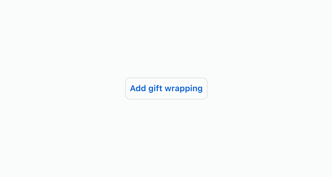
Let buyers opt in to add-ons with a toggle button. This example shows an s-press-button element for gift wrapping.Toggle optional selections
html
Anchor to Pre-select an optionPre-select an option
Start an option in its selected state on first load. This example uses an s-press-button with the pressed attribute for a pre-selected option that the buyer can toggle off.html
Show a toggle in a non-interactive state when the option isn't available for the current order. This example displays an
s-press-button with the disabled attribute for an unavailable shipping method.html
Anchor to Best practicesBest practices
- Write clear toggle labels: Use text that describes the option being toggled, such as "Add gift wrapping" rather than "Toggle" or "On/Off."
- Pre-select recommended options: Use
defaultPressedwhen an option is commonly chosen, so buyers start with the recommended selection. - Disable rather than hide: When an option is temporarily unavailable, use the
disabledattribute to keep it visible and set expectations. - Use for binary choices only: Press button represents on/off states. For multi-option selections, use choice list instead.