Divider
The divider component creates clear visual separation between elements in the interface. Use divider to separate distinct content groups in forms, settings panels, lists, or page sections, helping buyers scan and understand content organization.
Dividers support both horizontal and vertical orientations. For more structured content grouping with headings, use section.
Dividers are purely decorative — they don't carry semantic meaning and aren't announced by assistive technologies. For accessible content regions, use section.
Supported targets
- purchase.
checkout. actions. render-before - purchase.
checkout. block. render - purchase.
checkout. cart-line-item. render-after - purchase.
checkout. cart-line-list. render-after - purchase.
checkout. contact. render-after - purchase.
checkout. delivery-address. render-after - purchase.
checkout. delivery-address. render-before - purchase.
checkout. footer. render-after - purchase.
checkout. header. render-after - purchase.
checkout. payment-method-list. render-after - purchase.
checkout. payment-method-list. render-before - purchase.
checkout. pickup-location-list. render-after - purchase.
checkout. pickup-location-list. render-before - purchase.
checkout. pickup-location-option-item. render-after - purchase.
checkout. pickup-point-list. render-after - purchase.
checkout. pickup-point-list. render-before - purchase.
checkout. reductions. render-after - purchase.
checkout. reductions. render-before - purchase.
checkout. shipping-option-item. details. render - purchase.
checkout. shipping-option-item. render-after - purchase.
checkout. shipping-option-list. render-after - purchase.
checkout. shipping-option-list. render-before - purchase.
thank-you. announcement. render - purchase.
thank-you. block. render - purchase.
thank-you. cart-line-item. render-after - purchase.
thank-you. cart-line-list. render-after - purchase.
thank-you. customer-information. render-after - purchase.
thank-you. footer. render-after - purchase.
thank-you. header. render-after
Anchor to PropertiesProperties
Configure the following properties on the divider component.
- Anchor to directiondirectiondirection'inline' | 'block''inline' | 'block'Default: 'inline'Default: 'inline'
The orientation of the divider, using logical properties.
inline: A horizontal divider that separates content stacked vertically.block: A vertical divider that separates content arranged horizontally. Requires a parent with a defined height to render visibly.
- Anchor to idididstringstring
A unique identifier for the element. Use this to reference the element in JavaScript, link labels to form controls, or target specific elements for styling or scripting.
Anchor to ExamplesExamples
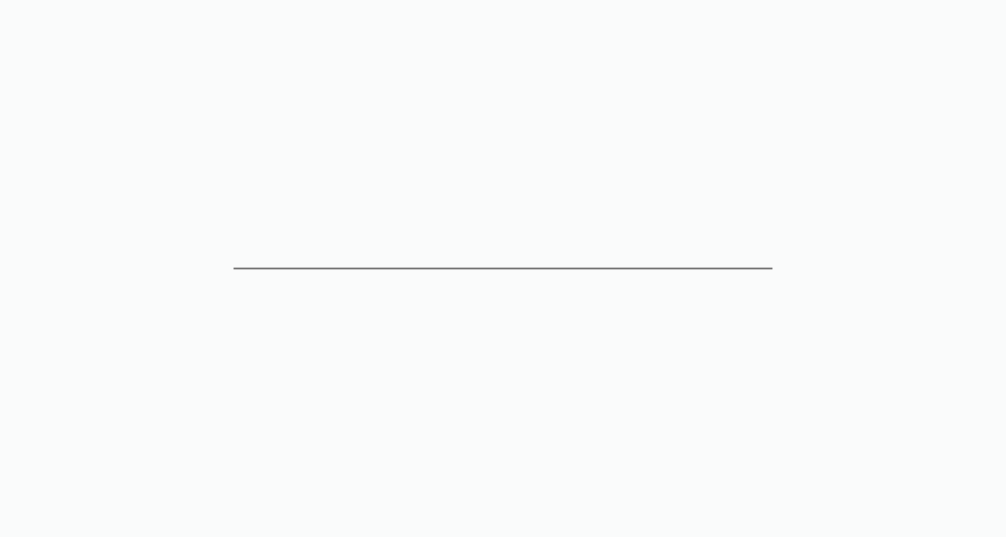
Anchor to Insert a default horizontal dividerInsert a default horizontal divider
Insert a horizontal rule between content groups. This example places a default s-divider between a section label and its supporting text.
Insert a default horizontal divider
html
Anchor to Separate inline content with a vertical dividerSeparate inline content with a vertical divider
Draw a vertical rule between side-by-side items. This example places direction="block" on s-divider inside an inline stack to separate subtotal and tax labels.
html
Anchor to Add a horizontal divider between inline itemsAdd a horizontal divider between inline items
Add a horizontal rule between side-by-side items. This example places direction="inline" on s-divider between two text elements inside an inline stack.
html
Anchor to Best practicesBest practices
- Use dividers sparingly: Too many dividers can make a page feel cluttered. Rely on spacing and grouping first, and add dividers only where content boundaries aren't clear from layout alone.
- Match direction to layout axis: Use
direction="block"in vertical stacks anddirection="inline"in horizontal rows. - Prefer sections for labeled groups: If the content groups have headings, use section instead of raw dividers for better semantics and accessibility.