Payment icon
The payment icon component renders recognized payment brand marks for checkout. Use payment icons to show accepted methods, saved cards, and regional payment options.
Payment icons support the type property for major brands and accessibilityLabel for screen readers. For symbolic UI cues that aren't payment brands, use icon instead.
Supported targets
- purchase.
checkout. actions. render-before - purchase.
checkout. block. render - purchase.
checkout. cart-line-item. render-after - purchase.
checkout. cart-line-list. render-after - purchase.
checkout. contact. render-after - purchase.
checkout. delivery-address. render-after - purchase.
checkout. delivery-address. render-before - purchase.
checkout. footer. render-after - purchase.
checkout. header. render-after - purchase.
checkout. payment-method-list. render-after - purchase.
checkout. payment-method-list. render-before - purchase.
checkout. pickup-location-list. render-after - purchase.
checkout. pickup-location-list. render-before - purchase.
checkout. pickup-location-option-item. render-after - purchase.
checkout. pickup-point-list. render-after - purchase.
checkout. pickup-point-list. render-before - purchase.
checkout. reductions. render-after - purchase.
checkout. reductions. render-before - purchase.
checkout. shipping-option-item. details. render - purchase.
checkout. shipping-option-item. render-after - purchase.
checkout. shipping-option-list. render-after - purchase.
checkout. shipping-option-list. render-before - purchase.
thank-you. announcement. render - purchase.
thank-you. block. render - purchase.
thank-you. cart-line-item. render-after - purchase.
thank-you. cart-line-list. render-after - purchase.
thank-you. customer-information. render-after - purchase.
thank-you. footer. render-after - purchase.
thank-you. header. render-after
Supported targets
- purchase.
checkout. actions. render-before - purchase.
checkout. block. render - purchase.
checkout. cart-line-item. render-after - purchase.
checkout. cart-line-list. render-after - purchase.
checkout. contact. render-after - purchase.
checkout. delivery-address. render-after - purchase.
checkout. delivery-address. render-before - purchase.
checkout. footer. render-after - purchase.
checkout. header. render-after - purchase.
checkout. payment-method-list. render-after - purchase.
checkout. payment-method-list. render-before - purchase.
checkout. pickup-location-list. render-after - purchase.
checkout. pickup-location-list. render-before - purchase.
checkout. pickup-location-option-item. render-after - purchase.
checkout. pickup-point-list. render-after - purchase.
checkout. pickup-point-list. render-before - purchase.
checkout. reductions. render-after - purchase.
checkout. reductions. render-before - purchase.
checkout. shipping-option-item. details. render - purchase.
checkout. shipping-option-item. render-after - purchase.
checkout. shipping-option-list. render-after - purchase.
checkout. shipping-option-list. render-before - purchase.
thank-you. announcement. render - purchase.
thank-you. block. render - purchase.
thank-you. cart-line-item. render-after - purchase.
thank-you. cart-line-list. render-after - purchase.
thank-you. customer-information. render-after - purchase.
thank-you. footer. render-after - purchase.
thank-you. header. render-after
Anchor to Use casesUse cases
- Accepted methods: Display a row of accepted payment method icons to build trust and set buyer expectations.
- Saved cards: Show the icon for a buyer's saved payment method alongside the last four digits.
- Regional methods: Render localized payment icons like iDEAL or Bancontact with custom accessibility labels for international buyers.
- Checkout summary: List the payment methods used for an order in the order confirmation section.
Anchor to PropertiesProperties
Configure the following properties on the payment icon component.
- Anchor to accessibilityLabelaccessibility
Labelaccessibility Label stringstring A label that describes the payment icon for accessibility. When set, it will be announced to users using assistive technologies such as screen readers, providing context about which payment method the icon represents.
- Anchor to idididstringstring
A unique identifier for the element. Use this to reference the element in JavaScript, link labels to form controls, or target specific elements for styling or scripting.
- Anchor to typetypetypePaymentIconName | AnyStringPaymentIconName | AnyStringDefault: ''Default: ''
The payment method to display. Specify a payment method name from the available set (for example,
'visa','mastercard', or'paypal'), or use an empty string to show no icon.
PaymentIconName
"abn" | "acima-leasing" | "acuotaz" | "ada" | "addi" | "adyen" | "aeropay" | "affin-bank" | "affirm" | "aftee" | "afterpay-paynl-version" | "afterpay" | "airtel-money" | "airteltigo-mobile-money" | "aktia" | "akulaku-paylater" | "akulaku" | "alandsbanken" | "alfamart" | "alfamidi" | "alipay-hk" | "alipay-paynl-version" | "alipay" | "alliance-bank" | "alma" | "aman" | "amazon" | "ambank" | "american-express" | "amex" | "ansa-stored-value" | "ansa" | "anyday" | "apecoin" | "aplazo" | "apple-pay" | "aqsat" | "arbitrum" | "arhaus" | "arvato" | "ashley-plcc" | "ask" | "astrapay" | "atm-bersama" | "atobaraidotcom" | "atome" | "atone" | "atrato" | "au-kantan-kessai" | "au-pay" | "authorize-net" | "avalanche" | "axs" | "bancnet" | "banco-azteca" | "bancomat" | "bancontact" | "bangkok-bank" | "bank-islam" | "bank-muamalat" | "bank-rakyat" | "barclays" | "base" | "bbva-cie" | "bc-card" | "bca-klikpay" | "bca" | "bdo" | "belfius" | "benefit" | "best-buy-card" | "biercheque-paynl-version" | "bigc" | "billease" | "biller-paynl-version" | "billie" | "billink-method" | "billink" | "bitcoin-cash" | "bitcoin" | "bizum" | "blik" | "bnbchain" | "bni" | "bnp" | "bogus-app-coin" | "bogus" | "boleto" | "boodil" | "boost" | "bpi" | "braintree" | "bread-pay" | "bread" | "bri-direct-debit" | "bri" | "brimo" | "bsi" | "bsn" | "bss" | "busd" | "careem-pay" | "cartes-bancaires" | "cash-app-pay" | "cash" | "cashew" | "cashinvoice-latin-america" | "catch-payments" | "cebuana" | "cembrapay" | "centi" | "cetelem" | "checkout-finance" | "chinabank" | "cimb-clicks" | "cimb" | "circle-k" | "citadele" | "citi-pay" | "clave-telered" | "clearpay" | "clerq" | "cleverpay" | "clip" | "cliq" | "codensa" | "coinsph" | "collector-bank" | "coop" | "coppel-pay" | "credit-agricole" | "credit-key" | "creditclick-paynl-version" | "credix" | "cuotas" | "d-barai" | "dai" | "daily-yamazaki" | "dan-dan" | "dana" | "danamon-online" | "dankort" | "danske-bank" | "dappmx" | "dash" | "daviplata" | "de-cadeaukaart" | "depay" | "deutsche-bank" | "dinacard" | "diners-club" | "direct-bank-transfer-latin-america" | "directa24" | "directpay" | "discover" | "divido" | "dnb" | "docomo-barai" | "dogecoin" | "dropp" | "duitnow" | "duologi" | "dwolla" | "easywallet" | "ebucks" | "echelon-financing" | "ecpay" | "edenred" | "efecty" | "eft-secure" | "eftpos-au" | "eghl" | "elo" | "elv" | "empty" | "enets" | "eos" | "epayments" | "epospay" | "eps" | "erste" | "escrowcom" | "esr-paymentslip-switzerland" | "ethereum" | "etihad-guest-pay" | "etika" | "ewallet-indonesia" | "ewallet-philippines" | "ewallet-southkorea" | "facebook-pay" | "fairstone-payments" | "fam" | "familymart" | "fantom" | "farmlands" | "fashion-giftcard-paynlversion" | "fashioncheque" | "favepay" | "fawry" | "finloup" | "fintecture" | "fintoc" | "flexiti" | "float-payments" | "flying-blue-plus" | "forbrugsforeningen" | "forsa" | "fortiva" | "fps" | "fpx" | "freecharge" | "freedompay" | "futurepay-mytab" | "gcash" | "generalfinancing" | "generic" | "genoapay" | "gezondheidsbon-paynl-version" | "giftcard" | "giropay" | "givacard" | "glbe-paypal" | "glbe-plus" | "gmo-atokara" | "gmo-bank-transfer" | "gmo-postpay" | "gmo-virtualaccount" | "gnosis" | "google-pay" | "google-wallet" | "gopay" | "grabpay" | "grailpay" | "gusd" | "hana-card" | "handelsbanken" | "happy-pay" | "hello-clever" | "heylight" | "hitrustpay-transfer" | "home-credit" | "hong-leong-bank" | "hong-leong-connect" | "hsbc" | "huis-tuin-cadeau" | "humm" | "hyper" | "hypercard" | "hypercash" | "hyundai-card" | "ibexpay" | "ideal" | "in3-via-ideal" | "in3" | "inbank" | "indomaret" | "ing-homepay" | "interac" | "ivy" | "iwocapay-pay-later" | "jcb" | "jenius" | "jko" | "jousto" | "kakao-pay" | "kakebaraidotcom" | "kasikornbank" | "kasssh" | "katapult" | "kb-card" | "kbc-cbc" | "kcp-credit-card" | "kfast" | "khqr" | "klarna-pay-later" | "klarna-pay-now" | "klarna-slice-it" | "klarna" | "knaken-settle" | "knet" | "koalafi" | "koin" | "krediidipank" | "kredivo" | "krungsri" | "krungthai-bank" | "kueski-pay" | "kunst-en-cultuur-cadeaukaart" | "kuwait-finance-house" | "land-bank" | "laser" | "latitude-creditline-au" | "latitude-gem-au" | "latitude-gem-nz" | "latitude-go-au" | "latitudepay" | "lawson" | "laybuy-heart" | "laybuy" | "lbc" | "lhv" | "line-pay" | "linkaja" | "linkpay" | "litecoin" | "lku" | "lloyds" | "lotte-card" | "lpb" | "luminor" | "lunch-check" | "lydia" | "mach" | "mada" | "maestro" | "mandiri" | "mash" | "master" | "mastercard" | "masterpass" | "maxima" | "maya-bank" | "maya" | "maybank-qrpay" | "maybank" | "maybankm2u" | "mb-way" | "mb" | "mcash" | "medicinos-bankas" | "meeza" | "mercado-credito" | "mercado-pago" | "merpay" | "meta-pay" | "metro-bank" | "military-starcard" | "minicuotas" | "ministop" | "mobicred" | "mobikwik" | "mobilepay" | "mode" | "mokka" | "momopay" | "mondido" | "monero" | "monzo" | "mpesa" | "mtn-mobile-money" | "multisafepay" | "mybank" | "myfatoorah" | "n26" | "naps" | "nationale-bioscoopbon" | "nationale-entertainmentcard" | "natwest" | "naver-pay" | "nelo" | "nequi" | "netbanking" | "neteller" | "nh-card" | "nordea" | "notyd" | "novuna" | "npatobarai" | "npkakebarai" | "oca" | "ocbc-bank" | "octo-clicks" | "octopus" | "offline-bank-transfer-latin-america" | "ola-money" | "omannet" | "omasp" | "oney" | "online-banking" | "online-banktransfer" | "op" | "opay" | "openpay" | "optimism" | "orange-mobile-money" | "overstock-citicobrand" | "overstock-citiplcc" | "ovo" | "oxxo" | "ozow" | "pagoefectivo" | "paid" | "paidy" | "palawa" | "palawan" | "pastpay" | "pay-after-delivery-instalments" | "pay-by-bank-us" | "pay-by-bank" | "pay-easy" | "pay-pay" | "paybylink" | "paycash" | "payco" | "payconiq" | "payd" | "payfast-instant-eft" | "payflex" | "payid" | "payitmonthly" | "payjustnow" | "paymark-online-eftpos" | "paymaya" | "payme" | "paynow-mbank" | "paynow" | "payoo-qr" | "payoo" | "paypal" | "payplan" | "paypo" | "payrexx-bank-transfer" | "payright" | "paysafecard-paynl-version" | "paysafecard" | "paysafecash" | "paysera" | "paysquad" | "paytm" | "payto" | "paytomorrow" | "payu" | "payzapp" | "pei" | "perlasfinance" | "permata" | "pf-pay" | "pivo" | "pix" | "podium-cadeaukaart" | "pointspay" | "poli" | "polygon" | "poppankki" | "postfinance-card" | "postfinance-efinance" | "postpay" | "powered-by-ansa-stored-value" | "powered-by-ansa" | "powerpay" | "pps" | "prepaysolutions" | "progressive-leasing" | "przelew24" | "przelewy24-paynl-version" | "przelewy24" | "pse" | "public-bank" | "publicbank-pbe" | "qasitli" | "qliro" | "qr-promptpay" | "qris" | "qrph" | "rabbit-line-pay" | "rabobank" | "rakuten-pay" | "rapid-transfer" | "ratepay" | "raty-pekao" | "rcbc" | "rcs" | "reka" | "resolve-pay" | "revolut" | "rhb-bank" | "rhb-now" | "rietumu" | "riverty-paynl-version" | "riverty" | "rupay" | "saastopankki" | "sadad" | "sam" | "samsung-card" | "samsung-pay" | "santander" | "satisfi" | "satispay" | "sbpl" | "scalapay" | "scream-truck-wallet" | "scream-truck" | "seb" | "seicomart" | "sepa-bank-transfer" | "sepa-direct-debit" | "sequra" | "seven-eleven" | "sezzle" | "shib" | "shinhan-card" | "shop-pay" | "shopeepay" | "shopify-pay" | "siam-commercial" | "siauliu-bankas" | "siirto" | "sika-fsa" | "sika-hsa" | "sika" | "simpl" | "simple-pay" | "sinpe-movil" | "sistecredito" | "skeps" | "skrill-digital-wallet" | "slice-fnbo" | "smartpay" | "snap-checkout" | "snapmint" | "societe-generale" | "sofort" | "softbank" | "solana-pay-helio" | "solana-pay" | "solana" | "souhoola" | "spankki" | "sparkasse" | "spei" | "splitit" | "spotii" | "spraypay" | "standard-chartered" | "stc-pay" | "stoov" | "store-credit" | "stripe" | "sunkus" | "super-payments" | "svea-b2b-faktura" | "svea-b2b-invoice" | "svea-checkout" | "svea-credit-account" | "svea-delbetalning" | "svea-faktura" | "svea-invoice" | "svea-lasku" | "svea-ostukonto" | "svea-part-payment" | "svea-yrityslasku" | "sveaeramaksu" | "swedbank" | "swiftpay" | "swish" | "swissbilling" | "sympl" | "synchrony-pay" | "synchrony" | "tabby" | "tabit" | "taly" | "tamara" | "tandympayment" | "tasa-cero" | "tbi-bank" | "tcf" | "tendopay" | "tensile" | "tesco-lotus" | "thanachart-bank" | "timepayment" | "tiptop" | "todopay" | "toss" | "touch-n-go" | "tpay" | "trevipay" | "truelayer" | "truemoney-pay" | "trustly" | "twig-pay" | "twint" | "twoinvoice" | "uae-visa" | "uangme" | "ubp" | "underpay" | "unionpay" | "unipay" | "uob-ez-pay" | "uob-thai" | "uob" | "upi" | "urbo" | "urpay" | "usdc" | "usdp" | "v-pay" | "valu" | "venmo" | "ventipay" | "venus-plcc" | "viabill" | "vipps" | "visa-electron" | "visa" | "volksbank" | "volt" | "vvv-cadeaukaart-paynl-version" | "vvv-giftcard" | "waave-pay-by-bank" | "wallet" | "walley" | "wbtc" | "webshop-giftcard" | "wechat-pay" | "wechat-paynl-version" | "wegetfinancing" | "whish-checkout" | "whish-pay" | "wise" | "wissel" | "world-chain" | "xrp" | "yape" | "yappy" | "ymobile" | "younited-pay" | "zalopay" | "zapper" | "zingala" | "zinia" | "zip" | "zoodpay" | "zulily-credit-card" | "zustaina"AnyString
Prevents widening string literal types in a union to `string`.
string & {}Anchor to ExamplesExamples
Anchor to List accepted payment method logosList accepted payment method logos
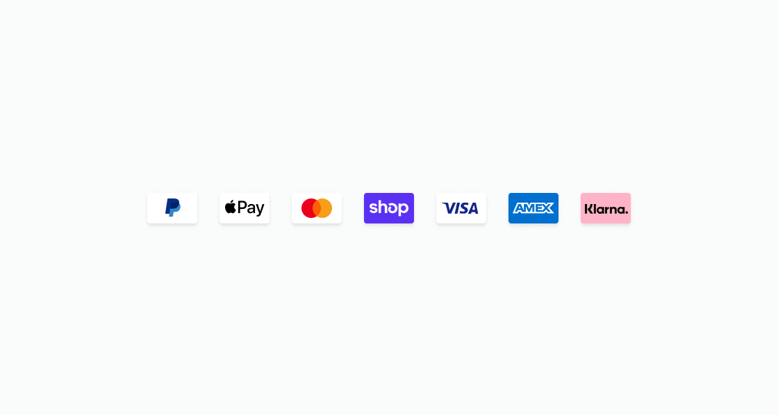
List recognized payment method logos in one row. This example renders s-payment-icon elements for PayPal, Apple Pay, Mastercard, Shop Pay, Visa, Amex, and Klarna using the type property.List accepted payment method logos
html
Anchor to Label payment icons for screen readersLabel payment icons for screen readers
Provide custom accessible names for payment method icons. This example uses accessibilityLabel to supply localized or descriptive names for screen readers when the default icon label isn't sufficient.html
Anchor to Show a compact row of card brand iconsShow a compact row of card brand icons
List card brand icons in a tight horizontal layout. This example configures an s-stack with direction="inline" and gap="small-400" to render Visa, Mastercard, Amex, and Shop Pay icons side by side.html
Anchor to Best practicesBest practices
- Add accessibility labels: Use the
accessibilityLabelproperty so screen readers can announce icons correctly. Keep the text brief and avoid repeating surrounding copy. - Group icons in a row: Use
s-stackwithdirection=”inline”for a clean horizontal layout of multiple payment icons and limit the row to 6-8 icons to avoid an overwhelming layout.