Profile page (default)
Profile page (default) extensions render on the Profile page in customer accounts. These targets are available for all customers (non-B2B) and help customers manage their account and see updates that matter to them.
To build extensions that render for B2B customers on the Profile page, see Profile page (B2B) targets.
To build extensions that render for B2B customers on the Profile page, see Profile page (B2B) targets.
Anchor to Use casesUse cases
- Custom profile fields: Collect additional information from customers using customer metafields, such as birthday, size preferences, or communication preferences.
- Address management: Display supplementary address information or validation notices alongside the customer's saved addresses.
- Announcements: Show dismissible announcements at the top of the Profile page, such as promotional offers, surveys, or account update reminders.
- Custom profile content: Add app-specific content blocks to the Profile page, such as loyalty programs, subscription preferences, or account-specific tools.
- Customer engagement: Surface contextual messages or calls-to-action to encourage customers to update their profile or engage with your app.
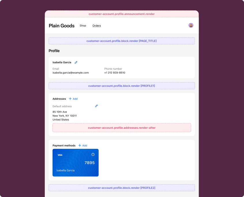
Anchor to Profile page (default) targetsProfile page (default) targets
Profile page (default) targets render on the Profile page for all customers. They're useful for adding address-related content, announcements, and custom content blocks.
Anchor to Profile addresses (render after) ,[object Object]Profile addresses (render after) target
customer-account.profile.addresses.render-after
Renders after the addresses section on the Profile page. This target does not show to B2B customers.
Use this target to display supplementary address information, such as address validation notices or delivery preferences. This target gives you access to the Authenticated Account API.
Supported components
- Abbreviation
- Announcement
- Avatar
- Badge
- Banner
- Box
- Button
- Button group
- Checkbox
- Chip
- Choice list
- Clickable
- Clickable chip
- Clipboard item
- Customer account action
- Date field
- Date picker
- Details
- Divider
- Drop zone
- Email field
- Form
- Grid
- Heading
- Icon
- Image
- Image group
- Link
- Map
- Menu
- Modal
- Money field
- Number field
- Ordered list
- Page
- Paragraph
- Password field
- Payment icon
- Phone field
- Popover
- Press button
- Product thumbnail
- Progress
- Qr code
- Query container
- Scroll box
- Section
- Select
- Sheet
- Skeleton paragraph
- Spinner
- Stack
- Switch
- Text
- Text area
- Text field
- Time
- Tooltip
- Unordered list
- Url field
Supported components
- Abbreviation
- Announcement
- Avatar
- Badge
- Banner
- Box
- Button
- Button group
- Checkbox
- Chip
- Choice list
- Clickable
- Clickable chip
- Clipboard item
- Customer account action
- Date field
- Date picker
- Details
- Divider
- Drop zone
- Email field
- Form
- Grid
- Heading
- Icon
- Image
- Image group
- Link
- Map
- Menu
- Modal
- Money field
- Number field
- Ordered list
- Page
- Paragraph
- Password field
- Payment icon
- Phone field
- Popover
- Press button
- Product thumbnail
- Progress
- Qr code
- Query container
- Scroll box
- Section
- Select
- Sheet
- Skeleton paragraph
- Spinner
- Stack
- Switch
- Text
- Text area
- Text field
- Time
- Tooltip
- Unordered list
- Url field
jsx
Examples
Display an address validation notice
Description
Show a banner after the addresses section informing customers about address validation. This example reads the customer ID from `shopify.authenticatedAccount` for context.
jsx
import '@shopify/ui-extensions/preact';
import {render} from 'preact';

export default async () => {
  render(<Extension />, document.body);
};

function Extension() {
  return (
    <s-banner tone="info">
      We verify all shipping addresses to ensure accurate delivery. If your
      address can't be verified, you may be contacted to confirm details.
    </s-banner>
  );
}
Show delivery preferences
Description
Display delivery preference options after the addresses section. This example provides a way for customers to set delivery instructions for their saved addresses.
jsx
import '@shopify/ui-extensions/preact';
import {render} from 'preact';

export default async () => {
  render(<Extension />, document.body);
};

function Extension() {
  return (
    <s-stack direction="block" gap="base">
      <s-heading>Delivery preferences</s-heading>
      <s-text>
        Set your default delivery instructions for all saved addresses. These
        preferences will apply to future orders.
      </s-text>
      <s-link href="https://your-app.com/delivery-preferences">
        Manage delivery preferences
      </s-link>
    </s-stack>
  );
}
Anchor to Profile announcement ,[object Object]Profile announcement target
customer-account.profile.announcement.render
Renders a dismissible announcement at the top of the Profile page.
Use this target to display promotional messages, surveys, or account-related notices. This target requires the s-announcement component as the root element. This target gives you access to the Authenticated Account API.
Supported components
- Abbreviation
- Announcement
- Avatar
- Badge
- Banner
- Box
- Button
- Button group
- Checkbox
- Chip
- Choice list
- Clickable
- Clickable chip
- Clipboard item
- Customer account action
- Date field
- Date picker
- Details
- Divider
- Drop zone
- Email field
- Form
- Grid
- Heading
- Icon
- Image
- Image group
- Link
- Map
- Menu
- Modal
- Money field
- Number field
- Ordered list
- Page
- Paragraph
- Password field
- Payment icon
- Phone field
- Popover
- Press button
- Product thumbnail
- Progress
- Qr code
- Query container
- Scroll box
- Section
- Select
- Sheet
- Skeleton paragraph
- Spinner
- Stack
- Switch
- Text
- Text area
- Text field
- Time
- Tooltip
- Unordered list
- Url field
Supported components
- Abbreviation
- Announcement
- Avatar
- Badge
- Banner
- Box
- Button
- Button group
- Checkbox
- Chip
- Choice list
- Clickable
- Clickable chip
- Clipboard item
- Customer account action
- Date field
- Date picker
- Details
- Divider
- Drop zone
- Email field
- Form
- Grid
- Heading
- Icon
- Image
- Image group
- Link
- Map
- Menu
- Modal
- Money field
- Number field
- Ordered list
- Page
- Paragraph
- Password field
- Payment icon
- Phone field
- Popover
- Press button
- Product thumbnail
- Progress
- Qr code
- Query container
- Scroll box
- Section
- Select
- Sheet
- Skeleton paragraph
- Spinner
- Stack
- Switch
- Text
- Text area
- Text field
- Time
- Tooltip
- Unordered list
- Url field
jsx
Examples
Display a promotional announcement
Description
Show a dismissible announcement at the top of the Profile page with a promotional message. This example uses the `s-announcement` component as the root element, which is required for this target.
jsx
import '@shopify/ui-extensions/preact';
import {render} from 'preact';

export default async () => {
  render(<Extension />, document.body);
};

function Extension() {
  return (
    <s-announcement>
      <s-stack direction="inline" gap="base">
        <s-text>Complete your profile to unlock exclusive member discounts.</s-text>
        <s-link href="https://your-app.com/rewards">
          Learn more
        </s-link>
      </s-stack>
    </s-announcement>
  );
}
Show a survey prompt with a modal
Description
Display a dismissible announcement that opens a survey modal. This example uses `s-announcement` as the root element with a `s-link` that triggers a `s-modal` for collecting customer feedback.
jsx
import '@shopify/ui-extensions/preact';
import {render} from 'preact';

export default async () => {
  render(<Extension />, document.body);
};

function Extension() {
  return (
    <s-announcement>
      <s-stack direction="inline" gap="base">
        <s-text>Help us improve your experience.</s-text>
        <s-link
          commandFor="survey-modal"
          command="--show"
        >
          Take a quick survey
        </s-link>
      </s-stack>
      <s-modal
        id="survey-modal"
        heading="Tell us about your experience"
      >
        <s-stack gap="base">
          <s-text>
            We'd love to hear how we can improve your account experience.
          </s-text>
          <s-text-area
            rows="4"
            label="What could we do better?"
          ></s-text-area>
          <s-button>Submit feedback</s-button>
        </s-stack>
      </s-modal>
    </s-announcement>
  );
}
Anchor to Profile block ,[object Object]Profile block target
customer-account.profile.block.render
Renders a block extension target on the Profile page. This target renders for all customers, including B2B customers.
Merchants can choose to place this extension in any of the supported locations.
Supported components
- Abbreviation
- Announcement
- Avatar
- Badge
- Banner
- Box
- Button
- Button group
- Checkbox
- Chip
- Choice list
- Clickable
- Clickable chip
- Clipboard item
- Customer account action
- Date field
- Date picker
- Details
- Divider
- Drop zone
- Email field
- Form
- Grid
- Heading
- Icon
- Image
- Image group
- Link
- Map
- Menu
- Modal
- Money field
- Number field
- Ordered list
- Page
- Paragraph
- Password field
- Payment icon
- Phone field
- Popover
- Press button
- Product thumbnail
- Progress
- Qr code
- Query container
- Scroll box
- Section
- Select
- Sheet
- Skeleton paragraph
- Spinner
- Stack
- Switch
- Text
- Text area
- Text field
- Time
- Tooltip
- Unordered list
- Url field
Supported components
- Abbreviation
- Announcement
- Avatar
- Badge
- Banner
- Box
- Button
- Button group
- Checkbox
- Chip
- Choice list
- Clickable
- Clickable chip
- Clipboard item
- Customer account action
- Date field
- Date picker
- Details
- Divider
- Drop zone
- Email field
- Form
- Grid
- Heading
- Icon
- Image
- Image group
- Link
- Map
- Menu
- Modal
- Money field
- Number field
- Ordered list
- Page
- Paragraph
- Password field
- Payment icon
- Phone field
- Popover
- Press button
- Product thumbnail
- Progress
- Qr code
- Query container
- Scroll box
- Section
- Select
- Sheet
- Skeleton paragraph
- Spinner
- Stack
- Switch
- Text
- Text area
- Text field
- Time
- Tooltip
- Unordered list
- Url field
jsx
Examples
Display a loyalty points summary
Description
Show a custom content block on the Profile page that displays loyalty points information. This example renders for all customers, including B2B customers.
jsx
import '@shopify/ui-extensions/preact';
import {render} from 'preact';

export default async () => {
  render(<Extension />, document.body);
};

function Extension() {
  return (
    <s-stack direction="block" gap="base">
      <s-heading>Loyalty program</s-heading>
      <s-text>
        You're a valued member of our loyalty program. Check your points
        balance and available rewards.
      </s-text>
      <s-link href="https://your-app.com/loyalty">
        View rewards
      </s-link>
    </s-stack>
  );
}
Show an app-specific profile section
Description
Add a custom section to the Profile page with app-specific content. This block extension renders for all customers and can be placed in any supported location by the merchant.
jsx
import '@shopify/ui-extensions/preact';
import {render} from 'preact';

export default async () => {
  render(<Extension />, document.body);
};

function Extension() {
  return (
    <s-stack direction="block" gap="base">
      <s-heading>Subscription preferences</s-heading>
      <s-text>
        Manage your email and notification preferences for order updates,
        promotions, and account activity.
      </s-text>
      <s-button onClick={() => shopify.toast.show('Preferences updated')}>
        Update preferences
      </s-button>
    </s-stack>
  );
}
Anchor to Best practicesBest practices
- Keep content contextual: Profile page extensions render alongside customer profile management UI, so content should be directly relevant to the customer's profile or account.
- Avoid heavy rendering: These targets render inline within the Profile page. Avoid complex layouts or large data fetches that could cause layout shifts. Use banner or lightweight stack layouts for the best experience.