Icon
The icon component displays standardized visual symbols from the POS catalog to represent actions, statuses, or categories. Use icons to enhance navigation or provide visual context alongside text.
For interactive icons, wrap them in button or clickable components.
Supported targets
- pos.
cart. line-item-details. action. render - pos.
customer-details. action. render - pos.
customer-details. block. render - pos.
draft-order-details. action. render - pos.
draft-order-details. block. render - pos.
home. modal. render - pos.
order-details. action. render - pos.
order-details. block. render - pos.
product-details. action. render - pos.
product-details. block. render - pos.
purchase. post. action. render - pos.
purchase. post. block. render - pos.
register-details. action. render - pos.
register-details. block. render
Supported targets
- pos.
cart. line-item-details. action. render - pos.
customer-details. action. render - pos.
customer-details. block. render - pos.
draft-order-details. action. render - pos.
draft-order-details. block. render - pos.
home. modal. render - pos.
order-details. action. render - pos.
order-details. block. render - pos.
product-details. action. render - pos.
product-details. block. render - pos.
purchase. post. action. render - pos.
purchase. post. block. render - pos.
register-details. action. render - pos.
register-details. block. render
Anchor to Use casesUse cases
- Action clarity: Enhance buttons with visual indicators for actions like save, delete, or navigate.
- Visual context: Provide context in lists and cards to identify item types or statuses.
- Navigation cues: Create intuitive elements that help merchants understand destinations.
- System states: Indicate states like connectivity, battery levels, or processing status.
Anchor to PropertiesProperties
Displays a predefined icon glyph.
- Anchor to colorcolorcolorColorKeywordColorKeywordDefault: 'base'Default: 'base'
Modify the color to be more or less intense.
- Anchor to idididstringstring
A unique identifier for the element.
- Anchor to sizesizesizeSizeKeywordSizeKeywordDefault: 'base'Default: 'base'
Adjusts the size of the icon.
- Anchor to tonetonetoneToneKeywordToneKeywordDefault: 'auto'Default: 'auto'
Sets the tone of the icon, based on the intention of the information being conveyed.
- Anchor to typetypetypeSupportedIconNamesSupportedIconNamesDefault: ''Default: ''
The type of icon to display.
ColorKeyword
'subdued' | 'base' | 'strong'SizeKeyword
'small-500' | 'small-400' | 'small-300' | 'small-200' | 'small-100' | 'small' | 'base' | 'large' | 'large-100' | 'large-200' | 'large-300' | 'large-400' | 'large-500'ToneKeyword
Tone is a property for defining the color treatment of a component. A tone can apply a grouping of colors to a component. For example, critical may have a specific text color and background color. In some cases, like for Banner, the tone may also affect the semantic and accessibility treatment of the component.
'auto' | 'neutral' | 'info' | 'success' | 'caution' | 'warning' | 'critical' | 'accent' | 'custom'SupportedIconNames
'external' | 'alert-circle' | 'apps' | 'arrow-down' | 'arrow-left' | 'arrow-right' | 'arrow-up' | 'backspace' | 'barcode' | 'battery-low' | 'bolt-filled' | 'bullet' | 'camera-flip' | 'caret-down' | 'caret-up' | 'cart' | 'cart-down' | 'cart-filled' | 'cart-send' | 'cart-up' | 'chart-line' | 'chart-vertical' | 'check' | 'check-circle-filled' | 'chevron-down' | 'chevron-left' | 'chevron-right' | 'chevron-up' | 'circle' | 'clipboard-checklist' | 'clock' | 'collection' | 'credit-card' | 'credit-card-reader' | 'delete' | 'delivery' | 'desktop' | 'disabled' | 'disabled-filled' | 'discount' | 'discount-add' | 'discount-automatic' | 'discount-code' | 'discount-remove' | 'drag-handle' | 'drawer' | 'duplicate' | 'edit' | 'email' | 'exchange' | 'flag' | 'gift-card' | 'graduation-hat' | 'grid' | 'hide-filled' | 'home' | 'home-filled' | 'image' | 'images' | 'info' | 'inventory' | 'inventory-edit' | 'inventory-list' | 'inventory-transfer' | 'keyboard-hide' | 'keypad' | 'link' | 'list-bulleted' | 'list-bulleted-filled' | 'live' | 'live-critical' | 'live-none' | 'location' | 'lock' | 'maximize' | 'menu' | 'menu-filled' | 'menu-horizontal' | 'minimize' | 'minus' | 'mobile' | 'money' | 'money-split' | 'note' | 'order' | 'order-draft' | 'order-filled' | 'package' | 'package-cancel' | 'package-reassign' | 'payment' | 'person' | 'person-add' | 'person-filled' | 'phablet' | 'phone-out' | 'play-circle' | 'plus' | 'point-of-sale' | 'point-of-sale-register' | 'print' | 'product' | 'product-filled' | 'profile' | 'question-circle-filled' | 'receipt' | 'refresh' | 'return' | 'scan-qr-code' | 'search' | 'send' | 'settings' | 'shipping-label-cancel' | 'sort' | 'star-circle' | 'star-filled' | 'store' | 'tablet' | 'transaction-fee-add' | 'unlock' | 'variant' | 'view' | 'wallet' | 'x' | 'x-circle'Anchor to ExamplesExamples
Anchor to Display icons from the POS catalogDisplay icons from the POS catalog
Display standardized visual symbols using an icon component from the POS icon catalog. This example shows a basic icon with proper sizing and accessibility.Display icons from the POS catalog
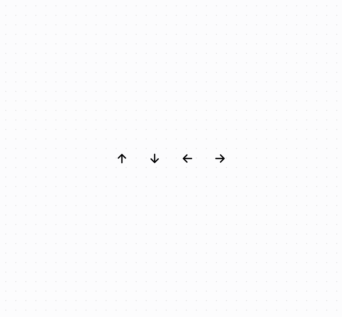
Display icons from the POS catalog
Anchor to Best practicesBest practices
- Choose recognizable icons: Use universally recognized symbols like
search,cart, orsettings. Avoid ambiguous icons. - Match size to context: Use smaller sizes for inline text or secondary actions,
basefor standard elements, larger sizes for primary actions. - Apply tones for meaning: Use
criticalfor destructive actions,warningfor cautions,successfor confirmations,autoorneutralfor general elements. - Pair with text for clarity: Consider adding text labels, especially for complex or uncommon actions.
- Use color for hierarchy: Use
subduedfor secondary elements,basefor standard visibility,strongfor emphasis.