shopify-account
The <shopify-account> component displays an avatar on your website. When customers click the avatar, an account sheet opens with menu links. For signed-out customers, sign-in options appear above the menu.
The account component is designed to drive customer sign-ins to accelerate checkout and unlock storefront personalization. It supports the following sign-in methods: passwordless sign-in, automatic sign-in with Shop recognition, and social sign-in providers. Customers can also opt in to email marketing when signing in through the component.
In a theme
Refer to this theme documentation on how to add the component to your theme.
Outside a theme
Refer to this Hydrogen with account component documentation on how to add the component to your Hydrogen store.
Anchor to attributes and propertiesAttributes and properties
- stringstring
A menu in a store. The component should use "customer-account-main-menu" to refer to the same menu used in customer accounts. Default links include the Orders and Profile pages. To learn more about menus, refer to Menus and links.
- Anchor to sign-in-urlsign-in-urlsign-in-urlstringstringDefault: "/customer_authentication/login"Default: "/customer_authentication/login"
When attempting to sign in, the user will be redirected to this URL with query parameters that must be passed in the authorization request to Shopify's customer authentication.
Anchor to css variablesCSS variables
CSS variables allow you to target and override the default styling within the account component.
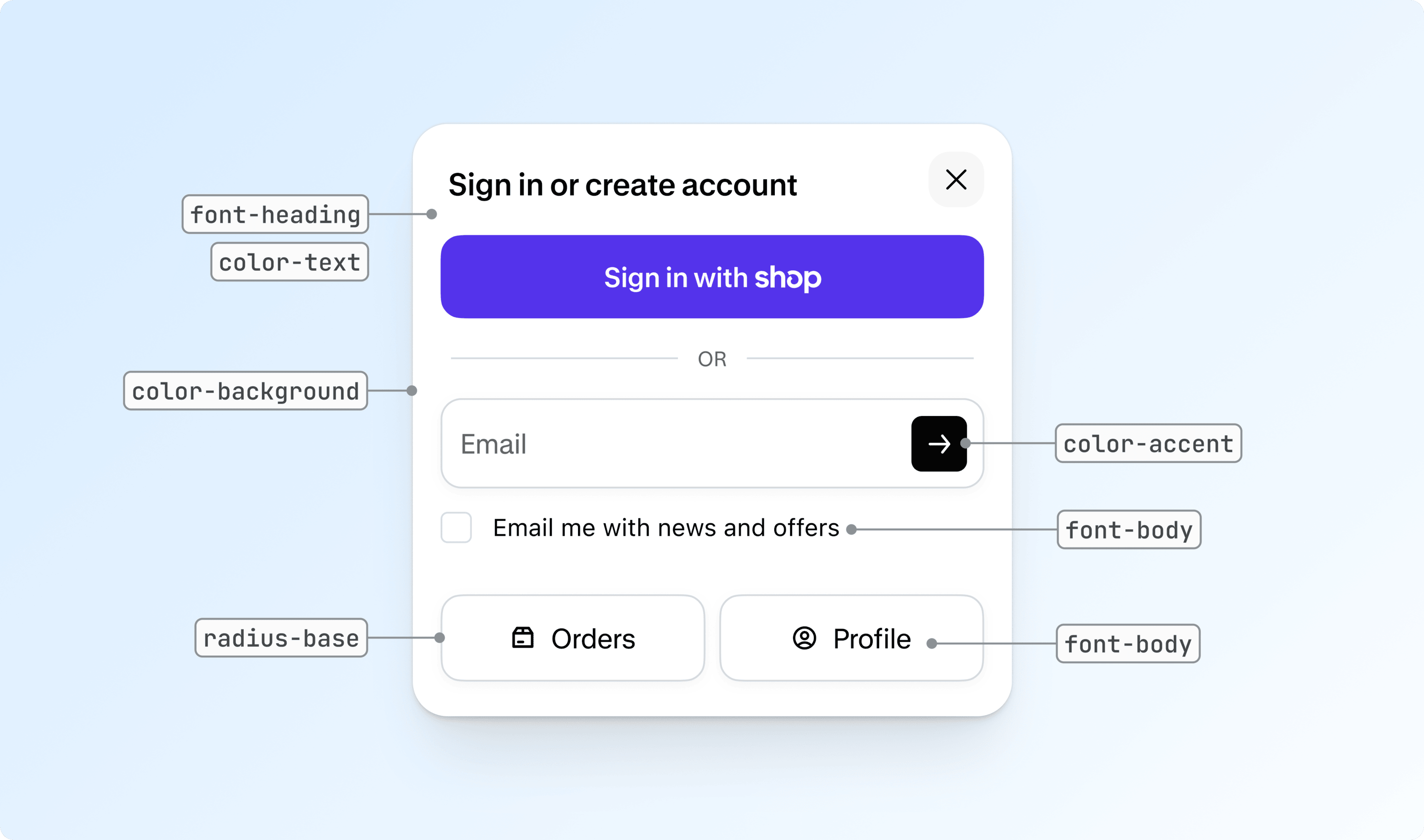
- Anchor to --shopify-account-color-accent--shopify-account-color-accent--shopify-account-color-accentstringstring
The accent color used for interactive elements.
- Anchor to --shopify-account-color-background--shopify-account-color-background--shopify-account-color-backgroundstringstring
The background color of the account sheet.
- Anchor to --shopify-account-color-text--shopify-account-color-text--shopify-account-color-textstringstring
The color of the text used throughout the account sheet.
- Anchor to --shopify-account-dialog-position-top--shopify-account-dialog-position-top--shopify-account-dialog-position-topstringstring
The offset from the top of the dialog.
- Anchor to --shopify-account-font-body--shopify-account-font-body--shopify-account-font-bodystringstring
The font family used for body text in the account sheet. For online store, follow best practices for fonts.
- Anchor to --shopify-account-font-heading--shopify-account-font-heading--shopify-account-font-headingstringstring
The font family used for headings in the account sheet. For online store, follow best practices for fonts.
- Anchor to --shopify-account-radius-base--shopify-account-radius-base--shopify-account-radius-basestringstring
The base corner radius applied to elements within the sheet.
Anchor to derived css variablesDerived CSS variables
These variables are automatically derived from the CSS variables above. Override them individually if you need finer control.
- Anchor to --shopify-account-avatar-size--shopify-account-avatar-size--shopify-account-avatar-sizestringstring
The width and height of the account button. Overrides the default size derived from the avatar.
- Anchor to --shopify-account-color-accent-hover--shopify-account-color-accent-hover--shopify-account-color-accent-hoverstringstring
The accent color on hover state.
- Anchor to --shopify-account-color-accent-text--shopify-account-color-accent-text--shopify-account-color-accent-textstringstring
The accent contrast color used for interactive elements.
- Anchor to --shopify-account-color-background-subdued--shopify-account-color-background-subdued--shopify-account-color-background-subduedstringstring
Subdued background color for secondary elements.
- Anchor to --shopify-account-color-border--shopify-account-color-border--shopify-account-color-borderstringstring
The border color used in the sheet.
- Anchor to --shopify-account-color-card-background--shopify-account-color-card-background--shopify-account-color-card-backgroundstringstring
Background color for card elements.
- Anchor to --shopify-account-color-card-text--shopify-account-color-card-text--shopify-account-color-card-textstringstring
Text color for card elements.
- Anchor to --shopify-account-color-control-background--shopify-account-color-control-background--shopify-account-color-control-backgroundstringstring
Background color for form controls.
- Anchor to --shopify-account-color-control-text--shopify-account-color-control-text--shopify-account-color-control-textstringstring
Text color for form controls.
- Anchor to --shopify-account-color-shadow--shopify-account-color-shadow--shopify-account-color-shadowstringstring
Shadow color used for depth.
- Anchor to --shopify-account-color-text-subdued--shopify-account-color-text-subdued--shopify-account-color-text-subduedstringstring
Subdued text color for secondary text.
- Anchor to --shopify-account-font-body-transform--shopify-account-font-body-transform--shopify-account-font-body-transformstringstring
The text transform for text elements.
- Anchor to --shopify-account-font-body-weight--shopify-account-font-body-weight--shopify-account-font-body-weightstringstring
The font weight for text elements.
- Anchor to --shopify-account-font-heading-transform--shopify-account-font-heading-transform--shopify-account-font-heading-transformstringstring
The text transform for headings.
- Anchor to --shopify-account-font-heading-weight--shopify-account-font-heading-weight--shopify-account-font-heading-weightstringstring
The font weight for headings.
- stringstring
Corner radius for buttons.
- stringstring
Small corner radius for minor elements.
- Anchor to --shopify-account-radius-dialog--shopify-account-radius-dialog--shopify-account-radius-dialogstringstring
Corner radius for the dialog container.
- Anchor to --shopify-account-radius-input--shopify-account-radius-input--shopify-account-radius-inputstringstring
Corner radius for input fields.
- stringstring
The background color of the signed-in avatar.
- stringstring
The text color of the initial in the signed-in avatar.
- stringstring
The width and height of the signed-in avatar.
Anchor to css partsCSS parts
CSS parts allow you to override the default styling of the account component.
- Anchor to signed-out-avatarsigned-out-avatarsigned-out-avatarCSSPartCSSPart
The button element for the signed-out avatar.
CSSPart
A [`::part` CSS pseudo-element](https://developer.mozilla.org/en-US/docs/Web/CSS/::part) allowing you to target and override the default styling within the component.
stringAnchor to slotsSlots
Slots enable you to override the default content of the account component.
- Anchor to signed-out-avatarsigned-out-avatarsigned-out-avatarSlotElementSlotElement
The avatar to display when the user is signed out.
SlotElement
A slot element allows you to override the default content of the component. Read more on the [MDN Documentation](https://developer.mozilla.org/en-US/docs/Web/HTML/Element/slot).
stringAnchor to eventsEvents
Events let you listen and respond to changes in the account component's state.
- Anchor to closeclosecloseCustomEventCustomEvent
Fired when the account sheet is closed.
- Anchor to openopenopenCustomEventCustomEvent
Fired when the account sheet is opened.