Version 2025-07 is the last API version to support React-based UI components. Later versions use Polaris web components, native UI elements with built-in accessibility, better performance, and consistent styling with Shopify's design system. Check out the upgrade guide to upgrade your extension and avoid being blocked from updating your extension after October 1st 2026.
Menu
The menu component displays a list of actions that can be performed on a resource or within a specific context. Use menu to present multiple related actions in a compact dropdown format, reducing visual clutter while maintaining discoverability.
Menus support action grouping, icons for visual clarity, and keyboard navigation for efficient interaction.
Supported targets
- Customer
Account::Kitchen Sink - customer-account.
footer. render-after - customer-account.
order-index. announcement. render - customer-account.
order-index. block. render - customer-account.
order-status. announcement. render - customer-account.
order-status. block. render - customer-account.
order-status. cart-line-item. render-after - customer-account.
order-status. cart-line-list. render-after - customer-account.
order-status. customer-information. render-after - customer-account.
order-status. fulfillment-details. render-after - customer-account.
order-status. payment-details. render-after - customer-account.
order-status. return-details. render-after - customer-account.
order-status. unfulfilled-items. render-after - customer-account.
order. action. menu-item. render - customer-account.
order. action. render - customer-account.
order. page. render - customer-account.
page. render - customer-account.
profile. addresses. render-after - customer-account.
profile. announcement. render - customer-account.
profile. block. render - customer-account.
profile. company-details. render-after - customer-account.
profile. company-location-addresses. render-after - customer-account.
profile. company-location-payment. render-after - customer-account.
profile. company-location-staff. render-after - customer-account.
profile. payment. render-after
Supported targets
- Customer
Account::Kitchen Sink - customer-account.
footer. render-after - customer-account.
order-index. announcement. render - customer-account.
order-index. block. render - customer-account.
order-status. announcement. render - customer-account.
order-status. block. render - customer-account.
order-status. cart-line-item. render-after - customer-account.
order-status. cart-line-list. render-after - customer-account.
order-status. customer-information. render-after - customer-account.
order-status. fulfillment-details. render-after - customer-account.
order-status. payment-details. render-after - customer-account.
order-status. return-details. render-after - customer-account.
order-status. unfulfilled-items. render-after - customer-account.
order. action. menu-item. render - customer-account.
order. action. render - customer-account.
order. page. render - customer-account.
page. render - customer-account.
profile. addresses. render-after - customer-account.
profile. announcement. render - customer-account.
profile. block. render - customer-account.
profile. company-details. render-after - customer-account.
profile. company-location-addresses. render-after - customer-account.
profile. company-location-payment. render-after - customer-account.
profile. company-location-staff. render-after - customer-account.
profile. payment. render-after
Anchor to Use casesUse cases
- Order actions: Consolidate order management actions like "Submit problem," "Request return," and "Cancel order" in a popover menu.
- Subscription management: Provide subscription actions like "Skip order," "Change frequency," and "Cancel" in a compact menu.
- Help and support: Group help-related actions like "Visit help center" and "Contact support" in a menu.
Anchor to PropertiesProperties
Configure the following properties on the Menu component.
- stringstring
A label to describe the purpose of the menu that is announced by screen readers.
- stringstring
A unique identifier for the component.
- () => void() => void
Callback to run when the Menu is closed
- () => void() => void
Callback to run when the Menu is opened
Configure the following properties on buttons placed inside the menu component.
- stringstring
A label used for buyers using assistive technologies. When set, any
childrensupplied to this component will not be announced to screen reader users.- ButtonAccessibilityRoleButtonAccessibilityRoleDefault: 'button'Default: 'button'
The role of the button that will be rendered.
button: renders a regular button.submit: renders a button that submits a form.- 'auto' | 'copy''auto' | 'copy'Default: 'auto' - a default action for the target component.Default: 'auto' - a default action for the target component.
- stringstring
ID of a component that should respond to activations (e.g. clicks) on this pressable.
See
for how to control the behavior of the target.- 'critical' | 'monochrome''critical' | 'monochrome'
Specify the color treatment of the Button.
- booleanbooleanDefault: falseDefault: false
Disables the button, disallowing any interaction.
- stringstring
A unique identifier for the component. Use this to target the component in scripts or stylesheets, or to distinguish it from other instances of the same component.
- booleanbooleanDefault: falseDefault: false
Replaces content with a loading indicator.
- stringstring
Accessible label for the loading indicator when user prefers reduced motion. This value is only used if
loadingis true.- () => void() => void
Callback that is run when the button is pressed.
- RemoteFragmentRemoteFragment
An overlay component to render when the user interacts with the component.
- stringstring
Destination URL to link to.
- stringstring
The component's identifier whose visibility will be toggled when this component is actioned.
- booleanbooleandeprecateddeprecated
Allows the button to submit a form.
Deprecateduse
insteadDeprecated:use
instead
ButtonAccessibilityRole
The accessibility role for button-like components. - `button`: A generic button that triggers an action. - `submit`: A button that submits a form.
'button' | 'submit'Anchor to ExamplesExamples
Anchor to Add order management actionsAdd order management actions
Display a menu with actions for managing an order. This example shows a Menu triggered by a button overlay, containing actions for submitting a problem, requesting a return, and canceling an order.Add order management actions
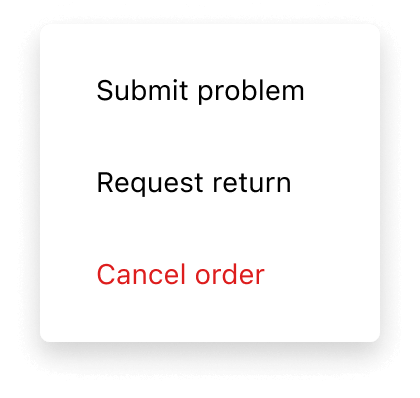
Add order management actions
React
import {
  reactExtension,
  Button,
  Menu,
} from '@shopify/ui-extensions-react/customer-account';
import React from 'react';

export default reactExtension(
  'customer-account.page.render',
  () => <App />,
);

function App() {
  return (
    <Button
      overlay={
        <Menu>
          <Button
            onPress={() =>
              console.log('Submit problem')
            }
          >
            Submit problem
          </Button>
          <Button to="https://shopify.com">
            Request return
          </Button>
          <Button appearance="critical">
            Cancel order
          </Button>
        </Menu>
      }
    >
      Manage
    </Button>
  );
}
JS
import {Menu, Button, extension} from '@shopify/ui-extensions/customer-account';

export default extension('customer-account.page.render', (root, api) => {
  renderApp(root, api);
});

async function renderApp(root, api) {
  const menuFragment = root.createFragment();
  const menu = root.createComponent(Menu, {}, [
    root.createComponent(
      Button,
      {onPress: () => console.log('Submit problem')},
      'Submit problem',
    ),
    root.createComponent(Button, {to: 'https://shopify.com'}, 'Request return'),
    root.createComponent(Button, {appearance: 'critical'}, 'Cancel order'),
  ]);
  menuFragment.appendChild(menu);
  const button = root.createComponent(
    Button,
    {overlay: menuFragment},
    'Manage',
  );

  root.appendChild(button);
}Include an action that navigates to an external page. This example shows a
Menu with a button that links to a help center using the to prop.Add a help menu with link actions
React
import {
  reactExtension,
  Button,
  Menu,
} from '@shopify/ui-extensions-react/customer-account';
import React from 'react';

export default reactExtension(
  'customer-account.page.render',
  () => <App />,
);

function App() {
  return (
    <Button
      overlay={
        <Menu>
          <Button to="https://help.shopify.com">
            Visit help center
          </Button>
          <Button
            onPress={() =>
              console.log('Contact support')
            }
          >
            Contact support
          </Button>
        </Menu>
      }
    >
      Help
    </Button>
  );
}
JS
import {Menu, Button, extension} from '@shopify/ui-extensions/customer-account';

export default extension('customer-account.page.render', (root) => {
  renderApp(root);
});

async function renderApp(root) {
  const menuFragment = root.createFragment();
  const menu = root.createComponent(Menu, {}, [
    root.createComponent(
      Button,
      {to: 'https://help.shopify.com'},
      'Visit help center',
    ),
    root.createComponent(
      Button,
      {onPress: () => console.log('Contact support')},
      'Contact support',
    ),
  ]);
  menuFragment.appendChild(menu);
  const button = root.createComponent(
    Button,
    {overlay: menuFragment},
    'Help',
  );

  root.appendChild(button);
});Highlight a destructive action using the
appearance="critical" prop. This example shows a subscription management menu with a cancel action styled as critical.Add a destructive action to a menu
React
import {
  reactExtension,
  Button,
  Menu,
} from '@shopify/ui-extensions-react/customer-account';
import React from 'react';

export default reactExtension(
  'customer-account.page.render',
  () => <App />,
);

function App() {
  return (
    <Button
      overlay={
        <Menu>
          <Button
            onPress={() =>
              console.log('Skip next order')
            }
          >
            Skip next order
          </Button>
          <Button
            onPress={() =>
              console.log('Change frequency')
            }
          >
            Change frequency
          </Button>
          <Button appearance="critical">
            Cancel subscription
          </Button>
        </Menu>
      }
    >
      Manage subscription
    </Button>
  );
}
JS
import {Menu, Button, extension} from '@shopify/ui-extensions/customer-account';

export default extension('customer-account.page.render', (root) => {
  renderApp(root);
});

async function renderApp(root) {
  const menuFragment = root.createFragment();
  const menu = root.createComponent(Menu, {}, [
    root.createComponent(
      Button,
      {onPress: () => console.log('Skip next order')},
      'Skip next order',
    ),
    root.createComponent(
      Button,
      {onPress: () => console.log('Change frequency')},
      'Change frequency',
    ),
    root.createComponent(
      Button,
      {appearance: 'critical'},
      'Cancel subscription',
    ),
  ]);
  menuFragment.appendChild(menu);
  const button = root.createComponent(
    Button,
    {overlay: menuFragment},
    'Manage subscription',
  );

  root.appendChild(button);
});
Anchor to Best practicesBest practices
- Place menus consistently: Use the menu component in the upper-right corner of full-page extensions, to be consistent with the Order status page.
- Group related actions: Use menus to consolidate page-level actions, instead of adding multiple buttons around the page.
- Write concise labels: Use short labels (two words ideally) that start with a verb and use sentence case, such as "Skip order."
Anchor to LimitationsLimitations
- Menu items must be Button components. Other interactive components aren't supported as direct children.
- The menu doesn't support nested submenus. All actions must be in a single flat list.