Version 2025-07 is the last API version to support React-based UI components. Later versions use Polaris web components, native UI elements with built-in accessibility, better performance, and consistent styling with Shopify's design system. Check out the upgrade guide to upgrade your extension and avoid being blocked from updating your extension after October 1st 2026.
Order actions
Order pages allow customers to view and manage their purchases, including browsing order history, checking fulfillment status, and reviewing order details. Extensions on these pages help customers take action on their orders directly from customer accounts.
Anchor to Use casesUse cases
- Return and exchange requests: Let customers select items to return or exchange, submit a reason, and receive a shipping label directly from the order page.
- Reorder: Add all items from a previous order back to the cart with a single click.
- Subscription management: Show active subscriptions tied to past orders, with options to skip, pause, or cancel.
- Shipment tracking: Surface real-time tracking updates when a shipment is in transit.
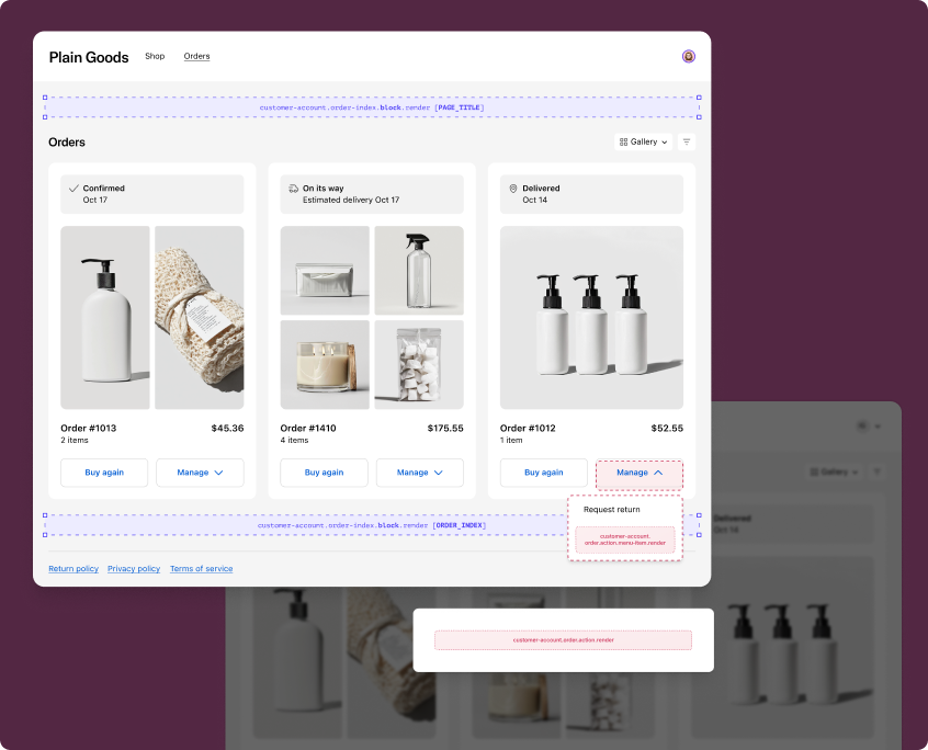
Use static targets to extend the order index and order status pages with custom workflows in the order action menu.
Menu item targets render as buttons in the order action menu, while action targets open as modal overlays. The examples demonstrate fetching data from your app's backend or using the Order API.
customer-account.order.action.menu-item.render
Renders a button in the order action menu on the order index and order status pages. Use this target to add custom actions that navigate to a URL or open a modal for workflows like returns, exchanges, or reorders.
Extensions at this target can access order data through the Order API. The root element must be a single Button component. Use the href prop to navigate directly, or omit it to open a modal rendered by customer-account.order.action.render.
Supported components
- Avatar
- Badge
- Banner
- Block
Layout - Block
Spacer - Block
Stack - Button
- Card
- Checkbox
- Choice
- Choice
List - Clipboard
Item - Customer
Account Action - Date
Field - Date
Picker - Disclosure
- Divider
- Drop
Zone - Form
- Grid
- Grid
Item - Heading
- Heading
Group - Icon
- Image
- Image
Group - Inline
Layout - Inline
Spacer - Inline
Stack - Link
- List
- List
Item - Map
- Map
Marker - Map
Popover - Menu
- Modal
- Page
- Payment
Icon - Phone
Field - Popover
- Pressable
- Product
Thumbnail - Progress
- QRCode
- Resource
Item - Scroll
View - Select
- Sheet
- Skeleton
Image - Skeleton
Text - Skeleton
Text Block - Spinner
- Stepper
- Switch
- Tag
- Text
- Text
Block - Text
Field - Toggle
Button - Toggle
Button Group - Tooltip
- View
Supported components
- Avatar
- Badge
- Banner
- Block
Layout - Block
Spacer - Block
Stack - Button
- Card
- Checkbox
- Choice
- Choice
List - Clipboard
Item - Customer
Account Action - Date
Field - Date
Picker - Disclosure
- Divider
- Drop
Zone - Form
- Grid
- Grid
Item - Heading
- Heading
Group - Icon
- Image
- Image
Group - Inline
Layout - Inline
Spacer - Inline
Stack - Link
- List
- List
Item - Map
- Map
Marker - Map
Popover - Menu
- Modal
- Page
- Payment
Icon - Phone
Field - Popover
- Pressable
- Product
Thumbnail - Progress
- QRCode
- Resource
Item - Scroll
View - Select
- Sheet
- Skeleton
Image - Skeleton
Text - Skeleton
Text Block - Spinner
- Stepper
- Switch
- Tag
- Text
- Text
Block - Text
Field - Toggle
Button - Toggle
Button Group - Tooltip
- View
Examples
Add a localized order action button
Description
Add a localized button to the order action menu that opens a modal when clicked. This example omits `href` so the paired `customer-account.order.action.render` target renders the modal, and uses `useTranslate` for the button label.
React
import {
  reactExtension,
  Button,
  useTranslate,
} from '@shopify/ui-extensions-react/customer-account';

export default reactExtension(
  'customer-account.order.action.menu-item.render',
  () => <MenuActionItemExtension />,
);

function MenuActionItemExtension() {
  const translate = useTranslate();

  return (
    <Button>
      {translate('menuItem.button')}
    </Button>
  );
}
TS
import {
  extension,
  Button,
} from '@shopify/ui-extensions/customer-account';

export default extension(
  'customer-account.order.action.menu-item.render',
  (root, api) => {
    const translate = api.i18n.translate;

    root.appendChild(
      root.createComponent(
        Button,
        undefined,
        translate('menuItem.button'),
      ),
    );
  },
);
Navigate to a URL from the action menu
Description
Customize the button label and destination with data from your app's backend. This example uses a session token for authentication and sets the `href` prop to navigate directly instead of opening a modal.
React
import {useState, useEffect} from 'react';
import {
  reactExtension,
  Button,
  useSessionToken,
} from '@shopify/ui-extensions-react/customer-account';

export default reactExtension(
  'customer-account.order.action.menu-item.render',
  () => <MenuActionItemExtension />,
);

function MenuActionItemExtension() {
  const sessionToken = useSessionToken();
  const [data, setData] = useState(null);

  useEffect(() => {
    async function fetchMenuItems() {
      const token = await sessionToken.get();
      const res = await fetch('https://your-app.com/api/menu-items', {
        headers: {Authorization: `Bearer ${token}`},
      });
      setData(await res.json());
    }
    fetchMenuItems();
  }, []);

  if (!data) return null;

  return (
    <Button href={data.url}>
      {data.itemName}
    </Button>
  );
}
TS
import {
  extension,
  Button,
} from '@shopify/ui-extensions/customer-account';

export default extension(
  'customer-account.order.action.menu-item.render',
  async (root, api) => {
    const token = await api.sessionToken.get();
    const res = await fetch('https://your-app.com/api/menu-items', {
      headers: {Authorization: `Bearer ${token}`},
    });
    const data = await res.json();

    root.appendChild(
      root.createComponent(
        Button,
        {href: data.url},
        data.itemName,
      ),
    );
  },
);
Anchor to Order action ,[object Object]Order action target
customer-account.order.action.render
Renders a modal when a customer clicks an order action button that doesn't have an href prop set. Use this target to build multi-step workflows like return requests, order modifications, or confirmations.
Extensions at this target can access order data through the Order API and control the modal with close(). The root element must be a CustomerAccountAction component.
Supported components
- Avatar
- Badge
- Banner
- Block
Layout - Block
Spacer - Block
Stack - Button
- Card
- Checkbox
- Choice
- Choice
List - Clipboard
Item - Customer
Account Action - Date
Field - Date
Picker - Disclosure
- Divider
- Drop
Zone - Form
- Grid
- Grid
Item - Heading
- Heading
Group - Icon
- Image
- Image
Group - Inline
Layout - Inline
Spacer - Inline
Stack - Link
- List
- List
Item - Map
- Map
Marker - Map
Popover - Menu
- Modal
- Page
- Payment
Icon - Phone
Field - Popover
- Pressable
- Product
Thumbnail - Progress
- QRCode
- Resource
Item - Scroll
View - Select
- Sheet
- Skeleton
Image - Skeleton
Text - Skeleton
Text Block - Spinner
- Stepper
- Switch
- Tag
- Text
- Text
Block - Text
Field - Toggle
Button - Toggle
Button Group - Tooltip
- View
Supported components
- Avatar
- Badge
- Banner
- Block
Layout - Block
Spacer - Block
Stack - Button
- Card
- Checkbox
- Choice
- Choice
List - Clipboard
Item - Customer
Account Action - Date
Field - Date
Picker - Disclosure
- Divider
- Drop
Zone - Form
- Grid
- Grid
Item - Heading
- Heading
Group - Icon
- Image
- Image
Group - Inline
Layout - Inline
Spacer - Inline
Stack - Link
- List
- List
Item - Map
- Map
Marker - Map
Popover - Menu
- Modal
- Page
- Payment
Icon - Phone
Field - Popover
- Pressable
- Product
Thumbnail - Progress
- QRCode
- Resource
Item - Scroll
View - Select
- Sheet
- Skeleton
Image - Skeleton
Text - Skeleton
Text Block - Spinner
- Stepper
- Switch
- Tag
- Text
- Text
Block - Text
Field - Toggle
Button - Toggle
Button Group - Tooltip
- View
Examples
Build a basic order action modal
Description
Display a confirmation modal with a heading, message, and primary action button. This example uses `CustomerAccountAction` as the required root element and `close()` to dismiss the modal.
React
import {
  reactExtension,
  useApi,
  CustomerAccountAction,
  Button,
  BlockStack,
  Text,
} from '@shopify/ui-extensions-react/customer-account';

export default reactExtension(
  'customer-account.order.action.render',
  () => <OrderActionExtension />,
);

function OrderActionExtension() {
  const {close} = useApi<'customer-account.order.action.render'>();

  return (
    <CustomerAccountAction
      title="Request a return"
      primaryAction={
        <Button
          onPress={() => {
            // Submit return request, then close
            close();
          }}
        >
          Submit request
        </Button>
      }
      secondaryAction={
        <Button onPress={() => close()}>
          Cancel
        </Button>
      }
    >
      <BlockStack spacing="base">
        <Text>
          Select the items you'd like to return and we'll email you a shipping label.
        </Text>
      </BlockStack>
    </CustomerAccountAction>
  );
}
TS
import {
  extension,
  CustomerAccountAction,
  Button,
  BlockStack,
  Text,
} from '@shopify/ui-extensions/customer-account';

export default extension(
  'customer-account.order.action.render',
  (root, api) => {
    const primaryAction = root.createFragment();
    primaryAction.append(
      root.createComponent(
        Button,
        {onPress: () => api.close()},
        'Submit request',
      ),
    );

    const secondaryAction = root.createFragment();
    secondaryAction.append(
      root.createComponent(
        Button,
        {onPress: () => api.close()},
        'Cancel',
      ),
    );

    root.appendChild(
      root.createComponent(
        CustomerAccountAction,
        {
          title: 'Request a return',
          primaryAction,
          secondaryAction,
        },
        root.createComponent(
          BlockStack,
          {spacing: 'base'},
          root.createComponent(
            Text,
            undefined,
            "Select the items you'd like to return and we'll email you a shipping label.",
          ),
        ),
      ),
    );
  },
);
Reorder items from a previous order
Description
Show order-specific information in the action modal with a one-click reorder flow. This example reads from `useOrder`, guards against missing data with a loading state, and displays the order name in the modal heading.
React
import {
  reactExtension,
  useApi,
  CustomerAccountAction,
  Button,
  Text,
  Spinner,
  useOrder,
} from '@shopify/ui-extensions-react/customer-account';

export default reactExtension(
  'customer-account.order.action.render',
  () => <ReorderExtension />,
);

function ReorderExtension() {
  const {close} = useApi<'customer-account.order.action.render'>();
  const order = useOrder();

  if (!order) {
    return (
      <CustomerAccountAction title="Reorder">
        <Spinner size="base" />
      </CustomerAccountAction>
    );
  }

  return (
    <CustomerAccountAction
      title={`Reorder from ${order.name}`}
      primaryAction={
        <Button
          onPress={() => {
            // Add items to cart, then close
            close();
          }}
        >
          Add all to cart
        </Button>
      }
      secondaryAction={
        <Button onPress={() => close()}>
          Cancel
        </Button>
      }
    >
      <Text>
        Add all items from this order back to your cart.
      </Text>
    </CustomerAccountAction>
  );
}
TS
import {
  extension,
  CustomerAccountAction,
  Button,
  Text,
  Spinner,
} from '@shopify/ui-extensions/customer-account';

export default extension(
  'customer-account.order.action.render',
  (root, api) => {
    function render() {
      const order = api.order.current;

      root.replaceChildren();

      if (!order) {
        root.appendChild(
          root.createComponent(
            CustomerAccountAction,
            {title: 'Reorder'},
            root.createComponent(Spinner, {size: 'base'}),
          ),
        );
        return;
      }

      const primaryAction = root.createFragment();
      primaryAction.append(
        root.createComponent(
          Button,
          {onPress: () => api.close()},
          'Add all to cart',
        ),
      );

      const secondaryAction = root.createFragment();
      secondaryAction.append(
        root.createComponent(
          Button,
          {onPress: () => api.close()},
          'Cancel',
        ),
      );

      root.appendChild(
        root.createComponent(
          CustomerAccountAction,
          {
            title: `Reorder from ${order.name}`,
            primaryAction,
            secondaryAction,
          },
          root.createComponent(
            Text,
            undefined,
            'Add all items from this order back to your cart.',
          ),
        ),
      );
    }

    api.order.subscribe(render);
    render();
  },
);
Anchor to Order index targetsOrder index targets
Use static and block targets to extend the order index page with contextual content and information.
Announcement targets render as dismissable banners at the top of the page, while block targets display as inline cards that merchants can position using the checkout and accounts editor. The examples demonstrate using the Localization API or fetching data from your app's backend.
Anchor to Order index announcement ,[object Object]Order index announcement target
customer-account.order-index.announcement.render
Renders a dismissable announcement at the top of the order index page. Use this target to surface time-sensitive information like shipping updates, promotions, or account status changes.
Extensions at this target can access locale and currency context through the Localization API. The root element should be a Banner component.
Supported components
- Avatar
- Badge
- Banner
- Block
Layout - Block
Spacer - Block
Stack - Button
- Card
- Checkbox
- Choice
- Choice
List - Clipboard
Item - Customer
Account Action - Date
Field - Date
Picker - Disclosure
- Divider
- Drop
Zone - Form
- Grid
- Grid
Item - Heading
- Heading
Group - Icon
- Image
- Image
Group - Inline
Layout - Inline
Spacer - Inline
Stack - Link
- List
- List
Item - Map
- Map
Marker - Map
Popover - Menu
- Modal
- Page
- Payment
Icon - Phone
Field - Popover
- Pressable
- Product
Thumbnail - Progress
- QRCode
- Resource
Item - Scroll
View - Select
- Sheet
- Skeleton
Image - Skeleton
Text - Skeleton
Text Block - Spinner
- Stepper
- Switch
- Tag
- Text
- Text
Block - Text
Field - Toggle
Button - Toggle
Button Group - Tooltip
- View
Supported components
- Avatar
- Badge
- Banner
- Block
Layout - Block
Spacer - Block
Stack - Button
- Card
- Checkbox
- Choice
- Choice
List - Clipboard
Item - Customer
Account Action - Date
Field - Date
Picker - Disclosure
- Divider
- Drop
Zone - Form
- Grid
- Grid
Item - Heading
- Heading
Group - Icon
- Image
- Image
Group - Inline
Layout - Inline
Spacer - Inline
Stack - Link
- List
- List
Item - Map
- Map
Marker - Map
Popover - Menu
- Modal
- Page
- Payment
Icon - Phone
Field - Popover
- Pressable
- Product
Thumbnail - Progress
- QRCode
- Resource
Item - Scroll
View - Select
- Sheet
- Skeleton
Image - Skeleton
Text - Skeleton
Text Block - Spinner
- Stepper
- Switch
- Tag
- Text
- Text
Block - Text
Field - Toggle
Button - Toggle
Button Group - Tooltip
- View
Examples
Show an account status announcement
Description
Display a dismissable announcement with a message and a link to the profile page. This example uses `Banner` as the root element and the `shopify:customer-account` protocol for internal navigation.
React
import {
  reactExtension,
  Banner,
  InlineStack,
  Text,
  Link,
} from '@shopify/ui-extensions-react/customer-account';

export default reactExtension(
  'customer-account.order-index.announcement.render',
  () => <Extension />,
);

function Extension() {
  return (
    <Banner>
      <InlineStack spacing="base">
        <Text>Your loyalty status has been upgraded!</Text>
        <Link to="shopify:customer-account/profile">
          View your profile
        </Link>
      </InlineStack>
    </Banner>
  );
}
TS
import {
  extension,
  Banner,
  InlineStack,
  Text,
  Link,
} from '@shopify/ui-extensions/customer-account';

export default extension(
  'customer-account.order-index.announcement.render',
  (root) => {
    root.appendChild(
      root.createComponent(Banner, undefined, [
        root.createComponent(InlineStack, {spacing: 'base'}, [
          root.createComponent(
            Text,
            undefined,
            'Your loyalty status has been upgraded!',
          ),
          root.createComponent(
            Link,
            {to: 'shopify:customer-account/profile'},
            'View your profile',
          ),
        ]),
      ]),
    );
  },
);
Announce a shipping update with localized content
Description
Surface a shipping update announcement in the customer's language. This example combines `useTranslate` with `useLocalizationCountry` to localize the announcement content.
React
import {
  reactExtension,
  Banner,
  InlineStack,
  Text,
  Link,
  useTranslate,
  useLocalizationCountry,
} from '@shopify/ui-extensions-react/customer-account';

export default reactExtension(
  'customer-account.order-index.announcement.render',
  () => <Extension />,
);

function Extension() {
  const translate = useTranslate();
  const country = useLocalizationCountry();

  return (
    <Banner>
      <InlineStack spacing="base">
        <Text>
          {translate('announcement.shippingUpdate', {
            country: country?.isoCode,
          })}
        </Text>
        <Link to="shopify:customer-account/orders">
          {translate('announcement.viewOrders')}
        </Link>
      </InlineStack>
    </Banner>
  );
}
TS
import {
  extension,
  Banner,
  InlineStack,
  Text,
  Link,
} from '@shopify/ui-extensions/customer-account';

export default extension(
  'customer-account.order-index.announcement.render',
  (root, api) => {
    const translate = api.i18n.translate;
    const country = api.localization.country.current;

    root.appendChild(
      root.createComponent(Banner, undefined, [
        root.createComponent(InlineStack, {spacing: 'base'}, [
          root.createComponent(
            Text,
            undefined,
            translate('announcement.shippingUpdate', {
              country: country?.isoCode,
            }),
          ),
          root.createComponent(
            Link,
            {to: 'shopify:customer-account/orders'},
            translate('announcement.viewOrders'),
          ),
        ]),
      ]),
    );
  },
);
Anchor to Order index block ,[object Object]Order index block target
customer-account.order-index.block.render
Renders inline content on the order index page. Use this target to display persistent information like loyalty points, subscription summaries, or account-level insights.
Extensions at this target appear as blocks that merchants can position using the checkout and accounts editor. To preview your extension in each supported location, use the placement reference for that location as a URL parameter.
Supported components
- Avatar
- Badge
- Banner
- Block
Layout - Block
Spacer - Block
Stack - Button
- Card
- Checkbox
- Choice
- Choice
List - Clipboard
Item - Customer
Account Action - Date
Field - Date
Picker - Disclosure
- Divider
- Drop
Zone - Form
- Grid
- Grid
Item - Heading
- Heading
Group - Icon
- Image
- Image
Group - Inline
Layout - Inline
Spacer - Inline
Stack - Link
- List
- List
Item - Map
- Map
Marker - Map
Popover - Menu
- Modal
- Page
- Payment
Icon - Phone
Field - Popover
- Pressable
- Product
Thumbnail - Progress
- QRCode
- Resource
Item - Scroll
View - Select
- Sheet
- Skeleton
Image - Skeleton
Text - Skeleton
Text Block - Spinner
- Stepper
- Switch
- Tag
- Text
- Text
Block - Text
Field - Toggle
Button - Toggle
Button Group - Tooltip
- View
Supported components
- Avatar
- Badge
- Banner
- Block
Layout - Block
Spacer - Block
Stack - Button
- Card
- Checkbox
- Choice
- Choice
List - Clipboard
Item - Customer
Account Action - Date
Field - Date
Picker - Disclosure
- Divider
- Drop
Zone - Form
- Grid
- Grid
Item - Heading
- Heading
Group - Icon
- Image
- Image
Group - Inline
Layout - Inline
Spacer - Inline
Stack - Link
- List
- List
Item - Map
- Map
Marker - Map
Popover - Menu
- Modal
- Page
- Payment
Icon - Phone
Field - Popover
- Pressable
- Product
Thumbnail - Progress
- QRCode
- Resource
Item - Scroll
View - Select
- Sheet
- Skeleton
Image - Skeleton
Text - Skeleton
Text Block - Spinner
- Stepper
- Switch
- Tag
- Text
- Text
Block - Text
Field - Toggle
Button - Toggle
Button Group - Tooltip
- View
Examples
Display a loyalty points summary
Description
Show a customer's loyalty points on the order index page. This example fetches loyalty data from your app's backend using a session token for authentication.
React
import {useState, useEffect} from 'react';
import {
  reactExtension,
  BlockStack,
  Text,
  Link,
  Heading,
  useSessionToken,
} from '@shopify/ui-extensions-react/customer-account';

export default reactExtension(
  'customer-account.order-index.block.render',
  () => <Extension />,
);

function Extension() {
  const sessionToken = useSessionToken();
  const [points, setPoints] = useState(null);

  useEffect(() => {
    async function fetchPoints() {
      const token = await sessionToken.get();
      const res = await fetch('https://your-app.com/api/loyalty', {
        headers: {Authorization: `Bearer ${token}`},
      });
      const data = await res.json();
      setPoints(data.points);
    }
    fetchPoints();
  }, []);

  return (
    <BlockStack spacing="base">
      <Heading>Loyalty program</Heading>
      <Text>
        {points !== null
          ? `You have ${points} loyalty points.`
          : 'Loading your points...'}
      </Text>
      <Link to="shopify:customer-account/profile">
        View rewards
      </Link>
    </BlockStack>
  );
}
TS
import {
  extension,
  BlockStack,
  Text,
  Link,
  Heading,
} from '@shopify/ui-extensions/customer-account';

export default extension(
  'customer-account.order-index.block.render',
  async (root, api) => {
    const token = await api.sessionToken.get();
    const res = await fetch('https://your-app.com/api/loyalty', {
      headers: {Authorization: `Bearer ${token}`},
    });
    const data = await res.json();
    const points = data.points;

    root.appendChild(
      root.createComponent(BlockStack, {spacing: 'base'}, [
        root.createComponent(Heading, undefined, 'Loyalty program'),
        root.createComponent(
          Text,
          undefined,
          points !== null
            ? `You have ${points} loyalty points.`
            : 'Loading your points...',
        ),
        root.createComponent(
          Link,
          {to: 'shopify:customer-account/profile'},
          'View rewards',
        ),
      ]),
    );
  },
);
Show active subscriptions tied to orders
Description
Display a block that lists a customer's active subscriptions. This example fetches subscription data from your app's backend and renders each subscription with its status and next billing date.
React
import {useState, useEffect} from 'react';
import {
  reactExtension,
  BlockStack,
  InlineStack,
  Text,
  Badge,
  Heading,
  Spinner,
  useSessionToken,
} from '@shopify/ui-extensions-react/customer-account';

export default reactExtension(
  'customer-account.order-index.block.render',
  () => <Extension />,
);

function Extension() {
  const sessionToken = useSessionToken();
  const [subscriptions, setSubscriptions] = useState(null);

  useEffect(() => {
    async function fetchSubscriptions() {
      const token = await sessionToken.get();
      const res = await fetch('https://your-app.com/api/subscriptions', {
        headers: {Authorization: `Bearer ${token}`},
      });
      const data = await res.json();
      setSubscriptions(data.subscriptions);
    }
    fetchSubscriptions();
  }, []);

  if (!subscriptions) {
    return (
      <BlockStack spacing="base">
        <Heading>Subscriptions</Heading>
        <Spinner size="base" />
      </BlockStack>
    );
  }

  if (subscriptions.length === 0) {
    return null;
  }

  return (
    <BlockStack spacing="base">
      <Heading>Subscriptions</Heading>
      {subscriptions.map((sub) => (
        <InlineStack key={sub.id} spacing="base">
          <Text emphasis="bold">{sub.productName}</Text>
          <Badge>{sub.status}</Badge>
          <Text appearance="subdued">
            Next billing: {sub.nextBillingDate}
          </Text>
        </InlineStack>
      ))}
    </BlockStack>
  );
}
TS
import {
  extension,
  BlockStack,
  InlineStack,
  Text,
  Badge,
  Heading,
  Spinner,
} from '@shopify/ui-extensions/customer-account';

export default extension(
  'customer-account.order-index.block.render',
  async (root, api) => {
    const loadingContainer = root.createComponent(
      BlockStack,
      {spacing: 'base'},
      [
        root.createComponent(Heading, undefined, 'Subscriptions'),
        root.createComponent(Spinner, {size: 'base'}),
      ],
    );
    root.appendChild(loadingContainer);

    const token = await api.sessionToken.get();
    const res = await fetch('https://your-app.com/api/subscriptions', {
      headers: {Authorization: `Bearer ${token}`},
    });
    const data = await res.json();
    const subscriptions = data.subscriptions;

    root.removeChild(loadingContainer);

    if (!subscriptions || subscriptions.length === 0) return;

    const items = subscriptions.map((sub) =>
      root.createComponent(InlineStack, {spacing: 'base'}, [
        root.createComponent(Text, {emphasis: 'bold'}, sub.productName),
        root.createComponent(Badge, undefined, sub.status),
        root.createComponent(
          Text,
          {appearance: 'subdued'},
          `Next billing: ${sub.nextBillingDate}`,
        ),
      ]),
    );

    root.appendChild(
      root.createComponent(BlockStack, {spacing: 'base'}, [
        root.createComponent(Heading, undefined, 'Subscriptions'),
        ...items,
      ]),
    );
  },
);
Anchor to Best practicesBest practices
- Guard against missing data: Always check that
useOrderreturns a value before rendering order-specific content in action targets. The order data loads asynchronously and might beundefinedon the initial render. - Keep announcements concise: The Banner component is dismissable by the customer, so long messages risk being closed before they're read. Use short, actionable text and link to modals or pages for additional detail.
- Pair menu items with modals: When building order actions, implement both
customer-account.order.action.menu-item.render(the button) andcustomer-account.order.action.render(the modal) in the same extension. Omithrefon the button to trigger the modal automatically.
Anchor to LimitationsLimitations
- Single root element for menu items: The
customer-account.order.action.menu-item.rendertarget requires a single Button component as the root element. You can't render multiple buttons or other components at this target. - Modal requires CustomerAccountAction root: The
customer-account.order.action.rendertarget only renders when wrapped in a CustomerAccountAction component. Other root elements won't render.