Version 2025-07 is the last API version to support React-based UI components. Later versions use Polaris web components, native UI elements with built-in accessibility, better performance, and consistent styling with Shopify's design system. Check out the upgrade guide to upgrade your extension and avoid being blocked from updating your extension after October 1st 2026.
Progress
Use the Progress component to visually represent the completion of a task or process. The component supports both determinate (known percentage) and indeterminate (unknown duration) states.
Pair Progress with Text or TextBlock components to communicate what the progress bar is tracking. For a loading indicator without a progress bar, use Spinner instead.
Supported targets
- Customer
Account::Kitchen Sink - customer-account.
footer. render-after - customer-account.
order-index. announcement. render - customer-account.
order-index. block. render - customer-account.
order-status. announcement. render - customer-account.
order-status. block. render - customer-account.
order-status. cart-line-item. render-after - customer-account.
order-status. cart-line-list. render-after - customer-account.
order-status. customer-information. render-after - customer-account.
order-status. fulfillment-details. render-after - customer-account.
order-status. payment-details. render-after - customer-account.
order-status. return-details. render-after - customer-account.
order-status. unfulfilled-items. render-after - customer-account.
order. action. menu-item. render - customer-account.
order. action. render - customer-account.
order. page. render - customer-account.
page. render - customer-account.
profile. addresses. render-after - customer-account.
profile. announcement. render - customer-account.
profile. block. render - customer-account.
profile. company-details. render-after - customer-account.
profile. company-location-addresses. render-after - customer-account.
profile. company-location-payment. render-after - customer-account.
profile. company-location-staff. render-after - customer-account.
profile. payment. render-after
Supported targets
- Customer
Account::Kitchen Sink - customer-account.
footer. render-after - customer-account.
order-index. announcement. render - customer-account.
order-index. block. render - customer-account.
order-status. announcement. render - customer-account.
order-status. block. render - customer-account.
order-status. cart-line-item. render-after - customer-account.
order-status. cart-line-list. render-after - customer-account.
order-status. customer-information. render-after - customer-account.
order-status. fulfillment-details. render-after - customer-account.
order-status. payment-details. render-after - customer-account.
order-status. return-details. render-after - customer-account.
order-status. unfulfilled-items. render-after - customer-account.
order. action. menu-item. render - customer-account.
order. action. render - customer-account.
order. page. render - customer-account.
page. render - customer-account.
profile. addresses. render-after - customer-account.
profile. announcement. render - customer-account.
profile. block. render - customer-account.
profile. company-details. render-after - customer-account.
profile. company-location-addresses. render-after - customer-account.
profile. company-location-payment. render-after - customer-account.
profile. company-location-staff. render-after - customer-account.
profile. payment. render-after
Anchor to Use casesUse cases
- Rewards progress: Show how close a customer is to reaching the next loyalty or rewards tier.
- Free shipping threshold: Visualize how much more a customer needs to spend to qualify for free shipping.
- Loading states: Indicate that an asynchronous operation is in progress with an indeterminate progress bar.
- Error recovery: Communicate a failed process with the
criticaltone alongside an error message.
Anchor to PropertiesProperties
Configure the following properties on the Progress component.
- Anchor to accessibilityLabelaccessibility
Labelaccessibility Label stringstring A label that describes the purpose or contents of the element. When set, it will be announced to users using assistive technologies and will provide them with more context. When set, any children or
labelsupplied won't be announced to screen readers.- Anchor to idididstringstring
A unique identifier for the component. Use this to target the component in scripts or stylesheets, or to distinguish it from other instances of the same component.
- Anchor to maxmaxmaxnumbernumberDefault: 1Default: 1
The total amount of work the task requires. Must be a value greater than 0 and a valid floating point number.
Learn more about the max attribute.
- Anchor to tonetonetone'auto' | 'critical''auto' | 'critical'Default: 'auto'Default: 'auto'
The semantic meaning and color treatment of the progress indicator.
auto: Automatically determined based on context.critical: Indicates an urgent or error state requiring immediate attention.
- Anchor to valuevaluevaluenumbernumber
How much of the task has been completed. Must be a valid floating point number between 0 and
max, or between 0 and 1 ifmaxis omitted. When no value is set, the progress bar is indeterminate, indicating an ongoing activity with no estimated completion time.Learn more about the value attribute.
Anchor to ExamplesExamples
Anchor to Show a loading stateShow a loading state
Use an indeterminate progress bar when the duration of an operation isn't known. Omit the value prop to render an animated loading indicator.
Show a loading state
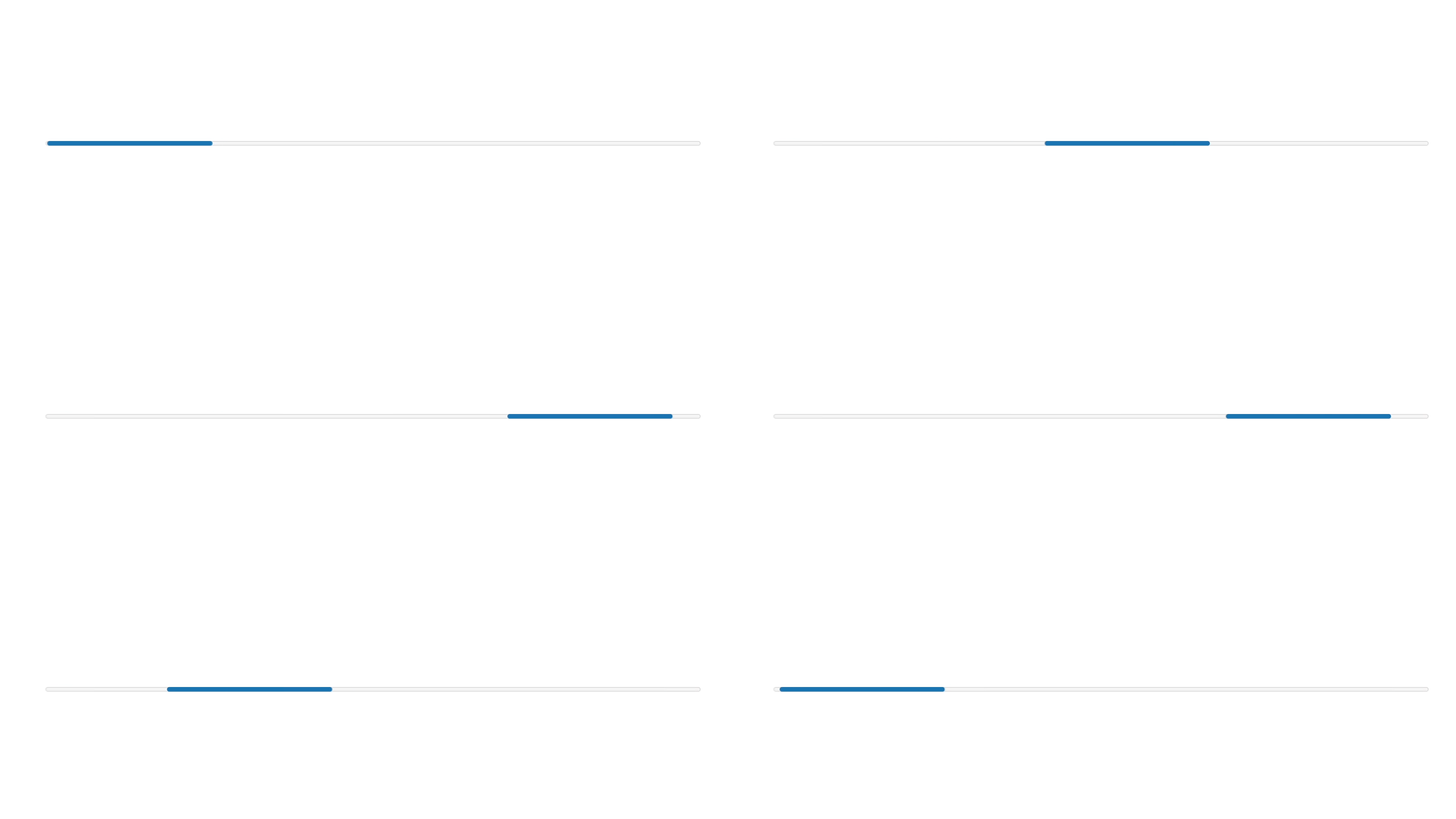
Show a loading state
React
import {
  reactExtension,
  Progress,
} from '@shopify/ui-extensions-react/customer-account';

export default reactExtension(
  'customer-account.page.render',
  () => <Extension />,
);

function Extension() {
  return (
    <Progress accessibilityLabel="Loading" />
  );
}
JS
import {extension, Progress} from '@shopify/ui-extensions/customer-account';

export default extension('customer-account.page.render', (root) => {
  const baseProgress = root.createComponent(Progress, {
    accessibilityLabel: 'Loading',
  });

  root.appendChild(baseProgress);
});
Anchor to Track progress toward a goalTrack progress toward a goal
Set a value and max to show determinate progress. This example displays a rewards tier progress bar with point counts and a description of how many more points are needed.
Track progress toward a goal
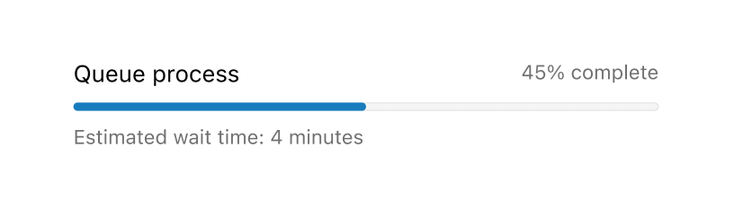
Track progress toward a goal
React
import {
  reactExtension,
  BlockStack,
  Grid,
  Progress,
  Text,
  TextBlock,
} from '@shopify/ui-extensions-react/customer-account';

export default reactExtension(
  'customer-account.page.render',
  () => <Extension />,
);

function Extension() {
  const label = 'Rewards progress';
  return (
    <BlockStack>
      <Grid columns={['fill', 'auto']}>
        <Text>{label}</Text>
        <Text appearance="subdued">
          350 / 500 points
        </Text>
      </Grid>
      <Progress
        value={350}
        max={500}
        accessibilityLabel={label}
      />
      <TextBlock appearance="subdued">
        Earn 150 more points to reach Gold tier
      </TextBlock>
    </BlockStack>
  );
}
JS
import {
  extension,
  BlockStack,
  Grid,
  Progress,
  Text,
  TextBlock,
} from '@shopify/ui-extensions/customer-account';

export default extension(
  'customer-account.page.render',
  (root) => {
    const label = 'Rewards progress';

    const progress = root.createComponent(
      BlockStack,
      null,
      [
        root.createComponent(
          Grid,
          {columns: ['fill', 'auto']},
          [
            root.createComponent(Text, null, label),
            root.createComponent(
              Text,
              {appearance: 'subdued'},
              '350 / 500 points',
            ),
          ],
        ),
        root.createComponent(Progress, {
          value: 350,
          max: 500,
          accessibilityLabel: label,
        }),
        root.createComponent(
          TextBlock,
          {appearance: 'subdued'},
          'Earn 150 more points to reach Gold tier',
        ),
      ],
    );

    root.appendChild(progress);
  },
);
Anchor to Indicate an error stateIndicate an error state
Use the critical tone to visually communicate that a process has failed. Pair the progress bar with a Banner to describe the error and guide the customer toward a resolution.
Indicate an error state
React
import {
  reactExtension,
  BlockStack,
  Progress,
  Banner,
} from '@shopify/ui-extensions-react/customer-account';

export default reactExtension(
  'customer-account.page.render',
  () => <Extension />,
);

function Extension() {
  return (
    <BlockStack>
      <Progress
        value={0.3}
        tone="critical"
        accessibilityLabel="Upload failed"
      />
      <Banner
        status="critical"
        title="The file upload failed. Check your file and try again."
      />
    </BlockStack>
  );
}
JS
import {
  extension,
  BlockStack,
  Progress,
  Banner,
} from '@shopify/ui-extensions/customer-account';

export default extension(
  'customer-account.page.render',
  (root) => {
    const container = root.createComponent(BlockStack, null, [
      root.createComponent(Progress, {
        value: 0.3,
        tone: 'critical',
        accessibilityLabel: 'Upload failed',
      }),
      root.createComponent(Banner, {
        status: 'critical',
        title:
          'The file upload failed. Check your file and try again.',
      }),
    ]);

    root.appendChild(container);
  },
);
Anchor to Best practicesBest practices
- Pair with text to communicate status: The progress bar alone doesn't convey what's happening. Add a label, percentage, or description using Text or TextBlock components.
- Add reassuring text for loading states: When using an indeterminate progress bar, include text like "Loading..." to confirm the operation is still in progress.
- Use the critical tone with an error description: When a process fails, switch the tone to
criticaland add a Banner or text describing the error and next steps. - Visualize meaningful goals: Use determinate progress bars for goals that are valuable to the customer, like rewards tiers or free shipping thresholds.
Anchor to LimitationsLimitations
- The Progress component doesn't include a built-in text label. Pair it with Text or TextBlock to describe the current state.
- The
valuemust be a valid floating point number between 0 andmax(or between 0 and 1 ifmaxis omitted). - There's no animation control for the indeterminate state. The animation runs automatically when
valueis omitted. - Customers who prefer reduced motion see a static text label instead of the animated indicator, if
accessibilityLabelis set.