Version 2025-07 is the last API version to support React-based UI components. Later versions use Polaris web components, native UI elements with built-in accessibility, better performance, and consistent styling with Shopify's design system. Check out the upgrade guide to upgrade your extension and avoid being blocked from updating your extension after October 1st 2026.
Fulfillment status
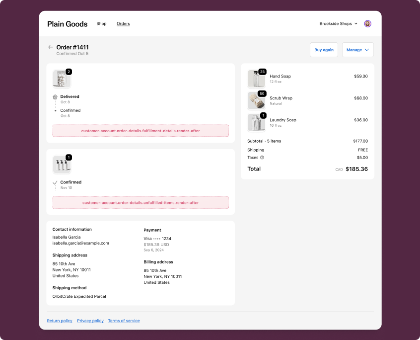
Fulfillment status extensions render inside the delivery status cards on the Order status page. These cards appear alongside Shopify's native fulfillment UI so customers see your extension content in direct context with their shipment details.
Anchor to Use casesUse cases
- Tracking notices: Display courier-specific information or tracking update delays for fulfilled shipments.
- Delivery instructions: Provide delivery preferences or special handling notes tied to a specific fulfillment.
- Processing updates: Show estimated processing times or preparation status for items that haven't shipped yet.
- Custom fulfillment details: Display supplementary fulfillment information from your app, such as warranty activation or installation scheduling.
- Order-specific messaging: Surface contextual messages related to the delivery or preparation of items in the order.
Anchor to Fulfillment status targetsFulfillment status targets
Fulfillment status targets render inside the delivery status cards on the Order status page. They're useful for adding contextual information about the delivery or preparation of order items.
Anchor to Fulfillment details (render after) ,[object Object]Fulfillment details (render after) target
customer-account.order-status.fulfillment-details.render-after
Renders after the fulfillment details in the delivery status card on the Order status page. A separate instance of this extension is rendered for each fulfillment.
Use this target to display tracking notices, delivery instructions, or supplementary shipment information for a specific fulfillment. This target provides fulfillmentId to identify the current fulfillment, and gives you access to the Order API and the Cart Lines API.
Supported components
- Avatar
- Badge
- Banner
- Block
Layout - Block
Spacer - Block
Stack - Button
- Card
- Checkbox
- Choice
- Choice
List - Clipboard
Item - Customer
Account Action - Date
Field - Date
Picker - Disclosure
- Divider
- Drop
Zone - Form
- Grid
- Grid
Item - Heading
- Heading
Group - Icon
- Image
- Image
Group - Inline
Layout - Inline
Spacer - Inline
Stack - Link
- List
- List
Item - Map
- Map
Marker - Map
Popover - Menu
- Modal
- Page
- Payment
Icon - Phone
Field - Popover
- Pressable
- Product
Thumbnail - Progress
- QRCode
- Resource
Item - Scroll
View - Select
- Sheet
- Skeleton
Image - Skeleton
Text - Skeleton
Text Block - Spinner
- Stepper
- Switch
- Tag
- Text
- Text
Block - Text
Field - Toggle
Button - Toggle
Button Group - Tooltip
- View
Available APIs
- Addresses API
- Analytics API
- Attributes API
- Authenticated Account API
- Authentication State API
- Buyer Identity API
- Cart Lines API
- Checkout Settings API
- Cost API
- Customer Account API
- Customer Privacy API
- Discounts API
- Extension API
- Gift Cards API
- Localization API
- Metafields API
- Navigation API
- Note API
- Order API
- Order Status Localization API
- Require Login API
- Session Token API
- Settings API
- Shop API
- Storage API
- Storefront API
- UI API
- Version API
Supported components
- Avatar
- Badge
- Banner
- Block
Layout - Block
Spacer - Block
Stack - Button
- Card
- Checkbox
- Choice
- Choice
List - Clipboard
Item - Customer
Account Action - Date
Field - Date
Picker - Disclosure
- Divider
- Drop
Zone - Form
- Grid
- Grid
Item - Heading
- Heading
Group - Icon
- Image
- Image
Group - Inline
Layout - Inline
Spacer - Inline
Stack - Link
- List
- List
Item - Map
- Map
Marker - Map
Popover - Menu
- Modal
- Page
- Payment
Icon - Phone
Field - Popover
- Pressable
- Product
Thumbnail - Progress
- QRCode
- Resource
Item - Scroll
View - Select
- Sheet
- Skeleton
Image - Skeleton
Text - Skeleton
Text Block - Spinner
- Stepper
- Switch
- Tag
- Text
- Text
Block - Text
Field - Toggle
Button - Toggle
Button Group - Tooltip
- View
Available APIs
- Addresses API
- Analytics API
- Attributes API
- Authenticated Account API
- Authentication State API
- Buyer Identity API
- Cart Lines API
- Checkout Settings API
- Cost API
- Customer Account API
- Customer Privacy API
- Discounts API
- Extension API
- Gift Cards API
- Localization API
- Metafields API
- Navigation API
- Note API
- Order API
- Order Status Localization API
- Require Login API
- Session Token API
- Settings API
- Shop API
- Storage API
- Storefront API
- UI API
- Version API
Examples
Display a tracking notice
Description
Show a banner in the delivery status card informing customers about tracking update timing. This example reads order data using `useOrder()` (React) or `order` (TS) to include the order name for context.
React
import {
  reactExtension,
  Banner,
  useOrder,
} from '@shopify/ui-extensions-react/customer-account';

export default reactExtension(
  'customer-account.order-status.fulfillment-details.render-after',
  () => <Extension />,
);

function Extension() {
  const order = useOrder();

  if (!order) {
    return null;
  }

  return (
    <Banner status="info">
      Tracking updates for order {order.name} may take 24–48 hours to appear
      after shipment.
    </Banner>
  );
}
TS
import {
  Banner,
  extension,
} from '@shopify/ui-extensions/customer-account';

export default extension(
  'customer-account.order-status.fulfillment-details.render-after',
  (root, {order}) => {
    function render() {
      root.replaceChildren();

      const currentOrder = order.current;

      if (!currentOrder) {
        return;
      }

      root.appendChild(
        root.createComponent(
          Banner,
          {status: 'info'},
          `Tracking updates for order ${currentOrder.name} may take 24–48 hours to appear after shipment.`,
        ),
      );
    }

    order.subscribe(() => render());
    render();
  },
);
Show delivery instructions
Description
Display delivery instructions specific to a fulfillment. This example uses `fulfillmentId` from `useApi()` (React) or the API object (TS) to reference the current fulfillment and provides contextual delivery information.
React
import {
  reactExtension,
  BlockStack,
  Heading,
  Text,
  useApi,
  useOrder,
} from '@shopify/ui-extensions-react/customer-account';

export default reactExtension(
  'customer-account.order-status.fulfillment-details.render-after',
  () => <Extension />,
);

function Extension() {
  const {fulfillmentId} = useApi<'customer-account.order-status.fulfillment-details.render-after'>();
  const order = useOrder();

  if (!order) {
    return null;
  }

  return (
    <BlockStack spacing="base">
      <Heading>Delivery instructions</Heading>
      <Text>
        If you're not home, your package will be left at the door. Contact our
        team with fulfillment reference {fulfillmentId} for assistance.
      </Text>
      <Text appearance="subdued">
        Order {order.name}
      </Text>
    </BlockStack>
  );
}
TS
import {
  BlockStack,
  extension,
  Heading,
  Text,
} from '@shopify/ui-extensions/customer-account';

export default extension(
  'customer-account.order-status.fulfillment-details.render-after',
  (root, {fulfillmentId, order}) => {
    function render() {
      root.replaceChildren();

      const currentOrder = order.current;

      if (!currentOrder) {
        return;
      }

      root.appendChild(
        root.createComponent(BlockStack, {spacing: 'base'}, [
          root.createComponent(Heading, undefined, 'Delivery instructions'),
          root.createComponent(
            Text,
            undefined,
            `If you're not home, your package will be left at the door. Contact our team with fulfillment reference ${fulfillmentId} for assistance.`,
          ),
          root.createComponent(
            Text,
            {appearance: 'subdued'},
            `Order ${currentOrder.name}`,
          ),
        ]),
      );
    }

    order.subscribe(() => render());
    render();
  },
);
Anchor to Unfulfilled items (render after) ,[object Object]Unfulfilled items (render after) target
customer-account.order-status.unfulfilled-items.render-after
Renders after the unfulfilled items in the delivery status card on the Order status page. A single instance of this extension is rendered for all unfulfilled items in the order.
Use this target to display information about items that haven't been shipped yet, such as processing updates or estimated preparation times. This target gives you access to the Order API and the Cart Lines API.
Supported components
- Avatar
- Badge
- Banner
- Block
Layout - Block
Spacer - Block
Stack - Button
- Card
- Checkbox
- Choice
- Choice
List - Clipboard
Item - Customer
Account Action - Date
Field - Date
Picker - Disclosure
- Divider
- Drop
Zone - Form
- Grid
- Grid
Item - Heading
- Heading
Group - Icon
- Image
- Image
Group - Inline
Layout - Inline
Spacer - Inline
Stack - Link
- List
- List
Item - Map
- Map
Marker - Map
Popover - Menu
- Modal
- Page
- Payment
Icon - Phone
Field - Popover
- Pressable
- Product
Thumbnail - Progress
- QRCode
- Resource
Item - Scroll
View - Select
- Sheet
- Skeleton
Image - Skeleton
Text - Skeleton
Text Block - Spinner
- Stepper
- Switch
- Tag
- Text
- Text
Block - Text
Field - Toggle
Button - Toggle
Button Group - Tooltip
- View
Available APIs
- Addresses API
- Analytics API
- Attributes API
- Authenticated Account API
- Authentication State API
- Buyer Identity API
- Cart Lines API
- Checkout Settings API
- Cost API
- Customer Account API
- Customer Privacy API
- Discounts API
- Extension API
- Gift Cards API
- Localization API
- Metafields API
- Navigation API
- Note API
- Order API
- Order Status Localization API
- Require Login API
- Session Token API
- Settings API
- Shop API
- Storage API
- Storefront API
- UI API
- Version API
Supported components
- Avatar
- Badge
- Banner
- Block
Layout - Block
Spacer - Block
Stack - Button
- Card
- Checkbox
- Choice
- Choice
List - Clipboard
Item - Customer
Account Action - Date
Field - Date
Picker - Disclosure
- Divider
- Drop
Zone - Form
- Grid
- Grid
Item - Heading
- Heading
Group - Icon
- Image
- Image
Group - Inline
Layout - Inline
Spacer - Inline
Stack - Link
- List
- List
Item - Map
- Map
Marker - Map
Popover - Menu
- Modal
- Page
- Payment
Icon - Phone
Field - Popover
- Pressable
- Product
Thumbnail - Progress
- QRCode
- Resource
Item - Scroll
View - Select
- Sheet
- Skeleton
Image - Skeleton
Text - Skeleton
Text Block - Spinner
- Stepper
- Switch
- Tag
- Text
- Text
Block - Text
Field - Toggle
Button - Toggle
Button Group - Tooltip
- View
Available APIs
- Addresses API
- Analytics API
- Attributes API
- Authenticated Account API
- Authentication State API
- Buyer Identity API
- Cart Lines API
- Checkout Settings API
- Cost API
- Customer Account API
- Customer Privacy API
- Discounts API
- Extension API
- Gift Cards API
- Localization API
- Metafields API
- Navigation API
- Note API
- Order API
- Order Status Localization API
- Require Login API
- Session Token API
- Settings API
- Shop API
- Storage API
- Storefront API
- UI API
- Version API
Examples
Show a preparation notice
Description
Display a banner informing customers that their items are being prepared for shipment. This example reads order data using `useOrder()` (React) or `order` (TS) to include the order name for context.
React
import {
  reactExtension,
  Banner,
  useOrder,
} from '@shopify/ui-extensions-react/customer-account';

export default reactExtension(
  'customer-account.order-status.unfulfilled-items.render-after',
  () => <Extension />,
);

function Extension() {
  const order = useOrder();

  if (!order) {
    return null;
  }

  return (
    <Banner status="info">
      Items from order {order.name} are being prepared. You'll receive tracking
      details once they ship.
    </Banner>
  );
}
TS
import {
  Banner,
  extension,
} from '@shopify/ui-extensions/customer-account';

export default extension(
  'customer-account.order-status.unfulfilled-items.render-after',
  (root, {order}) => {
    function render() {
      root.replaceChildren();

      const currentOrder = order.current;

      if (!currentOrder) {
        return;
      }

      root.appendChild(
        root.createComponent(
          Banner,
          {status: 'info'},
          `Items from order ${currentOrder.name} are being prepared. You'll receive tracking details once they ship.`,
        ),
      );
    }

    order.subscribe(() => render());
    render();
  },
);
Display order line items with a processing notice
Description
Show a processing notice alongside order line items. This example reads line items using `useCartLines()` (React) or `lines` (TS) and order data using `useOrder()` (React) or `order` (TS) to display contextual information about unfulfilled items.
React
import {
  reactExtension,
  Banner,
  BlockStack,
  InlineStack,
  Text,
  useCartLines,
  useOrder,
} from '@shopify/ui-extensions-react/customer-account';

export default reactExtension(
  'customer-account.order-status.unfulfilled-items.render-after',
  () => <Extension />,
);

function Extension() {
  const order = useOrder();
  const lines = useCartLines();

  if (!order) {
    return null;
  }

  return (
    <BlockStack spacing="base">
      <Banner status="info">
        Items from order {order.name} typically take 1–3 business days to
        prepare for shipment.
      </Banner>
      <BlockStack spacing="tight">
        {lines.map((line) => (
          <InlineStack key={line.id} spacing="base" blockAlignment="center">
            <Text>{line.merchandise.title}</Text>
            <Text appearance="subdued">Qty: {line.quantity}</Text>
          </InlineStack>
        ))}
      </BlockStack>
    </BlockStack>
  );
}
TS
import {
  Banner,
  BlockStack,
  extension,
  InlineStack,
  Text,
} from '@shopify/ui-extensions/customer-account';

export default extension(
  'customer-account.order-status.unfulfilled-items.render-after',
  (root, {order, lines}) => {
    function render() {
      root.replaceChildren();

      const currentOrder = order.current;
      const currentLines = lines.current;

      if (!currentOrder) {
        return;
      }

      const lineItems = currentLines.map((line) =>
        root.createComponent(InlineStack, {spacing: 'base', blockAlignment: 'center'}, [
          root.createComponent(Text, undefined, line.merchandise.title),
          root.createComponent(Text, {appearance: 'subdued'}, `Qty: ${line.quantity}`),
        ]),
      );

      root.appendChild(
        root.createComponent(BlockStack, {spacing: 'base'}, [
          root.createComponent(
            Banner,
            {status: 'info'},
            `Items from order ${currentOrder.name} typically take 1–3 business days to prepare for shipment.`,
          ),
          root.createComponent(BlockStack, {spacing: 'tight'}, lineItems),
        ]),
      );
    }

    order.subscribe(() => render());
    lines.subscribe(() => render());
    render();
  },
);
Anchor to Best practicesBest practices
- Keep content contextual: Fulfillment status extensions render inside delivery status cards, so content should be directly relevant to the fulfillment or unfulfilled items being displayed.
- Guard against missing data: Always check that
useOrder()(React) ororder.current(TS) is defined before rendering order-specific content. The order data loads asynchronously and may beundefinedon the initial render. - Subscribe to data changes in TS extensions: When using the imperative
extension()API, subscribe toorderandlinesto re-render when data becomes available or changes. Callroot.replaceChildren()before re-rendering to avoid duplicate content. - Avoid heavy rendering: These targets render inline within the Order status page. Avoid complex layouts or large data fetches that could cause layout shifts. Use Banner or lightweight BlockStack layouts for the best experience.