Version 2025-07 is the last API version to support React-based UI components. Later versions use Polaris web components, native UI elements with built-in accessibility, better performance, and consistent styling with Shopify's design system. Check out the upgrade guide to upgrade your extension and avoid being blocked from updating your extension after October 1st 2026.
Card
The Card component groups related content and functionality together in a familiar and consistent style. Use Card to create contained surfaces for customers to scan, read, and interact with, such as address blocks, order summaries, or account details.
Card provides consistent padding and borders to visually separate content groups. For vertically stacking content inside a card, use BlockStack. For structured page-level grouping with headings and actions, use the Page component.
Supported targets
- Customer
Account::Kitchen Sink - customer-account.
footer. render-after - customer-account.
order-index. announcement. render - customer-account.
order-index. block. render - customer-account.
order-status. announcement. render - customer-account.
order-status. block. render - customer-account.
order-status. cart-line-item. render-after - customer-account.
order-status. cart-line-list. render-after - customer-account.
order-status. customer-information. render-after - customer-account.
order-status. fulfillment-details. render-after - customer-account.
order-status. payment-details. render-after - customer-account.
order-status. return-details. render-after - customer-account.
order-status. unfulfilled-items. render-after - customer-account.
order. action. menu-item. render - customer-account.
order. action. render - customer-account.
order. page. render - customer-account.
page. render - customer-account.
profile. addresses. render-after - customer-account.
profile. announcement. render - customer-account.
profile. block. render - customer-account.
profile. company-details. render-after - customer-account.
profile. company-location-addresses. render-after - customer-account.
profile. company-location-payment. render-after - customer-account.
profile. company-location-staff. render-after - customer-account.
profile. payment. render-after
Supported targets
- Customer
Account::Kitchen Sink - customer-account.
footer. render-after - customer-account.
order-index. announcement. render - customer-account.
order-index. block. render - customer-account.
order-status. announcement. render - customer-account.
order-status. block. render - customer-account.
order-status. cart-line-item. render-after - customer-account.
order-status. cart-line-list. render-after - customer-account.
order-status. customer-information. render-after - customer-account.
order-status. fulfillment-details. render-after - customer-account.
order-status. payment-details. render-after - customer-account.
order-status. return-details. render-after - customer-account.
order-status. unfulfilled-items. render-after - customer-account.
order. action. menu-item. render - customer-account.
order. action. render - customer-account.
order. page. render - customer-account.
page. render - customer-account.
profile. addresses. render-after - customer-account.
profile. announcement. render - customer-account.
profile. block. render - customer-account.
profile. company-details. render-after - customer-account.
profile. company-location-addresses. render-after - customer-account.
profile. company-location-payment. render-after - customer-account.
profile. company-location-staff. render-after - customer-account.
profile. payment. render-after
Anchor to Use casesUse cases
- Address management: Display saved addresses with edit actions in a self-contained card.
- Order summaries: Group order line items, totals, and actions in a clearly bounded area.
- Subscription details: Show subscription plan information, renewal dates, and management actions together.
- Account information: Present profile details like name, email, and phone number in a scannable card.
Anchor to PropertiesProperties
Configure the following properties on the Card component.
- Anchor to paddingpaddingpaddingbooleanboolean
Whether to apply default padding to all edges of the card.
true: Applies context-appropriate padding.false(or omitted): No padding is applied.
Anchor to ExamplesExamples
Anchor to Display an address cardDisplay an address card
Use Card to group related content like an address block with an edit action. The card provides a consistent visual container.
Display an address card
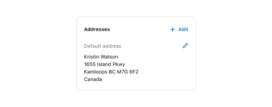
Display an address card
React
import {
  Card,
  Grid,
  BlockStack,
  Heading,
  Text,
  TextBlock,
  View,
  Icon,
  InlineLayout,
  reactExtension,
} from '@shopify/ui-extensions-react/customer-account';
import React from 'react';

export default reactExtension(
  'customer-account.page.render',
  () => <App />,
);

function App() {
  return (
    <Card padding>
      <Grid
        columns={['fill', 'auto']}
        spacing="base"
        minInlineSize="fill"
        blockAlignment="start"
      >
        <BlockStack spacing="loose">
          <Heading>Addresses</Heading>
          <BlockStack spacing="base">
            <Text appearance="subdued">
              Default address
            </Text>
            <BlockStack spacing="extraTight">
              <TextBlock>
                Kristin Watson
              </TextBlock>
              <TextBlock>
                1655 Island Pkwy
              </TextBlock>
              <TextBlock>
                Kamloops BC M7G 672
              </TextBlock>
              <TextBlock>Canada</TextBlock>
            </BlockStack>
          </BlockStack>
        </BlockStack>
        <BlockStack spacing="loose">
          <InlineLayout blockAlignment="center">
            <Icon
              source="plus"
              size="small"
              appearance="accent"
            />
            <Text appearance="accent">Add</Text>
          </InlineLayout>
          <View inlineAlignment="end">
            <Icon
              source="pen"
              size="small"
              appearance="accent"
            />
          </View>
        </BlockStack>
      </Grid>
    </Card>
  );
}
JS
import {
  Card,
  Grid,
  extension,
} from '@shopify/ui-extensions/customer-account';

export default extension(
  'customer-account.page.render',
  (root, api) => {
    renderApp(root, api);
  },
)

function renderApp(root, api) {
  const card = root.createComponent(
    Card,
    {padding: true},
    [
      root.createComponent(Grid, {columns: ['1fr', 'auto'],
        spacing: "base",
        minInlineSize: "fill",
        blockAlignment: "start"}, [
        root.createComponent('BlockStack', {spacing: 'loose'}, [
          root.createComponent('Heading', undefined, 'Addresses'),
          root.createComponent('BlockStack', {spacing: 'base'}, [
            root.createComponent('Text', {appearance: "subdued"}, 'Default address'),
            root.createComponent('BlockStack', {spacing: 'extraTight'}, [
                root.createComponent('TextBlock',{}, 'Kristin Watson'),
                root.createComponent('TextBlock', {}, '1655 Island Pkwy'),
                root.createComponent('TextBlock', {}, 'Kamloops BC M7G 672'),
                root.createComponent('TextBlock', {}, 'Canada'),
            ]),
          ]),
        ]),
        root.createComponent('BlockStack', {spacing: 'loose'}, [
          root.createComponent('InlineLayout',  {blockAlignment: "center"}, [
            root.createComponent('Icon', {source: "plus", size: "small", appearance: "accent"}),
            root.createComponent('Text', {appearance: "accent"}, 'Add'),
          ]),
          root.createComponent('View', {inlineAlignment: "end"}, [
            root.createComponent('Icon', {source: "pen", size: "small", appearance: "accent"}),
          ]),
        ]),
      ]),
    ])
  root.append(card);
}
Anchor to Best practicesBest practices
- Group related information: Only include content in a card that belongs together conceptually. Mixing unrelated content makes the card harder to scan.
- Use headings that set clear expectations: Add a heading inside the card that describes its purpose so customers know what to expect.
- Prioritize important information: Display the most critical information first so customers can get what they need at a glance.
- Keep cards focused: Limit the amount of content in a single card. If a card grows too large, consider splitting it into multiple cards or sections.
Anchor to LimitationsLimitations
- Card provides only the outer container with padding. Internal layout must be handled with components like BlockStack or InlineLayout.
- Card doesn't support custom background colors or border styles. Styling is limited to the predefined design.
- Card doesn't include built-in heading or action slots. Structure the card content manually using text and button components.