Version 2025-07 is the last API version to support React-based UI components. Later versions use Polaris web components, native UI elements with built-in accessibility, better performance, and consistent styling with Shopify's design system. Check out the upgrade guide to upgrade your extension and avoid being blocked from updating your extension after October 1st 2026.
Disclosure
The disclosure component creates expandable content sections that customers can show or hide. Use disclosure to place long content blocks behind toggle controls like buttons, links, or switches.
The component automatically applies the WAI-ARIA Accordion pattern for accessibility.
Supported targets
- Customer
Account::Kitchen Sink - customer-account.
footer. render-after - customer-account.
order-index. announcement. render - customer-account.
order-index. block. render - customer-account.
order-status. announcement. render - customer-account.
order-status. block. render - customer-account.
order-status. cart-line-item. render-after - customer-account.
order-status. cart-line-list. render-after - customer-account.
order-status. customer-information. render-after - customer-account.
order-status. fulfillment-details. render-after - customer-account.
order-status. payment-details. render-after - customer-account.
order-status. return-details. render-after - customer-account.
order-status. unfulfilled-items. render-after - customer-account.
order. action. menu-item. render - customer-account.
order. action. render - customer-account.
order. page. render - customer-account.
page. render - customer-account.
profile. addresses. render-after - customer-account.
profile. announcement. render - customer-account.
profile. block. render - customer-account.
profile. company-details. render-after - customer-account.
profile. company-location-addresses. render-after - customer-account.
profile. company-location-payment. render-after - customer-account.
profile. company-location-staff. render-after - customer-account.
profile. payment. render-after
Supported targets
- Customer
Account::Kitchen Sink - customer-account.
footer. render-after - customer-account.
order-index. announcement. render - customer-account.
order-index. block. render - customer-account.
order-status. announcement. render - customer-account.
order-status. block. render - customer-account.
order-status. cart-line-item. render-after - customer-account.
order-status. cart-line-list. render-after - customer-account.
order-status. customer-information. render-after - customer-account.
order-status. fulfillment-details. render-after - customer-account.
order-status. payment-details. render-after - customer-account.
order-status. return-details. render-after - customer-account.
order-status. unfulfilled-items. render-after - customer-account.
order. action. menu-item. render - customer-account.
order. action. render - customer-account.
order. page. render - customer-account.
page. render - customer-account.
profile. addresses. render-after - customer-account.
profile. announcement. render - customer-account.
profile. block. render - customer-account.
profile. company-details. render-after - customer-account.
profile. company-location-addresses. render-after - customer-account.
profile. company-location-payment. render-after - customer-account.
profile. company-location-staff. render-after - customer-account.
profile. payment. render-after
Anchor to Use casesUse cases
- Expandable FAQs: Let customers reveal answers to common questions without cluttering the page.
- Optional settings: Hide advanced configuration behind a toggle for a cleaner interface.
- Additional order details: Show extended order information only when requested.
- Terms and conditions: Place lengthy legal text behind an expandable control.
Anchor to PropertiesProperties
Configure the following properties on the Disclosure component.
- Anchor to defaultOpendefault
Opendefault Open MaybeResponsiveConditionalStyle<DisclosureOpen | undefined>MaybeResponsiveConditionalStyle<DisclosureOpen | undefined> For uncontrolled disclosure components, the default
openstate on the initial render.It's possible to specify a boolean value, a string value, or an array of string values:
truewill expand all contentfalsewill collapse all contentstringwill expand the content with the matchingidstring[]will expand the content with the matchingids
- Anchor to onToggleon
Toggleon Toggle (open: string[]) => void(open: string[]) => void Callback fired when the open state of the disclosure changes.
- Anchor to openopenopenDisclosureOpenDisclosureOpen
For controlled disclosure components, the open state. The
openprop should be used along withto create a controlled disclosure component.- Anchor to transitiontransitiontransition'none''none'
Set to 'none' to disable the default transition animation.
MaybeResponsiveConditionalStyle
A type that represents a value that can be a conditional style. The conditions are based on the viewport size. We highly recommend using the `Style` helper which simplifies the creation of conditional styles.
T | ConditionalStyle<T, ViewportSizeCondition>ConditionalStyle
A conditional style definition that maps one or more conditions to different values. The `default` value is used as a fallback when none of the conditions in `conditionals` are satisfied.
- conditionals
An array of conditional values.
ConditionalValue<T, AcceptedConditions>[] - default
The default value applied when none of the conditional values specified in `conditionals` are met.
T
ConditionalValue
A single conditional branch that pairs a set of conditions with the value to apply when those conditions are met.
- conditions
The conditions that must be met for the value to be applied. At least one condition must be specified.
AcceptedConditions - value
The value that will be applied if the conditions are met.
T
ViewportSizeCondition
A condition that targets layouts based on the inline size (width in horizontal writing modes) of the viewport.
- viewportInlineSize
The minimum viewport inline size that the condition must match.
{ min: T; }
DisclosureOpen
boolean | string | string[]Anchor to ExamplesExamples
Anchor to Create an expandable sectionCreate an expandable section
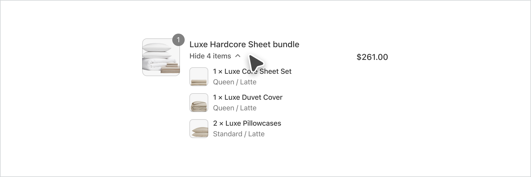
Hide content behind a toggle that customers can expand on demand. This example uses a button activator to reveal a hidden content block.Create an expandable section
Create an expandable section
React
import {
  reactExtension,
  Disclosure,
  Button,
  View,
} from '@shopify/ui-extensions-react/customer-account';

export default reactExtension(
  'customer-account.page.render',
  () => <Extension />,
);

function Extension() {
  return (
    <Disclosure>
      <Button toggles="one">Toggle</Button>
      <View id="one">Content</View>
    </Disclosure>
  );
}
JS
import {
  extension,
  Button,
  View,
  Disclosure,
} from '@shopify/ui-extensions/customer-account';

export default extension('customer-account.page.render', (root) => {
  const disclosure = root.createComponent(Disclosure, {}, [
    root.createComponent(Button, {toggles: 'one'}, 'Toggle'),
    root.createComponent(
      View,
      {border: 'base', padding: 'base', id: 'one'},
      'Content',
    ),
  ]);

  root.appendChild(disclosure);
});
Anchor to Combine disclosure with layout componentsCombine disclosure with layout components
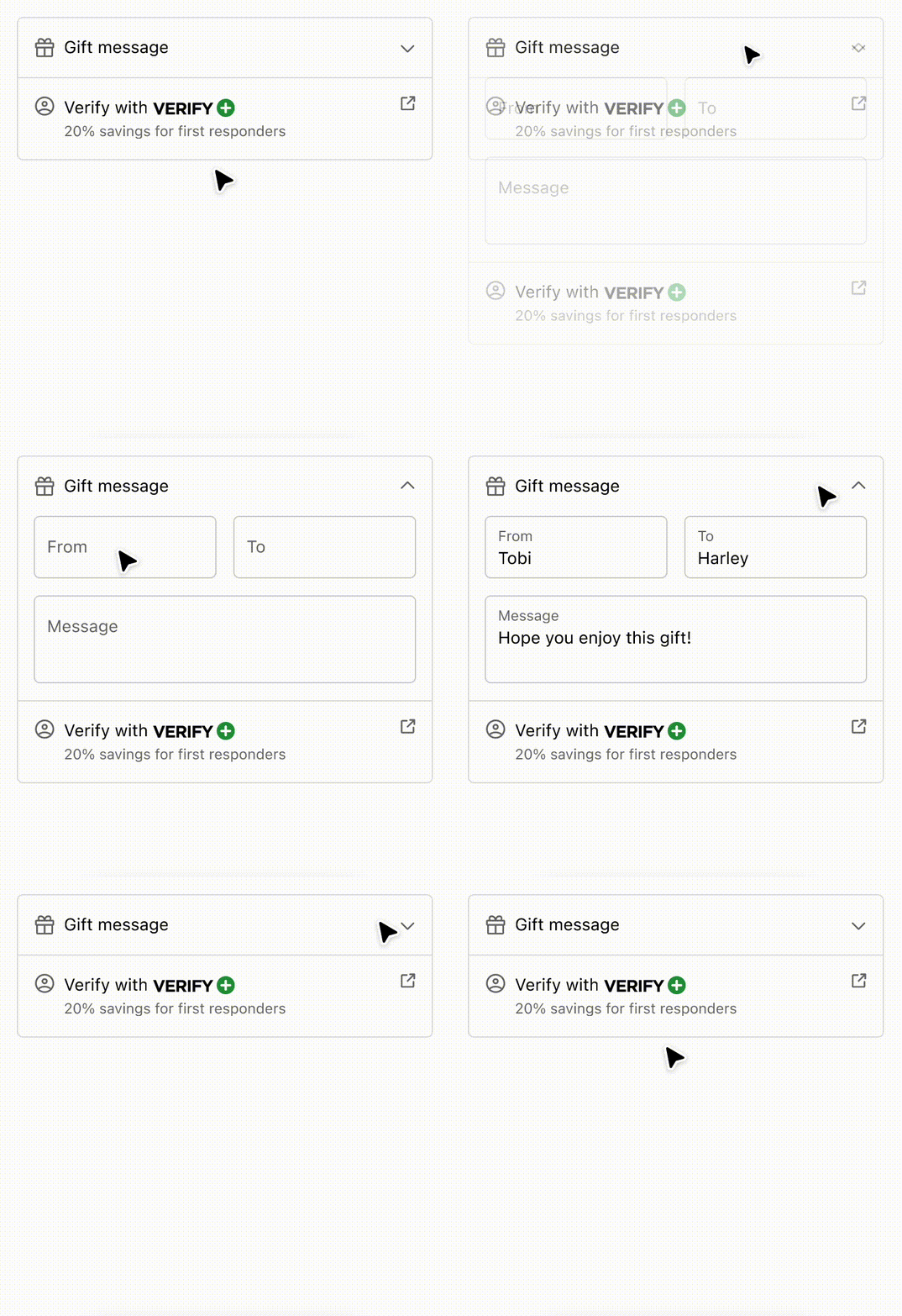
Use disclosure with inline and block layout components to organize expandable content. This example shows how to reveal structured information when the customer requests it.Combine disclosure with layout components
Combine disclosure with layout components
React
import {
  reactExtension,
  View,
  Image,
  Icon,
  Pressable,
  Disclosure,
  InlineLayout,
  BlockStack,
  Text,
  Form,
  TextField,
  Button,
  Divider,
  InlineStack,
} from '@shopify/ui-extensions-react/checkout';

export default reactExtension(
  'purchase.checkout.block.render',
  () => <DisclosureAndAlignment />,
);

export const DisclosureAndAlignment = () => {
  const openIds = ['one'];
  return (
    <View
      maxInlineSize={400}
      cornerRadius="large"
      border="base"
    >
      <BlockStack spacing="none">
        <Disclosure
          defaultOpen="one"
          onToggle={(open) =>
            console.log('onToggle event', open)
          }
        >
          <Pressable toggles="one" padding="base">
            <InlineLayout
              blockAlignment="center"
              spacing="base"
              columns={['auto', 'fill', 'auto']}
            >
              <Icon
                source="gift"
                appearance="subdued"
              />
              Gift message
              <Icon
                source={
                  openIds.includes('one')
                    ? 'chevronUp'
                    : 'chevronDown'
                }
                appearance="subdued"
              />
            </InlineLayout>
          </Pressable>
          <View
            id="one"
            padding={[
              'none',
              'base',
              'base',
              'base',
            ]}
          >
            <Form
              onSubmit={() =>
                console.log('onSubmit event')
              }
            >
              <BlockStack>
                <InlineLayout
                  columns={['fill', 'fill']}
                  spacing="base"
                >
                  <TextField
                    label="From"
                    name="from0"
                    id="from0"
                  />
                  <TextField
                    label="To"
                    name="to0"
                    id="to0"
                  />
                </InlineLayout>
                <TextField
                  label="Message"
                  name="message0"
                  id="message0"
                />
                <View>
                  <Button
                    accessibilityRole="submit"
                    kind="secondary"
                  >
                    Save
                  </Button>
                </View>
              </BlockStack>
            </Form>
          </View>
        </Disclosure>
        <Divider />
        <InlineLayout
          blockAlignment="baseline"
          spacing="base"
          columns={['auto', 'fill', 'auto']}
          padding="base"
        >
          <Icon
            source="profile"
            appearance="subdued"
          />
          <BlockStack spacing="none">
            <InlineStack blockAlignment="center">
              <Text>Verify with</Text>
              <Image source="https://via.placeholder.com/50x15" />
            </InlineStack>
            <Text
              appearance="subdued"
              size="small"
            >
              15% savings for students and
              military
            </Text>
          </BlockStack>
          <Pressable to="https://www.shopify.com">
            <Icon
              source="external"
              appearance="subdued"
            />
          </Pressable>
        </InlineLayout>
      </BlockStack>
    </View>
  );
};
JavaScript
import {
  extension,
  BlockStack,
  View,
  InlineLayout,
  InlineStack,
  Image,
  Pressable,
  Icon,
  Text,
  TextField,
  Form,
  Button,
  Disclosure,
  Divider,
} from '@shopify/ui-extensions/checkout';

export default extension(
  'purchase.checkout.block.render',
  (root) => {
    const openIds = ['one'];

    const pressable = root.createComponent(
      Pressable,
      {
        toggles: 'one',
        padding: 'base',
      },
      [
        root.createComponent(
          InlineLayout,
          {
            blockAlignment: 'center',
            spacing: 'base',
            columns: ['auto', 'fill', 'auto'],
          },
          [
            root.createComponent(Icon, {
              source: 'gift',
              appearance: 'subdued',
            }),
            'Gift message',
            root.createComponent(Icon, {
              source: openIds.includes('one')
                ? 'chevronUp'
                : 'chevronDown',
              size: 'small',
            }),
          ],
        ),
      ],
    );

    const disclosureView = root.createComponent(
      View,
      {
        id: 'one',
        padding: ['none', 'base', 'base', 'base'],
      },
      [
        root.createComponent(
          Form,
          {
            onSubmit: () =>
              console.log('onSubmit event'),
          },
          [
            root.createComponent(BlockStack, {}, [
              root.createComponent(
                InlineLayout,
                {
                  columns: ['fill', 'fill'],
                  spacing: 'base',
                },
                [
                  root.createComponent(
                    TextField,
                    {
                      label: 'From',
                      name: 'from0',
                      id: 'from0',
                    },
                  ),
                  root.createComponent(
                    TextField,
                    {
                      label: 'To',
                      name: 'to0',
                      id: 'to0',
                    },
                  ),
                ],
              ),
              root.createComponent(TextField, {
                label: 'Message',
                name: 'message0',
                id: 'message0',
              }),
              root.createComponent(View, {}, [
                root.createComponent(
                  Button,
                  {
                    accessibilityRole: 'submit',
                    kind: 'secondary',
                  },
                  'Save',
                ),
              ]),
            ]),
          ],
        ),
      ],
    );

    const disclosure = root.createComponent(
      Disclosure,
      {
        defaultOpen: 'one',
        onToggle: (open) =>
          console.log('onToggle event', open),
      },
      [pressable, disclosureView],
    );

    const inlineLayout = root.createComponent(
      InlineLayout,
      {
        blockAlignment: 'baseline',
        spacing: 'base',
        columns: ['auto', 'fill', 'auto'],
        padding: 'base',
      },
      [
        root.createComponent(Icon, {
          source: 'profile',
          appearance: 'subdued',
        }),
        root.createComponent(
          BlockStack,
          {
            spacing: 'none',
          },
          [
            root.createComponent(
              InlineStack,
              {
                blockAlignment: 'center',
              },
              [
                root.createComponent(
                  Text,
                  {},
                  'Verify with',
                ),
                root.createComponent(Image, {
                  source:
                    'https://via.placeholder.com/50x15',
                }),
              ],
            ),
            root.createComponent(
              Text,
              {
                appearance: 'subdued',
                size: 'small',
              },
              '15% savings for students and military',
            ),
          ],
        ),
        root.createComponent(
          Pressable,
          {
            to: 'https://www.shopify.com',
          },
          [
            root.createComponent(Icon, {
              source: 'external',
              appearance: 'subdued',
            }),
          ],
        ),
      ],
    );
    const view = root.createComponent(
      View,
      {
        maxInlineSize: 400,
        cornerRadius: 'large',
        border: 'base',
      },
      [
        root.createComponent(
          BlockStack,
          {
            spacing: 'none',
          },
          [
            disclosure,
            root.createComponent(Divider),
            inlineLayout,
          ],
        ),
      ],
    );

    root.appendChild(view);
  },
);
Anchor to Best practicesBest practices
- Use clear toggle labels: Make activator text describe what will be revealed.
- Default to collapsed: Keep disclosure closed unless content is essential.
- Use appropriate activators: Use buttons for actions, switches for settings, checkboxes for opt-ins.
Anchor to LimitationsLimitations
- The activator must be an action component (Button, Link, Pressable) or form control (Checkbox, Switch).
- Content must be wrapped in a structure component (View, BlockStack, Grid, etc.).