Version 2025-07 is the last API version to support React-based UI components. Later versions use Polaris web components, native UI elements with built-in accessibility, better performance, and consistent styling with Shopify's design system. Check out the upgrade guide to upgrade your extension and avoid being blocked from updating your extension after October 1st 2026.
Toggle
The toggle button group component lets customers make a single choice from a set of options displayed as connected buttons. Use it for compact selection interfaces where all options should be visible at once.
For selections that need additional details or support multiple selections, use ChoiceList instead.
Supported targets
- Customer
Account::Kitchen Sink - customer-account.
footer. render-after - customer-account.
order-index. announcement. render - customer-account.
order-index. block. render - customer-account.
order-status. announcement. render - customer-account.
order-status. block. render - customer-account.
order-status. cart-line-item. render-after - customer-account.
order-status. cart-line-list. render-after - customer-account.
order-status. customer-information. render-after - customer-account.
order-status. fulfillment-details. render-after - customer-account.
order-status. payment-details. render-after - customer-account.
order-status. return-details. render-after - customer-account.
order-status. unfulfilled-items. render-after - customer-account.
order. action. menu-item. render - customer-account.
order. action. render - customer-account.
order. page. render - customer-account.
page. render - customer-account.
profile. addresses. render-after - customer-account.
profile. announcement. render - customer-account.
profile. block. render - customer-account.
profile. company-details. render-after - customer-account.
profile. company-location-addresses. render-after - customer-account.
profile. company-location-payment. render-after - customer-account.
profile. company-location-staff. render-after - customer-account.
profile. payment. render-after
Supported targets
- Customer
Account::Kitchen Sink - customer-account.
footer. render-after - customer-account.
order-index. announcement. render - customer-account.
order-index. block. render - customer-account.
order-status. announcement. render - customer-account.
order-status. block. render - customer-account.
order-status. cart-line-item. render-after - customer-account.
order-status. cart-line-list. render-after - customer-account.
order-status. customer-information. render-after - customer-account.
order-status. fulfillment-details. render-after - customer-account.
order-status. payment-details. render-after - customer-account.
order-status. return-details. render-after - customer-account.
order-status. unfulfilled-items. render-after - customer-account.
order. action. menu-item. render - customer-account.
order. action. render - customer-account.
order. page. render - customer-account.
page. render - customer-account.
profile. addresses. render-after - customer-account.
profile. announcement. render - customer-account.
profile. block. render - customer-account.
profile. company-details. render-after - customer-account.
profile. company-location-addresses. render-after - customer-account.
profile. company-location-payment. render-after - customer-account.
profile. company-location-staff. render-after - customer-account.
profile. payment. render-after
Anchor to Use casesUse cases
- Quick selection: Let customers pick an option with a single tap.
- Time slots: Present a small set of available times for scheduling.
- Size selection: Offer size options in a compact, visual layout.
- Compact choices: Save space compared to a full choice list with radio buttons.
Anchor to PropertiesProperties
Configure the following properties on the ToggleButtonGroup component.
- (value: T) => void(value: T) => voidrequiredrequired
A callback that is run whenever one of the buttons is pressed. This callback is called with a string or array of strings indicating the ids of buttons that should now be selected. When this component is controlled, you must store this value in state and reflect it back in the
valueprop.- TTrequiredrequired
An id of the selected button.
- booleanboolean
Whether the button group is disabled.
Anchor to ExamplesExamples
Anchor to Choose from a set of optionsChoose from a set of options
Use toggle button group to present a small set of options that customers can select with a single tap. This example shows a basic toggle button group with selectable options.Choose from a set of options
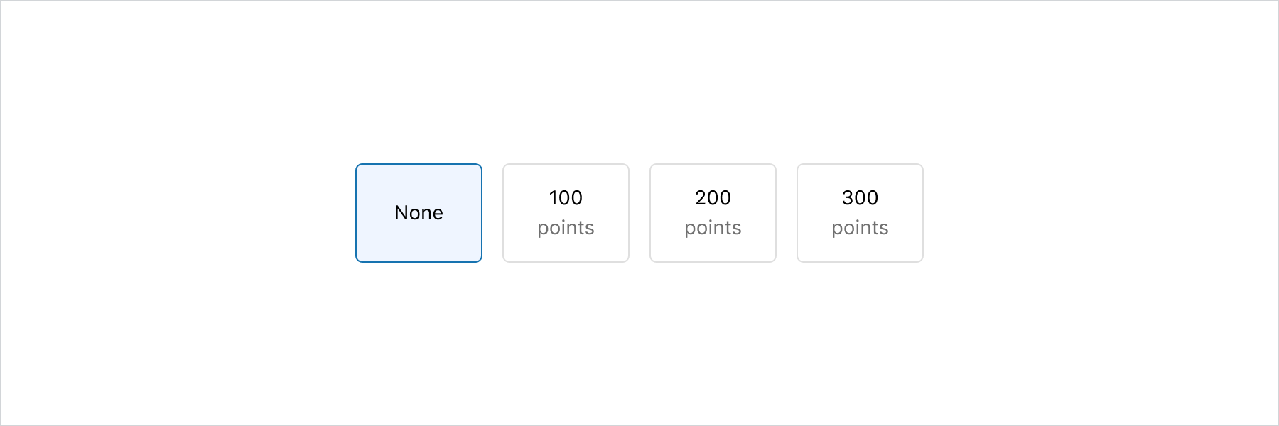
Choose from a set of options
React
import {
  reactExtension,
  BlockStack,
  InlineLayout,
  Text,
  ToggleButton,
  ToggleButtonGroup,
  View,
} from '@shopify/ui-extensions-react/customer-account';

export default reactExtension(
  'customer-account.page.render',
  () => <Extension />,
);

function Extension() {
  return (
    <ToggleButtonGroup
      value="none"
      onChange={(value) => {
        console.log(
          `onChange event with value: ${value}`,
        );
      }}
    >
      <InlineLayout spacing="base">
        <ToggleButton id="none">
          <View
            blockAlignment="center"
            inlineAlignment="center"
            minBlockSize="fill"
          >
            None
          </View>
        </ToggleButton>
        <ToggleButton id="points-100">
          <BlockStack
            inlineAlignment="center"
            spacing="none"
          >
            <Text>100</Text>
            <Text appearance="subdued">
              points
            </Text>
          </BlockStack>
        </ToggleButton>
        <ToggleButton id="points-200">
          <BlockStack
            inlineAlignment="center"
            spacing="none"
          >
            <Text>200</Text>
            <Text appearance="subdued">
              points
            </Text>
          </BlockStack>
        </ToggleButton>
        <ToggleButton id="points-300">
          <BlockStack
            inlineAlignment="center"
            spacing="none"
          >
            <Text>300</Text>
            <Text appearance="subdued">
              points
            </Text>
          </BlockStack>
        </ToggleButton>
      </InlineLayout>
    </ToggleButtonGroup>
  );
}
JS
import {
  extension,
  ToggleButtonGroup,
  ToggleButton,
  InlineLayout,
  View,
  BlockStack,
  Text,
} from '@shopify/ui-extensions/customer-account';

export default extension('customer-account.page.render', (root) => {
  const toggleButtonGroup = root.createComponent(
    ToggleButtonGroup,
    {
      value: 'none',
      onChange: (value) => {
        console.log(`onChange event with value: ${value}`);
      },
    },
    [
      root.createComponent(InlineLayout, {spacing: 'base'}, [
        root.createComponent(
          ToggleButton,
          {id: 'none'},
          root.createComponent(
            View,
            {
              blockAlignment: 'center',
              inlineAlignment: 'center',
              minBlockSize: 'fill',
            },
            'None',
          ),
        ),
        root.createComponent(
          ToggleButton,
          {id: 'points-100'},
          root.createComponent(
            BlockStack,
            {inlineAlignment: 'center', spacing: 'none'},
            [
              root.createComponent(Text, undefined, '100'),
              root.createComponent(Text, {appearance: 'subdued'}, 'points'),
            ],
          ),
        ),
        root.createComponent(
          ToggleButton,
          {id: 'points-200'},
          root.createComponent(
            BlockStack,
            {inlineAlignment: 'center', spacing: 'none'},
            [
              root.createComponent(Text, undefined, '200'),
              root.createComponent(Text, {appearance: 'subdued'}, 'points'),
            ],
          ),
        ),
        root.createComponent(
          ToggleButton,
          {id: 'points-300'},
          root.createComponent(
            BlockStack,
            {inlineAlignment: 'center', spacing: 'none'},
            [
              root.createComponent(Text, undefined, '300'),
              root.createComponent(Text, {appearance: 'subdued'}, 'points'),
            ],
          ),
        ),
      ]),
    ],
  );

  root.appendChild(toggleButtonGroup);
});
Anchor to Display a small set of time choicesDisplay a small set of time choices
The toggle button group component is ideal for a small set of options. It allows for easy scanning of available choices, and the component's large tap target makes it a good choice for an enhanced mobile experience. However, in a grid layout, having more than 6 toggle buttons can get overwhelming and take up too much vertical space. When there are more than 6 choices, consider using the select component instead.
Display a small set of time choices
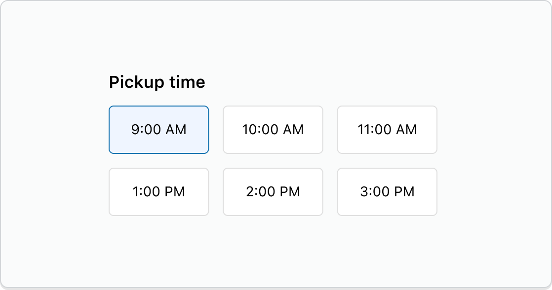
Display a small set of time choices
React
import {
  reactExtension,
  Grid,
  ToggleButton,
  ToggleButtonGroup,
  View,
} from '@shopify/ui-extensions-react/checkout';

export default reactExtension(
  'purchase.checkout.block.render',
  () => <Extension />,
);

function Extension() {
  return (
    <ToggleButtonGroup
      value="time-9am"
      onChange={(value) => {
        console.log(
          `onChange event with value: ${value}`,
        );
      }}
    >
      <Grid
        columns={['auto', 'auto', 'auto']}
        spacing="base"
      >
        <ToggleButton id="time-9am">
          <View inlineAlignment="center">
            9:00 AM
          </View>
        </ToggleButton>
        <ToggleButton id="time-10am">
          <View inlineAlignment="center">
            10:00 AM
          </View>
        </ToggleButton>
        <ToggleButton id="time-11am">
          <View inlineAlignment="center">
            11:00 AM
          </View>
        </ToggleButton>
        <ToggleButton id="time-1pm">
          <View inlineAlignment="center">
            1:00 PM
          </View>
        </ToggleButton>
        <ToggleButton id="time-2pm">
          <View inlineAlignment="center">
            2:00 PM
          </View>
        </ToggleButton>
        <ToggleButton id="time-3pm">
          <View inlineAlignment="center">
            3:00 PM
          </View>
        </ToggleButton>
      </Grid>
    </ToggleButtonGroup>
  );
}
JavaScript
import {
  extension,
  Grid,
  ToggleButtonGroup,
  ToggleButton,
  View,
} from '@shopify/ui-extensions/checkout';

export default extension(
  'purchase.checkout.block.render',
  (root) => {
    const toggleButtonGroup =
      root.createComponent(
        ToggleButtonGroup,
        {
          value: 'time-9am',
          onChange: (value) => {
            console.log(
              `onChange event with value: ${value}`,
            );
          },
        },
        [
          root.createComponent(
            Grid,
            {
              columns: ['auto', 'auto', 'auto'],
              spacing: 'base',
            },
            [
              root.createComponent(
                ToggleButton,
                {id: 'time-9am'},
                root.createComponent(
                  View,
                  {inlineAlignment: 'center'},
                  '9:00 AM',
                ),
              ),
              root.createComponent(
                ToggleButton,
                {id: 'time-10am'},
                root.createComponent(
                  View,
                  {inlineAlignment: 'center'},
                  '10:00 AM',
                ),
              ),
              root.createComponent(
                ToggleButton,
                {id: 'time-11am'},
                root.createComponent(
                  View,
                  {inlineAlignment: 'center'},
                  '11:00 AM',
                ),
              ),
              root.createComponent(
                ToggleButton,
                {id: 'time-1pm'},
                root.createComponent(
                  View,
                  {inlineAlignment: 'center'},
                  '1:00 PM',
                ),
              ),
              root.createComponent(
                ToggleButton,
                {id: 'time-2pm'},
                root.createComponent(
                  View,
                  {inlineAlignment: 'center'},
                  '2:00 PM',
                ),
              ),
              root.createComponent(
                ToggleButton,
                {id: 'time-3pm'},
                root.createComponent(
                  View,
                  {inlineAlignment: 'center'},
                  '3:00 PM',
                ),
              ),
            ],
          ),
        ],
      );

    root.appendChild(toggleButtonGroup);
  },
);
Anchor to Best practicesBest practices
- Limit the number of options: Keep to six or fewer options to prevent visual clutter and maintain scannability.
- Use for single selection: Toggle button group supports single selection only. For multiple selections, use ChoiceList.
- Keep labels concise: Use short, scannable labels that fit within the buttons without wrapping.
Anchor to LimitationsLimitations
- Only supports single selection. For multiple selections, use choice list.