Version 2025-07 is the last API version to support React-based UI components. Later versions use Polaris web components, native UI elements with built-in accessibility, better performance, and consistent styling with Shopify's design system. Check out the upgrade guide to upgrade your extension and avoid being blocked from updating your extension after October 1st 2026.
Choice
The choice list component presents multiple options for single or multiple selections. Use it when customers need to choose from a defined set of options.
The component supports both single selection (radio button behavior) and multiple selection (checkbox behavior) modes. It includes configurable labels, help text, and validation. For compact dropdown selection with four or more options, use Select.
Supported targets
- Customer
Account::Kitchen Sink - customer-account.
footer. render-after - customer-account.
order-index. announcement. render - customer-account.
order-index. block. render - customer-account.
order-status. announcement. render - customer-account.
order-status. block. render - customer-account.
order-status. cart-line-item. render-after - customer-account.
order-status. cart-line-list. render-after - customer-account.
order-status. customer-information. render-after - customer-account.
order-status. fulfillment-details. render-after - customer-account.
order-status. payment-details. render-after - customer-account.
order-status. return-details. render-after - customer-account.
order-status. unfulfilled-items. render-after - customer-account.
order. action. menu-item. render - customer-account.
order. action. render - customer-account.
order. page. render - customer-account.
page. render - customer-account.
profile. addresses. render-after - customer-account.
profile. announcement. render - customer-account.
profile. block. render - customer-account.
profile. company-details. render-after - customer-account.
profile. company-location-addresses. render-after - customer-account.
profile. company-location-payment. render-after - customer-account.
profile. company-location-staff. render-after - customer-account.
profile. payment. render-after
Supported targets
- Customer
Account::Kitchen Sink - customer-account.
footer. render-after - customer-account.
order-index. announcement. render - customer-account.
order-index. block. render - customer-account.
order-status. announcement. render - customer-account.
order-status. block. render - customer-account.
order-status. cart-line-item. render-after - customer-account.
order-status. cart-line-list. render-after - customer-account.
order-status. customer-information. render-after - customer-account.
order-status. fulfillment-details. render-after - customer-account.
order-status. payment-details. render-after - customer-account.
order-status. return-details. render-after - customer-account.
order-status. unfulfilled-items. render-after - customer-account.
order. action. menu-item. render - customer-account.
order. action. render - customer-account.
order. page. render - customer-account.
page. render - customer-account.
profile. addresses. render-after - customer-account.
profile. announcement. render - customer-account.
profile. block. render - customer-account.
profile. company-details. render-after - customer-account.
profile. company-location-addresses. render-after - customer-account.
profile. company-location-payment. render-after - customer-account.
profile. company-location-staff. render-after - customer-account.
profile. payment. render-after
Anchor to Use casesUse cases
- Pickup locations: Let customers select a preferred pickup point from a list.
- Preference selection: Offer single-select options like delivery speed or contact method.
- Multi-select: Allow customers to choose multiple items, such as add-ons or interests.
- Compact layouts: Display up to five options without the overhead of a dropdown.
Anchor to PropertiesProperties
Configure the following properties on the ChoiceList component.
- Anchor to namenamenamestringstringrequiredrequired
A unique identifier for the field in the closest
Formcomponent.- Anchor to onChangeon
Changeon Change (value: T) => void(value: T) => voidrequiredrequired A callback fired when the choice list value changes. This callback is called with a string or array of strings indicating the ids of choices that should now be selected. This component is controlled, so you must store this value in state and reflect it back in the
valueprop.- Anchor to valuevaluevalueTTrequiredrequired
A
stringorstring[]indicating the ids of selected choices. When a string is set, choices render as radios. When a string array is set, choices render as checkboxes.- Anchor to variantvariantvariant'base' | 'group''base' | 'group'Default: 'base'Default: 'base'
Toggle between
baseandgrouplook.Check the best practices to learn more about the variants.
Anchor to ExamplesExamples
Anchor to Pick from a set of optionsPick from a set of options
Use choice list to present a set of options that customers can select from. This example shows a basic single-select choice list with radio buttons.Pick from a set of options

Pick from a set of options
React
import {
  reactExtension,
  BlockStack,
  Choice,
  ChoiceList,
  Icon,
  InlineStack,
} from '@shopify/ui-extensions-react/customer-account';

export default reactExtension(
  'customer-account.page.render',
  () => <Extension />,
);

function Extension() {
  return (
    <InlineStack>
      <ChoiceList
        name="group-single"
        variant="group"
        value="ship"
        onChange={(value) => {
          console.log(
            `onChange event with value: ${value}`,
          );
        }}
      >
        <Choice
          secondaryContent={
            <Icon source="truck" />
          }
          id="ship"
        >
          Ship
        </Choice>
        <Choice
          secondaryContent={
            <Icon source="marker" />
          }
          id="ship-to-pickup-point"
        >
          Ship to pickup point
        </Choice>
        <Choice
          secondaryContent={
            <Icon source="store" />
          }
          id="pick-up"
        >
          Pick up in store
        </Choice>
      </ChoiceList>
      <ChoiceList
        name="base-multiple"
        value={['remember-me']}
        onChange={(value) => {
          console.log(
            `onChange event with value: ${value}`,
          );
        }}
      >
        <BlockStack>
          <Choice id="remember-me">
            Save this information for next time
          </Choice>
          <Choice id="email-me">
            Email me with news and offers
          </Choice>
          <Choice id="text-me">
            Text me with news and offers
          </Choice>
        </BlockStack>
      </ChoiceList>
    </InlineStack>
  );
}
JS
import {
  extension,
  InlineStack,
  ChoiceList,
  Choice,
  BlockStack,
  Icon,
} from '@shopify/ui-extensions/customer-account';

export default extension('customer-account.page.render', (root) => {
  const inlineStack = root.createComponent(InlineStack, undefined, [
    root.createComponent(
      ChoiceList,
      {
        name: 'group-single',
        variant: 'group',
        value: 'ship',
        onChange: (value) => {
          console.log(`onChange event with value: ${value}`);
        },
      },
      [
        root.createComponent(
          Choice,
          {
            secondaryContent: root.createComponent(Icon, {source: 'truck'}),
            id: 'ship',
          },
          'Ship',
        ),
        root.createComponent(
          Choice,
          {
            secondaryContent: root.createComponent(Icon, {source: 'marker'}),
            id: 'ship-to-pickup-point',
          },
          'Ship to pickup point',
        ),
        root.createComponent(
          Choice,
          {
            secondaryContent: root.createComponent(Icon, {source: 'store'}),
            id: 'pick-up',
          },
          'Pick up in store',
        ),
      ],
    ),
    root.createComponent(
      ChoiceList,
      {
        name: 'base-multiple',
        value: ['remember-me'],
        onChange: (value) => {
          console.log(`onChange event with value: ${value}`);
        },
      },
      [
        root.createComponent(BlockStack, undefined, [
          root.createComponent(
            Choice,
            {id: 'remember-me'},
            'Save this information for next time',
          ),
          root.createComponent(
            Choice,
            {id: 'email-me'},
            'Email me with news and offers',
          ),
          root.createComponent(
            Choice,
            {id: 'text-me'},
            'Text me with news and offers',
          ),
        ]),
      ],
    ),
  ]);

  root.appendChild(inlineStack);
});
Anchor to Build a custom survey using the base variantBuild a custom survey using the base variant
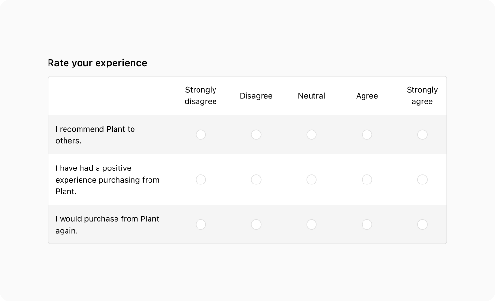
The base variant's flexibility allows for the creation of Likert scales using the choice list component. By using layout components, you can easily structure rows and columns for this purpose.
Build a custom survey using the base variant
Build a custom survey using the base variant
React
import {
  reactExtension,
  Choice,
  ChoiceList,
  Grid,
  TextBlock,
  View,
} from '@shopify/ui-extensions-react/checkout';

export default reactExtension(
  'purchase.checkout.block.render',
  () => <Extension />,
);

function Extension() {
  return (
    <Grid
      columns={[
        'fill',
        '13%',
        '13%',
        '13%',
        '13%',
        '13%',
      ]}
      rows="auto"
      spacing="none"
      border="base"
      cornerRadius="base"
      overflow="hidden"
    >
      <View />
      <View
        padding={['tight', 'extraTight']}
        blockAlignment="center"
        accessibilityVisibility="hidden"
      >
        <TextBlock inlineAlignment="center">
          Strongly disagree
        </TextBlock>
      </View>
      <View
        padding={['tight', 'extraTight']}
        blockAlignment="center"
        accessibilityVisibility="hidden"
      >
        <TextBlock inlineAlignment="center">
          Disagree
        </TextBlock>
      </View>
      <View
        padding={['tight', 'extraTight']}
        blockAlignment="center"
        accessibilityVisibility="hidden"
      >
        <TextBlock inlineAlignment="center">
          Neutral
        </TextBlock>
      </View>
      <View
        padding={['tight', 'extraTight']}
        blockAlignment="center"
        accessibilityVisibility="hidden"
      >
        <TextBlock inlineAlignment="center">
          Agree
        </TextBlock>
      </View>
      <View
        padding={['tight', 'extraTight']}
        blockAlignment="center"
        accessibilityVisibility="hidden"
      >
        <TextBlock inlineAlignment="center">
          Strongly agree
        </TextBlock>
      </View>

      <ChoiceList
        name="question1"
        value=""
        onChange={(value) => {
          console.log(
            `onChange event with value: ${value}`,
          );
        }}
      >
        <View
          background="subdued"
          padding="base"
          blockAlignment="center"
        >
          <TextBlock>
            I recommend Plant to others.
          </TextBlock>
        </View>
        <View
          background="subdued"
          blockAlignment="center"
          inlineAlignment="center"
        >
          <Choice
            id="question1-1"
            accessibilityLabel="Strongly disagree"
          />
        </View>
        <View
          background="subdued"
          blockAlignment="center"
          inlineAlignment="center"
        >
          <Choice
            id="question1-2"
            accessibilityLabel="Disagree"
          />
        </View>
        <View
          background="subdued"
          blockAlignment="center"
          inlineAlignment="center"
        >
          <Choice
            id="question1-3"
            accessibilityLabel="Neutral"
          />
        </View>
        <View
          background="subdued"
          blockAlignment="center"
          inlineAlignment="center"
        >
          <Choice
            id="question1-4"
            accessibilityLabel="Agree"
          />
        </View>
        <View
          background="subdued"
          blockAlignment="center"
          inlineAlignment="center"
        >
          <Choice
            id="question1-5"
            accessibilityLabel="Strongly agree"
          />
        </View>
      </ChoiceList>

      <ChoiceList
        name="question2"
        value=""
        onChange={(value) => {
          console.log(
            `onChange event with value: ${value}`,
          );
        }}
      >
        <View
          padding="base"
          blockAlignment="center"
        >
          <TextBlock>
            I have had a positive experience
            purchasing from Plant.
          </TextBlock>
        </View>
        <View
          blockAlignment="center"
          inlineAlignment="center"
        >
          <Choice
            id="question2-1"
            accessibilityLabel="Strongly disagree"
          />
        </View>
        <View
          blockAlignment="center"
          inlineAlignment="center"
        >
          <Choice
            id="question2-2"
            accessibilityLabel="Disagree"
          />
        </View>
        <View
          blockAlignment="center"
          inlineAlignment="center"
        >
          <Choice
            id="question2-3"
            accessibilityLabel="Neutral"
          />
        </View>
        <View
          blockAlignment="center"
          inlineAlignment="center"
        >
          <Choice
            id="question2-4"
            accessibilityLabel="Agree"
          />
        </View>
        <View
          blockAlignment="center"
          inlineAlignment="center"
        >
          <Choice
            id="question2-5"
            accessibilityLabel="Strongly agree"
          />
        </View>
      </ChoiceList>

      <ChoiceList
        name="question3"
        value=""
        onChange={(value) => {
          console.log(
            `onChange event with value: ${value}`,
          );
        }}
      >
        <View
          background="subdued"
          padding="base"
          blockAlignment="center"
        >
          <TextBlock>
            I would purchase from Plant again.
          </TextBlock>
        </View>
        <View
          background="subdued"
          blockAlignment="center"
          inlineAlignment="center"
        >
          <Choice
            id="question3-1"
            accessibilityLabel="Strongly disagree"
          />
        </View>
        <View
          background="subdued"
          blockAlignment="center"
          inlineAlignment="center"
        >
          <Choice
            id="question3-2"
            accessibilityLabel="Disagree"
          />
        </View>
        <View
          background="subdued"
          blockAlignment="center"
          inlineAlignment="center"
        >
          <Choice
            id="question3-3"
            accessibilityLabel="Neutral"
          />
        </View>
        <View
          background="subdued"
          blockAlignment="center"
          inlineAlignment="center"
        >
          <Choice
            id="question3-4"
            accessibilityLabel="Agree"
          />
        </View>
        <View
          background="subdued"
          blockAlignment="center"
          inlineAlignment="center"
        >
          <Choice
            id="question3-5"
            accessibilityLabel="Strongly agree"
          />
        </View>
      </ChoiceList>
    </Grid>
  );
}
JavaScript
import {
  extension,
  Choice,
  ChoiceList,
  Grid,
  TextBlock,
  View,
} from '@shopify/ui-extensions/checkout';

export default extension(
  'purchase.checkout.block.render',
  (root) => {
    const grid = root.createComponent(
      Grid,
      {
        columns: [
          'fill',
          '13%',
          '13%',
          '13%',
          '13%',
          '13%',
        ],
        rows: 'auto',
        spacing: 'none',
        border: 'base',
        cornerRadius: 'base',
        overflow: 'hidden',
      },
      [
        root.createComponent(View, {}, []),
        root.createComponent(
          View,
          {
            padding: ['tight', 'extraTight'],
            blockAlignment: 'center',
            accessibilityVisibility: 'hidden',
          },
          root.createComponent(
            TextBlock,
            {inlineAlignment: 'center'},
            'Strongly disagree',
          ),
        ),
        root.createComponent(
          View,
          {
            padding: ['tight', 'extraTight'],
            blockAlignment: 'center',
            accessibilityVisibility: 'hidden',
          },
          root.createComponent(
            TextBlock,
            {inlineAlignment: 'center'},
            'Disagree',
          ),
        ),
        root.createComponent(
          View,
          {
            padding: ['tight', 'extraTight'],
            blockAlignment: 'center',
            accessibilityVisibility: 'hidden',
          },
          root.createComponent(
            TextBlock,
            {inlineAlignment: 'center'},
            'Neutral',
          ),
        ),
        root.createComponent(
          View,
          {
            padding: ['tight', 'extraTight'],
            blockAlignment: 'center',
            accessibilityVisibility: 'hidden',
          },
          root.createComponent(
            TextBlock,
            {inlineAlignment: 'center'},
            'Agree',
          ),
        ),
        root.createComponent(
          View,
          {
            padding: ['tight', 'extraTight'],
            blockAlignment: 'center',
            accessibilityVisibility: 'hidden',
          },
          root.createComponent(
            TextBlock,
            {inlineAlignment: 'center'},
            'Strongly agree',
          ),
        ),
        // Then create the ChoiceList for 'question1'
        root.createComponent(
          ChoiceList,
          {
            name: 'question1',
            value: '',
            onChange: (value) => {
              console.log(
                `onChange event with value: ${value}`,
              );
            },
          },
          [
            root.createComponent(
              View,
              {
                background: 'subdued',
                padding: 'base',
                blockAlignment: 'center',
              },
              root.createComponent(
                TextBlock,
                {},
                'I recommend Plant to others.',
              ),
            ),
            root.createComponent(
              View,
              {
                background: 'subdued',
                blockAlignment: 'center',
                inlineAlignment: 'center',
              },
              root.createComponent(Choice, {
                id: 'question1-1',
                accessibilityLabel:
                  'Strongly disagree',
              }),
            ),
            root.createComponent(
              View,
              {
                background: 'subdued',
                blockAlignment: 'center',
                inlineAlignment: 'center',
              },
              root.createComponent(Choice, {
                id: 'question1-2',
                accessibilityLabel: 'Disagree',
              }),
            ),
            root.createComponent(
              View,
              {
                background: 'subdued',
                blockAlignment: 'center',
                inlineAlignment: 'center',
              },
              root.createComponent(Choice, {
                id: 'question1-3',
                accessibilityLabel: 'Neutral',
              }),
            ),
            root.createComponent(
              View,
              {
                background: 'subdued',
                blockAlignment: 'center',
                inlineAlignment: 'center',
              },
              root.createComponent(Choice, {
                id: 'question1-4',
                accessibilityLabel: 'Agree',
              }),
            ),
            root.createComponent(
              View,
              {
                background: 'subdued',
                blockAlignment: 'center',
                inlineAlignment: 'center',
              },
              root.createComponent(Choice, {
                id: 'question1-5',
                accessibilityLabel:
                  'Strongly agree',
              }),
            ),
          ],
        ),
        // Then create the ChoiceList for 'question2'
        root.createComponent(
          ChoiceList,
          {
            name: 'question2',
            value: '',
            onChange: (value) => {
              console.log(
                `onChange event with value: ${value}`,
              );
            },
          },
          [
            root.createComponent(
              View,
              {
                padding: 'base',
                blockAlignment: 'center',
              },
              root.createComponent(
                TextBlock,
                {},
                'I have had a positive experience purchasing from Plant.',
              ),
            ),
            root.createComponent(
              View,
              {
                blockAlignment: 'center',
                inlineAlignment: 'center',
              },
              root.createComponent(Choice, {
                id: 'question2-1',
                accessibilityLabel:
                  'Strongly disagree',
              }),
            ),
            root.createComponent(
              View,
              {
                blockAlignment: 'center',
                inlineAlignment: 'center',
              },
              root.createComponent(Choice, {
                id: 'question2-2',
                accessibilityLabel: 'Disagree',
              }),
            ),
            root.createComponent(
              View,
              {
                blockAlignment: 'center',
                inlineAlignment: 'center',
              },
              root.createComponent(Choice, {
                id: 'question2-3',
                accessibilityLabel: 'Neutral',
              }),
            ),
            root.createComponent(
              View,
              {
                blockAlignment: 'center',
                inlineAlignment: 'center',
              },
              root.createComponent(Choice, {
                id: 'question2-4',
                accessibilityLabel: 'Agree',
              }),
            ),
            root.createComponent(
              View,
              {
                blockAlignment: 'center',
                inlineAlignment: 'center',
              },
              root.createComponent(Choice, {
                id: 'question2-5',
                accessibilityLabel:
                  'Strongly agree',
              }),
            ),
          ],
        ),
        // Then create the ChoiceList for 'question3'
        root.createComponent(
          ChoiceList,
          {
            name: 'question3',
            value: '',
            onChange: (value) => {
              console.log(
                `onChange event with value: ${value}`,
              );
            },
          },
          [
            root.createComponent(
              View,
              {
                background: 'subdued',
                padding: 'base',
                blockAlignment: 'center',
              },
              root.createComponent(
                TextBlock,
                {},
                'I would purchase from Plant again.',
              ),
            ),
            root.createComponent(
              View,
              {
                background: 'subdued',
                blockAlignment: 'center',
                inlineAlignment: 'center',
              },
              root.createComponent(Choice, {
                id: 'question3-1',
                accessibilityLabel:
                  'Strongly disagree',
              }),
            ),
            root.createComponent(
              View,
              {
                background: 'subdued',
                blockAlignment: 'center',
                inlineAlignment: 'center',
              },
              root.createComponent(Choice, {
                id: 'question3-2',
                accessibilityLabel: 'Disagree',
              }),
            ),
            root.createComponent(
              View,
              {
                background: 'subdued',
                blockAlignment: 'center',
                inlineAlignment: 'center',
              },
              root.createComponent(Choice, {
                id: 'question3-3',
                accessibilityLabel: 'Neutral',
              }),
            ),
            root.createComponent(
              View,
              {
                background: 'subdued',
                blockAlignment: 'center',
                inlineAlignment: 'center',
              },
              root.createComponent(Choice, {
                id: 'question3-4',
                accessibilityLabel: 'Agree',
              }),
            ),
            root.createComponent(
              View,
              {
                background: 'subdued',
                blockAlignment: 'center',
                inlineAlignment: 'center',
              },
              root.createComponent(Choice, {
                id: 'question3-5',
                accessibilityLabel:
                  'Strongly agree',
              }),
            ),
          ],
        ),
      ],
    );

    root.appendChild(grid);
  },
);
Anchor to Collect additional informationCollect additional information
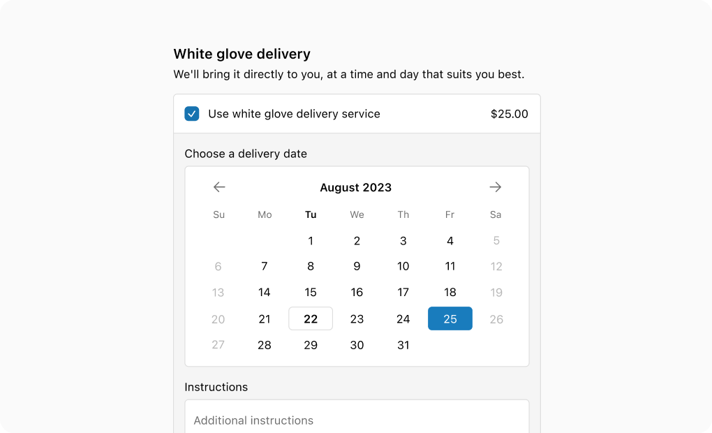
The choice list's group variant, combined with the details property, allows for the conditional display of information when needed.
Collect additional information
Collect additional information
React
import {
  reactExtension,
  BlockStack,
  Choice,
  ChoiceList,
  DatePicker,
  TextBlock,
  TextField,
  View,
} from '@shopify/ui-extensions-react/checkout';

export default reactExtension(
  'purchase.checkout.block.render',
  () => <Extension />,
);

function Extension() {
  return (
    <ChoiceList
      variant="group"
      name="white-glove"
      value={['white-glove-1']}
      onChange={(value) => {
        console.log(
          `onChange event with value: ${value}`,
        );
      }}
    >
      <Choice
        id="white-glove-1"
        details={
          <>
            <BlockStack spacing="base">
              <BlockStack spacing="extraTight">
                <TextBlock>
                  Choose a delivery date
                </TextBlock>
                <View
                  background="base"
                  border="base"
                  cornerRadius="base"
                  padding="base"
                >
                  <DatePicker selected="" />
                </View>
              </BlockStack>
              <BlockStack spacing="extraTight">
                <TextField
                  label="Additional instructions"
                  value=""
                />
                <TextBlock
                  appearance="subdued"
                  size="small"
                >
                  The more detailed the delivery
                  instructions are, the best we
                  can make the delivery experience
                  for you.
                </TextBlock>
              </BlockStack>
            </BlockStack>
          </>
        }
      >
        Use white glove delivery service
      </Choice>
    </ChoiceList>
  );
}
JavaScript
import {
  extension,
  BlockStack,
  Choice,
  ChoiceList,
  DatePicker,
  TextBlock,
  TextField,
  View,
} from '@shopify/ui-extensions/checkout';

export default extension(
  'purchase.checkout.block.render',
  (root) => {
    const choiceList = root.createComponent(
      ChoiceList,
      {
        name: 'white-glove',
        value: ['white-glove-1'],
        onChange: (nextValue) => {
          console.log(
            `onChange event with value: ${nextValue}`,
          );
        },
      },
      [
        root.createComponent(
          Choice,
          {id: 'white-glove-1'},
          [
            root.createComponent(
              BlockStack,
              {spacing: 'base'},
              [
                root.createComponent(
                  BlockStack,
                  {spacing: 'extraTight'},
                  [
                    root.createComponent(
                      TextBlock,
                      {},
                      'Choose a delivery date',
                    ),
                    root.createComponent(
                      View,
                      {
                        background: 'base',
                        border: 'base',
                        cornerRadius: 'base',
                        padding: 'base',
                      },
                      root.createComponent(
                        DatePicker,
                        {selected: ''},
                      ),
                    ),
                  ],
                ),
                root.createComponent(
                  BlockStack,
                  {spacing: 'extraTight'},
                  [
                    root.createComponent(
                      TextField,
                      {
                        label:
                          'Additional instructions',
                        value: '',
                      },
                    ),
                    root.createComponent(
                      TextBlock,
                      {
                        appearance: 'subdued',
                        size: 'small',
                      },
                      'The more detailed the delivery instructions are, the best we can make the delivery experience for you.',
                    ),
                  ],
                ),
              ],
            ),
          ],
        ),
      ],
    );

    root.appendChild(choiceList);
  },
);
Anchor to Display a short list of time choicesDisplay a short list of time choices
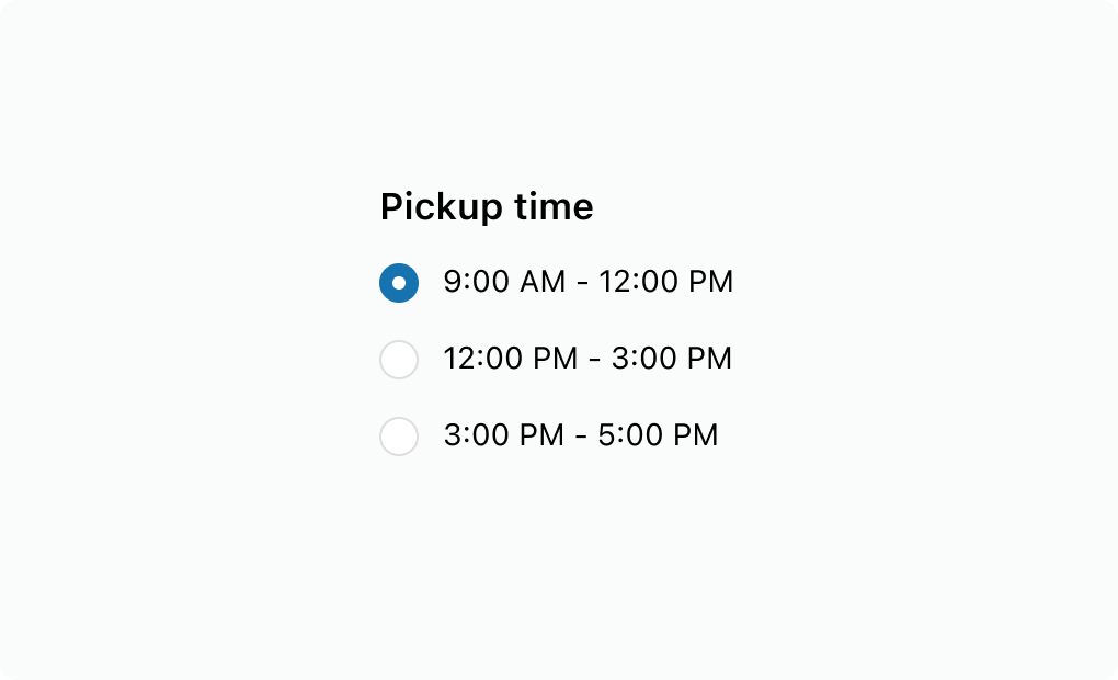
The choice list component is great for presenting a concise list of options, particularly when showcasing time ranges due to its ample horizontal space. However, if there are more than 5 choices, use the select component instead.
Display a short list of time choices
Display a short list of time choices
React
import {
  reactExtension,
  BlockStack,
  ChoiceList,
  Choice,
} from '@shopify/ui-extensions-react/checkout';

export default reactExtension(
  'purchase.checkout.block.render',
  () => <Extension />,
);

function Extension() {
  return (
    <ChoiceList
      name="time"
      value=""
      onChange={(value) => {
        console.log(
          `onChange event with value: ${value}`,
        );
      }}
    >
      <BlockStack>
        <Choice id="morning">
          9:00 AM - 12:00 PM
        </Choice>
        <Choice id="afternoon">
          12:00 PM - 3:00 PM
        </Choice>
        <Choice id="evening">
          3:00 PM - 5:00 PM
        </Choice>
      </BlockStack>
    </ChoiceList>
  );
}
JavaScript
import {
  extension,
  BlockStack,
  ChoiceList,
  Choice,
} from '@shopify/ui-extensions/checkout';

export default extension(
  'purchase.checkout.block.render',
  (root) => {
    const choiceList = root.createComponent(
      ChoiceList,
      {
        name: 'time',
        value: '',
        onChange: (value) => {
          console.log(
            `onChange event with value: ${value}`,
          );
        },
      },
      [
        root.createComponent(BlockStack, {}, [
          root.createComponent(
            Choice,
            {id: 'morning'},
            '9:00 AM - 12:00 PM',
          ),
          root.createComponent(
            Choice,
            {id: 'afternoon'},
            '12:00 PM - 3:00 PM',
          ),
          root.createComponent(
            Choice,
            {id: 'evening'},
            '3:00 PM - 5:00 PM',
          ),
        ]),
      ],
    );

    root.appendChild(choiceList);
  },
);
Anchor to Best practicesBest practices
- Keep labels concise: Write short, scannable labels so customers can quickly compare their choices.
- Add a group label: Use the
labelproperty to describe the purpose of the choice list, such as "Shipping speed" or "Contact method." - Use select for long lists: When you have four or more options and screen space is limited, use Select to keep the interface compact and scrollable.
Anchor to LimitationsLimitations
- Component is either single or multiple selection for all choices.