Version 2025-07 is the last API version to support React-based UI components. Later versions use Polaris web components, native UI elements with built-in accessibility, better performance, and consistent styling with Shopify's design system. Check out the upgrade guide to upgrade your extension and avoid being blocked from updating your extension after October 1st 2026.
Inline
The InlineStack component arranges elements horizontally along the inline axis with consistent spacing. Use InlineStack to lay out items in a row that automatically wraps to the next line when content exceeds the available space, such as a group of tags or action buttons.
InlineStack supports gap spacing, alignment, and wrapping properties for flexible horizontal layouts. For fixed-column layouts where content shouldn't wrap, use InlineLayout. For vertical stacking, use BlockStack.
Supported targets
- Customer
Account::Kitchen Sink - customer-account.
footer. render-after - customer-account.
order-index. announcement. render - customer-account.
order-index. block. render - customer-account.
order-status. announcement. render - customer-account.
order-status. block. render - customer-account.
order-status. cart-line-item. render-after - customer-account.
order-status. cart-line-list. render-after - customer-account.
order-status. customer-information. render-after - customer-account.
order-status. fulfillment-details. render-after - customer-account.
order-status. payment-details. render-after - customer-account.
order-status. return-details. render-after - customer-account.
order-status. unfulfilled-items. render-after - customer-account.
order. action. menu-item. render - customer-account.
order. action. render - customer-account.
order. page. render - customer-account.
page. render - customer-account.
profile. addresses. render-after - customer-account.
profile. announcement. render - customer-account.
profile. block. render - customer-account.
profile. company-details. render-after - customer-account.
profile. company-location-addresses. render-after - customer-account.
profile. company-location-payment. render-after - customer-account.
profile. company-location-staff. render-after - customer-account.
profile. payment. render-after
Supported targets
- Customer
Account::Kitchen Sink - customer-account.
footer. render-after - customer-account.
order-index. announcement. render - customer-account.
order-index. block. render - customer-account.
order-status. announcement. render - customer-account.
order-status. block. render - customer-account.
order-status. cart-line-item. render-after - customer-account.
order-status. cart-line-list. render-after - customer-account.
order-status. customer-information. render-after - customer-account.
order-status. fulfillment-details. render-after - customer-account.
order-status. payment-details. render-after - customer-account.
order-status. return-details. render-after - customer-account.
order-status. unfulfilled-items. render-after - customer-account.
order. action. menu-item. render - customer-account.
order. action. render - customer-account.
order. page. render - customer-account.
page. render - customer-account.
profile. addresses. render-after - customer-account.
profile. announcement. render - customer-account.
profile. block. render - customer-account.
profile. company-details. render-after - customer-account.
profile. company-location-addresses. render-after - customer-account.
profile. company-location-payment. render-after - customer-account.
profile. company-location-staff. render-after - customer-account.
profile. payment. render-after
Anchor to Use casesUse cases
- Badge rows: Display multiple badges side by side for order statuses, tags, or labels that wrap when space is limited.
- Button groups: Arrange action buttons horizontally with consistent spacing.
- Inline metadata: Show dates, order numbers, and statuses in a compact horizontal row.
- Tag lists: Display a wrapping list of product tags, categories, or filter chips.
- Responsive spacing: Use StyleHelper to adjust
spacingat different viewport sizes.
Anchor to PropertiesProperties
Configure the following properties on the InlineStack component.
- Anchor to accessibilityLabelaccessibility
Labelaccessibility Label stringstring A label announced by assistive technologies that describes the purpose or contents of the element. Only set this when the element's visible content doesn't provide enough context on its own.
- Anchor to accessibilityRoleaccessibility
Roleaccessibility Role ViewLikeAccessibilityRoleViewLikeAccessibilityRole The semantic meaning of the component's content. When set, assistive technologies use this role to help users navigate the page. Accepts a single role or a tuple of two roles (for example,
).- Anchor to backgroundbackgroundbackgroundMaybeConditionalStyle<Background>MaybeConditionalStyle<Background>Default: 'transparent'Default: 'transparent'
The background color of the element, set using a design-system keyword.
- Anchor to blockAlignmentblock
Alignmentblock Alignment MaybeResponsiveConditionalStyle<BlockAlignment>MaybeResponsiveConditionalStyle<BlockAlignment>Default: 'start'Default: 'start' The alignment of children along the block (cross) axis.
- Anchor to borderborderborderMaybeResponsiveConditionalStyle<MaybeShorthandProperty<BorderStyle>>MaybeResponsiveConditionalStyle<MaybeShorthandProperty<BorderStyle>>
The border style of the element. Accepts a single value for all four edges, or a shorthand tuple for per-edge control:
'base': Appliesbaseto all edges.['base', 'none']: Block edges getbase, inline edges getnone.['base', 'none', 'dotted', 'base']: Values apply to block-start, inline-end, block-end, and inline-start respectively.
- Anchor to borderWidthborder
Widthborder Width MaybeResponsiveConditionalStyle< MaybeShorthandProperty<BorderWidth> >MaybeResponsiveConditionalStyle< MaybeShorthandProperty<BorderWidth> > The border width of the element. Accepts a single value for all four edges, or a shorthand tuple for per-edge control:
'base': Appliesbaseto all edges.['base', 'medium']: Block edges getbase, inline edges getmedium.['base', 'medium', 'medium', 'base']: Values apply to block-start, inline-end, block-end, and inline-start respectively.
- Anchor to cornerRadiuscorner
Radiuscorner Radius MaybeResponsiveConditionalStyle< MaybeShorthandProperty<CornerRadius> >MaybeResponsiveConditionalStyle< MaybeShorthandProperty<CornerRadius> > The corner radius of the element. Accepts a single value for all four corners, or a shorthand tuple for per-corner control using logical (writing-mode-aware) corners:
'base': All four corners getbaseradius.['base', 'none']: StartStart/EndEnd getbase, StartEnd/EndStart getnone. In left-to-right mode, StartStart and EndEnd are the top-left and bottom-right corners.['base', 'none', 'small', 'base']: Values apply to StartStart, StartEnd, EndEnd, and EndStart respectively.
A
alias is available. When both are set,takes precedence.- Anchor to displaydisplaydisplayMaybeResponsiveConditionalStyle<'auto' | 'none'>MaybeResponsiveConditionalStyle<'auto' | 'none'>Default: 'auto'Default: 'auto'
The display mode of the component. Learn more about
display.auto: The initial value; the actual behavior depends on the component and context.none: Hides the component and removes it from the accessibility tree.
- Anchor to idididstringstring
A unique identifier for the component. Use this to target the component in scripts or stylesheets, or to distinguish it from other instances of the same component.
- Anchor to inlineAlignmentinline
Alignmentinline Alignment MaybeResponsiveConditionalStyle<InlineAlignment>MaybeResponsiveConditionalStyle<InlineAlignment>Default: 'start'Default: 'start' The alignment of children along the inline (main) axis.
- Anchor to maxBlockSizemax
Block Sizemax Block Size MaybeResponsiveConditionalStyle< number | `${number}%` | 'fill' >MaybeResponsiveConditionalStyle< number | `${number}%` | 'fill' > The maximum block size (maximum height in horizontal writing modes). The element won't grow taller than this value even if its content is longer.
number: The size in pixels.`${number}%`: The size as a percentage of the parent container's block size.'fill': Takes all the available space.
Learn more about the max-block-size property.
- Anchor to maxInlineSizemax
Inline Sizemax Inline Size MaybeResponsiveConditionalStyle< number | `${number}%` | 'fill' >MaybeResponsiveConditionalStyle< number | `${number}%` | 'fill' > The maximum inline size (maximum width in horizontal writing modes). The element won't grow wider than this value.
number: The size in pixels.`${number}%`: The size as a percentage of the parent container's inline size.'fill': Takes all the available space.
Learn more about the max-inline-size property.
- Anchor to minBlockSizemin
Block Sizemin Block Size MaybeResponsiveConditionalStyle< number | `${number}%` | 'fill' >MaybeResponsiveConditionalStyle< number | `${number}%` | 'fill' > The minimum block size (minimum height in horizontal writing modes). The element won't shrink smaller than this value even if its content is shorter.
number: The size in pixels.`${number}%`: The size as a percentage of the parent container's block size.'fill': Takes all the available space.
Learn more about the min-block-size property.
- Anchor to minInlineSizemin
Inline Sizemin Inline Size MaybeResponsiveConditionalStyle< number | `${number}%` | 'fill' >MaybeResponsiveConditionalStyle< number | `${number}%` | 'fill' > The minimum inline size (minimum width in horizontal writing modes). The element won't shrink narrower than this value.
number: The size in pixels.`${number}%`: The size as a percentage of the parent container's inline size.'fill': Takes all the available space.
Learn more about the min-inline-size property.
- Anchor to overflowoverflowoverflow'hidden' | 'visible''hidden' | 'visible'Default: 'visible'Default: 'visible'
The overflow behavior of the element.
visible: Content that extends beyond the container is visible.hidden: Content that extends beyond the container is clipped and not scrollable.
- Anchor to paddingpaddingpaddingMaybeResponsiveConditionalStyle<MaybeShorthandProperty<Spacing>>MaybeResponsiveConditionalStyle<MaybeShorthandProperty<Spacing>>
The padding on all edges of the element, using a shorthand syntax. You can specify one, two, or four values following the CSS shorthand convention.
T: A single value applied uniformly to all edges.[T, T]: The first value applies to block-start and block-end, the second to inline-start and inline-end.[T, T, T, T]: Values apply to block-start, inline-end, block-end, and inline-start respectively.
- Anchor to spacingspacingspacingMaybeResponsiveConditionalStyle<Spacing | [Spacing, Spacing]>MaybeResponsiveConditionalStyle<Spacing | [Spacing, Spacing]>Default: 'base'Default: 'base'
The spacing between child elements. A single value applies to both the row and column axes. A pair of values (for example,
['base', 'none']) sets the row and column spacing independently.- Anchor to borderRadiusborder
Radiusborder Radius MaybeResponsiveConditionalStyle< MaybeShorthandProperty<CornerRadius> >MaybeResponsiveConditionalStyle< MaybeShorthandProperty<CornerRadius> >deprecateddeprecated The corner radius of the element. Accepts a single value for all four corners, or a shorthand tuple for per-corner control:
'base': All four corners getbaseradius.['base', 'none']: StartStart/EndEnd getbase, StartEnd/EndStart getnone.['base', 'none', 'small', 'base']: Values apply to StartStart, StartEnd, EndEnd, and EndStart respectively.
DeprecatedUse
instead.Deprecated:Use
instead.
ViewLikeAccessibilityRole
The accessibility role accepted by view-like layout components. Accepts a single `NonPresentationalAccessibilityRole`, or a tuple of two roles to combine semantic meaning (for example, `['listItem', 'separator']` renders as `<li role='separator'>`).
NonPresentationalAccessibilityRole | [NonPresentationalAccessibilityRole, NonPresentationalAccessibilityRole]NonPresentationalAccessibilityRole
The subset of accessibility roles available to layout components. Excludes `decorative` and `presentation`, which are only available on the full `AccessibilityRole` type. - `main`: The primary content of the page. - `header`: A page or section header. - `footer`: A section for copyright information, navigation links, and privacy statements. - `section`: A generic section; should have a heading or accessible label. - `complementary`: A supporting section related to the main content. - `navigation`: A major group of navigation links. - `orderedList`: A list of ordered items. - `listItem`: An item inside a list. - `unorderedList`: A list of unordered items. - `separator`: A divider separating sections of content. - `status`: A live region with advisory information that isn't urgent enough to be an alert. - `alert`: Important, usually time-sensitive information.
'main' | 'header' | 'footer' | 'section' | 'complementary' | 'navigation' | 'orderedList' | 'listItem' | 'unorderedList' | 'separator' | 'status' | 'alert'MaybeConditionalStyle
A type that represents a value that can be a conditional style. We highly recommend using the `Style` helper which simplifies the creation of conditional styles.
T | ConditionalStyle<T, AcceptedConditions>ConditionalStyle
A conditional style definition that maps one or more conditions to different values. The `default` value is used as a fallback when none of the conditions in `conditionals` are satisfied.
- conditionals
An array of conditional values.
ConditionalValue<T, AcceptedConditions>[] - default
The default value applied when none of the conditional values specified in `conditionals` are met.
T
ConditionalValue
A single conditional branch that pairs a set of conditions with the value to apply when those conditions are met.
- conditions
The conditions that must be met for the value to be applied. At least one condition must be specified.
AcceptedConditions - value
The value that will be applied if the conditions are met.
T
Background
A keyword that maps to a predefined background color from the design system. - `transparent`: No background color; the parent's background shows through. - `base`: The standard surface background color. - `subdued`: A muted background color, typically used to de-emphasize content or distinguish secondary areas from the primary surface.
'transparent' | 'base' | 'subdued'MaybeResponsiveConditionalStyle
A type that represents a value that can be a conditional style. The conditions are based on the viewport size. We highly recommend using the `Style` helper which simplifies the creation of conditional styles.
T | ConditionalStyle<T, ViewportSizeCondition>ViewportSizeCondition
A condition that targets layouts based on the inline size (width in horizontal writing modes) of the viewport.
- viewportInlineSize
The minimum viewport inline size that the condition must match.
{ min: T; }
BlockAlignment
Controls how content is aligned along the block axis (vertical in standard writing modes). - `'start'`: Aligns content to the block start of the container. - `'center'`: Centers content along the block axis. - `'end'`: Aligns content to the block end of the container. - `'baseline'`: Aligns content so their text baselines line up.
Alignment | 'baseline'Alignment
Controls how content is aligned along the cross axis. - `'start'`: Aligns content to the start of the container. - `'center'`: Centers content within the container. - `'end'`: Aligns content to the end of the container.
'start' | 'center' | 'end'MaybeShorthandProperty
A type that accepts either a single value applied to all edges or a shorthand tuple for per-edge control. - `T`: A single value applied uniformly to all edges. - `[T, T]`: The first value applies to block-start and block-end, the second to inline-start and inline-end. - `[T, T, T, T]`: Values apply to block-start, inline-end, block-end, and inline-start respectively.
T | ShorthandProperty<T>ShorthandProperty
A tuple type that accepts two or four values following the CSS shorthand convention for box edges. - `[T, T]`: The first value applies to block-start and block-end, the second to inline-start and inline-end. - `[T, T, T, T]`: Values apply to block-start, inline-end, block-end, and inline-start respectively.
[T, T] | [T, T, T, T]BorderStyle
A keyword that maps to a predefined border style from the design system. - `base`: A solid border line, suitable for most use cases. - `dashed`: A dashed border line, often used for drop zones or placeholder boundaries. - `dotted`: A dotted border line. - `none`: No border is rendered.
'base' | 'dashed' | 'dotted' | 'none'CornerRadius
A keyword that maps to a predefined corner radius from the design system. - `base`: The default corner radius. - `small`: A subtle corner radius, smaller than `base`. - `large`: A pronounced corner radius, larger than `base`. - `fullyRounded`: Fully rounds the corners into a pill or circle shape. - `none`: No corner rounding; sharp square corners.
'base' | 'small' | 'large' | 'fullyRounded' | 'none' | CornerRadiusDeprecatedCornerRadiusDeprecated
'tight' | 'loose'BorderWidth
A keyword that maps to a predefined border width from the design system. - `base`: The default border width. - `medium`: A medium border width, thicker than `base`. - `thick`: The thickest available border width.
'base' | 'medium' | 'thick'InlineAlignment
Controls how content is aligned along the inline axis (horizontal in standard writing modes). - `'start'`: Aligns content to the inline start of the container. - `'center'`: Centers content along the inline axis. - `'end'`: Aligns content to the inline end of the container.
'start' | 'center' | 'end'Spacing
A keyword that maps to a predefined spacing value from the design system. Use these instead of pixel values to ensure consistent spacing throughout the UI. - `none`: No spacing (0px). - `extraTight`: The smallest amount of spacing. - `tight`: A compact amount of spacing, suitable for tight layouts. - `base`: The default spacing, appropriate for most layouts. - `loose`: A generous amount of spacing, used to create visual separation. - `extraLoose`: The largest amount of spacing.
'none' | 'extraTight' | 'tight' | 'base' | 'loose' | 'extraLoose'Anchor to ExamplesExamples
Anchor to Arrange items in a rowArrange items in a row
Use InlineStack to lay out elements horizontally with uniform spacing. This example arranges items in a row that automatically wraps to the next line when they exceed the container width.
Arrange items in a row
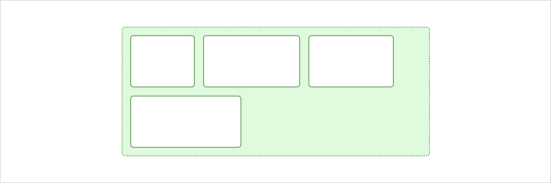
Arrange items in a row
React
import {
  reactExtension,
  InlineStack,
  View,
} from '@shopify/ui-extensions-react/customer-account';

export default reactExtension(
  'customer-account.page.render',
  () => <Extension />,
);

function Extension() {
  return (
    <InlineStack spacing="base">
      <View border="base" padding="base">
        View
      </View>
      <View border="base" padding="base">
        View
      </View>
      <View border="base" padding="base">
        View
      </View>
      <View border="base" padding="base">
        View
      </View>
    </InlineStack>
  );
}
JS
import {extension, InlineStack, View} from '@shopify/ui-extensions/customer-account';

export default extension('customer-account.page.render', (root) => {
  const inlineStack = root.createComponent(
    InlineStack,
    {
      spacing: 'base',
    },
    [
      root.createComponent(View, {border: 'base', padding: 'base'}, 'View'),
      root.createComponent(View, {border: 'base', padding: 'base'}, 'View'),
      root.createComponent(View, {border: 'base', padding: 'base'}, 'View'),
      root.createComponent(View, {border: 'base', padding: 'base'}, 'View'),
    ],
  );

  root.appendChild(inlineStack);
});
Anchor to Best practicesBest practices
- Use for wrapping horizontal lists: InlineStack is ideal when you want elements to flow horizontally and wrap naturally. For fixed-column layouts, use InlineLayout.
- Keep spacing consistent: Set the
spacingprop to maintain uniform gaps between elements. - Combine with alignment: Use
blockAlignmentandinlineAlignmentto control how items are positioned within the stack.
Anchor to LimitationsLimitations
- Elements always wrap when they exceed the container width. This behavior can't be disabled.
- InlineStack doesn't support explicit column sizing. For fixed-width columns, use InlineLayout.
- Reverse ordering isn't supported. Items always render in document order.