Version 2025-07 is the last API version to support React-based UI components. Later versions use Polaris web components, native UI elements with built-in accessibility, better performance, and consistent styling with Shopify's design system. Check out the upgrade guide to upgrade your extension and avoid being blocked from updating your extension after October 1st 2026.
Resource
The ResourceItem component represents a specific object within a collection that a customer can take action on. Use it for lists of active subscriptions, redeemable offers, or similar collections in a style consistent with the order index page.
Supported targets
- Customer
Account::Kitchen Sink - customer-account.
footer. render-after - customer-account.
order-index. announcement. render - customer-account.
order-index. block. render - customer-account.
order-status. announcement. render - customer-account.
order-status. block. render - customer-account.
order-status. cart-line-item. render-after - customer-account.
order-status. cart-line-list. render-after - customer-account.
order-status. customer-information. render-after - customer-account.
order-status. fulfillment-details. render-after - customer-account.
order-status. payment-details. render-after - customer-account.
order-status. return-details. render-after - customer-account.
order-status. unfulfilled-items. render-after - customer-account.
order. action. menu-item. render - customer-account.
order. action. render - customer-account.
order. page. render - customer-account.
page. render - customer-account.
profile. addresses. render-after - customer-account.
profile. announcement. render - customer-account.
profile. block. render - customer-account.
profile. company-details. render-after - customer-account.
profile. company-location-addresses. render-after - customer-account.
profile. company-location-payment. render-after - customer-account.
profile. company-location-staff. render-after - customer-account.
profile. payment. render-after
Supported targets
- Customer
Account::Kitchen Sink - customer-account.
footer. render-after - customer-account.
order-index. announcement. render - customer-account.
order-index. block. render - customer-account.
order-status. announcement. render - customer-account.
order-status. block. render - customer-account.
order-status. cart-line-item. render-after - customer-account.
order-status. cart-line-list. render-after - customer-account.
order-status. customer-information. render-after - customer-account.
order-status. fulfillment-details. render-after - customer-account.
order-status. payment-details. render-after - customer-account.
order-status. return-details. render-after - customer-account.
order-status. unfulfilled-items. render-after - customer-account.
order. action. menu-item. render - customer-account.
order. action. render - customer-account.
order. page. render - customer-account.
page. render - customer-account.
profile. addresses. render-after - customer-account.
profile. announcement. render - customer-account.
profile. block. render - customer-account.
profile. company-details. render-after - customer-account.
profile. company-location-addresses. render-after - customer-account.
profile. company-location-payment. render-after - customer-account.
profile. company-location-staff. render-after - customer-account.
profile. payment. render-after
Anchor to Use casesUse cases
- Subscription lists: Display active subscriptions with management actions like "Skip order" or "Cancel."
- Redeemable offers: Show available offers or rewards that customers can redeem.
- Order collections: Present order-related items in a consistent grid layout with action buttons.
Anchor to PropertiesProperties
Configure the following properties on the ResourceItem component.
- Anchor to accessibilityLabelaccessibility
Labelaccessibility Label stringstring A label used for buyers using assistive technologies. When set, any
childrensupplied to this component will not be announced to screen reader users.- Anchor to actionactionactionRemoteFragmentRemoteFragment
The action grouping for the item, provided as buttons.
- Anchor to actionAccessibilityLabelaction
Accessibility Labelaction Accessibility Label stringstringDefault: "More actions"Default: "More actions" Accessibility label for the action grouping. If an accessibility label is not provided, default text is used.
- Anchor to actionLabelaction
Labelaction Label stringstringDefault: "More actions"Default: "More actions" Label for the action grouping. If a label is not provided, default text is used.
- Anchor to loadingloadingloadingbooleanbooleanDefault: falseDefault: false
Indicates that the item is in a loading state.
When
true, the item shows loading indicators for the UI elements that it is owns. The item is not responsible for the loading indicators of any content that is passed aschildren.- Anchor to onPresson
Presson Press () => void() => void Callback when pressed. If
tois set, it will execute the callback and then navigate to the location specified byto.- Anchor to tototostringstring
Destination to navigate to. You must provide either this property,
, or both.
Configure the following properties on the action button.
- stringstring
A label used for buyers using assistive technologies. When set, any
childrensupplied to this component will not be announced to screen reader users.- booleanbooleanDefault: falseDefault: false
Disables the button, disallowing any interaction.
- 'primary' | 'secondary' | 'plain''primary' | 'secondary' | 'plain'Default: 'primary'Default: 'primary'
The type of button that will be rendered. The visual presentation of the button type is controlled by merchants through the Branding API.
primary: button used for main actions. For example: "Continue to next step".secondary: button used for secondary actions not blocking user progress. For example: "Download Shop app".plain: renders a button that visually looks like a link.- booleanbooleanDefault: falseDefault: false
Replaces content with a loading indicator.
- stringstring
Accessible label for the loading indicator when user prefers reduced motion. This value is only used if
loadingis true.- () => void() => void
Callback that is run when the button is pressed.
- RemoteFragmentRemoteFragment
An overlay component to render when the user interacts with the component.
- stringstring
Destination URL to link to.
Anchor to ExamplesExamples
Anchor to Display a resource itemDisplay a resource item
Represent a single object in a collection with associated actions. This example shows a ResourceItem with product details and action buttons in a style consistent with the order index page.Display a resource item
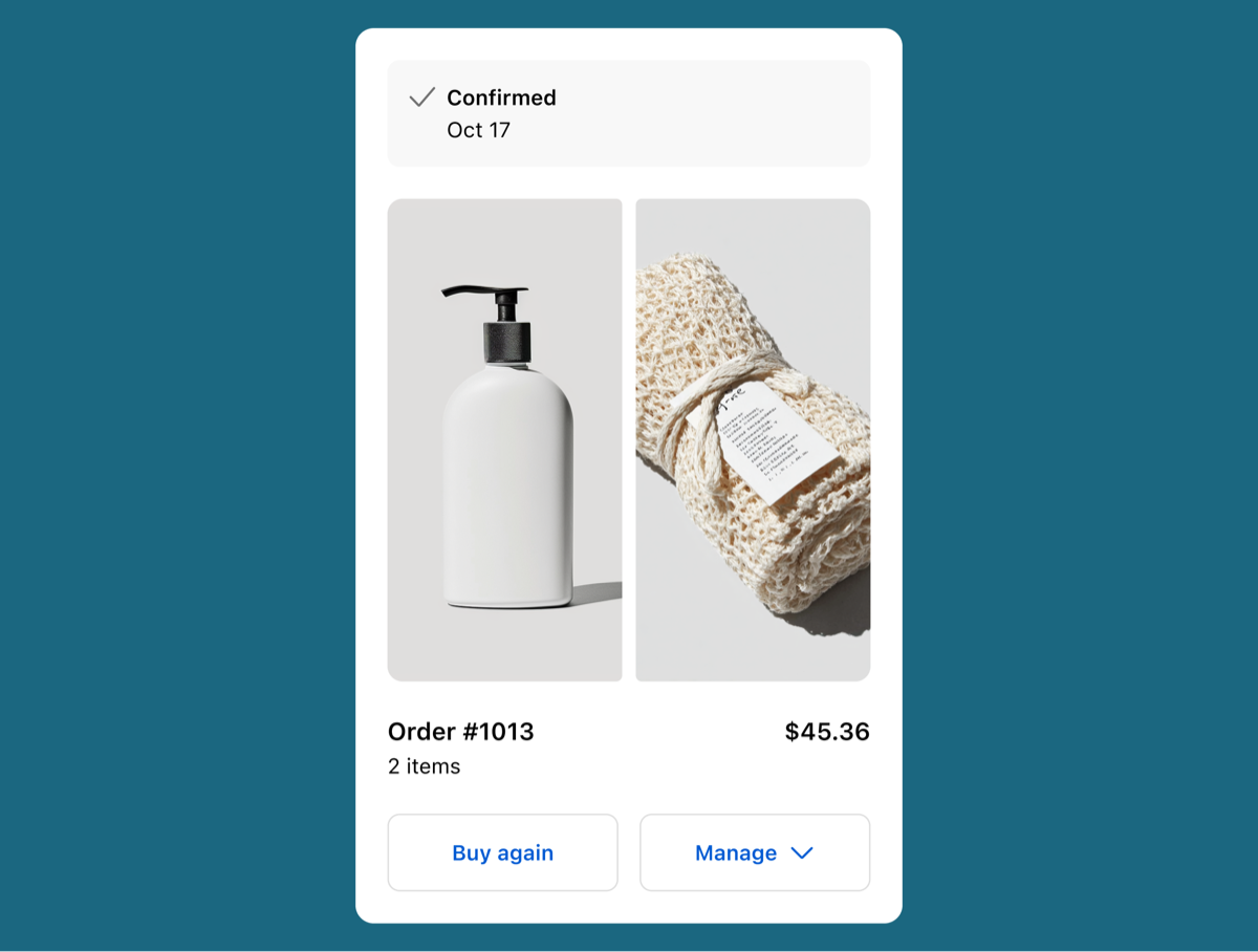
Display a resource item
React
import {
  ResourceItem,
  Button,
  Text,
  View,
  reactExtension,
} from '@shopify/ui-extensions-react/customer-account';
import React from 'react';

export default reactExtension(
  'customer-account.page.render',
  () => <App />,
);

function App() {
  return (
    <View maxInlineSize={300}>
      <ResourceItem
        accessibilityLabel="Resource Item"
        onPress={() => {}}
        actionLabel="Manage"
        action={
          <>
            <Button
              kind="primary"
              onPress={() => {}}
            >
              Pay now
            </Button>
            <Button onPress={() => {}}>
              Second action
            </Button>
            <Button onPress={() => {}}>
              Third action
            </Button>
          </>
        }
      >
        Resource item content
      </ResourceItem>
    </View>
  );
}
JS
import {
  ResourceItem,
  Button,
  View,
  extension,
} from '@shopify/ui-extensions/customer-account';

export default extension(
  'customer-account.page.render',
  (root, api) => {
    renderApp(root, api);
  },
)

function renderApp(root, api) {

  const actionFragment = root.createFragment();

  const primaryButton = root.createComponent(Button, {
    kind: 'primary',
    onPress: () => {},
  });

  primaryButton.append(root.createText('Pay now'))

  const secondButton = root.createComponent(Button, {
    kind: 'secondary',
    onPress: () => {},
  });

  secondButton.append(root.createText('Second button'))

  const thirdButton = root.createComponent(Button, {
    kind: 'secondary',
    onPress: () => {},
  });

  thirdButton.append(root.createText('Third button'))

  actionFragment.append(primaryButton);
  actionFragment.append(secondButton);
  actionFragment.append(thirdButton);

  const resourceItem = root.createComponent(
    ResourceItem,
    {
      accessibilityLabel: 'Resource Item',
      onPress: () => {},
      actionLabel: 'Manage',
      action: actionFragment,
    },
    'Content',
  );

  const view = root.createComponent(View, {maxInlineSize: 300});
  view.append(resourceItem);

  root.append(view);
}
Anchor to Best practicesBest practices
- Group related information: Structure your content so it's easy for customers to scan to the most important information.
- Use images to complement text: Include product thumbnails or icons alongside text content.
- Use a single primary action: If there's one primary action for the object, display it as a primary button. Display other actions as secondary buttons.
- Follow UX guidelines: See UX guidelines to learn more about the button logic for order actions.
Anchor to LimitationsLimitations
- ResourceItem is designed for collection views. For standalone detail views, use other layout components instead.