Version 2025-07 is the last API version to support React-based UI components. Later versions use Polaris web components, native UI elements with built-in accessibility, better performance, and consistent styling with Shopify's design system. Check out the upgrade guide to upgrade your extension and avoid being blocked from updating your extension after October 1st 2026.
Scroll
The ScrollView component provides a scrollable container for long-form content that exceeds the available space. Use ScrollView to display lists, order summaries, or other lengthy content while maintaining a constrained layout.
ScrollView supports scroll event callbacks, direction control, and maximum size constraints to create bounded scrollable regions. For static layouts where all content should be visible, use BlockStack or View.
Supported targets
- Customer
Account::Kitchen Sink - customer-account.
footer. render-after - customer-account.
order-index. announcement. render - customer-account.
order-index. block. render - customer-account.
order-status. announcement. render - customer-account.
order-status. block. render - customer-account.
order-status. cart-line-item. render-after - customer-account.
order-status. cart-line-list. render-after - customer-account.
order-status. customer-information. render-after - customer-account.
order-status. fulfillment-details. render-after - customer-account.
order-status. payment-details. render-after - customer-account.
order-status. return-details. render-after - customer-account.
order-status. unfulfilled-items. render-after - customer-account.
order. action. menu-item. render - customer-account.
order. action. render - customer-account.
order. page. render - customer-account.
page. render - customer-account.
profile. addresses. render-after - customer-account.
profile. announcement. render - customer-account.
profile. block. render - customer-account.
profile. company-details. render-after - customer-account.
profile. company-location-addresses. render-after - customer-account.
profile. company-location-payment. render-after - customer-account.
profile. company-location-staff. render-after - customer-account.
profile. payment. render-after
Supported targets
- Customer
Account::Kitchen Sink - customer-account.
footer. render-after - customer-account.
order-index. announcement. render - customer-account.
order-index. block. render - customer-account.
order-status. announcement. render - customer-account.
order-status. block. render - customer-account.
order-status. cart-line-item. render-after - customer-account.
order-status. cart-line-list. render-after - customer-account.
order-status. customer-information. render-after - customer-account.
order-status. fulfillment-details. render-after - customer-account.
order-status. payment-details. render-after - customer-account.
order-status. return-details. render-after - customer-account.
order-status. unfulfilled-items. render-after - customer-account.
order. action. menu-item. render - customer-account.
order. action. render - customer-account.
order. page. render - customer-account.
page. render - customer-account.
profile. addresses. render-after - customer-account.
profile. announcement. render - customer-account.
profile. block. render - customer-account.
profile. company-details. render-after - customer-account.
profile. company-location-addresses. render-after - customer-account.
profile. company-location-payment. render-after - customer-account.
profile. company-location-staff. render-after - customer-account.
profile. payment. render-after
Anchor to Use casesUse cases
- Order line items: Display a long list of products in a scrollable area so the order summary doesn't push other content off-screen.
- Activity history: Show a scrollable timeline of account activity, order history, or reward transactions.
- Terms and conditions: Present lengthy legal text in a constrained scroll area alongside a checkbox.
- Product lists: Display a scrollable catalog preview within a section of the customer account page.
- Responsive scroll areas: Use StyleHelper to adjust
maxBlockSizeat different viewport sizes.
Anchor to PropertiesProperties
Configure the following properties on the ScrollView component.
- Anchor to accessibilityLabelaccessibility
Labelaccessibility Label stringstring A label announced by assistive technologies that describes the purpose or contents of the element. Only set this when the element's visible content doesn't provide enough context on its own.
- Anchor to backgroundbackgroundbackgroundMaybeConditionalStyle<Background>MaybeConditionalStyle<Background>Default: 'transparent'Default: 'transparent'
The background color of the element, set using a design-system keyword.
- Anchor to borderborderborderMaybeResponsiveConditionalStyle<MaybeShorthandProperty<BorderStyle>>MaybeResponsiveConditionalStyle<MaybeShorthandProperty<BorderStyle>>
The border style of the element. Accepts a single value for all four edges, or a shorthand tuple for per-edge control:
'base': Appliesbaseto all edges.['base', 'none']: Block edges getbase, inline edges getnone.['base', 'none', 'dotted', 'base']: Values apply to block-start, inline-end, block-end, and inline-start respectively.
- Anchor to borderWidthborder
Widthborder Width MaybeResponsiveConditionalStyle< MaybeShorthandProperty<BorderWidth> >MaybeResponsiveConditionalStyle< MaybeShorthandProperty<BorderWidth> > The border width of the element. Accepts a single value for all four edges, or a shorthand tuple for per-edge control:
'base': Appliesbaseto all edges.['base', 'medium']: Block edges getbase, inline edges getmedium.['base', 'medium', 'medium', 'base']: Values apply to block-start, inline-end, block-end, and inline-start respectively.
- Anchor to cornerRadiuscorner
Radiuscorner Radius MaybeResponsiveConditionalStyle< MaybeShorthandProperty<CornerRadius> >MaybeResponsiveConditionalStyle< MaybeShorthandProperty<CornerRadius> > The corner radius of the element. Accepts a single value for all four corners, or a shorthand tuple for per-corner control using logical (writing-mode-aware) corners:
'base': All four corners getbaseradius.['base', 'none']: StartStart/EndEnd getbase, StartEnd/EndStart getnone. In left-to-right mode, StartStart and EndEnd are the top-left and bottom-right corners.['base', 'none', 'small', 'base']: Values apply to StartStart, StartEnd, EndEnd, and EndStart respectively.
A
alias is available. When both are set,takes precedence.- Anchor to directiondirectiondirection'block' | 'inline''block' | 'inline'Default: blockDefault: block
The axis along which the content is scrollable.
block: Content scrolls along the main (block) axis.inline: Content scrolls along the cross (inline) axis.
- Anchor to displaydisplaydisplayMaybeResponsiveConditionalStyle<'auto' | 'none'>MaybeResponsiveConditionalStyle<'auto' | 'none'>Default: 'auto'Default: 'auto'
The display mode of the component. Learn more about
display.auto: The initial value; the actual behavior depends on the component and context.none: Hides the component and removes it from the accessibility tree.
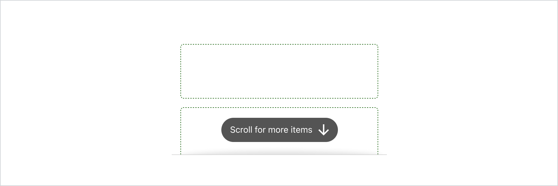
- Anchor to hinthinthint'innerShadow' | {type: 'pill'; content: string}'innerShadow' | {type: 'pill'; content: string}
A visual hint indicating that the area is scrollable.
: An inner shadow indicating that content continues beyond the visible area.{type: 'pill', content: string}: A pill-shaped message displayed at the end of the scrollable area that disappears when the user starts scrolling.
- Anchor to idididstringstring
A unique identifier for the component. Use this to target the component in scripts or stylesheets, or to distinguish it from other instances of the same component.
- Anchor to maxBlockSizemax
Block Sizemax Block Size MaybeResponsiveConditionalStyle< number | `${number}%` | 'fill' >MaybeResponsiveConditionalStyle< number | `${number}%` | 'fill' > The maximum block size (maximum height in horizontal writing modes). The element won't grow taller than this value even if its content is longer.
number: The size in pixels.`${number}%`: The size as a percentage of the parent container's block size.'fill': Takes all the available space.
Learn more about the max-block-size property.
- Anchor to maxInlineSizemax
Inline Sizemax Inline Size MaybeResponsiveConditionalStyle< number | `${number}%` | 'fill' >MaybeResponsiveConditionalStyle< number | `${number}%` | 'fill' > The maximum inline size (maximum width in horizontal writing modes). The element won't grow wider than this value.
number: The size in pixels.`${number}%`: The size as a percentage of the parent container's inline size.'fill': Takes all the available space.
Learn more about the max-inline-size property.
- Anchor to minBlockSizemin
Block Sizemin Block Size MaybeResponsiveConditionalStyle< number | `${number}%` | 'fill' >MaybeResponsiveConditionalStyle< number | `${number}%` | 'fill' > The minimum block size (minimum height in horizontal writing modes). The element won't shrink smaller than this value even if its content is shorter.
number: The size in pixels.`${number}%`: The size as a percentage of the parent container's block size.'fill': Takes all the available space.
Learn more about the min-block-size property.
- Anchor to minInlineSizemin
Inline Sizemin Inline Size MaybeResponsiveConditionalStyle< number | `${number}%` | 'fill' >MaybeResponsiveConditionalStyle< number | `${number}%` | 'fill' > The minimum inline size (minimum width in horizontal writing modes). The element won't shrink narrower than this value.
number: The size in pixels.`${number}%`: The size as a percentage of the parent container's inline size.'fill': Takes all the available space.
Learn more about the min-inline-size property.
- Anchor to onScrollon
Scrollon Scroll (args: ScrollViewEvent) => void(args: ScrollViewEvent) => void A callback fired when the scroll position changes. On touch devices, this fires only when the user finishes scrolling, unlike non-touch devices where it fires continuously during scrolling.
- Anchor to onScrolledToEdgeon
Scrolled To Edgeon Scrolled To Edge (args: ScrollViewEvent) => void(args: ScrollViewEvent) => void A callback fired when the scroll position reaches one of the container's edges.
- Anchor to paddingpaddingpaddingMaybeResponsiveConditionalStyle<MaybeShorthandProperty<Spacing>>MaybeResponsiveConditionalStyle<MaybeShorthandProperty<Spacing>>
The padding on all edges of the element, using a shorthand syntax. You can specify one, two, or four values following the CSS shorthand convention.
T: A single value applied uniformly to all edges.[T, T]: The first value applies to block-start and block-end, the second to inline-start and inline-end.[T, T, T, T]: Values apply to block-start, inline-end, block-end, and inline-start respectively.
- Anchor to scrollToscroll
Toscroll To number | HTMLElementnumber | HTMLElement The initial scroll target when the component first renders. Accepts a pixel offset (
number) to scroll to a specific position, or anHTMLElementto scroll that element into view. This only takes effect on the first render; subsequent updates to this prop are ignored.- Anchor to borderRadiusborder
Radiusborder Radius MaybeResponsiveConditionalStyle< MaybeShorthandProperty<CornerRadius> >MaybeResponsiveConditionalStyle< MaybeShorthandProperty<CornerRadius> >deprecateddeprecated The corner radius of the element. Accepts a single value for all four corners, or a shorthand tuple for per-corner control:
'base': All four corners getbaseradius.['base', 'none']: StartStart/EndEnd getbase, StartEnd/EndStart getnone.['base', 'none', 'small', 'base']: Values apply to StartStart, StartEnd, EndEnd, and EndStart respectively.
DeprecatedUse
instead.Deprecated:Use
instead.
MaybeConditionalStyle
A type that represents a value that can be a conditional style. We highly recommend using the `Style` helper which simplifies the creation of conditional styles.
T | ConditionalStyle<T, AcceptedConditions>ConditionalStyle
A conditional style definition that maps one or more conditions to different values. The `default` value is used as a fallback when none of the conditions in `conditionals` are satisfied.
- conditionals
An array of conditional values.
ConditionalValue<T, AcceptedConditions>[] - default
The default value applied when none of the conditional values specified in `conditionals` are met.
T
ConditionalValue
A single conditional branch that pairs a set of conditions with the value to apply when those conditions are met.
- conditions
The conditions that must be met for the value to be applied. At least one condition must be specified.
AcceptedConditions - value
The value that will be applied if the conditions are met.
T
Background
A keyword that maps to a predefined background color from the design system. - `transparent`: No background color; the parent's background shows through. - `base`: The standard surface background color. - `subdued`: A muted background color, typically used to de-emphasize content or distinguish secondary areas from the primary surface.
'transparent' | 'base' | 'subdued'MaybeResponsiveConditionalStyle
A type that represents a value that can be a conditional style. The conditions are based on the viewport size. We highly recommend using the `Style` helper which simplifies the creation of conditional styles.
T | ConditionalStyle<T, ViewportSizeCondition>ViewportSizeCondition
A condition that targets layouts based on the inline size (width in horizontal writing modes) of the viewport.
- viewportInlineSize
The minimum viewport inline size that the condition must match.
{ min: T; }
MaybeShorthandProperty
A type that accepts either a single value applied to all edges or a shorthand tuple for per-edge control. - `T`: A single value applied uniformly to all edges. - `[T, T]`: The first value applies to block-start and block-end, the second to inline-start and inline-end. - `[T, T, T, T]`: Values apply to block-start, inline-end, block-end, and inline-start respectively.
T | ShorthandProperty<T>ShorthandProperty
A tuple type that accepts two or four values following the CSS shorthand convention for box edges. - `[T, T]`: The first value applies to block-start and block-end, the second to inline-start and inline-end. - `[T, T, T, T]`: Values apply to block-start, inline-end, block-end, and inline-start respectively.
[T, T] | [T, T, T, T]BorderStyle
A keyword that maps to a predefined border style from the design system. - `base`: A solid border line, suitable for most use cases. - `dashed`: A dashed border line, often used for drop zones or placeholder boundaries. - `dotted`: A dotted border line. - `none`: No border is rendered.
'base' | 'dashed' | 'dotted' | 'none'CornerRadius
A keyword that maps to a predefined corner radius from the design system. - `base`: The default corner radius. - `small`: A subtle corner radius, smaller than `base`. - `large`: A pronounced corner radius, larger than `base`. - `fullyRounded`: Fully rounds the corners into a pill or circle shape. - `none`: No corner rounding; sharp square corners.
'base' | 'small' | 'large' | 'fullyRounded' | 'none' | CornerRadiusDeprecatedCornerRadiusDeprecated
'tight' | 'loose'BorderWidth
A keyword that maps to a predefined border width from the design system. - `base`: The default border width. - `medium`: A medium border width, thicker than `base`. - `thick`: The thickest available border width.
'base' | 'medium' | 'thick'ScrollViewEvent
The event object passed to `onScroll` and `onScrolledToEdge` callbacks on a ScrollView.
- position
The current scroll position in pixels, broken out by axis.
{ inline: number; block: number; } - scrolledTo
Whether the scroll position has reached the start or end of each axis, or `null` if neither edge has been reached.
{ inline: "start" | "end"; block: "start" | "end"; }
Spacing
A keyword that maps to a predefined spacing value from the design system. Use these instead of pixel values to ensure consistent spacing throughout the UI. - `none`: No spacing (0px). - `extraTight`: The smallest amount of spacing. - `tight`: A compact amount of spacing, suitable for tight layouts. - `base`: The default spacing, appropriate for most layouts. - `loose`: A generous amount of spacing, used to create visual separation. - `extraLoose`: The largest amount of spacing.
'none' | 'extraTight' | 'tight' | 'base' | 'loose' | 'extraLoose'Anchor to ExamplesExamples
Anchor to Display scrollable contentDisplay scrollable content
Use ScrollView to contain long content in a scrollable area. Set maxBlockSize to constrain the container height and enable vertical scrolling.
Display scrollable content
Display scrollable content
React
import {
  reactExtension,
  ScrollView,
  View,
} from '@shopify/ui-extensions-react/customer-account';

export default reactExtension(
  'customer-account.page.render',
  () => <Extension />,
);

function Extension() {
  return (
    <ScrollView maxBlockSize={300}>
      <View
        border="base"
        padding="base"
        minBlockSize={50}
      >
        View
      </View>
      <View
        border="base"
        padding="base"
        minBlockSize={50}
      >
        View
      </View>
      <View
        border="base"
        padding="base"
        minBlockSize={50}
      >
        View
      </View>
      <View
        border="base"
        padding="base"
        minBlockSize={50}
      >
        View
      </View>
      <View
        border="base"
        padding="base"
        minBlockSize={50}
      >
        View
      </View>
    </ScrollView>
  );
}
JS
import {extension, ScrollView, View} from '@shopify/ui-extensions/customer-account';

export default extension('customer-account.page.render', (root) => {
  const scrollView = root.createComponent(ScrollView, {maxBlockSize: 400}, [
    root.createComponent(
      View,
      {border: 'base', padding: 'base', minBlockSize: 50},
      'View',
    ),
    root.createComponent(
      View,
      {border: 'base', padding: 'base', minBlockSize: 50},
      'View',
    ),
    root.createComponent(
      View,
      {border: 'base', padding: 'base', minBlockSize: 50},
      'View',
    ),
    root.createComponent(
      View,
      {border: 'base', padding: 'base', minBlockSize: 50},
      'View',
    ),
    root.createComponent(
      View,
      {border: 'base', padding: 'base', minBlockSize: 50},
      'View',
    ),
    root.createComponent(
      View,
      {border: 'base', padding: 'base', minBlockSize: 50},
      'View',
    ),
  ]);

  root.appendChild(scrollView);
});
Anchor to Best practicesBest practices
- Set a reasonable max height: Choose a
maxBlockSizethat shows enough content for context. Showing 2-3 visible items before scrolling gives customers a clear indication that more content is available. - Provide an accessibility label: Set
accessibilityLabelto describe the scrollable region so screen reader users understand what content is scrollable. - Don't nest scroll views: Avoid placing ScrollViews inside other ScrollViews. Nested scrollable regions create confusing navigation for keyboard and assistive technology users.
- Use scroll callbacks for dynamic behavior: Use
onScrollandonScrolledToEdgeto trigger actions like loading more content when the customer reaches the bottom.
Anchor to LimitationsLimitations
- ScrollView doesn't support pull-to-refresh behavior. Infinite scrolling must be implemented manually using the
onScrolledToEdgecallback. - The scroll indicator styling is determined by the platform and can't be customized.
- ScrollView requires a constrained height (via
maxBlockSizeor a parent with a fixed height) to enable scrolling. Without constraints, it expands to fit all content.