Formatted
Use a formatted text field when you require additional functionality such as the text field input type or a custom validator.
Anchor to formattedtextfieldFormattedTextField
- Anchor to autoCapitalizeautoCapitalize
Dictates when the text should be auto-capitalized.
- Anchor to errorMessageerrorMessagestring
Sets an error message to present to the user.
- Anchor to initialValueinitialValuestring
Populates the
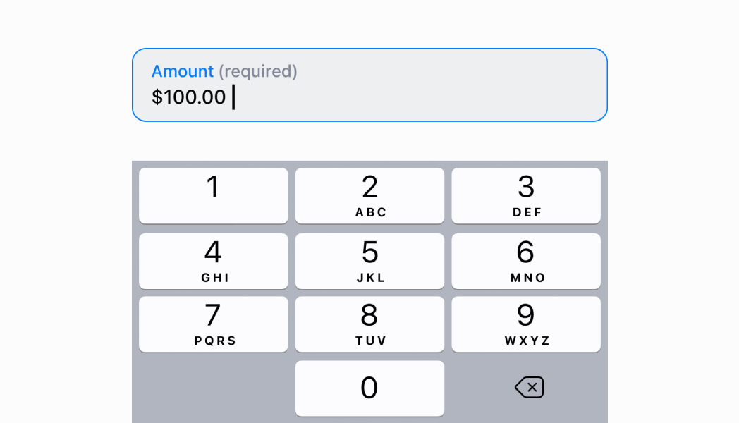
with an text initial value.- Anchor to inputTypeinputType
The
of the. This will select the appropriate keyboard.- Anchor to isValidisValidboolean
Set whether the current value in the
is valid.- Anchor to onChangeTextonChangeText(value: string) => void
A callback that is executed every time the
value changes.- Anchor to placeholderplaceholderstring
Sets a placeholder value for when the
is empty.- Anchor to titletitlestring
The title of the
.
FormattedTextFieldProps
- autoCapitalize
Dictates when the text should be auto-capitalized.
AutoCapitalizationType - errorMessage
Sets an error message to present to the user.
string - initialValue
Populates the `TextField` with an text initial value.
string - inputType
The `InputType` of the `TextField`. This will select the appropriate keyboard.
InputType - isValid
Set whether the current value in the `TextField` is valid.
boolean - onChangeText
A callback that is executed every time the `TextField` value changes.
(value: string) => void - placeholder
Sets a placeholder value for when the `TextField` is empty.
string - title
The title of the `TextField`.
string
export interface FormattedTextFieldProps extends BaseTextFieldProps {
  /**
   * The `InputType` of the `TextField`. This will select the appropriate keyboard.
   */
  inputType?: InputType;
  /**
   * Dictates when the text should be auto-capitalized.
   */
  autoCapitalize?: AutoCapitalizationType;
}
AutoCapitalizationType
'none' | 'sentences' | 'words' | 'characters'InputType
Dictates what type of values can be used in a `TextField`.
'text' | 'number' | 'currency' | 'giftcard' | 'email'Anchor to inputtypeInputType
'text' | 'number' | 'currency' | 'giftcard' | 'email'InputType
Dictates what type of values can be used in a `TextField`.
'text' | 'number' | 'currency' | 'giftcard' | 'email'Anchor to autocapitalizationtypeAutoCapitalizationType
'none' | 'sentences' | 'words' | 'characters'AutoCapitalizationType
'none' | 'sentences' | 'words' | 'characters'Render a FormattedTextField for an email addresses
examples
Render a FormattedTextField for an email addresses
React
import React, {useState} from 'react';
import {
  Navigator,
  Screen,
  Text,
  ScrollView,
  FormattedTextField,
  reactExtension,
} from '@shopify/ui-extensions-react/point-of-sale';

const SmartGridModal = () => {
  const [textFieldValue, setTextFieldValue] =
    useState('');

  return (
    <Navigator>
      <Screen
        name="FormattedTextField"
        title="FormattedTextField Example"
      >
        <ScrollView>
          <FormattedTextField
            placeholder="Email address"
            inputType="email"
            onChangeText={setTextFieldValue}
          />
          <Text>{textFieldValue}</Text>
        </ScrollView>
      </Screen>
    </Navigator>
  );
};

export default reactExtension(
  'pos.home.modal.render',
  () => <SmartGridModal />,
);
TS
import {
  extension,
  Screen,
  Navigator,
  ScrollView,
  Text,
  FormattedTextField,
} from '@shopify/ui-extensions/point-of-sale';

export default extension(
  'pos.home.modal.render',
  (root) => {
    const homeScreen = root.createComponent(
      Screen,
      {
        name: 'FormattedTextField',
        title: 'FormattedTextField Example',
      },
    );

    const text = root.createComponent(Text);

    const textField = root.createComponent(
      FormattedTextField,
      {
        placeholder: 'Email address',
        inputType: 'email',
        onChangeText: (newText) => {
          text.replaceChildren(newText);
        },
      },
    );

    const scrollView =
      root.createComponent(ScrollView);

    homeScreen.append(scrollView);
    scrollView.append(textField);
    scrollView.append(text);

    const navigator =
      root.createComponent(Navigator);
    navigator.append(homeScreen);
    root.append(navigator);
  },
);
Preview