Text
Use a text input to allow merchants to input or modify multiline text.
Anchor to textareaTextArea
A text field which supports multiple lines.
- Anchor to labellabelstringrequired
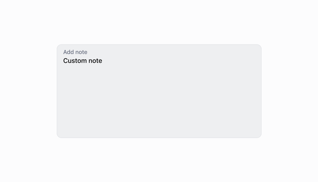
The content to use as the field label.
- Anchor to actionaction
A button under the text field to provide extra functionality.
- Anchor to disableddisabledboolean
Whether the field can be modified.
- Anchor to errorerrorstring
Indicates an error to the user. The field is given specific stylistic treatment to communicate problems that have to be resolved immediately.
- Anchor to helpTexthelpTextstring
The label under the text field which provides guidance or instructions that assist users.
- Anchor to maxLengthmaxLengthnumber
The maximum number of characters allowed in the input field.
- Anchor to onBluronBlur() => void
The callback when focus is removed.
- Anchor to onChangeonChange(value: string) => void
The callback when the user has finished editing a field.
- Anchor to onFocusonFocus() => void
The callback when input is focused.
- Anchor to onInputonInput(value: string) => void
Callback when the user makes any changes in the field. As noted in the documentation for
, you must not use this to updatevalue— use thecallback for that purpose. Use theprop when you need to do something as soon as the user makes a change, like clearing validation errors that apply to the field as soon as the user begins making the necessary adjustments.- Anchor to placeholderplaceholderstring
A short hint that describes the expected value of the field.
- Anchor to requiredrequiredboolean
Whether the field needs a value.
- Anchor to rowsrowsnumber
The initial number of lines to be displayed. Maximum of 8 lines.
- Anchor to valuevaluestring
The current value for the field. Defaults to now. You should update this value in response to the
callback.
TextAreaProps
- action
A button under the text field to provide extra functionality.
InputAction - disabled
Whether the field can be modified.
boolean - error
Indicates an error to the user. The field is given specific stylistic treatment to communicate problems that have to be resolved immediately.
string - helpText
The label under the text field which provides guidance or instructions that assist users.
string - label
The content to use as the field label.
string - maxLength
The maximum number of characters allowed in the input field.
number - onBlur
The callback when focus is removed.
() => void - onChange
The callback when the user has finished editing a field.
(value: string) => void - onFocus
The callback when input is focused.
() => void - onInput
Callback when the user makes any changes in the field. As noted in the documentation for `onChange`, you **must not** use this to update `value` — use the `onChange` callback for that purpose. Use the `onInput` prop when you need to do something as soon as the user makes a change, like clearing validation errors that apply to the field as soon as the user begins making the necessary adjustments.
(value: string) => void - placeholder
A short hint that describes the expected value of the field.
string - required
Whether the field needs a value.
boolean - rows
The initial number of lines to be displayed. Maximum of 8 lines.
number - value
The current value for the field. Defaults to now. You should update this value in response to the `onChange` callback.
string
export interface TextAreaProps extends InputProps {
  /**
   * The initial number of lines to be displayed. Maximum of 8 lines.
   */
  rows?: number;
}
InputAction
- disabled
Whether the button can be pressed.
boolean - label
The text displayed in the button.
string - onPress
A callback to be performed.
() => void
export interface InputAction {
  /**
   * The text displayed in the button.
   */
  label: string;
  /**
   * A callback to be performed.
   */
  onPress: () => void;
  /**
   * Whether the button can be pressed.
   */
  disabled?: boolean;
}Thumbnail
examples
Thumbnail
React
import React, {useState} from 'react';
import {
  TextArea,
  Screen,
  ScrollView,
  Navigator,
  reactExtension,
  Text,
} from '@shopify/ui-extensions-react/point-of-sale';

const SmartGridModal = () => {
  const [text, setText] = useState('');

  return (
    <Navigator>
      <Screen
        name="TextArea"
        title="Comment Input Example"
      >
        <ScrollView>
          <TextArea
            label="Text"
            rows={4}
            placeholder="Input your text here"
            value={text}
            onChange={setText}
          />
          <Text>{text}</Text>
        </ScrollView>
      </Screen>
    </Navigator>
  );
};

export default reactExtension(
  'pos.home.modal.render',
  () => <SmartGridModal />,
);
TS
import {
  TextArea,
  Text,
  Screen,
  ScrollView,
  Navigator,
  extension,
} from '@shopify/ui-extensions-react/point-of-sale';

export default extension(
  'pos.home.modal.render',
  (root) => {
    const textArea = root.createComponent(
      TextArea,
      {
        label: 'Text',
        placeholder: 'Input your text here',
        required: true,
        value: '',
      },
    );

    const textBox = root.createComponent(Text);

    const onChangeHandler = (
      newValue: string,
    ) => {
      textArea.updateProps({value: newValue});
      textBox.replaceChildren(newValue);
    };

    textArea.updateProps({
      onChange: onChangeHandler,
    });

    const scrollView =
      root.createComponent(ScrollView);
    scrollView.append(textArea);
    scrollView.append(textBox);

    const screen = root.createComponent(Screen, {
      name: 'TextArea',
      title: 'Text Area Example',
    });
    screen.append(scrollView);

    const navigator =
      root.createComponent(Navigator);
    navigator.append(screen);

    root.append(navigator);
  },
);
Preview