Clickable
The clickable component makes any content interactive. Use it to add click interactions to non-interactive elements while maintaining full control over their visual presentation.
Unlike the button component, clickable doesn't impose visual styling, allowing you to create custom interactive elements. You must implement focus indicators and other visual cues yourself.
Anchor to Use casesUse cases
- Interactive cards: Create custom cards that respond to clicks without button styling.
- Clickable elements: Make text, images, or icons clickable while preserving visual appearance.
- Complex layouts: Build interactive layouts with multiple clickable regions.
- Custom interfaces: Implement selection interfaces, galleries, or navigation with tailored designs.
Anchor to PropertiesProperties
Configure the following properties on the Clickable component.
- Anchor to disableddisableddisabledbooleanboolean
Whether the field is disabled, preventing user interaction. Use when the field is temporarily unavailable due to application state, permissions, or dependencies.
- Anchor to idididstringstring
A unique identifier for the element used for targeting with CSS, JavaScript, or accessibility features.
Anchor to EventsEvents
The clickable component provides event callbacks for handling user interactions. Learn more about handling events.
- Anchor to clickclickclick(event: CallbackEvent<"s-clickable">) => void(event: CallbackEvent<"s-clickable">) => void
The callback when the element is activated.
CallbackEvent
Represents the event object passed to callback functions when interactive events occur. Contains metadata about the event, including the target element, event phase, and propagation behavior.
- bubbles
Whether the event bubbles up through the DOM tree.
boolean - cancelable
Whether the event can be canceled.
boolean - composed
Whether the event will trigger listeners outside of a shadow root.
boolean - currentTarget
The element that the event listener is attached to.
HTMLElementTagNameMap[T] - detail
Additional data associated with the event.
any - eventPhase
The current phase of the event flow.
number - target
The element that triggered the event.
HTMLElementTagNameMap[T] | null
Anchor to ExamplesExamples
Anchor to Make content clickableMake content clickable
Make any content interactive using a clickable component wrapper without imposing visual styling. This example shows how to create custom interactive elements while maintaining full control over appearance.Make content clickable
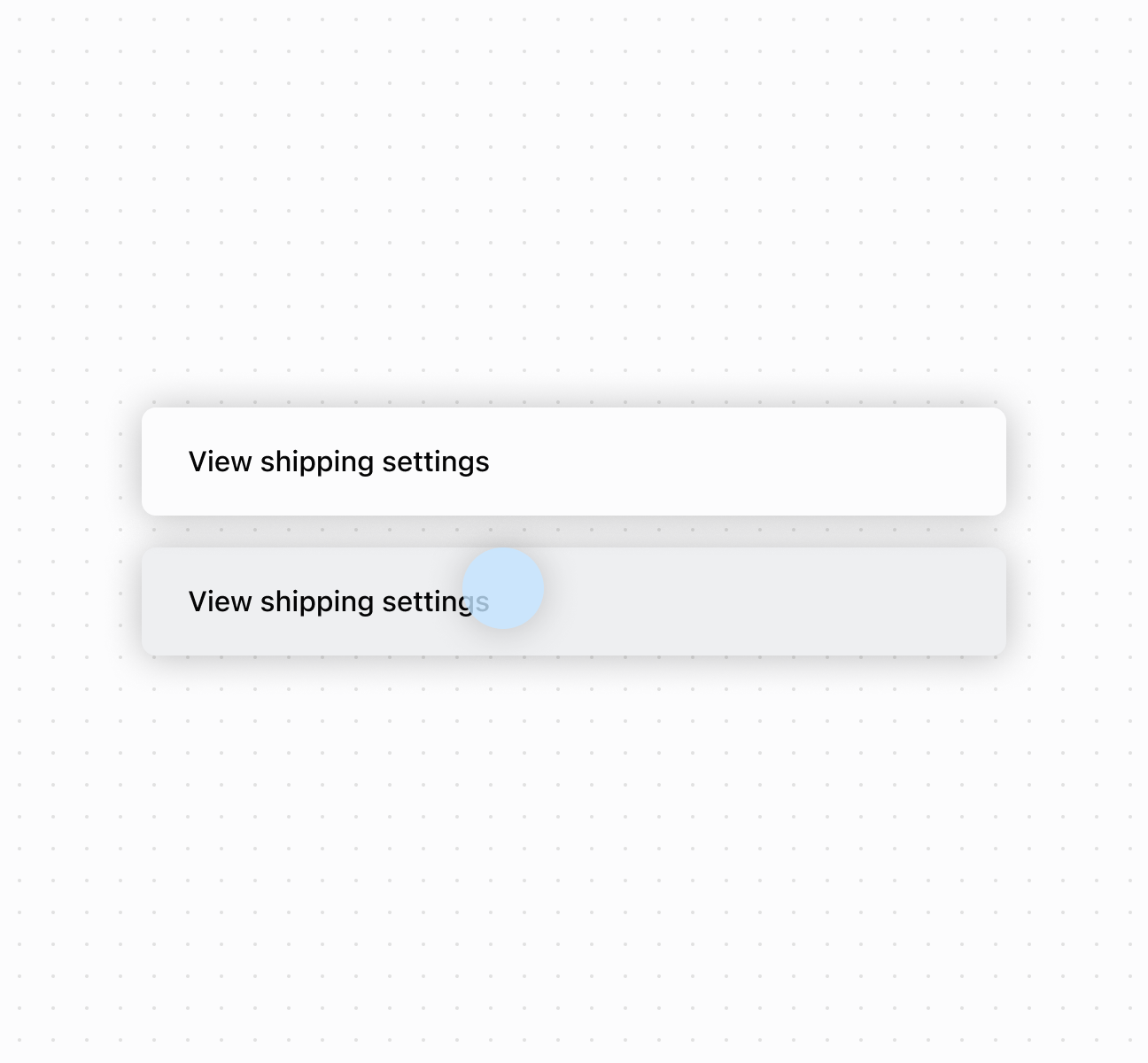
Make content clickable
Anchor to Best practicesBest practices
- Implement visual feedback: Since clickable has no built-in styling, add focus indicators and active states to show interactivity.
- Wrap non-interactive elements: Use clickable for text, images, or icons. Avoid wrapping components with built-in interactions.
- Handle disabled state carefully: When
disabled, child elements can still receive focus. Provide visual feedback for the non-interactive state.
Anchor to LimitationsLimitations
The component doesn't automatically provide keyboard navigation support beyond basic click functionality.