Date spinner
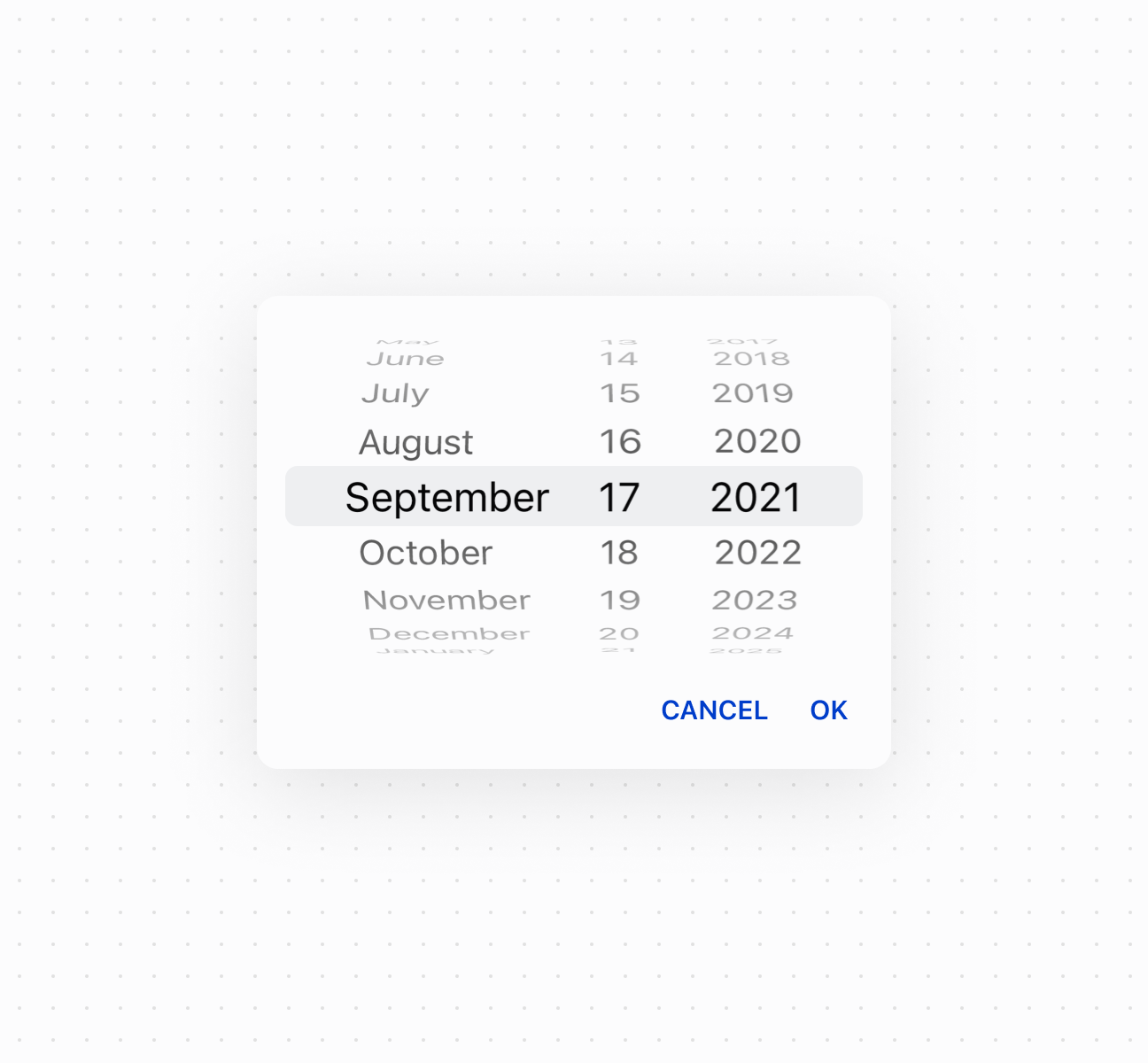
The date spinner component enables merchants to select dates using a spinner interface with scrollable columns for month, day, and year. Use it for compact date selection in space-constrained layouts or when selecting dates close to the current date.
For visual calendar context, consider using date picker instead. For text date entry, use date field.
Supported targets
- pos.
cart. line-item-details. action. render - pos.
customer-details. action. render - pos.
customer-details. block. render - pos.
draft-order-details. action. render - pos.
draft-order-details. block. render - pos.
home. modal. render - pos.
order-details. action. render - pos.
order-details. block. render - pos.
product-details. action. render - pos.
product-details. block. render - pos.
purchase. post. action. render - pos.
purchase. post. block. render
Supported targets
- pos.
cart. line-item-details. action. render - pos.
customer-details. action. render - pos.
customer-details. block. render - pos.
draft-order-details. action. render - pos.
draft-order-details. block. render - pos.
home. modal. render - pos.
order-details. action. render - pos.
order-details. block. render - pos.
product-details. action. render - pos.
product-details. block. render - pos.
purchase. post. action. render - pos.
purchase. post. block. render
Anchor to Use casesUse cases
- Compact selection: Provide compact date selection in space-constrained interfaces.
- Quick navigation: Enable quick date selection by scrolling through nearby dates.
- Modal dialogs: Support date input in modal dialogs where a spinner is more appropriate.
- Touch optimization: Offer touch-optimized scrolling date selection for POS devices.
Anchor to PropertiesProperties
Configure the following properties on the DateSpinner component.
- Anchor to idididstringstring
A unique identifier for the element used for targeting with CSS, JavaScript, or accessibility features.
- Anchor to valuevaluevaluestringstringDefault: ""Default: ""
The currently selected date value in ISO 8601 format (
YYYY-MM-DD, for example,"2024-05-15"). An empty string means no date is selected. Other date formats require conversion before setting this property. Validation occurs when the user finishes editing (on blur), rather than on every keystroke, so invalid dates are flagged after completing entry.
Anchor to EventsEvents
The date spinner component provides event callbacks for handling user interactions. Learn more about handling events.
- Anchor to blurblurblur(event: CallbackEvent<"s-date-spinner">) => void(event: CallbackEvent<"s-date-spinner">) => void
Called when the element loses focus.
- Anchor to changechangechange(event: CallbackEvent<"s-date-spinner">) => void(event: CallbackEvent<"s-date-spinner">) => void
Called after editing completes, typically on blur.
- Anchor to focusfocusfocus(event: CallbackEvent<"s-date-spinner">) => void(event: CallbackEvent<"s-date-spinner">) => void
Called when the element receives focus.
- Anchor to inputinputinput(event: CallbackEvent<"s-date-spinner">) => void(event: CallbackEvent<"s-date-spinner">) => void
Called when the user makes any changes in the field.
CallbackEvent
Represents the event object passed to callback functions when interactive events occur. Contains metadata about the event, including the target element, event phase, and propagation behavior.
- bubbles
Whether the event bubbles up through the DOM tree.
boolean - cancelable
Whether the event can be canceled.
boolean - composed
Whether the event will trigger listeners outside of a shadow root.
boolean - currentTarget
The element that the event listener is attached to.
HTMLElementTagNameMap[T] - detail
Additional data associated with the event.
any - eventPhase
The current phase of the event flow.
number - target
The element that triggered the event.
HTMLElementTagNameMap[T] | null
Anchor to ExamplesExamples
Anchor to Select dates with a spinnerSelect dates with a spinner
Enable compact date selection using a date spinner component with scrollable columns for month, day, and year. This example shows a basic date spinner for space-constrained layouts.Select dates with a spinner
Select dates with a spinner
Anchor to Control spinner visibilityControl spinner visibility
Control date spinner visibility programmatically using the command system with show and hide methods. This example demonstrates using button commands to display or dismiss the spinner picker, enabling custom trigger patterns for date selection in constrained layouts.Control spinner visibility
Anchor to Handle date selection eventsHandle date selection events
Subscribe to date selection events to respond when merchants pick a date from the spinner columns. This example shows how to handle onChange events to capture selected dates, enabling validation, scheduling logic, or dynamic updates based on the chosen date.Handle date selection events
Anchor to Best practicesBest practices
- Use for space-constrained layouts: Choose date spinner for narrow layouts or split-screen interfaces where a calendar view would be impractical.
- Best for nearby dates: Use when selecting dates close to the current date. For distant dates, date picker provides faster navigation.
- Provide interaction cues: Consider labels or instructions to help first-time users understand the scrollable column interface.