Page
The page component serves as the main container for app content with preset layouts and heading controls. Use it to structure full-screen views with consistent navigation and content organization.
The page component is designed for full-screen modal interfaces and isn't suitable for inline content or partial page layouts within existing POS screens.
Anchor to Use casesUse cases
- Full-screen interfaces: Create interfaces for complex workflows like customer management or inventory.
- Header layouts: Structure content areas with consistent headers, titles, and action buttons.
- Sidebar support: Organize content with built-in sidebar for secondary information or tools.
- Consistent patterns: Establish consistent page layouts to maintain user familiarity.
Anchor to PropertiesProperties
Configure the following properties on the Page component.
- Anchor to headingheadingheadingstringstringDefault: : ''Default: : ''
A title that describes the content of the section. If omitted and no secondary actions are provided, the section will be rendered without a header.
- Anchor to idididstringstring
A unique identifier for the element used for targeting with CSS, JavaScript, or accessibility features.
- Anchor to subheadingsubheadingsubheadingstringstring
A secondary page heading displayed under the main heading in the action bar.
Anchor to SlotsSlots
The page component supports slots for additional content placement within the page. Learn more about using slots.
- Anchor to asideasideasideHTMLElementHTMLElement
The content to display in the page's sidebar. This area is for content that is tangentially related to the main content, such as navigation or contextual information. Use the
slot="aside"attribute to place content in this area.- Anchor to secondary-actionssecondary-actionssecondary-actionsHTMLElementHTMLElement
A button element to display in the action bar. Only a single button is supported. Use the
slot="secondary-actions"attribute to place content in this area.
Anchor to ExamplesExamples
Anchor to Structure a page layoutStructure a page layout
Structure full-screen views using a page component with built-in header and content layouts. This example shows a basic page with title and main content area.Structure a page layout
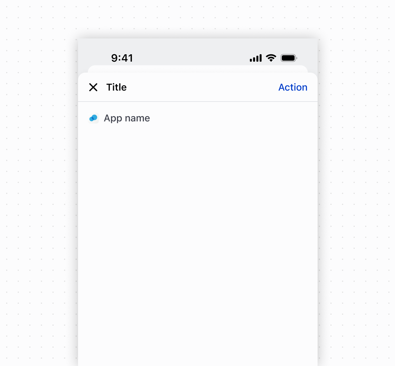
Structure a page layout
Anchor to Best practicesBest practices
- Write descriptive headings: Use heading and subheading to describe the page's purpose and provide context about the current workflow step.
- Place one primary action in action bar: Use the secondary-actions slot for the page's most important action.
- Use aside for supplementary content: Reserve the aside slot for navigation, contextual help, or supporting information.
Anchor to LimitationsLimitations
The secondary-actions slot supports only a single button element. Multiple actions in the action bar aren't supported and should be handled within the main content area.