POS block
The POS block component creates a container to place content with an action button. Use it to display structured content within POS block targets.
The component provides a standardized layout specifically designed for content blocks within POS detail views, with consistent padding, spacing, and optional action buttons.
Supported targets
- pos.
cart. line-item-details. action. render - pos.
customer-details. action. render - pos.
customer-details. block. render - pos.
draft-order-details. action. render - pos.
draft-order-details. block. render - pos.
home. modal. render - pos.
order-details. action. render - pos.
order-details. block. render - pos.
product-details. action. render - pos.
product-details. block. render - pos.
purchase. post. action. render - pos.
purchase. post. block. render
Supported targets
- pos.
cart. line-item-details. action. render - pos.
customer-details. action. render - pos.
customer-details. block. render - pos.
draft-order-details. action. render - pos.
draft-order-details. block. render - pos.
home. modal. render - pos.
order-details. action. render - pos.
order-details. block. render - pos.
product-details. action. render - pos.
product-details. block. render - pos.
purchase. post. action. render - pos.
purchase. post. block. render
Anchor to Use casesUse cases
- Customer information: Display customer info, loyalty status, or account details.
- Order summaries: Show order details, transaction info, or fulfillment status.
- Product recommendations: Present recommendations, inventory status, or related items.
- Contextual content: Provide actions and information that enhance core POS functionality.
Anchor to PropertiesProperties
Configure the following properties on the PosBlock component.
- Anchor to headingheadingheadingstringstring
A title that describes the content of the section. If omitted and no secondary actions are provided, the section will be rendered without a header.
- Anchor to idididstringstring
A unique identifier for the element used for targeting with CSS, JavaScript, or accessibility features.
Anchor to SlotsSlots
The POS block component supports slots for additional content placement within the block. Learn more about using slots.
- Anchor to secondary-actionssecondary-actionssecondary-actionsHTMLElementHTMLElement
The secondary actions to perform, provided as button or link type elements. Use the
slot="secondary-actions"attribute to place interactive elements that allow users to take actions related to the block's content.
Anchor to ExamplesExamples
Create structured content blocks using a POS block component with optional action buttons. This example shows a basic block with content and an action button.
Create a content block with an action button
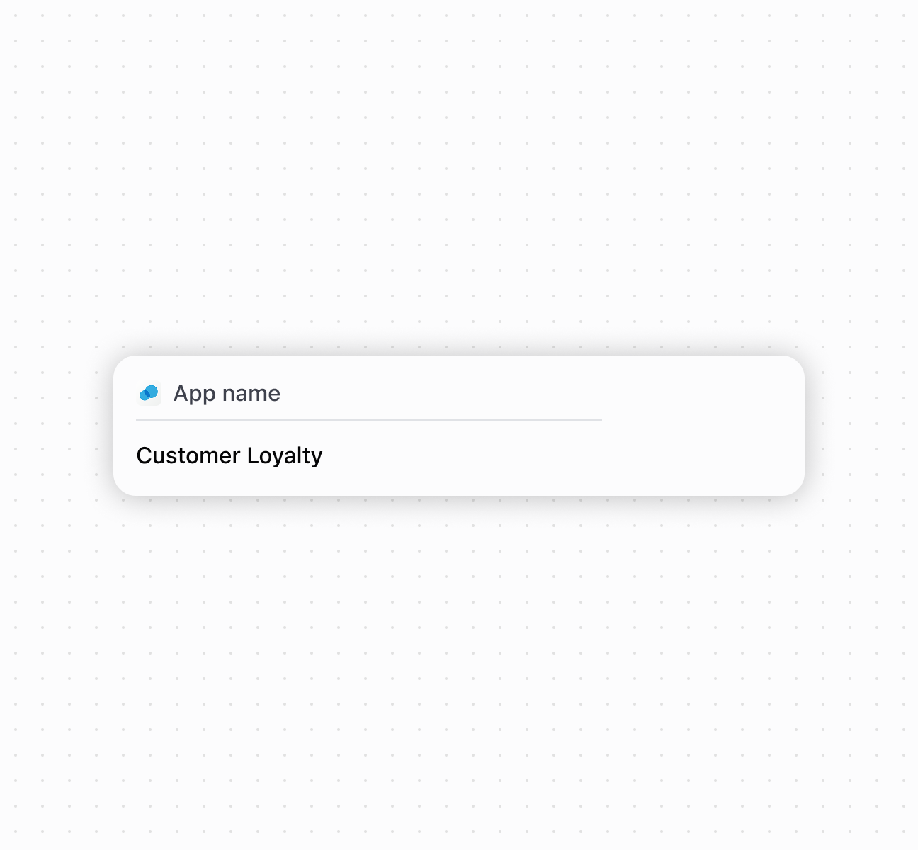
Create a content block with an action button
Anchor to Best practicesBest practices
- Provide descriptive headings: If you don't specify a heading, the system uses your extension's description, so ensure it's meaningful and concise.
- Place important actions in secondary-actions slot: Include only the most relevant actions directly related to your block's content.
- Limit secondary actions: To maintain clean, focused interfaces that don't overwhelm the existing POS workflow, use only one secondary action element in each block.