Banner
The banner component highlights important information or required actions prominently within the interface. Use banner to communicate statuses, provide feedback, draw attention to critical updates, or guide users toward necessary actions.
Banners support multiple tones to convey urgency levels, optional actions for next steps, and can be positioned contextually within sections or page-wide at the top. For inline status indicators on individual items, use badge.
Supported targets
- customer-account.
footer. render-after - customer-account.
order-index. announcement. render - customer-account.
order-index. block. render - customer-account.
order-status. announcement. render - customer-account.
order-status. block. render - customer-account.
order-status. cart-line-item. render-after - customer-account.
order-status. cart-line-list. render-after - customer-account.
order-status. customer-information. render-after - customer-account.
order-status. fulfillment-details. render-after - customer-account.
order-status. payment-details. render-after - customer-account.
order-status. return-details. render-after - customer-account.
order-status. unfulfilled-items. render-after - customer-account.
order. action. menu-item. render - customer-account.
order. action. render - customer-account.
order. page. render - customer-account.
page. render - customer-account.
profile. addresses. render-after - customer-account.
profile. announcement. render - customer-account.
profile. block. render - customer-account.
profile. company-details. render-after - customer-account.
profile. company-location-addresses. render-after - customer-account.
profile. company-location-payment. render-after - customer-account.
profile. company-location-staff. render-after - customer-account.
profile. payment. render-after
Anchor to PropertiesProperties
Configure the following properties on the banner component.
- booleanbooleanDefault: falseDefault: false
Whether the banner content can be collapsed and expanded by the user. A collapsible banner conceals child elements initially, allowing the user to expand the banner to reveal them.
- booleanbooleanDefault: falseDefault: false
Whether the banner displays a close button that allows users to dismiss it.
When the close button is pressed, the
dismissevent will fire, thenhiddenwill be set totrue, any animation will complete, and theafterhideevent will fire.- stringstringDefault: ''Default: ''
The heading text displayed at the top of the banner to summarize the message or alert.
- booleanbooleanDefault: falseDefault: false
Controls whether the banner is visible or hidden.
When using a controlled component pattern and the banner is
dismissible, update this property totruewhen thedismissevent fires.You can hide the banner programmatically by setting this to
trueeven if it's notdismissible.- stringstring
A unique identifier for the element. Use this to reference the element in JavaScript, link labels to form controls, or target specific elements for styling or scripting.
- 'info' | 'auto' | 'success' | 'warning' | 'critical''info' | 'auto' | 'success' | 'warning' | 'critical'Default: 'auto'Default: 'auto'
The semantic meaning and color treatment of the component. The banner is a live region and the type of status is dictated by the tone selected.
info: Informational content or helpful tips.auto: Automatically determined based on context.success: Positive outcomes or successful states.warning: Important warnings about potential issues.critical: Urgent problems or destructive actions.
The
criticaltone creates an assertive live region that is announced by screen readers immediately. Theinfo,success, andwarningtones create an informative live region that is announced by screen readers after the current message.
Anchor to EventsEvents
The banner component provides event callbacks for handling user interactions. Learn more about handling events.
- CallbackEventListener<typeof tagName>CallbackEventListener<typeof tagName>
A callback that fires when the banner has fully hidden, including after any hide animations have completed.
The
hiddenproperty istruewhen this event fires.- CallbackEventListener<typeof tagName>CallbackEventListener<typeof tagName>
A callback that fires when the banner is dismissed by the user clicking the close button.
This doesn't fire when setting
hiddenmanually.The
hiddenproperty isfalsewhen this event fires.
CallbackEventListener
A typed event listener for custom element events. The listener receives a `CallbackEvent` with the correct `currentTarget` type for the associated custom element tag.
(EventListener & {
      (event: CallbackEvent<TTagName, TEvent>): void;
    }) | null
CallbackEvent
An event type that narrows the `currentTarget` to the specific HTML element associated with the custom element tag. This provides type-safe event handling in callback listeners.
TEvent & {
  currentTarget: HTMLElementTagNameMap[TTagName];
}
Anchor to ExamplesExamples
Anchor to Display a basic notificationDisplay a basic notification
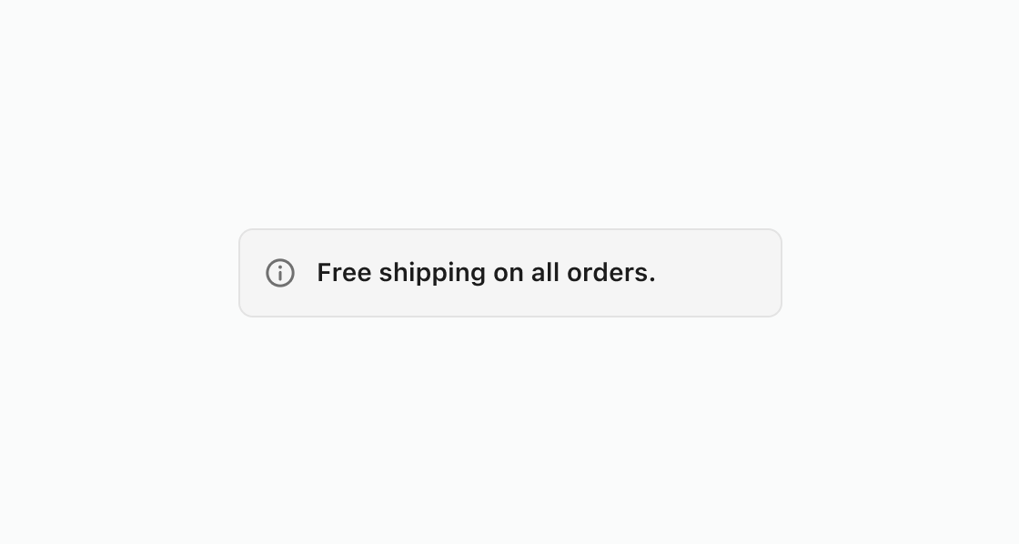
Display a basic notification to the customer. This example renders an s-banner with an info tone and a heading to communicate a free shipping promotion.
Display a basic notification
html
Let customers dismiss informational banners after reading them. This example uses the dismissible property to add a close button that hides the banner when pressed.
html
Anchor to Present a collapsible warningPresent a collapsible warning
Use a collapsible banner to show a warning title with additional details hidden by default. This example warns about an expiring payment method and reveals instructions when expanded.
html
Anchor to Best practicesBest practices
- Use banners sparingly: Too many banners distract customers from the main content. Reserve them for the most important information.
- Place banners contextually: Display banners at the top of a page or section, below the relevant header. If a banner relates to specific content, place it near that content.
- Include a next step when possible: Add a button with a clear action so customers know what to do after reading the message.
- Make banners dismissible unless critical: Customers should be able to dismiss informational banners. Keep
criticalbanners persistent until the issue is resolved. - Match tone to urgency: Use
infofor general updates,warningfor issues needing attention,successfor confirmations, andcriticalfor problems that block progress.