Number field
The number field component captures numeric input with built-in number validation. Use it to collect quantities, measurements, or other numeric information.
The component supports min/max constraints and step increments for guided numeric entry. For monetary values with currency formatting, use money field.
Supported targets
- customer-account.
footer. render-after - customer-account.
order-index. announcement. render - customer-account.
order-index. block. render - customer-account.
order-status. announcement. render - customer-account.
order-status. block. render - customer-account.
order-status. cart-line-item. render-after - customer-account.
order-status. cart-line-list. render-after - customer-account.
order-status. customer-information. render-after - customer-account.
order-status. fulfillment-details. render-after - customer-account.
order-status. payment-details. render-after - customer-account.
order-status. return-details. render-after - customer-account.
order-status. unfulfilled-items. render-after - customer-account.
order. action. menu-item. render - customer-account.
order. action. render - customer-account.
order. page. render - customer-account.
page. render - customer-account.
profile. addresses. render-after - customer-account.
profile. announcement. render - customer-account.
profile. block. render - customer-account.
profile. company-details. render-after - customer-account.
profile. company-location-addresses. render-after - customer-account.
profile. company-location-payment. render-after - customer-account.
profile. company-location-staff. render-after - customer-account.
profile. payment. render-after
Supported targets
- customer-account.
footer. render-after - customer-account.
order-index. announcement. render - customer-account.
order-index. block. render - customer-account.
order-status. announcement. render - customer-account.
order-status. block. render - customer-account.
order-status. cart-line-item. render-after - customer-account.
order-status. cart-line-list. render-after - customer-account.
order-status. customer-information. render-after - customer-account.
order-status. fulfillment-details. render-after - customer-account.
order-status. payment-details. render-after - customer-account.
order-status. return-details. render-after - customer-account.
order-status. unfulfilled-items. render-after - customer-account.
order. action. menu-item. render - customer-account.
order. action. render - customer-account.
order. page. render - customer-account.
page. render - customer-account.
profile. addresses. render-after - customer-account.
profile. announcement. render - customer-account.
profile. block. render - customer-account.
profile. company-details. render-after - customer-account.
profile. company-location-addresses. render-after - customer-account.
profile. company-location-payment. render-after - customer-account.
profile. company-location-staff. render-after - customer-account.
profile. payment. render-after
Anchor to Use casesUse cases
- Quantity selectors: Let customers adjust item quantities with stepper controls and min/max bounds.
- Unit measurements: Collect weight, length, or other numeric measurements with prefix and suffix labels.
- Step increments: Guide entry with specific step values like 0.5 for half-unit quantities.
- Range validation: Enforce valid ranges and show error messages when values exceed the allowed bounds.
Anchor to PropertiesProperties
Configure the following properties on the number field component.
- Anchor to autocompleteautocompleteautocompleteAutocompleteField | `${AutocompleteSection} ${AutocompleteField}` | `${AutocompleteGroup} ${AutocompleteField}` | `${AutocompleteSection} ${AutocompleteGroup} ${AutocompleteField}` | "on" | "off"AutocompleteField | `${AutocompleteSection} ${AutocompleteField}` | `${AutocompleteGroup} ${AutocompleteField}` | `${AutocompleteSection} ${AutocompleteGroup} ${AutocompleteField}` | "on" | "off"Default: 'on'Default: 'on'
A hint about the intended content of the field for browser autofill.
When set to
on(the default), this property indicates that the field should support autofill, but you do not have any more semantic information on the intended contents.When set to
off, you are indicating that this field contains sensitive information, or contents that are never saved, like one-time codes.Alternatively, you can provide value which describes the specific data you would like to be entered into this field during autofill.
Learn more about the set of autocomplete values supported in browsers.
- Anchor to controlscontrolscontrols'auto' | 'stepper' | 'none''auto' | 'stepper' | 'none'Default: 'auto'Default: 'auto'
Sets the type of controls displayed in the field.
'auto': The presence of the controls depends on the surface and context.'stepper': Displays buttons to increase or decrease the value by the stepping interval defined in thestepproperty. Appropriate mouse and keyboard interactions to control the value are enabled.'none': No controls are displayed and users must input the value manually. Arrow keys and scroll wheels can’t be used either to avoid accidental changes.
- Anchor to defaultValuedefault
Valuedefault Value stringstring The initial value of the field when it first loads. Unlike
placeholder, this is a real value that the user can edit and that gets submitted with the form. Once the user starts typing, their input replaces this value.- Anchor to disableddisableddisabledbooleanbooleanDefault: falseDefault: false
Whether the field is disabled, preventing any user interaction.
- Anchor to errorerrorerrorstringstring
An error message displayed below the field to indicate validation problems. When set, the field is styled with error indicators and the message is announced to screen readers.
- Anchor to iconiconiconIconProps['type']IconProps['type']Default: ''Default: ''
The type of icon to be displayed in the field.
- Anchor to idididstringstring
A unique identifier for the element. Use this to reference the element in JavaScript, link labels to form controls, or target specific elements for styling or scripting.
- Anchor to inputModeinput
Modeinput Mode 'decimal' | 'numeric''decimal' | 'numeric'Default: 'decimal'Default: 'decimal' Sets the virtual keyboard layout for the field.
'decimal': A numeric keyboard with a decimal point, suitable for decimal numbers.'numeric': A numeric keyboard without a decimal point, suitable for integers.
Learn more about the inputMode attribute.
- Anchor to labellabellabelstringstring
The text displayed as the field label, which identifies the purpose of the field to users. This label is associated with the field for accessibility and helps users understand what information to provide.
- Anchor to labelAccessibilityVisibilitylabel
Accessibility Visibilitylabel Accessibility Visibility 'visible' | 'exclusive''visible' | 'exclusive'Default: 'visible'Default: 'visible' Controls whether the label is visible to all users or only to screen readers.
visible: The label is shown to everyone.exclusive: The label is visually hidden but still announced by screen readers.
- Anchor to maxmaxmaxnumbernumberDefault: InfinityDefault: Infinity
The highest decimal or integer to be accepted for the field. When used with
stepthe value will round down to the max number.Note: a user can still use the keyboard to input a number higher than the max. It's up to the developer to add appropriate validation.
- Anchor to minminminnumbernumberDefault: -InfinityDefault: -Infinity
The lowest decimal or integer to be accepted for the field. When used with
stepthe value will round up to the min number.Note: a user can still use the keyboard to input a number lower than the min. It's up to the developer to add appropriate validation.
- Anchor to namenamenamestringstring
The name attribute for the field, used to identify the field's value when the form is submitted. Must be unique within the nearest containing form.
- Anchor to prefixprefixprefixstringstringDefault: ''Default: ''
A value to be displayed immediately before the editable portion of the field.
This is useful for displaying an implied part of the value, such as "https://" or "+353".
This can't be edited by the user, and it isn't included in the value of the field.
It may not be displayed until the user has interacted with the input. For example, an inline label may take the place of the prefix until the user focuses the input.
- Anchor to readOnlyread
Onlyread Only booleanbooleanDefault: falseDefault: false Whether the field is read-only and can't be edited. Read-only fields remain focusable and their content is announced by screen readers.
- Anchor to requiredrequiredrequiredbooleanbooleanDefault: falseDefault: false
Whether the field needs a value. This requirement adds semantic value to the field, but it will not cause an error to appear automatically. If you want to present an error when this field is empty, you can do so with the
errorproperty.- Anchor to stepstepstepnumbernumberDefault: 1Default: 1
The amount the value can increase or decrease by. This can be an integer or decimal. If a
maxorminis specified withstepwhen increasing/decreasing the value via the buttons, the final value will always round to themaxorminrather than the closest valid amount.- Anchor to suffixsuffixsuffixstringstringDefault: ''Default: ''
A value to be displayed immediately after the editable portion of the field.
This is useful for displaying an implied part of the value, such as "@shopify.com", or "%".
This can't be edited by the user, and it isn't included in the value of the field.
It may not be displayed until the user has interacted with the input. For example, an inline label may take the place of the suffix until the user focuses the input.
- Anchor to valuevaluevaluestringstring
The current value for the field. If omitted, the field will be empty.
AutocompleteSection
The “section” scopes the autocomplete data that should be inserted to a specific area of the page. Commonly used when there are multiple fields with the same autocomplete needs in the same page. For example: 2 shipping address forms in the same page.
`section-${string}`AutocompleteGroup
The contact information group the autocomplete data should be sourced from.
"shipping" | "billing"IconProps
The properties for the icon component when it's used in JSX.
- id
A unique identifier for the element. Use this to reference the element in JavaScript, link labels to form controls, or target specific elements for styling or scripting.
string - size
The size of the icon. - `'base'`: Default size that works well for most use cases. - `'small'`: Small icon for inline use within text or compact UI elements. - `'small-200'`: Extra small icon for the most compact contexts. - `'small-100'`: Small icon suitable for tight or dense layouts. - `'large'`: Large icon for emphasis or prominent display. - `'large-100'`: Extra large icon for maximum visual impact.
'base' | 'small' | 'small-200' | 'small-100' | 'large' | 'large-100' - tone
The semantic meaning and color treatment of the icon. - `'info'`: Informational content or helpful tips. - `'auto'`: Automatically determined based on context. - `'neutral'`: General information without specific intent. - `'success'`: Positive outcomes or successful states. - `'warning'`: Important warnings about potential issues. - `'critical'`: Urgent problems or destructive actions. - `'custom'`: Inherits a custom color from its parent element's CSS.
'info' | 'auto' | 'neutral' | 'success' | 'warning' | 'critical' | 'custom' - type
The type of icon that will be displayed. You can specify an icon name from the available icon set, or use an empty string to show no icon.
'' | ReducedIconTypes
ReducedIconTypes
The subset of icon types available in checkout and customer account surfaces. This is a narrowed set from the full Shopify icon library, containing only the icons supported in these contexts.
'reset' | 'map' | 'menu' | 'search' | 'circle' | 'filter' | 'image' | 'alert-circle' | 'alert-triangle-filled' | 'alert-triangle' | 'arrow-down' | 'arrow-left' | 'arrow-right' | 'arrow-up-right' | 'arrow-up' | 'bag' | 'bullet' | 'calendar' | 'camera' | 'caret-down' | 'cart' | 'cash-dollar' | 'categories' | 'check-circle' | 'check-circle-filled' | 'check' | 'chevron-down' | 'chevron-left' | 'chevron-right' | 'chevron-up' | 'clipboard' | 'clock' | 'credit-card' | 'delete' | 'delivered' | 'delivery' | 'disabled' | 'discount' | 'edit' | 'email' | 'empty' | 'external' | 'geolocation' | 'gift-card' | 'globe' | 'grid' | 'info-filled' | 'info' | 'list-bulleted' | 'location' | 'lock' | 'menu-horizontal' | 'menu-vertical' | 'minus' | 'mobile' | 'note' | 'order' | 'organization' | 'plus' | 'profile' | 'question-circle-filled' | 'question-circle' | 'reorder' | 'return' | 'savings' | 'settings' | 'star-filled' | 'star-half' | 'star' | 'store' | 'truck' | 'upload' | 'x-circle-filled' | 'x-circle' | 'x'Anchor to EventsEvents
The number field component provides event callbacks for handling user interactions. Learn more about handling events.
- Anchor to blurblurblurCallbackEventListener<typeof tagName>CallbackEventListener<typeof tagName>
A callback fired when the number field loses focus.
Learn more about the blur event.
- Anchor to changechangechangeCallbackEventListener<typeof tagName>CallbackEventListener<typeof tagName>
A callback fired when the number field value is committed on blur or after pressing Enter. Also fired on each step when using the increment/decrement controls or the Up Arrow and Down Arrow keys.
Learn more about the change event.
- Anchor to focusfocusfocusCallbackEventListener<typeof tagName>CallbackEventListener<typeof tagName>
A callback fired when the number field receives focus.
Learn more about the focus event.
- Anchor to inputinputinputCallbackEventListener<typeof tagName>CallbackEventListener<typeof tagName>
A callback fired when the user inputs data into the number field. Also fired on each step when using the increment/decrement controls or the Up Arrow and Down Arrow keys.
Learn more about the input event.
CallbackEventListener
A typed event listener for custom element events. The listener receives a `CallbackEvent` with the correct `currentTarget` type for the associated custom element tag.
(EventListener & {
      (event: CallbackEvent<TTagName, TEvent>): void;
    }) | null
CallbackEvent
An event type that narrows the `currentTarget` to the specific HTML element associated with the custom element tag. This provides type-safe event handling in callback listeners.
TEvent & {
  currentTarget: HTMLElementTagNameMap[TTagName];
}
Anchor to SlotsSlots
The number field component supports slots for additional content placement within the component. Learn more about using slots.
- Anchor to accessoryaccessoryaccessoryHTMLElementHTMLElement
Additional interactive content displayed within the field. Accepts button and clickable components with text content only. Other component types or complex layouts are not supported.
Anchor to ExamplesExamples
Anchor to Adjust a quantity with stepper controlsAdjust a quantity with stepper controls
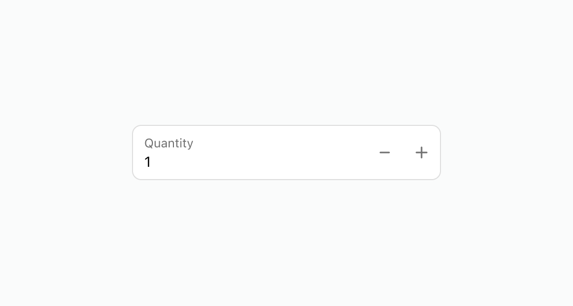
Add a numeric input with stepper controls for easy quantity adjustment. This example shows a number field with controls, min, max, and a defaultValue.Adjust a quantity with stepper controls
html
Anchor to Add a prefix and suffixAdd a prefix and suffix
Add labels before and after the input value for units or symbols. This example shows a number field with a prefix for an approximation symbol and a suffix for a weight unit.html
Anchor to Show a range validation errorShow a range validation error
Display an error message when the value exceeds the allowed range. This example uses a number field with min, max, and an error message.html
Anchor to Best practicesBest practices
- Use stepper controls: Set
controlstostepperfor fields where customers adjust values incrementally, such as quantities. - Label units clearly: Use
prefixorsuffixto indicate units like "kg" or "cm" so customers know what they're entering. - Set reasonable ranges: Use
minandmaxto prevent values outside the acceptable range and provide clear error messages. - Match step to precision: Set the
stepvalue to match the expected precision, such as0.1for decimal weights or1for whole quantities.