Version 2025-07 is the last API version to support React-based UI components. Later versions use web components, native UI elements with built-in accessibility, better performance, and consistent styling with Shopify's design system. Check out the upgrade guide to upgrade your extension.
Button
The Button component triggers actions or events, such as opening dialogs or navigating to other pages. Use Button to let merchants perform specific tasks or initiate interactions throughout the POS interface.
Buttons provide clear calls-to-action that guide merchants through workflows, enable form submissions, and trigger important operations. They support various visual styles, tones, and interaction patterns to communicate intent and hierarchy within the interface.
Supported targets
- pos.
cart. line-item-details. action. menu-item. render - pos.
cart. line-item-details. action. render - pos.
customer-details. action. menu-item. render - pos.
customer-details. action. render - pos.
customer-details. block. render - pos.
draft-order-details. action. menu-item. render - pos.
draft-order-details. action. render - pos.
draft-order-details. block. render - pos.
home. modal. render - pos.
order-details. action. menu-item. render - pos.
order-details. action. render - pos.
order-details. block. render - pos.
product-details. action. menu-item. render - pos.
product-details. action. render - pos.
product-details. block. render - pos.
purchase. post. action. menu-item. render - pos.
purchase. post. action. render - pos.
purchase. post. block. render
Supported targets
- pos.
cart. line-item-details. action. menu-item. render - pos.
cart. line-item-details. action. render - pos.
customer-details. action. menu-item. render - pos.
customer-details. action. render - pos.
customer-details. block. render - pos.
draft-order-details. action. menu-item. render - pos.
draft-order-details. action. render - pos.
draft-order-details. block. render - pos.
home. modal. render - pos.
order-details. action. menu-item. render - pos.
order-details. action. render - pos.
order-details. block. render - pos.
product-details. action. menu-item. render - pos.
product-details. action. render - pos.
product-details. block. render - pos.
purchase. post. action. menu-item. render - pos.
purchase. post. action. render - pos.
purchase. post. block. render
Anchor to Use casesUse cases
- Primary actions: Create actions like "Save changes," "Add customer," or "Process payment" that complete workflows.
- Secondary actions: Provide supporting actions such as "Cancel," "Edit," or "View details."
- Navigation: Enable screen transitions or launch modal experiences for complex operations.
- Loading states: Display loading indicators during asynchronous operations while preventing duplicate submissions.
Anchor to PropertiesProperties
Configure the following properties on the Button component.
- booleanboolean
Whether the button can be tapped.
- booleanboolean
Whether the button is displaying an animated loading state.
- () => void() => void
The callback that's executed when the user taps the button.
- stringstring
The text set on the button. When using a button for action (menu item) targets, the title will be ignored. The text on the menu item will be the extension's description.
- ButtonTypeButtonType
The type of button to render. Determines the appearance of the button.
'primary'- Creates a prominent call-to-action button with high visual emphasis for the most important action on a screen'basic'- Provides a standard button appearance for secondary actions and general interactions'destructive'- Displays a warning-styled button for actions that delete, remove, or cause irreversible changes'plain'- Deprecated as of POS 10.0.0. Using this option will automatically default to'basic'
ButtonType
'primary' | 'basic' | 'destructive' | 'plain'Anchor to ExamplesExamples
Display a button that responds to user interactions. This example shows a button that displays a toast notification when pressed, demonstrating how to handle button taps and provide immediate feedback to merchants.
Show a button
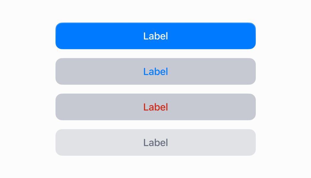
Show a button
React
import React from 'react'
import { Button, Navigator, Screen, reactExtension, useApi } from '@shopify/ui-extensions-react/point-of-sale'

const ModalComponent = () => {
  const api = useApi()
  return (
    <Navigator>
      <Screen title="Home" name="Home">
        <Button title="Press me!" onPress={() => api.toast.show('Button tapped!')} />
      </Screen>
    </Navigator>
  )
}

export default reactExtension('pos.home.modal.render', () => {
  return <ModalComponent />
})
TS
import {
  Button,
  Navigator,
  Screen,
  extension,
} from '@shopify/ui-extensions/point-of-sale';

export default extension(
  'pos.home.modal.render',
  (root, api) => {
    const button = root.createComponent(Button, {
      title: 'Press me!',
      onPress: () => {
        api.toast.show('Button tapped!');
      },
    });

    const screen = root.createComponent(Screen, {
      name: 'Home',
      title: 'Home',
    });
    screen.append(button);

    const navigator =
      root.createComponent(Navigator);

    navigator.append(screen);

    root.append(navigator);
  },
);
Anchor to Best practicesBest practices
- Choose appropriate variants and tones: Use
primaryvariant for the most important action on a screen,secondaryfor supporting actions, andtertiaryfor less prominent options. Applycriticaltone for destructive actions like "Delete order,"successfor positive actions like "Complete sale," andcautionorwarningfor actions requiring attention. - Provide loading states for async operations: Set the
loadingproperty totrueduring async operations. - Use the command system for component control: Use
commandForandcommandproperties to control modals, overlays, and other components without complex event handlers. - Structure button hierarchies clearly: Place primary and secondary actions together using consistent spacing and visual hierarchy. Position destructive actions separately or use confirmation patterns to prevent accidental activation.
Anchor to LimitationsLimitations
- Button titles must be plain strings. HTML, markdown, or rich text formatting isn't supported.
- Loading states replace all button content with a spinner. Custom loading indicators or partial content updates aren't supported.
- Complex button layouts or nested interactive components within buttons aren't supported.