Version 2025-07 is the last API version to support React-based UI components. Later versions use web components, native UI elements with built-in accessibility, better performance, and consistent styling with Shopify's design system. Check out the upgrade guide to upgrade your extension.
Home screen (smart grid)
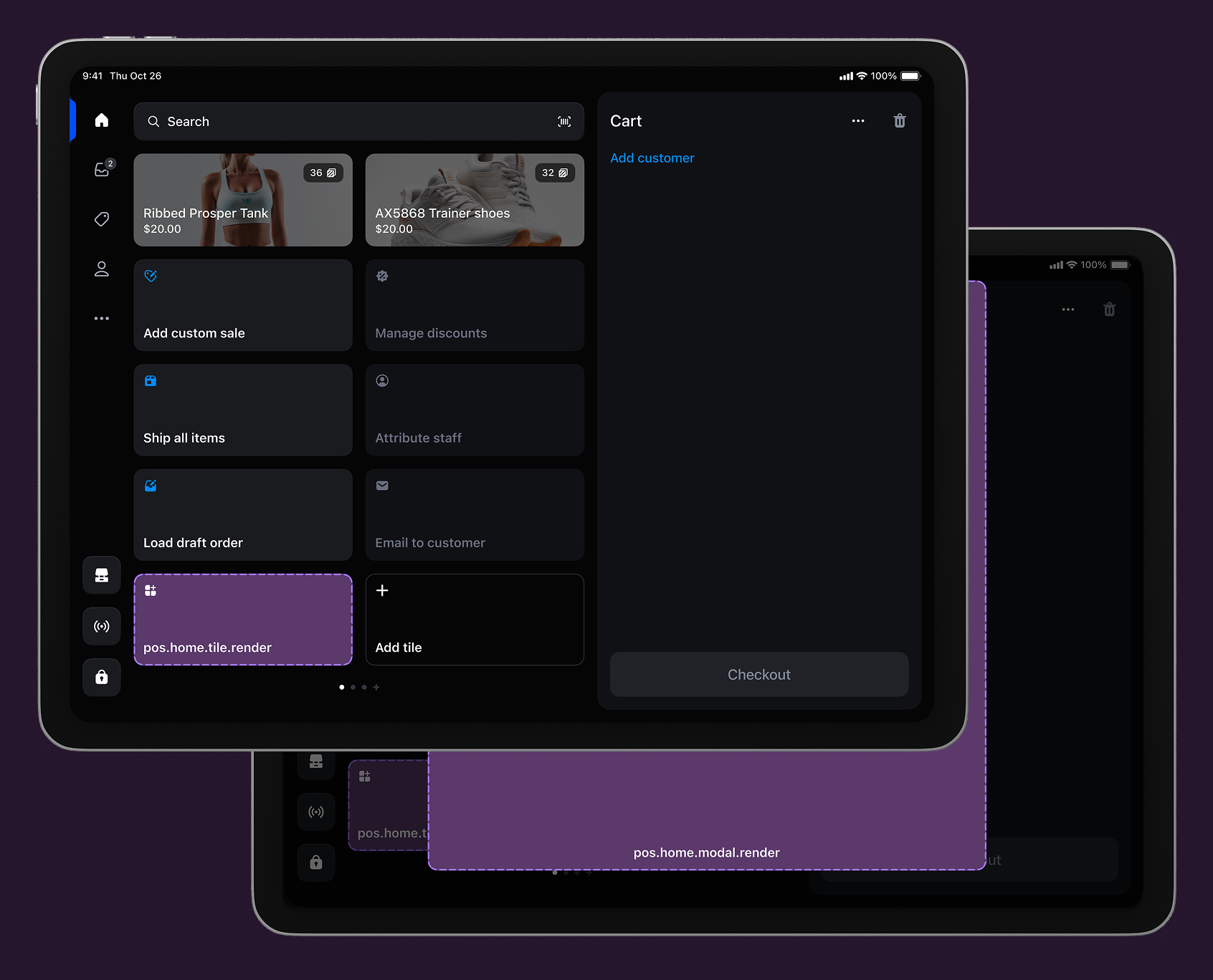
The smart grid is the first screen merchants see when they open the POS app. It provides quick access to essential functions and serves as the starting point for merchant activities.
Anchor to Use casesUse cases
- Sales analytics: Display summaries and launch detailed reporting dashboards.
- Inventory management: Access scanning tools, stock alerts, and bulk operations.
- Customer engagement: Launch profile management and enrollment workflows.
- Promotions: Configure discounts and manage campaign status.
Anchor to Home screen targetsHome screen targets
Use these targets for high-frequency actions, status displays, or entry points to workflows that merchants need daily.
Anchor to Home screen tile ,[object Object]Home screen tile target
pos.home.tile.render
Renders a single interactive tile component on the POS home screen's smart grid. The tile appears once during home screen initialization and remains persistent until navigation occurs. Use this target for high-frequency actions, status displays, or entry points to workflows that merchants need daily.
Extensions at this target can dynamically update properties like enabled state and badge values in response to cart changes or device conditions. Tiles typically invoke api.action.presentModal() to launch the companion modal for complete workflows.
Supported components
Supported components
Examples
Create a smart grid tile
Description
Add an interactive tile to the POS home screen smart grid for high-frequency actions. This example shows how to create a persistent tile that can dynamically update its enabled state and badge values, providing merchants with quick access to daily workflows and status displays.
React
import React from 'react';

import {
  Tile,
  reactExtension,
  useApi,
} from '@shopify/ui-extensions-react/point-of-sale';

const TileComponent = () => {
  const api = useApi<'pos.home.tile.render'>();
  return (
    <Tile
      title="My app"
      subtitle="SmartGrid react Extension"
      onPress={() => {
        api.action.presentModal();
      }}
      enabled
    />
  );
};

export default reactExtension('pos.home.tile.render', () => {
  return <TileComponent />;
});
TS
import {extension, Tile} from '@shopify/ui-extensions/point-of-sale';

export default extension('pos.home.tile.render', (root, api) => {
  const tile = root.createComponent(Tile, {
    title: 'My app',
    subtitle: 'SmartGrid vanilla-js Extension',
    onPress: () => api.action.presentModal(),
    enabled: true,
  });

  root.append(tile);
});
Anchor to Home screen action (modal) ,[object Object]Home screen action (modal) target
pos.home.modal.render
Renders a full-screen modal interface launched from smart grid tiles. The modal appears when users tap a companion tile. Use this target for complete workflow experiences that require more space and functionality than the tile interface provides, such as multi-step processes, detailed information displays, or complex user interactions.
Extensions at this target support full navigation hierarchies with multiple screens, scroll views, and interactive components to handle sophisticated workflows.
Supported components
Supported components
Examples
Create a full-screen modal from a tile
Description
Build a full-screen modal interface launched from smart grid tiles. This example demonstrates creating a modal that appears when merchants tap a tile, supporting complete workflows with multiple screens, scroll views, and interactive components for sophisticated tasks.
React
import React from 'react'

import { Text, Screen, ScrollView, Navigator, reactExtension } from '@shopify/ui-extensions-react/point-of-sale'

const Modal = () => {
  return (
    <Navigator>
      <Screen name='HelloWorld' title='Hello World!'>
        <ScrollView>
          <Text>Welcome to the extension!</Text>
        </ScrollView>
      </Screen>
    </Navigator>
  )
}

export default reactExtension('pos.home.modal.render', () => <Modal />);
TS
import {
  Navigator,
  Screen,
  ScrollView,
  Text,
  extension,
} from '@shopify/ui-extensions/point-of-sale';

export default extension('pos.home.modal.render', (root) => {
  const navigator = root.createComponent(Navigator);
  const screen = root.createComponent(Screen, {
    name: 'HelloWorld',
    title: 'Hello World!',
  });
  const scrollView = root.createComponent(ScrollView);
  const text = root.createComponent(Text);

  text.append('Welcome to the extension!');
  scrollView.append(text);
  screen.append(scrollView);
  navigator.append(screen);
  root.append(navigator);
});
Anchor to Best practicesBest practices
- Update tiles immediately: Update tile appearance when data changes to show the system responds to actions.
- Show clear confirmations: Display success or error messages in modals with specific details like "Discount applied successfully."
- Use toasts for quick feedback: Use toast messages for successful actions or errors without disrupting workflows.
- Communicate error states clearly: Show unavailable functionality through disabled tiles, modal messages, or error text explaining next steps.
- Write action-oriented titles: Use specific titles like "Apply loyalty discount" instead of generic labels like "Loyalty app."
- Provide contextual information: Show eligibility requirements, status, or context through subtitles and badge values.
Anchor to LimitationsLimitations
You can only render one Tile component for each POS UI extension.