Version 2025-07 is the last API version to support React-based UI components. Later versions use web components, native UI elements with built-in accessibility, better performance, and consistent styling with Shopify's design system. Check out the upgrade guide to upgrade your extension.
Stepper
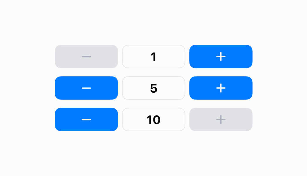
The Stepper component provides increment and decrement controls for numeric values with visual feedback. Use it to adjust quantities, counts, or other numeric values with clear visual buttons.
The component provides visual increment and decrement controls with customizable step values and min/max constraints to control numeric adjustments. It supports both button clicks and keyboard input for flexibility, with visual feedback for boundary conditions and disabled states to prevent invalid value entries during quantity adjustments or numeric configurations.
Stepper components provide continuous increment behavior when buttons are held down, enabling rapid value changes while still supporting single-step precision adjustments for fine-tuned control.
Anchor to Use casesUse cases
- Quantity adjustment: Adjust product quantities in cart or order interfaces.
- Inventory counts: Modify inventory counts, stock levels, or reorder quantities.
- Numeric settings: Control numeric settings like display brightness or volume.
- Touch-optimized: Provide touch-optimized numeric input where steppers are more intuitive.
Anchor to PropertiesProperties
Configure the following properties on the Stepper component.
- Anchor to initialValueinitial
Valueinitial Value numbernumberrequiredrequired The initial value of the stepper that sets the starting numeric value when the component is first rendered.
- Anchor to onValueChangedon
Value Changedon Value Changed (value: number) => void(value: number) => voidrequiredrequired A callback function executed when the value of the stepper changes, receiving the new numeric value as a parameter.
- Anchor to disableddisableddisabledbooleanbooleanDefault: falseDefault: false
Whether the field can be modified, disabling both increment and decrement buttons.
- Anchor to maximumValuemaximum
Valuemaximum Value numbernumber The maximum value that the stepper can reach. When the value equals the maximum, the increment button will be disabled.
- Anchor to minimumValueminimum
Valueminimum Value numbernumberDefault: 1Default: 1 The minimum value that the stepper can reach. When the value equals the minimum, the decrement button will be disabled.
- Anchor to valuevaluevaluenumbernumber
An optional value to override the internal state of the component. Only use this if you need complete control over the stepper's value from external state.
Anchor to ExamplesExamples
Anchor to Increment and decrement numeric valuesIncrement and decrement numeric values
Adjust numeric values with visual increment and decrement controls. This example demonstrates a Stepper with customizable step values and min/max constraints, supporting both button clicks and keyboard input for quantity adjustments or numeric configurations.Increment and decrement numeric values
Increment and decrement numeric values
React
import React, { useState } from 'react';

import { Screen, reactExtension, Text, Stepper, ScrollView } from '@shopify/ui-extensions-react/point-of-sale';

const SmartGridModal = () => {
  const [value, setValue] = useState(4);

  return (
    <Screen name='stepper' title='Stepper'>
      <ScrollView>
        <Stepper initialValue={value} onValueChanged={setValue} />
        <Text>{value}</Text>
      </ScrollView>
    </Screen>
  );
}

export default reactExtension('pos.home.modal.render', () => {
  return <SmartGridModal />
})
TS
import {
  extension,
  Screen,
  ScrollView,
  Stepper,
  Text,
} from '@shopify/ui-extensions/point-of-sale';

export default extension(
  'pos.home.modal.render',
  (root) => {
    const mainScreen = root.createComponent(
      Screen,
      {name: 'stepper', title: 'Stepper'},
    );
    const scrollView =
      root.createComponent(ScrollView);
    const text = root.createComponent(
      Text,
      null,
      '4',
    );
    const stepper = root.createComponent(
      Stepper,
      {
        initialValue: 4,
        onValueChanged: (value) => {
          text.replaceChildren(value.toString());
        },
      },
    );

    scrollView.append(stepper);
    scrollView.append(text);
    mainScreen.append(scrollView);
    root.append(mainScreen);
  },
);
Anchor to Best practicesBest practices
- Use initialValue for default starting points: Set
initialValueto a sensible default that makes sense for your use case, such as 1 for quantities or a typical value for settings. - Let the component manage its own state: By default, Stepper manages its own internal state—you only need to respond to
onValueChangedto capture the new value. Avoid using thevalueproperty unless you specifically need to override the internal state for external synchronization. - Handle value changes appropriately: Implement the
onValueChangedcallback to capture value changes and update your application state, trigger calculations, or perform related actions based on the new numeric value. - Provide visual context for stepper values: While Stepper handles the increment/decrement controls, consider displaying the current value prominently alongside the Stepper buttons so users can see the exact numeric value, not just the controls.
- Design for touch interaction: Stepper buttons are optimized for touch interaction on POS devices. Ensure adequate spacing around the Stepper buttons and consider the overall layout to prevent accidental taps on adjacent controls.
Anchor to LimitationsLimitations
- Stepper provides increment/decrement controls only—if users need to enter specific values directly by keyboard, combine Stepper with a NumberField component.
- The component manages integer values by default—fractional or decimal increments require using the optional
valueproperty with external state management. - Stepper doesn't include labels or field descriptions—combine with Text components or other UI elements to provide context about what value is being adjusted.