Version 2025-07 is the last API version to support React-based UI components. Later versions use web components, native UI elements with built-in accessibility, better performance, and consistent styling with Shopify's design system. Check out the upgrade guide to upgrade your extension.
Screen
The Screen component represents a screen in the navigation stack with full control over presentation, actions, and navigation lifecycle. Use it to create navigable screens with titles, loading states, and custom navigation behavior.
The component manages full-screen presentations with proper navigation stack integration, allowing extensions to push and pop screens as part of the POS navigation flow. It handles transitions, back button behavior, and safe area padding automatically, ensuring extensions provide native-feeling navigation experiences on both iOS and Android devices.
Screen components maintain scroll position across navigation operations where appropriate, allowing merchants to return to their previous location after viewing details or completing sub-tasks.
Anchor to Use casesUse cases
- Multi-step workflows: Create workflows with navigation between different screens.
- Configuration interfaces: Build settings interfaces requiring separate screens for different categories.
- Modal presentations: Implement modal-style presentations for focused tasks or data entry.
- Loading states: Provide loading states during asynchronous operations.
Anchor to PropertiesProperties
Configure the following properties on the Screen component.
- Anchor to namenamenamestringstringrequiredrequired
The unique identifier used to identify this screen as a destination in the navigation stack.
- Anchor to titletitletitlestringstringrequiredrequired
The title text of the screen that will be displayed in the UI header.
- Anchor to isLoadingis
Loadingis Loading booleanboolean A boolean that displays a loading indicator when
true. Set this during asynchronous tasks and return tofalsewhen data becomes available.- () => void() => void
A callback function triggered when the screen is navigated to in the navigation stack.
- () => void() => void
A callback function triggered when the user navigates back from this screen. Runs after the screen is unmounted.
- Anchor to onReceiveParamson
Receive Paramson Receive Params (params: any) => void(params: any) => void A callback function triggered when the navigation event completes with any passed parameters. Runs when screen is mounted (with
undefined).- () => void() => void
A callback function that allows you to override the default back navigation action. Runs when the screen is mounted.
- Anchor to presentationpresentationpresentationScreenPresentationPropsScreenPresentationProps
The presentation configuration that dictates how the screen will be displayed when navigated to.
- Anchor to secondaryActionsecondary
Actionsecondary Action SecondaryActionPropsSecondaryActionProps The configuration for a secondary action button displayed on the screen header.
ScreenPresentationProps
- sheet
Displays the screen from the bottom as a sheet presentation when true during navigation. The text label displayed on the secondary action button in the screen's action bar.
boolean
SecondaryActionProps
- isEnabled
Whether the secondary action button can be tapped and is interactive.
boolean - onPress
A callback function triggered when the secondary action button is pressed by the user.
() => void - text
The text label displayed on the secondary action button in the screen's action bar.
string
Anchor to ExamplesExamples
Define screens within your navigation stack with full control over presentation and behavior. This example shows how to create Screen components with titles, actions, and proper navigation integration, handling transitions and back button behavior automatically.
Create a navigable screen
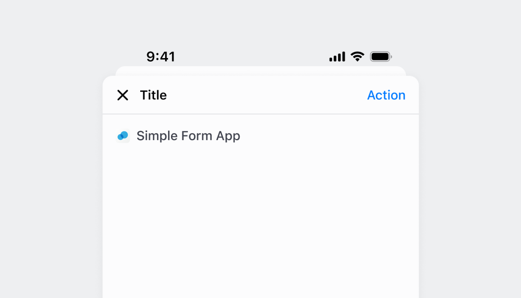
Create a navigable screen
React
import React from 'react'

import { Screen, Text, Navigator, reactExtension, Button, useApi } from '@shopify/ui-extensions-react/point-of-sale';

const Modal = () => {
  const api = useApi<'pos.home.modal.render'>();

  return (
    <Navigator>
      <Screen name="Home" title="Home">
        <Text>Home screen</Text>
        <Button title="Navigate to details" onPress={() => api.navigation.navigate('Details')} />
      </Screen>
      <Screen name="Details" title="Details">
        <Text>Details screen</Text>
      </Screen>
    </Navigator>
  )
}

export default reactExtension('pos.home.modal.render', () => <Modal />);
TS
import {
  extension,
  Screen,
  Navigator,
  Text,
  Button,
} from '@shopify/ui-extensions/point-of-sale';

export default extension('pos.home.modal.render', (root, api) => {
  const homeScreen = root.createComponent(Screen, {
    name: 'Home',
    title: 'Home',
  });

  const homeText = root.createComponent(Text);
  homeText.append('Home screen');
  homeScreen.append(homeText);

  const navigateButton = root.createComponent(Button, {
    title: 'Navigate to details',
    onPress: () => api.navigation.navigate('Details'),
  });
  homeScreen.append(navigateButton);

  const detailsScreen = root.createComponent(Screen, {
    name: 'Details',
    title: 'Details',
  });

  const detailsText = root.createComponent(Text);
  detailsText.append('Details screen');
  detailsScreen.append(detailsText);

  const navigator = root.createComponent(Navigator);
  navigator.append(homeScreen);
  navigator.append(detailsScreen);
  root.append(navigator);
});
Anchor to Pass data between screensPass data between screens
Navigate to screens while passing data as parameters. This example demonstrates how to send information from one screen to another using navigation parameters, enabling contextual data flow through multi-step workflows.Pass data between screens
React
import React, {useState} from 'react';

import {
  Screen,
  Text,
  Navigator,
  reactExtension,
  Button,
  useApi,
} from '@shopify/ui-extensions-react/point-of-sale';

const Modal = () => {
  return (
    <Navigator>
      <HomeScreen />
      <DetailsScreen />
    </Navigator>
  );
};

const HomeScreen = () => {
  const api = useApi<'pos.home.modal.render'>();
  return (
    <Screen name="Home" title="Home">
      <Text>Home screen</Text>
      <Button
        title="Navigate to details"
        onPress={() => api.navigation.navigate('Details', {orderId: '123'})}
      />
    </Screen>
  );
};

const DetailsScreen = () => {
  const [params, setParams] = useState<pos.home.modal.render>();

  return (
    <Screen
      name="Details"
      title="Details"
      presentation={{sheet: true}}
      onReceiveParams={setParams}
    >
      <Text>{`Order ID: ${params.orderId}`}</Text>
    </Screen>
  );
};

export default reactExtension('pos.home.modal.render', () => <Modal />);
TS
import {
  extension,
  Screen,
  Navigator,
  Text,
  Button,
} from '@shopify/ui-extensions/point-of-sale';

export default extension('pos.home.modal.render', (root, api) => {
  const homeScreen = root.createComponent(Screen, {
    name: 'Home',
    title: 'Home',
  });

  const homeText = root.createComponent(Text);
  homeText.append('Home screen');
  homeScreen.append(homeText);

  const navigateButton = root.createComponent(Button, {
    title: 'Navigate to details',
    onPress: () => api.navigation.navigate('Details', {orderId: '123'}),
  });
  homeScreen.append(navigateButton);

  const detailsText = root.createComponent(Text);

  const detailsScreen = root.createComponent(Screen, {
    name: 'Details',
    title: 'Details',
    onReceiveParams: (params) => {
      detailsText.replaceChildren(`Order ID: ${params.orderId}`);
    },
  });

  detailsScreen.append(detailsText);

  const navigator = root.createComponent(Navigator);
  navigator.append(homeScreen);
  navigator.append(detailsScreen);
  root.append(navigator);
});
Anchor to Present a screen as a sheetPresent a screen as a sheet
Show a screen using sheet presentation style for modal-like interactions. This example demonstrates how to present screens as overlays that slide up from the bottom, useful for quick actions or secondary information without losing the parent screen context.Present a screen as a sheet
React
import React from 'react'

import { Screen, Text, Navigator, reactExtension, Button, useApi } from '@shopify/ui-extensions-react/point-of-sale';

const Modal = () => {
  const api = useApi<'pos.home.modal.render'>();

  return (
    <Navigator>
      <Screen name="Home" title="Home">
        <Text>Home screen</Text>
        <Button title="Navigate to details" onPress={() => api.navigation.navigate('Details')} />
      </Screen>
      <Screen name="Details" title="Details" presentation={{sheet: true}}>
        <Text>Details screen</Text>
      </Screen>
    </Navigator>
  )
}

export default reactExtension('pos.home.modal.render', () => <Modal />);
TS
import {
  extension,
  Screen,
  Navigator,
  Text,
  Button,
} from '@shopify/ui-extensions/point-of-sale';

export default extension('pos.home.modal.render', (root, api) => {
  const homeScreen = root.createComponent(Screen, {
    name: 'Home',
    title: 'Home',
  });

  const homeText = root.createComponent(Text);
  homeText.append('Home screen');
  homeScreen.append(homeText);

  const navigateButton = root.createComponent(Button, {
    title: 'Navigate to details',
    onPress: () => api.navigation.navigate('Details'),
  });
  homeScreen.append(navigateButton);

  const detailsScreen = root.createComponent(Screen, {
    name: 'Details',
    title: 'Details',
    presentation: {sheet: true},
  });

  const detailsText = root.createComponent(Text);
  detailsText.append('Details screen');
  detailsScreen.append(detailsText);

  const navigator = root.createComponent(Navigator);
  navigator.append(homeScreen);
  navigator.append(detailsScreen);
  root.append(navigator);
});
Anchor to Best practicesBest practices
- Implement proper loading states: Use the
isLoadingproperty to provide visual feedback during async operations. Set it totruewhen starting data fetching or processing, andfalsewhen operations complete to maintain user awareness. - Handle navigation lifecycle appropriately: Use
onNavigatefor screen initialization,onNavigateBackfor cleanup operations, andonReceiveParamsfor handling passed data. Proper lifecycle management ensures smooth transitions and data consistency. - Choose appropriate presentation styles: Use sheet presentation for focused tasks, modal-style interactions, or when you want to maintain context with the previous screen. Reserve standard presentation for primary navigation flows.
- Design meaningful secondary actions: When adding secondary actions, use clear, action-oriented text and ensure the action is relevant to the current screen's content. Disable actions when they're not applicable using the
isEnabledproperty. - Override back navigation judiciously: Use
overrideNavigateBackonly when you need to prevent data loss or handle unsaved changes. Most screens should use the default back navigation behavior to maintain consistent user expectations.
Anchor to LimitationsLimitations
- Screen components are designed for navigation stack contexts—they can't be used as general layout containers outside of navigation workflows.
- Only one secondary action is supported for each screen to maintain clean header layouts that don't overwhelm the interface.
- Screen presentation and styling are controlled by the POS navigation system—custom screen transitions or styling beyond the provided options aren't supported.
- Navigation parameter handling is limited to the onReceiveParams callback—complex parameter validation or transformation requires custom implementation within the callback.