Version 2025-07 is the last API version to support React-based UI components. Later versions use web components, native UI elements with built-in accessibility, better performance, and consistent styling with Shopify's design system. Check out the upgrade guide to upgrade your extension.
POSBlock
The POSBlockRow component renders individual rows within a POSBlock container. Use it to create structured content rows with optional tap interactions inside POSBlock components.
The component follows Shopify's design system specifications to ensure visual consistency across the POS interface. It includes built-in support for different device sizes and orientations, providing a reliable and familiar experience for merchants across various retail environments and use cases.
POSBlockRow components handle edge cases and loading states gracefully, providing clear feedback during operations and maintaining interface responsiveness even when processing intensive tasks or handling large datasets.
Supported targets
- pos.
cart. line-item-details. action. render - pos.
customer-details. action. render - pos.
customer-details. block. render - pos.
draft-order-details. action. render - pos.
draft-order-details. block. render - pos.
home. modal. render - pos.
order-details. action. render - pos.
order-details. block. render - pos.
product-details. action. render - pos.
product-details. block. render - pos.
purchase. post. action. render - pos.
purchase. post. block. render
Supported targets
- pos.
cart. line-item-details. action. render - pos.
customer-details. action. render - pos.
customer-details. block. render - pos.
draft-order-details. action. render - pos.
draft-order-details. block. render - pos.
home. modal. render - pos.
order-details. action. render - pos.
order-details. block. render - pos.
product-details. action. render - pos.
product-details. block. render - pos.
purchase. post. action. render - pos.
purchase. post. block. render
Anchor to Use casesUse cases
- Content rows: Create individual content rows within POSBlock containers.
- Interactive rows: Add interactive functionality to specific rows through tap callbacks.
- Consistent layouts: Structure content with consistent row-based layouts.
- User interactions: Provide user interaction points that trigger actions or navigation.
Anchor to PropertiesProperties
Configure the following properties on the POSBlockRow component.
- Anchor to onPresson
Presson Press () => void() => void A callback function executed when the user taps the row. Use this to handle row-specific interactions or navigation.
Anchor to ExamplesExamples
Anchor to Create structured rows within a blockCreate structured rows within a block
Display individual rows within a POSBlock container with optional tap interactions. This example demonstrates creating structured content rows that follow POS design specifications, ensuring visual consistency and proper handling of various device sizes and orientations.Create structured rows within a block
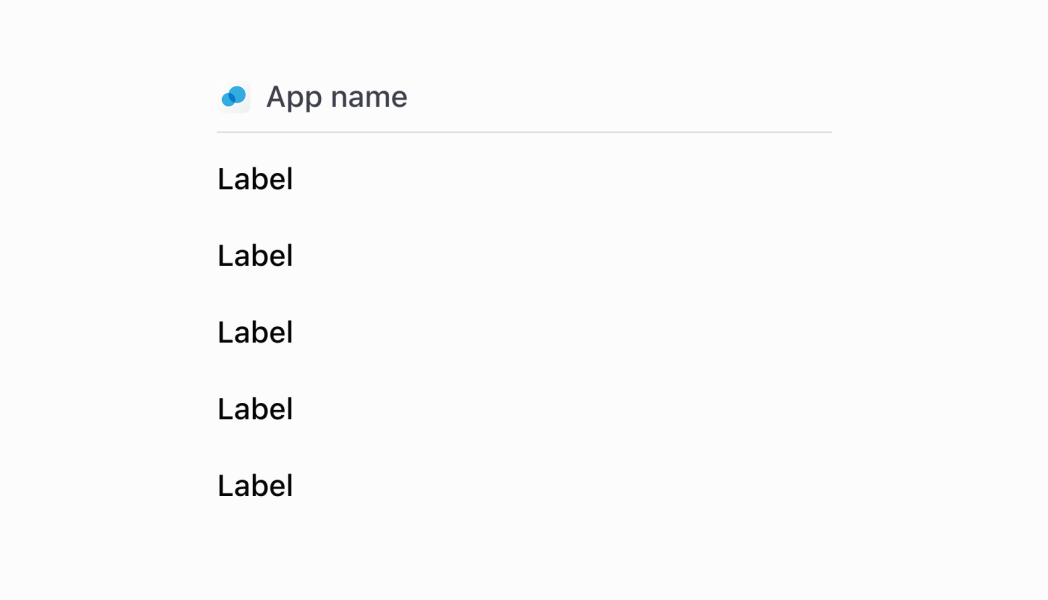
Create structured rows within a block
React
import React from 'react';
import {
  reactExtension,
  useApi,
  POSBlock,
  POSBlockRow,
  Text,
} from '@shopify/ui-extensions-react/point-of-sale';

const PostPurchaseBlock = () => {
  const api =
    useApi<'pos.purchase.post.block.render'>();

  return (
    <POSBlock>
      <POSBlockRow>
        <Text>Hello, world!</Text>
      </POSBlockRow>
    </POSBlock>
  );
};

export default reactExtension(
  'pos.purchase.post.block.render',
  () => <PostPurchaseBlock />,
);
TS
import {
  POSBlock,
  POSBlockRow,
  extension,
} from '@shopify/ui-extensions/point-of-sale';

export default extension(
  'pos.purchase.post.block.render',
  (root, api) => {
    const posBlock =
      root.createComponent(POSBlock);

    const posBlockRow =
      root.createComponent(POSBlockRow);

    const text = root.createText('Hello, world!');

    posBlockRow.append(text);
    posBlock.append(posBlockRow);
    root.append(posBlock);
  },
);
Anchor to Best practicesBest practices
- Organize content logically within rows: Structure your POSBlockRow content to be scannable and focused. Each row should represent a discrete piece of information or functionality that users can easily understand and interact with.
- Provide visual feedback for interactive rows: When rows are interactive (have
onPresscallbacks), ensure users understand they can be tapped. - Keep row content concise and focused: Design row content to be easily readable and actionable within the constrained space of a POSBlock. Focus on the most important information and avoid cluttering rows with excessive detail.
- Maintain consistent interaction patterns: Use similar
onPressbehaviors across different POSBlockRow instances in your extension to create predictable user experiences. Consistent interaction patterns help merchants understand and trust your extension.
Anchor to LimitationsLimitations
- POSBlockRow can only be used as children of POSBlock components—it can't be used independently or within other container types.
- The component's visual styling and layout are controlled by the POS design system—custom row styling beyond content organization isn't supported.
- Row content is provided through child components rather than direct content properties—organize your row content through component composition.
- Interactive behavior is limited to the
onPresscallback—complex interactions or multiple actions for each row require custom implementation within the row content.