Version 2025-07 is the last API version to support React-based UI components. Later versions use web components, native UI elements with built-in accessibility, better performance, and consistent styling with Shopify's design system. Check out the upgrade guide to upgrade your extension.
Text
The TextArea component captures longer text content with a multi-line, resizable text input area. Use it to collect descriptions, notes, comments, or other extended text input in forms and data entry workflows.
The component provides a multi-line text input area that accommodates longer content. It supports validation and multi-line formatting, making it ideal for capturing detailed information such as order notes, product descriptions, or customer feedback that requires more than single-line input.
Anchor to Use casesUse cases
- Descriptions: Collect product descriptions or notes in inventory management workflows.
- Customer comments: Capture customer comments or special instructions.
- Feedback: Enable feedback collection or issue reporting requiring detailed explanations.
- Multi-line entry: Support multi-line text entry for addresses or delivery instructions.
Anchor to PropertiesProperties
Configure the following properties on the TextArea component.
- Anchor to labellabellabelstringstringrequiredrequired
The content to use as the field label that describes the text information being requested.
- Anchor to actionactionactionInputActionInputAction
A button configuration object displayed under the text field to provide extra functionality.
- Anchor to disableddisableddisabledbooleanboolean
Controls whether the field can be modified. When
true, the field is disabled and users cannot edit its value.- Anchor to errorerrorerrorstringstring
An error message that indicates a problem to the user. The field is given specific stylistic treatment to communicate issues that must be resolved immediately.
- Anchor to helpTexthelp
Texthelp Text stringstring The label text displayed under the field that provides guidance or instructions to assist users.
- Anchor to maxLengthmax
Lengthmax Length numbernumber The maximum number of characters allowed in the text field.
- Anchor to onBluron
Bluron Blur () => void() => void A callback function executed when focus is removed from the field.
- Anchor to onChangeon
Changeon Change (value: string) => void(value: string) => void A callback function executed when the user has finished editing the field, receiving the new text value as a parameter. You should update the
valueproperty in response to this callback.- Anchor to onFocuson
Focuson Focus () => void() => void A callback function executed when the field receives focus.
- Anchor to onInputon
Inputon Input (value: string) => void(value: string) => void A callback function executed immediately when the user makes any change in the field. Use this for real-time feedback, such as clearing validation errors as soon as the user begins making corrections. Don't use this to update the
valueproperty—thecallback is the appropriate handler for updating the field's value.- Anchor to placeholderplaceholderplaceholderstringstring
A short hint that describes the expected value of the field.
- Anchor to requiredrequiredrequiredbooleanboolean
A boolean that indicates whether the field needs a value for form submission or validation purposes.
- Anchor to rowsrowsrowsnumbernumber
The initial number of visible text lines to be displayed. Maximum of 8 lines.
- Anchor to valuevaluevaluestringstring
The current text value for the field. If omitted, the field will be empty. You should update the
valueproperty in response to thecallback.
InputAction
Defines the configuration object for action buttons displayed below input fields to provide extra functionality.
- disabled
A boolean value that determines whether the action button can be pressed.
boolean - label
The text displayed on the action button.
string - onPress
A callback function executed when the action button is pressed.
() => void
Anchor to ExamplesExamples
Anchor to Capture multi-line text inputCapture multi-line text input
Collect longer text content using a multi-line resizable input area. This example shows a TextArea that supports validation and multi-line formatting, ideal for capturing descriptions, notes, comments, or extended information in forms and data entry workflows.Capture multi-line text input
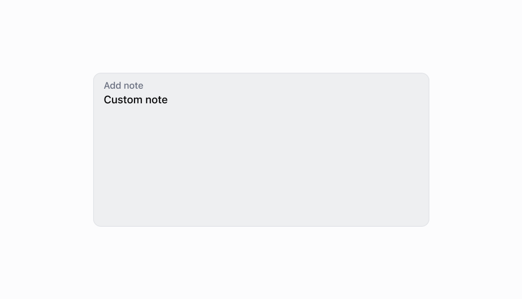
Capture multi-line text input
React
import React, {useState} from 'react';
import {
  TextArea,
  Screen,
  ScrollView,
  Navigator,
  reactExtension,
  Text,
} from '@shopify/ui-extensions-react/point-of-sale';

const SmartGridModal = () => {
  const [text, setText] = useState('');

  return (
    <Navigator>
      <Screen
        name="TextArea"
        title="Comment Input Example"
      >
        <ScrollView>
          <TextArea
            label="Text"
            rows={4}
            placeholder="Input your text here"
            value={text}
            onChange={setText}
          />
          <Text>{text}</Text>
        </ScrollView>
      </Screen>
    </Navigator>
  );
};

export default reactExtension(
  'pos.home.modal.render',
  () => <SmartGridModal />,
);
TS
import {
  TextArea,
  Text,
  Screen,
  ScrollView,
  Navigator,
  extension,
} from '@shopify/ui-extensions-react/point-of-sale';

export default extension(
  'pos.home.modal.render',
  (root) => {
    const textArea = root.createComponent(
      TextArea,
      {
        label: 'Text',
        placeholder: 'Input your text here',
        required: true,
        value: '',
      },
    );

    const textBox = root.createComponent(Text);

    const onChangeHandler = (
      newValue: string,
    ) => {
      textArea.updateProps({value: newValue});
      textBox.replaceChildren(newValue);
    };

    textArea.updateProps({
      onChange: onChangeHandler,
    });

    const scrollView =
      root.createComponent(ScrollView);
    scrollView.append(textArea);
    scrollView.append(textBox);

    const screen = root.createComponent(Screen, {
      name: 'TextArea',
      title: 'Text Area Example',
    });
    screen.append(scrollView);

    const navigator =
      root.createComponent(Navigator);
    navigator.append(screen);

    root.append(navigator);
  },
);
Anchor to Best practicesBest practices
- Provide helpful guidance with helpText and placeholder: Use
helpTextfor explain content expectations, formatting requirements, or character limits. Use placeholder text to provide examples of the expected content format or structure. - Implement character limits appropriately: Set
maxLengthto prevent excessively long input that might cause display or processing issues. Provide feedback about character limits in thehelpText, especially when users are approaching the limit. - Use clear and specific labels: Provide descriptive labels that indicate what type of text content is expected, like specific examples rather than generic terms.
- Handle validation for required fields: The
requiredproperty adds semantic meaning only. Implement validation logic in your onChange callback to check empty values and display errors. - Add action buttons for text operations: Use the
actionproperty to provide helpful actions like "Clear," "Use Template," or "Format Text." This enhances usability by providing quick access to common text operations. - Differentiate between input and change callbacks: Use
onInputfor immediate responses that need to happen as the user types, such as clearing validation errors or providing real-time feedback. UseonChangefor updating the field's value and performing actions after editing completes (typically on blur). Don't useonInputto update thevalueproperty—this can cause performance issues and unexpected behavior.
Anchor to LimitationsLimitations
- TextArea has a maximum of 8 visible rows—content requiring more vertical space should use scrolling within the text area or alternative layouts with ScrollView components.
- The component provides multi-line text input but doesn't include rich text formatting capabilities—complex formatting like bold, italic, or lists requires alternative solutions or plain text representations.
- The
requiredproperty adds semantic meaning only—it doesn't trigger automatic error display or validation, so you must implement validation logic manually. - Action buttons are limited to simple press callbacks—complex action workflows require custom implementation or additional components.