Version 2025-07 is the last API version to support React-based UI components. Later versions use web components, native UI elements with built-in accessibility, better performance, and consistent styling with Shopify's design system. Check out the upgrade guide to upgrade your extension.
Date
The DatePicker component allows merchants to select a specific date using a calendar-like picker interface. Use it to provide visual date selection with an intuitive calendar view for improved user experience.
DatePicker offers a calendar-based alternative to direct text input. The calendar interface allows merchants to see dates in context of the full month, making it easier to select dates relative to specific days of the week or to visualize date ranges within a month view. For simple date entry when users know the exact date, use DateField.
Supported targets
- pos.
cart. line-item-details. action. render - pos.
customer-details. action. render - pos.
customer-details. block. render - pos.
draft-order-details. action. render - pos.
draft-order-details. block. render - pos.
home. modal. render - pos.
order-details. action. render - pos.
order-details. block. render - pos.
product-details. action. render - pos.
product-details. block. render - pos.
purchase. post. action. render - pos.
purchase. post. block. render
Supported targets
- pos.
cart. line-item-details. action. render - pos.
customer-details. action. render - pos.
customer-details. block. render - pos.
draft-order-details. action. render - pos.
draft-order-details. block. render - pos.
home. modal. render - pos.
order-details. action. render - pos.
order-details. block. render - pos.
product-details. action. render - pos.
product-details. block. render - pos.
purchase. post. action. render - pos.
purchase. post. block. render
Anchor to Use casesUse cases
- Visual selection: Provide visual date selection with calendar context for scheduling workflows.
- Quick selection: Enable quick date selection for filtering reports or analytics.
- Touch-optimized: Support touch-optimized date input where tapping is more efficient than typing.
- Modal pickers: Implement modal-style date pickers that can be shown or hidden programmatically.
Anchor to PropertiesProperties
Configure the following properties on the DatePicker component.
- Anchor to visibleStatevisible
Statevisible State [boolean, (visible: boolean) => void][boolean, (visible: boolean) => void]requiredrequired A tuple that controls the visible state of the picker and provides a callback to set visibility to false when the dialog closes. The first element is the current visibility state, and the second is a setter function.
- Anchor to inputModeinput
Modeinput Mode 'inline' | 'spinner''inline' | 'spinner'Default: 'inline'Default: 'inline' The display mode for the date picker.
inline: A calendar-style interface that displays a full month view where users can tap specific dates. Provides visual context about weekdays, month structure, and date relationships.spinner: A spinner-style selector with scrollable columns for month, day, and year. Offers a more compact interface suitable for constrained spaces or when calendar context isn't necessary.
- Anchor to onChangeon
Changeon Change (selected: string) => void(selected: string) => void A callback function executed when the user selects a date, receiving the selected date string as a parameter.
- Anchor to selectedselectedselectedstringstringDefault: The current timeDefault: The current time
The currently selected date value. Defaults to the current date when not specified.
Anchor to ExamplesExamples
Anchor to Select a date with a calendarSelect a date with a calendar
Enable date selection using an intuitive calendar interface. This example demonstrates a DatePicker that displays dates in a monthly calendar view, making it easier for merchants to select dates in context and visualize date relationships, ideal for scheduling or date range selection.Select a date with a calendar
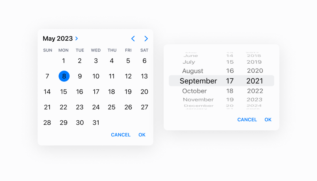
Select a date with a calendar
React
import React, {useState} from 'react';
import {
  Button,
  DatePicker,
  Screen,
  Text,
  reactExtension,
} from '@shopify/ui-extensions-react/point-of-sale';

const SmartGridModal = () => {
  const [date, setDate] = useState(
    new Date().toDateString(),
  );
  const visibleState = useState(false);

  return (
    <Screen name="Home" title="Home">
      <Text>Selected date: {date}</Text>
      <Button
        title="Show"
        onPress={() => {
          visibleState[1](true);
        }}
      />
      <DatePicker
        visibleState={visibleState}
        onChange={(selected) => {
          setDate(
            new Date(selected).toDateString(),
          );
        }}
        selected={date}
        inputMode={'spinner'}
      />
    </Screen>
  );
};

export default reactExtension(
  'pos.home.modal.render',
  () => <SmartGridModal />,
);
TS
import {
  Button,
  DatePicker,
  Screen,
  extension,
} from '@shopify/ui-extensions/point-of-sale';

export default extension(
  'pos.home.modal.render',
  (root) => {
    const mainScreen = root.createComponent(
      Screen,
      {
        name: 'Home',
        title: 'Home',
      },
    );

    const button = root.createComponent(Button, {
      title: 'Show',
      onPress: () => {
        datePicker.updateProps({
          visibleState: [true, () => {}],
        });
      },
    });

    const handleOnChange = (selected) => {
      datePicker.updateProps({
        selected: new Date(
          selected,
        ).toDateString(),
      });
    };

    const datePicker = root.createComponent(
      DatePicker,
      {
        visibleState: [false, () => {}],
        onChange: handleOnChange,
        selected: new Date().toDateString(),
        inputMode: 'spinner',
      },
    );

    mainScreen.append(button);
    mainScreen.append(datePicker);
    root.append(mainScreen);
  },
);
Anchor to Best practicesBest practices
- Manage visibility state with the tuple pattern: Use the
visibleStatetuple to control when the picker is shown or hidden. This pattern ensures consistent visibility management. - Handle date selection with onChange: Implement the
onChangecallback to capture selected dates and update your application state accordingly. This callback receives the selected date string that you can use to update UI or trigger related actions. - Provide clear triggers for showing the picker: Since visibility is controlled by
visibleState, ensure you have clear UI elements like buttons or field interactions that toggle the picker visibility. Users should understand how to open and close the date picker. - Default to current date thoughtfully: The picker defaults to the current date when no
selectedvalue is provided. If you need a different starting date or want to guide users to a specific time period, explicitly set theselectedproperty. - Optimize for touch interaction: Both input modes are designed for touch interaction on POS devices. Ensure adequate spacing around trigger elements and consider how the picker overlay affects the overall interface layout.
Anchor to LimitationsLimitations
- DatePicker requires external visibility state management through the
visibleStatetuple—automatic show/hide behavior based on field focus isn't built-in. - The component provides date selection but doesn't include field labels, help text, or error messaging—combine with other UI elements or text components to provide complete form field experiences.
- Input mode determines the interaction pattern but can't be changed dynamically while the picker is visible—you must set the mode before displaying the picker.