Version 2025-07 is the last API version to support React-based UI components. Later versions use web components, native UI elements with built-in accessibility, better performance, and consistent styling with Shopify's design system. Check out the upgrade guide to upgrade your extension.
Icon
The Icon component displays standardized visual symbols from the POS catalog to represent actions, statuses, or categories consistently. Use icons to enhance navigation or provide visual context alongside text in POS interfaces.
Icons help merchants quickly understand interface elements and actions without relying solely on text labels. Icons are optimized for readability at standard sizes and automatically scale to maintain visual consistency across different screen densities and device types.
Supported targets
- pos.
cart. line-item-details. action. render - pos.
customer-details. action. render - pos.
customer-details. block. render - pos.
draft-order-details. action. render - pos.
draft-order-details. block. render - pos.
home. modal. render - pos.
order-details. action. render - pos.
order-details. block. render - pos.
product-details. action. render - pos.
product-details. block. render - pos.
purchase. post. action. render - pos.
purchase. post. block. render
Supported targets
- pos.
cart. line-item-details. action. render - pos.
customer-details. action. render - pos.
customer-details. block. render - pos.
draft-order-details. action. render - pos.
draft-order-details. block. render - pos.
home. modal. render - pos.
order-details. action. render - pos.
order-details. block. render - pos.
product-details. action. render - pos.
product-details. block. render - pos.
purchase. post. action. render - pos.
purchase. post. block. render
Anchor to Use casesUse cases
- Button clarity: Enhance button clarity with visual indicators for actions like save or delete.
- Visual context: Provide visual context in lists and cards to identify item types or statuses.
- Navigation elements: Create intuitive navigation elements that help merchants understand actions.
- System states: Indicate system states like connectivity or processing status.
Anchor to PropertiesProperties
Configure the following properties on the Icon component.
- Anchor to namenamenameIconName | DeprecatedIconNameIconName | DeprecatedIconNamerequiredrequired
A name used to render the icon. Choose from the available icon set including commerce-specific symbols like
'cart','payment','search', navigation arrows, and system indicators.- Anchor to sizesizesizeIconSize | DeprecatedIconSizeIconSize | DeprecatedIconSizeDefault: 'l'Default: 'l'
The size of the icon. Use
's'for small icons,'m'for medium,'l'for large (default), or'xl'for extra large.- Anchor to tonetonetoneIconToneIconToneDefault: 'icon-primary'Default: 'icon-primary'
The color of the icon. Use semantic tones like
'icon-critical'for errors,'icon-warning'for cautions,'icon-success'for confirmations, or contextual tones like'icon-subdued'for secondary elements and'icon-interactive'for clickable elements.
IconName
'add-customer' | 'activity' | 'analytics' | 'apps' | 'arrow-down' | 'arrow-left' | 'arrow-right' | 'arrow-up' | 'backspace' | 'call' | 'cancel-fulfillment' | 'cancel' | 'card-reader' | 'caret-down' | 'caret-up' | 'cart-filled' | 'cart-outlined' | 'cash' | 'checklist' | 'checkmark' | 'checkmark-active' | 'checkmark-inactive' | 'chevron-down' | 'chevron-left' | 'chevron-right' | 'chevron-up' | 'circle-alert' | 'circle-cancel' | 'circle-checkmark' | 'circle-disconnected' | 'circle-info' | 'circle-outline' | 'clock' | 'collection' | 'connectivity' | 'connectivity-issue' | 'connectivity-critical-issue' | 'copy' | 'credit-card' | 'custom-payment' | 'custom-sale' | 'customer-filled' | 'customer-outlined' | 'delete' | 'desktop' | 'discount' | 'discount-automatic' | 'discount-code' | 'discount-custom' | 'discount-remove' | 'dockside' | 'draft-orders' | 'drawer' | 'exchange' | 'external-link' | 'fees' | 'flag' | 'flip-camera' | 'fulfillment-delivery' | 'fulfillment-shipment' | 'gallery-view' | 'gift-card' | 'help' | 'hide' | 'hide-keyboard' | 'home-filled' | 'home-outlined' | 'horizontal-dots' | 'image' | 'images' | 'inventory-adjustments' | 'inventory-counts' | 'inventory-po' | 'inventory-transfer' | 'keypad' | 'learn' | 'lightning' | 'link' | 'list' | 'list-view' | 'location' | 'lock' | 'low-battery' | 'mail' | 'maximize' | 'minimize' | 'minus' | 'mobile' | 'more-filled' | 'more-outlined' | 'no-internet' | 'note-report' | 'not-stocked' | 'orders-filled' | 'orders-outlined' | 'pencil' | 'play-button' | 'plus' | 'point-of-sale' | 'print' | 'pro' | 'products-filled' | 'products-outlined' | 'radio-active' | 'radio-inactive' | 'reassign-fulfillment' | 'rearrange' | 'receipt' | 'refresh' | 'register' | 'return' | 'retrieve-cart' | 'save-cart' | 'scan-barcode' | 'scan-qr-code' | 'search' | 'send' | 'send-cart' | 'settings' | 'shop-app' | 'shop-pay' | 'shopify-payments' | 'sort' | 'split-payment' | 'staff' | 'star' | 'store' | 'tablet-l' | 'tablet-s' | 'tap-to-pay' | 'unlock' | 'unordered-list' | 'variant' | 'view' | 'void-shipping-label'DeprecatedIconName
'add-customer' | 'analytics' | 'apps' | 'arrow' | 'arrow-left' | 'backspace' | 'card-reader' | 'call' | 'cancel' | 'not-stocked' | 'cash' | 'checkmark' | 'caret-down' | 'checkmark-active' | 'checkmark-inactive' | 'chevron-up' | 'chevron-right' | 'chevron-down' | 'circle-alert' | 'circle-cancel' | 'circle-checkmark' | 'circle-disconnected' | 'circle-info' | 'circle-outline' | 'clock' | 'collections' | 'copy' | 'credit-card' | 'custom-payment' | 'custom-sale' | 'discount' | 'external-link' | 'flag' | 'flip-camera' | 'gallery-view' | 'gift-card' | 'help' | 'hide-keyboard' | 'home' | 'horizontal-dots' | 'keypad' | 'lightning' | 'link' | 'list' | 'list-view' | 'lock' | 'mail' | 'available-at-other-locations' | 'menu' | 'minus' | 'mobile' | 'note-report' | 'drawer' | 'orders' | 'shopify-payments' | 'play-button' | 'plus' | 'products' | 'radio-active' | 'radio-inactive' | 'rearrange' | 'receipt' | 'refresh' | 'register' | 'retrieve-cart' | 'image-placeholder' | 'save-cart' | 'scan-barcode' | 'search' | 'send' | 'settings' | 'shipment' | 'split-payment' | 'sort' | 'staff' | 'star' | 'unordered-list' | 'connectivity-warning' | 'internet' | 'delivery' | 'shop-pay'IconSize
's' | 'm' | 'l' | 'xl'DeprecatedIconSize
'minor' | 'major' | 'spot' | 'caption' | 'badge'IconTone
'icon-primary' | 'icon-inverse' | 'icon-subdued' | 'icon-disabled' | 'icon-warning' | 'icon-critical' | 'icon-success' | 'icon-interactive' | 'icon-highlight' | 'icon-shoppay' | 'icon-static-light' | 'icon-static-dark' | 'icon-inactive' | 'icon-badge-neutral' | 'icon-search' | 'icon-tile-default' | 'icon-tile-stack' | 'icon-tile-disabled' | 'icon-tile-pink' | 'icon-tile-purple' | 'icon-tile-orange' | 'icon-subnavigation-inactive' | 'icon-primary-pressed'Anchor to ExamplesExamples
Anchor to Show iconsShow icons
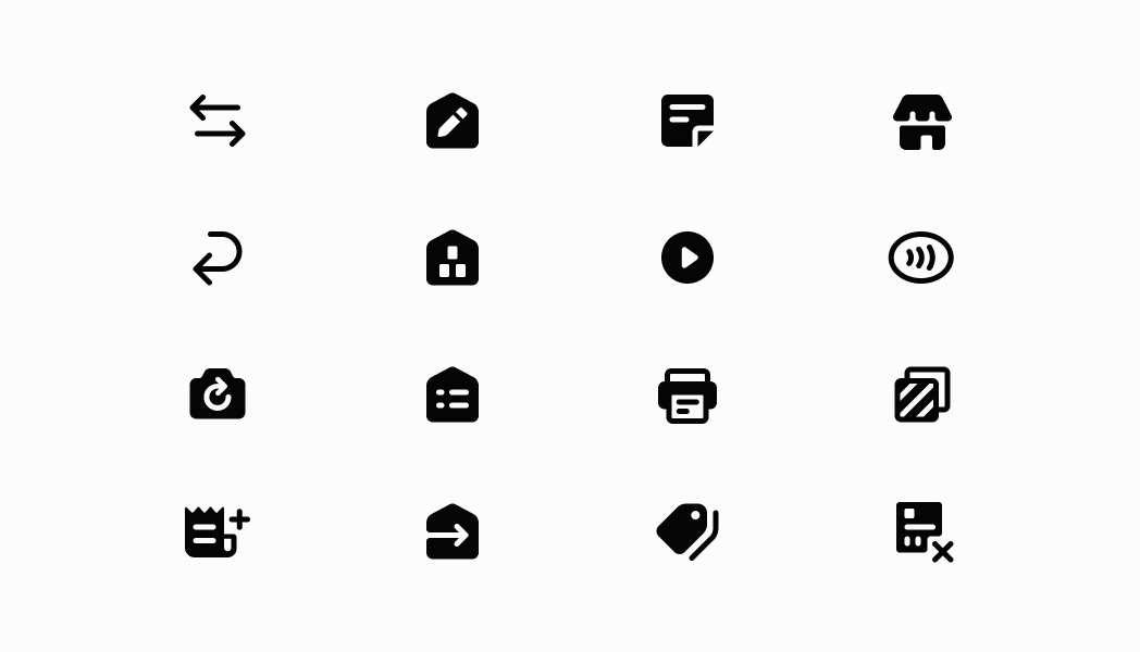
Show icons from the POS catalog to represent actions or statuses consistently. This example demonstrates rendering icons that enhance navigation, provide visual context alongside text, and maintain visual consistency across the interface with automatic scaling for different screen densities.Show icons
Show icons
React
import React from 'react';

import {
  Icon,
  Screen,
  ScrollView,
  Navigator,
  reactExtension,
} from '@shopify/ui-extensions-react/point-of-sale';

const SmartGridModal = () => {
  return (
    <Navigator>
      <Screen name="Image" title="Image Example">
        <ScrollView>
          <Icon name="call" size="s" tone="icon-success" />
          <Icon name="card-reader" size="l" />
          <Icon name="circle-cancel" size="xl" tone="icon-critical" />
          <Icon name="orders-filled" size="s" />
          <Icon name="star" size="m" />
        </ScrollView>
      </Screen>
    </Navigator>
  );
};

export default reactExtension('pos.home.modal.render', () => (
  <SmartGridModal />
));
TS
import {
  Navigator,
  Screen,
  ScrollView,
  Icon,
  IconName,
  IconSize,
  extension,
} from '@shopify/ui-extensions/point-of-sale';

export default extension('pos.home.modal.render', (root, api) => {
  const iconsData: {name: IconName; size: IconSize}[] = [
    {name: 'call', size: 's', tone: 'icon-success'},
    {name: 'card-reader', size: 'l'},
    {name: 'circle-cancel', size: 'xl', tone: 'icon-critical'},
    {name: 'orders-filled', size: 's'},
    {name: 'star', size: 'm'},
  ];
  const scrollView = root.createComponent(ScrollView);

  iconsData.forEach((iconData) => {
    const icon = root.createComponent(Icon, {
      name: iconData.name,
      size: iconData.size,
    });
    scrollView.append(icon);
  });

  const screen = root.createComponent(Screen, {
    name: 'Icon',
    title: 'Icon Example',
  });
  screen.append(scrollView);

  const navigator = root.createComponent(Navigator);
  navigator.append(screen);

  root.append(navigator);
});
Anchor to Best practicesBest practices
- Use appropriate sizes for context: Match icon sizes to their surrounding content and importance. Use
's'for inline text or secondary actions,'m'for standard interface elements,'l'(default) for primary actions, and'xl'for prominent features or headers. - Apply consistent tones for semantic meaning: Use tone consistently across your interface to establish clear visual patterns. Apply
'icon-critical'for destructive actions like delete,'icon-warning'for cautions,'icon-success'for confirmations, and'icon-primary'for general interface elements. - Combine icons with text when appropriate: While icons enhance visual communication, consider pairing them with text labels, especially for complex or less common actions.
Anchor to LimitationsLimitations
- Icons are purely decorative and don't support click events or interactive behaviors.
- The available icon set is predefined and limited to POS-specific symbols—custom icons or external icon libraries aren't supported.
- Icon appearance and styling are controlled by the POS design system—custom colors, styles, or modifications beyond the provided properties are not available.