Version 2025-07 is the last API version to support React-based UI components. Later versions use web components, native UI elements with built-in accessibility, better performance, and consistent styling with Shopify's design system. Check out the upgrade guide to upgrade your extension.
Date
The DateField component captures date input with a consistent interface for date selection and proper validation. Use it to collect date information in forms, scheduling interfaces, or data entry workflows.
DateField components support both manual text entry and picker selection, giving merchants flexibility to choose their preferred input method based on personal preference and specific date entry scenarios.
For visual calendar-based selection, consider DatePicker. The component validates dates in real-time and provides clear error messages for invalid entries, preventing form submission errors and reducing the need for merchants to correct date inputs multiple times.
Anchor to Use casesUse cases
- Scheduling: Collect appointment dates, delivery dates, or scheduling information.
- Transaction dates: Capture transaction dates, effective dates, or expiration dates.
- Filtering: Provide date-based filtering for reports or transaction histories.
- Date ranges: Enable date range selection for analytics or reporting.
Anchor to PropertiesProperties
Configure the following properties on the DateField component.
- Anchor to labellabellabelstringstringrequiredrequired
The content to use as the field label that describes the text information being requested.
- Anchor to actionactionactionInputActionInputAction
A button configuration object displayed under the text field to provide extra functionality.
- Anchor to disableddisableddisabledbooleanboolean
Controls whether the field can be modified. When
true, the field is disabled and users cannot edit its value.- Anchor to errorerrorerrorstringstring
An error message that indicates a problem to the user. The field is given specific stylistic treatment to communicate issues that must be resolved immediately.
- Anchor to helpTexthelp
Texthelp Text stringstring The label text displayed under the field that provides guidance or instructions to assist users.
- Anchor to onBluron
Bluron Blur () => void() => void A callback function executed when focus is removed from the field.
- Anchor to onChangeon
Changeon Change (value: string) => void(value: string) => void A callback function executed when the user has finished editing the field, receiving the new text value as a parameter. You should update the
valueproperty in response to this callback.- Anchor to onFocuson
Focuson Focus () => void() => void A callback function executed when the field receives focus.
- Anchor to valuevaluevaluestringstring
The current text value for the field. If omitted, the field will be empty. You should update the
valueproperty in response to thecallback.
InputAction
Defines the configuration object for action buttons displayed below input fields to provide extra functionality.
- disabled
A boolean value that determines whether the action button can be pressed.
boolean - label
The text displayed on the action button.
string - onPress
A callback function executed when the action button is pressed.
() => void
Anchor to ExamplesExamples
Anchor to Capture date input with validationCapture date input with validation
Collect date information using a text-based input field with built-in validation. This example shows how to implement a DateField that supports both manual text entry and picker selection, providing merchants with flexible date input options for scheduling, filtering, or data entry tasks.Capture date input with validation
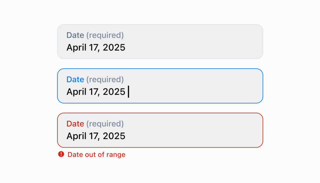
Capture date input with validation
React
import React, {useState} from 'react';
import {
  DateField,
  Screen,
  ScrollView,
  Navigator,
  Text,
  reactExtension,
} from '@shopify/ui-extensions-react/point-of-sale';

const SmartGridModal = () => {
  const [date, setDate] = useState('');
  return (
    <Navigator>
      <Screen name="DateField" title="DateField Example">
        <ScrollView>
          <DateField
            label="Date"
            value={date}
            onChange={setDate}
            action={{
              label: 'Clear',
              onPress: () => setDate(''),
            }}
          />
          <Text>Selected Date: {date}</Text>
        </ScrollView>
      </Screen>
    </Navigator>
  );
};

export default reactExtension('pos.home.modal.render', () => (
  <SmartGridModal />
));
TS
import {
  Navigator,
  Screen,
  ScrollView,
  Text,
  DateField,
  extension,
} from '@shopify/ui-extensions/point-of-sale';

export default extension('pos.home.modal.render', (root, api) => {
  const clearHandler = () => {
    dateField.updateProps({value: ''});
    textBox.replaceChildren('');
  };
  const dateField = root.createComponent(DateField, {
    label: 'Select Date',
    value: '',
    action: {label: 'Clear', onPress: clearHandler},
  });

  const textBox = root.createComponent(Text);

  const onChangeHandler = (newValue: string) => {
    dateField.updateProps({value: newValue});

    const textContent = `Selected Date: ${newValue}`;
    textBox.replaceChildren(textContent);
  };

  dateField.updateProps({onChange: onChangeHandler});

  const scrollView = root.createComponent(ScrollView);
  scrollView.append(dateField);
  scrollView.append(textBox);

  const screen = root.createComponent(Screen, {
    name: 'DateField',
    title: 'Date Field Example',
  });
  screen.append(scrollView);

  const navigator = root.createComponent(Navigator);
  navigator.append(screen);

  root.append(navigator);
});
Anchor to Best practicesBest practices
- Use clear and specific labels: Provide descriptive labels that indicate what date is being requested, such as Delivery Date or Appointment Date rather than generic Date. This helps users understand the context and purpose of the field.
- Provide helpful guidance with helpText: Use the
helpTextproperty to explain date constraints, format expectations, or other requirements. For example, Select a date within the next 30 days or Must be a future date. - Implement proper validation and error handling: Use the
errorproperty to display validation messages when users enter invalid dates. Provide clear, actionable error messages that help users correct their input. - Handle date values consistently: The field defaults to the current date when no value is provided. Update the
valueproperty in response to theonChangecallback to maintain controlled component behavior and ensure predictable state management. - Use action buttons for enhanced functionality: Use the
actionproperty to provide quick access to related functionality like Clear Date, Set to Today, or Show Calendar. This enhances usability without cluttering the interface. - Differentiate between input and change callbacks: Use
onInputfor immediate feedback like clearing validation errors as soon as users start typing. ReserveonChangefor updating the field value when editing is complete. Never useonInputto update thevalueproperty.
Anchor to LimitationsLimitations
- DateField provides text-based date input—for calendar-style visual date selection, use the DatePicker component which offers an interactive calendar interface.
- The field defaults to the current date rather than being empty—if you need an empty initial state, explicitly set the
valueproperty to an empty string. - Action buttons are limited to simple press callbacks—complex action workflows require custom implementation or additional components.