Version 2025-07 is the last API version to support React-based UI components. Later versions use web components, native UI elements with built-in accessibility, better performance, and consistent styling with Shopify's design system. Check out the upgrade guide to upgrade your extension.
Email
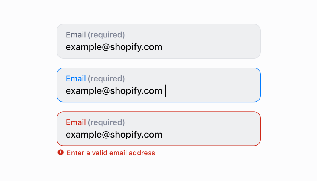
The EmailField component captures email address input from customers with built-in validation. Use it to collect email information in forms, customer profiles, or contact workflows.
The component includes built-in email format validation using standard email patterns to ensure data quality. It provides real-time feedback on invalid entries and supports features like autocomplete and keyboard optimization for email input, helping merchants quickly capture valid customer contact information during checkout or registration workflows.
EmailField components integrate with browser autocomplete features to speed up email entry by suggesting previously used addresses, significantly reducing typing time during customer registration workflows.
Anchor to Use casesUse cases
- Customer emails: Collect customer email addresses during account creation or profile updates.
- Merchant notifications: Capture merchant email addresses for notifications or receipts.
- Receipt delivery: Enable email-based features like sending receipts or order confirmations.
- Form validation: Support email validation in checkout or customer management interfaces.
Anchor to PropertiesProperties
Configure the following properties on the EmailField component.
- Anchor to labellabellabelstringstringrequiredrequired
The content to use as the field label that describes the text information being requested.
- Anchor to actionactionactionInputActionInputAction
A button configuration object displayed under the text field to provide extra functionality.
- Anchor to disableddisableddisabledbooleanboolean
Controls whether the field can be modified. When
true, the field is disabled and users cannot edit its value.- Anchor to errorerrorerrorstringstring
An error message that indicates a problem to the user. The field is given specific stylistic treatment to communicate issues that must be resolved immediately.
- Anchor to helpTexthelp
Texthelp Text stringstring The label text displayed under the field that provides guidance or instructions to assist users.
- Anchor to maxLengthmax
Lengthmax Length numbernumber The maximum number of characters allowed in the text field.
- Anchor to onBluron
Bluron Blur () => void() => void A callback function executed when focus is removed from the field.
- Anchor to onChangeon
Changeon Change (value: string) => void(value: string) => void A callback function executed when the user has finished editing the field, receiving the new text value as a parameter. You should update the
valueproperty in response to this callback.- Anchor to onFocuson
Focuson Focus () => void() => void A callback function executed when the field receives focus.
- Anchor to onInputon
Inputon Input (value: string) => void(value: string) => void A callback function executed immediately when the user makes any change in the field. Use this for real-time feedback, such as clearing validation errors as soon as the user begins making corrections. Don't use this to update the
valueproperty—thecallback is the appropriate handler for updating the field's value.- Anchor to placeholderplaceholderplaceholderstringstring
A short hint that describes the expected value of the field.
- Anchor to requiredrequiredrequiredbooleanboolean
A boolean that indicates whether the field needs a value for form submission or validation purposes.
- Anchor to valuevaluevaluestringstring
The current text value for the field. If omitted, the field will be empty. You should update the
valueproperty in response to thecallback.
InputAction
Defines the configuration object for action buttons displayed below input fields to provide extra functionality.
- disabled
A boolean value that determines whether the action button can be pressed.
boolean - label
The text displayed on the action button.
string - onPress
A callback function executed when the action button is pressed.
() => void
Anchor to ExamplesExamples
Anchor to Capture email input with validationCapture email input with validation
Capture customer email addresses with built-in format validation. This example shows how to implement an EmailField that validates email syntax in real-time, provides autocomplete support, and optimizes the keyboard for email entry, ensuring accurate customer contact information.Capture email input with validation
Capture email input with validation
React
import React, {useState} from 'react';
import {
  EmailField,
  Screen,
  ScrollView,
  Navigator,
  Text,
  reactExtension,
} from '@shopify/ui-extensions-react/point-of-sale';

const SmartGridModal = () => {
  const [email, setEmail] = useState('');
  return (
    <Navigator>
      <Screen name="DateField" title="DateField Example">
        <ScrollView>
          <EmailField
            label="Email"
            placeholder="example@email.com"
            helpText="Please enter a valid email"
            value={email}
            onChange={setEmail}
            required={true}
            action={{
              label: 'Clear',
              onPress: () => setEmail(''),
            }}
          />
          <Text>Entered Email: {email}</Text>
        </ScrollView>
      </Screen>
    </Navigator>
  );
};

export default reactExtension('pos.home.modal.render', () => (
  <SmartGridModal />
));
TS
import {
  Navigator,
  Screen,
  ScrollView,
  Text,
  EmailField,
  extension,
} from '@shopify/ui-extensions/point-of-sale';

export default extension('pos.home.modal.render', (root, api) => {
  const clearHandler = () => {
    emailField.updateProps({value: ''});
    textBox.replaceChildren('');
  };
  const emailField = root.createComponent(EmailField, {
    label: 'Email',
    value: '',
    action: {label: 'Clear', onPress: clearHandler},
  });

  const textBox = root.createComponent(Text);

  const onChangeHandler = (newValue: string) => {
    emailField.updateProps({value: newValue});

    const textContent = `Selected Date: ${newValue}`;
    textBox.replaceChildren(textContent);
  };

  emailField.updateProps({onChange: onChangeHandler});

  const scrollView = root.createComponent(ScrollView);
  scrollView.append(emailField);
  scrollView.append(textBox);

  const screen = root.createComponent(Screen, {
    name: 'DateField',
    title: 'Date Field Example',
  });
  screen.append(scrollView);

  const navigator = root.createComponent(Navigator);
  navigator.append(screen);

  root.append(navigator);
});
Anchor to Best practicesBest practices
- Provide helpful guidance with placeholder and helpText: Use placeholder text for format examples like
customer@example.comand thehelpTextproperty for additional context like "Required for digital receipts" or "We'll send order updates to this address." - Implement proper email validation: Use the
errorproperty to display validation messages when users enter invalid email formats. Provide clear, actionable error messages like "Please enter a valid email address" that help users correct their input. - Use the email-optimized keyboard: EmailField automatically display the email-optimized keyboard on mobile devices with easy access to
@and domain symbols. This improves input speed and reduces errors on touch devices. - Use the required property appropriately: Set
requiredtotruefor fields that must have a value. While this adds semantic meaning, you must still implement validation logic and use theerrorproperty to display validation errors to users. - Add action buttons for enhanced functionality: Use the
actionproperty to provide helpful actions like "Validate Email," "Use Default Email," or "Clear Field." This enhances usability by providing quick access to common operations. - Differentiate between input and change callbacks: Use
onInputfor immediate feedback like clearing validation errors as soon as users start typing. ReserveonChangefor updating the field value when editing is complete. Never useonInputto update thevalueproperty.
Anchor to LimitationsLimitations
- EmailField provides the input interface but doesn't perform automatic email validation—you must implement validation logic and use the
errorproperty to display validation results. - The
requiredproperty adds semantic meaning only—it doesn't trigger automatic error display or prevent form submission without additional validation logic. - Action buttons are limited to simple press callbacks—complex action workflows require custom implementation or additional components.