Version 2025-07 is the last API version to support React-based UI components. Later versions use web components, native UI elements with built-in accessibility, better performance, and consistent styling with Shopify's design system. Check out the upgrade guide to upgrade your extension.
Text
The Text component displays text with specific visual styles and colors. Use it to present content with appropriate typography hierarchy and semantic coloring for different types of information.
Text provides a comprehensive typography system that ensures consistent styling and proper visual hierarchy across POS interfaces.
Text components ensure proper text rendering across different device types and screen sizes while maintaining readability through appropriate line heights, letter spacing, and color contrast ratios. The component automatically adjusts line length for optimal readability based on container width, preventing overly long lines that reduce reading speed and comprehension in wider layouts.
Supported targets
- pos.
cart. line-item-details. action. render - pos.
customer-details. action. render - pos.
customer-details. block. render - pos.
draft-order-details. action. render - pos.
draft-order-details. block. render - pos.
home. modal. render - pos.
order-details. action. render - pos.
order-details. block. render - pos.
product-details. action. render - pos.
product-details. block. render - pos.
purchase. post. action. render - pos.
purchase. post. block. render
Supported targets
- pos.
cart. line-item-details. action. render - pos.
customer-details. action. render - pos.
customer-details. block. render - pos.
draft-order-details. action. render - pos.
draft-order-details. block. render - pos.
home. modal. render - pos.
order-details. action. render - pos.
order-details. block. render - pos.
product-details. action. render - pos.
product-details. block. render - pos.
purchase. post. action. render - pos.
purchase. post. block. render
Anchor to Use casesUse cases
- Typography hierarchy: Display content with appropriate typography using variants from captions to display sizes.
- Status information: Present status information using semantic colors to convey meaning.
- Consistent styling: Create consistent text styling across different interface elements.
- Visual emphasis: Provide visual emphasis through typography variants like headings and body text.
Anchor to PropertiesProperties
Configure the following properties on the Text component.
- Anchor to colorcolorcolorColorTypeColorType
The semantic color of the text that conveys meaning and intent through visual styling.
- Anchor to variantvariantvariantTextVariantTextVariant
The typography variant that determines the size, weight, and styling of the text within the design system hierarchy.
ColorType
Defines the semantic color options for text elements. Each color conveys specific meaning and intent through visual styling. Available colors: - `TextNeutral`: A neutral text color for general content that doesn't convey specific semantic meaning. - `TextSubdued`: A subdued text color for secondary information, captions, or content that should be less prominent. - `TextDisabled`: A disabled text color for inactive or unavailable content that users can't interact with. - `TextWarning`: A warning text color for cautionary messages or content that requires user attention. - `TextCritical`: A critical text color for errors, failures, or destructive actions that require immediate attention. - `TextSuccess`: A success text color for positive outcomes, confirmations, or completed actions. - `TextInteractive`: An interactive text color for clickable elements, links, or content that users can interact with. - `TextHighlight`: A highlight text color for emphasized content that needs to stand out or draw special attention.
'TextNeutral' | 'TextSubdued' | 'TextDisabled' | 'TextWarning' | 'TextCritical' | 'TextSuccess' | 'TextInteractive' | 'TextHighlight'TextVariant
Defines the typography hierarchy options for text elements. Each variant provides specific sizing, weight, and styling appropriate for different content types. Available variants: - `sectionHeader`: A section header variant for titles that organize and introduce content sections. - `captionRegular`: A regular caption variant for supplementary text, labels, or secondary information. - `captionRegularTall`: A taller caption variant with increased line height for improved readability in dense layouts. - `captionMedium`: A medium-weight caption variant for slightly emphasized secondary text or important labels. - `body`: The standard body text variant for primary content, descriptions, and general text. - `headingSmall`: A small heading variant for subsection titles and secondary headings. - `headingLarge`: A large heading variant for main section titles and primary headings. - `display`: The largest display variant for prominent titles, hero text, or major interface elements.
'sectionHeader' | 'captionRegular' | 'captionRegularTall' | 'captionMedium' | 'body' | 'headingSmall' | 'headingLarge' | 'display'Anchor to ExamplesExamples
Anchor to Display text with visual hierarchyDisplay text with visual hierarchy
Show text with appropriate typography styles and semantic coloring. This example demonstrates different text variants and colors to create visual hierarchy, ensuring consistent styling and proper readability across different device types and screen sizes.Display text with visual hierarchy
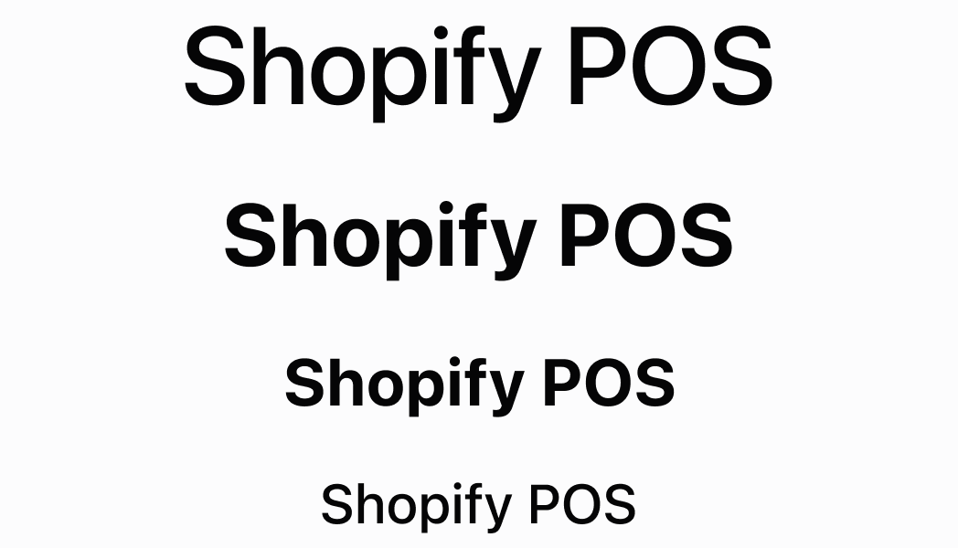
Display text with visual hierarchy
React
import React from 'react';

import { Screen, reactExtension, Text, ScrollView } from '@shopify/ui-extensions-react/point-of-sale';

const SmartGridModal = () => {
  return (
    <Screen name='text' title='Text'>
      <ScrollView>
        <Text variant="body">body</Text>
        <Text variant="captionMedium">captionMedium</Text>
        <Text variant="captionRegular">captionRegular</Text>
        <Text variant="captionRegularTall">captionRegularTall</Text>
        <Text variant="display">display</Text>
        <Text variant="headingLarge">headingLarge</Text>
        <Text variant="headingSmall">headingSmall</Text>
        <Text variant="sectionHeader">sectionHeader</Text>
        <Text variant="headingSmall" color="TextCritical">
          TextCritical
        </Text>
        <Text variant="headingSmall" color="TextDisabled">
          TextDisabled
        </Text>
        <Text variant="headingSmall" color="TextHighlight">
          TextHighlight
        </Text>
        <Text variant="headingSmall" color="TextInteractive">
          TextInteractive
        </Text>
        <Text variant="headingSmall" color="TextNeutral">
          TextNeutral
        </Text>
        <Text variant="headingSmall" color="TextSubdued">
          TextSubdued
        </Text>
        <Text variant="headingSmall" color="TextSuccess">
          TextSuccess
        </Text>
        <Text variant="headingSmall" color="TextWarning">
          TextWarning
        </Text>
      </ScrollView>
    </Screen>
  );
}

export default reactExtension('pos.home.modal.render', () => {
  return <SmartGridModal />
})
TS
import {
  extension,
  Screen,
  ScrollView,
  Text,
} from '@shopify/ui-extensions/point-of-sale';

export default extension(
  'pos.home.modal.render',
  (root) => {
    const mainScreen = root.createComponent(
      Screen,
      {name: 'text', title: 'Text'},
    );
    const scrollView =
      root.createComponent(ScrollView);

    scrollView.append(
      root.createComponent(
        Text,
        {variant: 'body'},
        'body',
      ),
    );
    scrollView.append(
      root.createComponent(
        Text,
        {variant: 'captionMedium'},
        'captionMedium',
      ),
    );
    scrollView.append(
      root.createComponent(
        Text,
        {variant: 'captionRegular'},
        'captionRegular',
      ),
    );
    scrollView.append(
      root.createComponent(
        Text,
        {variant: 'captionRegularTall'},
        'captionRegularTall',
      ),
    );
    scrollView.append(
      root.createComponent(
        Text,
        {variant: 'display'},
        'display',
      ),
    );
    scrollView.append(
      root.createComponent(
        Text,
        {variant: 'headingLarge'},
        'headingLarge',
      ),
    );
    scrollView.append(
      root.createComponent(
        Text,
        {variant: 'headingSmall'},
        'headingSmall',
      ),
    );
    scrollView.append(
      root.createComponent(
        Text,
        {variant: 'sectionHeader'},
        'sectionHeader',
      ),
    );
    scrollView.append(
      root.createComponent(
        Text,
        {
          variant: 'headingSmall',
          color: 'TextCritical',
        },
        'TextCritical',
      ),
    );
    scrollView.append(
      root.createComponent(
        Text,
        {
          variant: 'headingSmall',
          color: 'TextHighlight',
        },
        'TextHighlight',
      ),
    );
    scrollView.append(
      root.createComponent(
        Text,
        {
          variant: 'headingSmall',
          color: 'TextInteractive',
        },
        'TextInteractive',
      ),
    );
    scrollView.append(
      root.createComponent(
        Text,
        {
          variant: 'headingSmall',
          color: 'TextNeutral',
        },
        'TextNeutral',
      ),
    );
    scrollView.append(
      root.createComponent(
        Text,
        {
          variant: 'headingSmall',
          color: 'TextSubdued',
        },
        'TextSubdued',
      ),
    );
    scrollView.append(
      root.createComponent(
        Text,
        {
          variant: 'headingSmall',
          color: 'TextSuccess',
        },
        'TextSuccess',
      ),
    );
    scrollView.append(
      root.createComponent(
        Text,
        {
          variant: 'headingSmall',
          color: 'TextWarning',
        },
        'TextWarning',
      ),
    );

    mainScreen.append(scrollView);
    root.append(mainScreen);
  },
);
Anchor to Best practicesBest practices
- Apply semantic colors to convey meaning: Use color to communicate the nature and intent of your content. Apply
TextSuccessfor positive outcomes,TextCriticalfor errors,TextWarningfor cautions, andTextInteractivefor clickable elements. - Maintain consistent typography patterns: Establish consistent patterns for how you use text variants across your POS UI extension. Similar types of content should use similar variants, helping users develop familiarity with your interface hierarchy.
- Use subdued colors strategically: Apply
TextSubduedfor secondary information that supports but doesn't compete with primary content. UseTextDisabledonly for truly inactive content that users can't interact with. - Balance emphasis with clarity: Use highlighting and interactive colors sparingly to maintain their effectiveness. Too many emphasized elements can reduce the impact of truly important content.
Anchor to LimitationsLimitations
- Text content is provided through child components rather than direct text properties—organize your text content through component composition.
- Typography and color options are limited to the predefined design system variants—custom fonts, sizes, or colors beyond the available options aren't supported.
- Complex rich text formatting requires multiple Text components with different variants and colors rather than inline formatting options.