Version 2025-07 is the last API version to support React-based UI components. Later versions use web components, native UI elements with built-in accessibility, better performance, and consistent styling with Shopify's design system. Check out the upgrade guide to upgrade your extension.
List
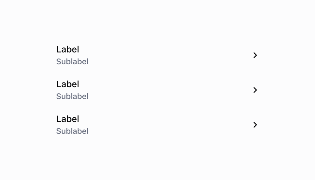
The List component displays structured data in rows with rich content including labels, subtitles, badges, images, and interactive elements. Use it to present organized information with consistent formatting and user interaction capabilities.
List items no longer have dividers as of POS version 10.0.0.
Anchor to Use casesUse cases
- Object display: Display and link to cart items, customers, or products with images and descriptions.
- Menu items: Display menu items and settings with toggle switches and navigation indicators.
- Selectable options: Display selectable options, filters, and actions with chevrons.
- Paginated data: Show paginated data with automatic loading indicators and end-reached callbacks.
Anchor to PropertiesProperties
Configure the following properties on the List component.
- Anchor to datadatadataListRow[]ListRow[]requiredrequired
An array of ListRow objects that define the content and structure of each row in the list.
- Anchor to imageDisplayStrategyimage
Display Strategyimage Display Strategy 'automatic' | 'always' | 'never''automatic' | 'always' | 'never'Default: `automatic`Default: `automatic` The logic for displaying images or placeholders:
automatic: Displays images or placeholders only when it detects that a ListRow has an image source value.always: Displays images or placeholders for all rows, even when image sources are undefined or empty.never: Hides all images and placeholders, creating a text-only list layout.
- Anchor to isLoadingMoreis
Loading Moreis Loading More booleanboolean A boolean indicating whether more data is being loaded. Set to
truewhen paginating and fetching additional data for the list.- Anchor to listHeaderComponentlist
Header Componentlist Header Component RemoteFragmentRemoteFragment A header component displayed at the top of the list for additional context or controls.
- Anchor to onEndReachedon
End Reachedon End Reached () => void() => void A callback function executed when the user reaches the end of the list. Use this to trigger requests for loading additional data.
- Anchor to titletitletitlestringstring
A large display title shown at the top of the list.
ListRow
- id
The unique identifier for the list item used for tracking and interaction handling.
string - leftSide
The content configuration for the left side of the row, including label, subtitles, badges, and optional image.
ListRowLeftSide - onPress
A callback function executed when the user taps the row.
() => void - rightSide
The content configuration for the right side of the row, including optional label, chevron, and toggle switch.
ListRowRightSide
ListRowLeftSide
- badges
An array of colored badges displayed underneath the title and subtitles for additional status or category information.
BadgeProps[] - image
An image configuration object for displaying images on the far left side of the row with optional badge overlay.
{ source?: string; badge?: number; } - label
The main label text displayed prominently on the left side of the row.
string - subtitle
An array of up to three subtitles displayed beneath the main label. Each subtitle can be a string or an object with content and color properties.
[ListRowSubtitle, ListRowSubtitle?, ListRowSubtitle?]
BadgeProps
Configure the following properties on the Badge component.
- status
Displays a circular status indicator alongside the badge text. This property is deprecated as of POS 10.0.0 and should not be used in new implementations. Available options: Use the `variant` property instead to convey status information in new implementations. - `'empty'` - Shows an empty circle indicator - `'partial'` - Shows a partially filled circle indicator - `'complete'` - Shows a completely filled circle indicator
BadgeStatus - text
The text content displayed within the badge. Keep this concise and descriptive to clearly communicate status or category information. Examples include "Paid," "Pending," "Out of Stock," or "VIP Customer."
string - variant
Controls the visual styling and semantic meaning of the badge. Available options: - `'neutral'` - Gray styling for general status information that doesn't require emphasis. Use for general status updates and standard information. - `'critical'` - Red styling for errors, failures, and urgent issues requiring immediate action. Use for urgent issues that need immediate merchant attention. - `'warning'` - Orange styling for important notices that require merchant awareness. Use for situations that need attention but aren't critical. - `'success'` - Green styling for positive states, completed actions, and successful operations. Use for positive outcomes and successful processes. - `'highlight'` - Bright styling for featured content, promotions, or emphasized information. Use for featured content that should stand out.
BadgeVariant
BadgeStatus
'empty' | 'partial' | 'complete'BadgeVariant
'neutral' | 'critical' | 'warning' | 'success' | 'highlight'ListRowSubtitle
string | SubtitleTypeSubtitleType
- color
The semantic color of the subtitle text that conveys meaning and intent through visual styling.
ColorType - content
The text content to display as a subtitle beneath the main label.
string
ColorType
Defines the semantic color options for text elements. Each color conveys specific meaning and intent through visual styling. Available colors: - `TextNeutral`: A neutral text color for general content that doesn't convey specific semantic meaning. - `TextSubdued`: A subdued text color for secondary information, captions, or content that should be less prominent. - `TextDisabled`: A disabled text color for inactive or unavailable content that users can't interact with. - `TextWarning`: A warning text color for cautionary messages or content that requires user attention. - `TextCritical`: A critical text color for errors, failures, or destructive actions that require immediate attention. - `TextSuccess`: A success text color for positive outcomes, confirmations, or completed actions. - `TextInteractive`: An interactive text color for clickable elements, links, or content that users can interact with. - `TextHighlight`: A highlight text color for emphasized content that needs to stand out or draw special attention.
'TextNeutral' | 'TextSubdued' | 'TextDisabled' | 'TextWarning' | 'TextCritical' | 'TextSuccess' | 'TextInteractive' | 'TextHighlight'ListRowRightSide
- label
An optional label text displayed on the right side of the row for additional information or values.
string - showChevron
A boolean that controls chevron display. Set to `true` when pressing the row navigates to another screen.
boolean - toggleSwitch
A toggle switch configuration object displayed on the right side of the row for boolean settings or states.
ToggleSwitch
ToggleSwitch
- disabled
Controls whether the toggle switch can be interacted with. When `true`, the switch is disabled and users cannot change its state.
boolean - value
The current state of the toggle switch. When `true`, the switch is in the "on" position. When `false`, it's in the "off" position.
boolean
Anchor to ExamplesExamples
Anchor to Show a product listShow a product list
Display structured data in organized rows with rich content. This example demonstrates a List component showing products with labels, subtitles, images, and interactive elements, providing consistent formatting for collections of items like products, customers, or menu options.Show a product list
Show a product list
React
import React, {useState} from 'react';
import {
  Navigator,
  Screen,
  List,
  Text,
  ScrollView,
  Section,
  ListRowSubtitle,
  reactExtension,
} from '@shopify/ui-extensions-react/point-of-sale';

const SmartGridModal = () => {
  const [seeDetails, setSeeDetails] = useState(false);
  const listData = [
    {
      id: 'graphicTees',
      leftSide: {
        label: 'Graphic Tees',
        subtitle: [{content: 'Summer Collection'}, {content: 'Unisex'}] as [
          ListRowSubtitle,
          ListRowSubtitle?,
        ],
      },
      rightSide: {
        label: 'Product details',
        showChevron: true,
      },
      onPress: () => setSeeDetails(!seeDetails),
    },
    {
      id: 'denimShorts',
      leftSide: {
        label: 'Denim Shorts',
        subtitle: [{content: 'Summer Collection'}, {content: 'Denim'}] as [
          ListRowSubtitle,
          ListRowSubtitle?,
        ],
      },
    },
  ];
  return (
    <Navigator>
      <Screen name="ProductList" title="Product List">
        <List title="Products" data={listData} />
        {seeDetails && (
          <ScrollView>
            <Section title="Our T-shirts">
              <Text>Our shirts are made with 100% organic cotton!</Text>
            </Section>
          </ScrollView>
        )}
      </Screen>
    </Navigator>
  );
};

export default reactExtension('pos.home.modal.render', () => (
  <SmartGridModal />
));
TS
import {
  Navigator,
  Screen,
  List,
  Text,
  ScrollView,
  Section,
  ListRowSubtitle,
  extension,
} from '@shopify/ui-extensions/point-of-sale';

export default extension('pos.home.modal.render', (root, api) => {
  let showDetails = false;
  const section = root.createComponent(Section, {
    title: 'Our T-shirts',
  });

  const scrollView = root.createComponent(ScrollView);

  const triggerShowDetails = () => {
    showDetails = !showDetails;
    if (showDetails) {
      scrollView.append(section);
    } else {
      scrollView.removeChild(section);
    }
  };

  const listData = [
    {
      id: 'graphicTees',
      leftSide: {
        label: 'Graphic Tees',
        subtitle: [{content: 'Summer Collection'}, {content: 'Unisex'}] as [
          ListRowSubtitle,
          ListRowSubtitle?,
        ],
      },
      rightSide: {
        label: 'Product details',
        showChevron: true,
      },
      onPress: () => triggerShowDetails(),
    },
    {
      id: 'denimShorts',
      leftSide: {
        label: 'Denim Shorts',
        subtitle: [{content: 'Summer Collection'}, {content: 'Denim'}] as [
          ListRowSubtitle,
          ListRowSubtitle?,
        ],
      },
    },
  ];

  const list = root.createComponent(List, {
    title: 'Products',
    data: listData,
  });

  const textBlock = root.createComponent(
    Text,
    null,
    'Our shirts are made with 100% organic cotton!',
  );

  section.append(textBlock);

  const screen = root.createComponent(Screen, {
    name: 'ProductList',
    title: 'Product List',
  });

  screen.append(list);

  if (showDetails) {
    scrollView.append(section);
  }

  screen.append(scrollView);

  const navigator = root.createComponent(Navigator);
  navigator.append(screen);

  root.append(navigator);
});
Anchor to Best practicesBest practices
- Use images strategically with appropriate display strategies: Choose the right image display strategy based on your content. Use
'automatic'for mixed content,'always'when consistent image areas improve layout, and'never'for text-heavy lists where images would be distracting. - Implement efficient pagination with onEndReached: Use the
onEndReachedcallback to implement smooth pagination that doesn't disrupt the user experience. SetisLoadingMoreappropriately to provide visual feedback during data fetching operations. - Apply semantic colors for subtitle information: Use
ColorTypevalues in subtitles to convey meaning effectively. ApplyTextSuccessfor positive states,TextCriticalfor errors, andTextSubduedfor less important information. - Design meaningful row interactions: Use
onPresscallbacks for navigation or detail views, andshowChevronto indicate navigation actions. Reserve toggle switches for immediate state changes that don't require navigation. - Optimize for touch interfaces: Ensure adequate spacing and touch target sizes by leveraging the List component's built-in touch optimization.
Anchor to LimitationsLimitations
- List row structure is predefined with specific left and right side layouts—custom row layouts beyond the provided structure aren't supported.
- Image display is limited to the left side of rows with optional badge overlays—complex image layouts or multiple images for each row aren't available.
- Toggle switches and interactive elements are limited to the predefined types—custom interactive components within rows require using
onPresscallbacks and external state management.